Technology: data visualisation
Amnesty International Italy –
Il barometro dell’odio
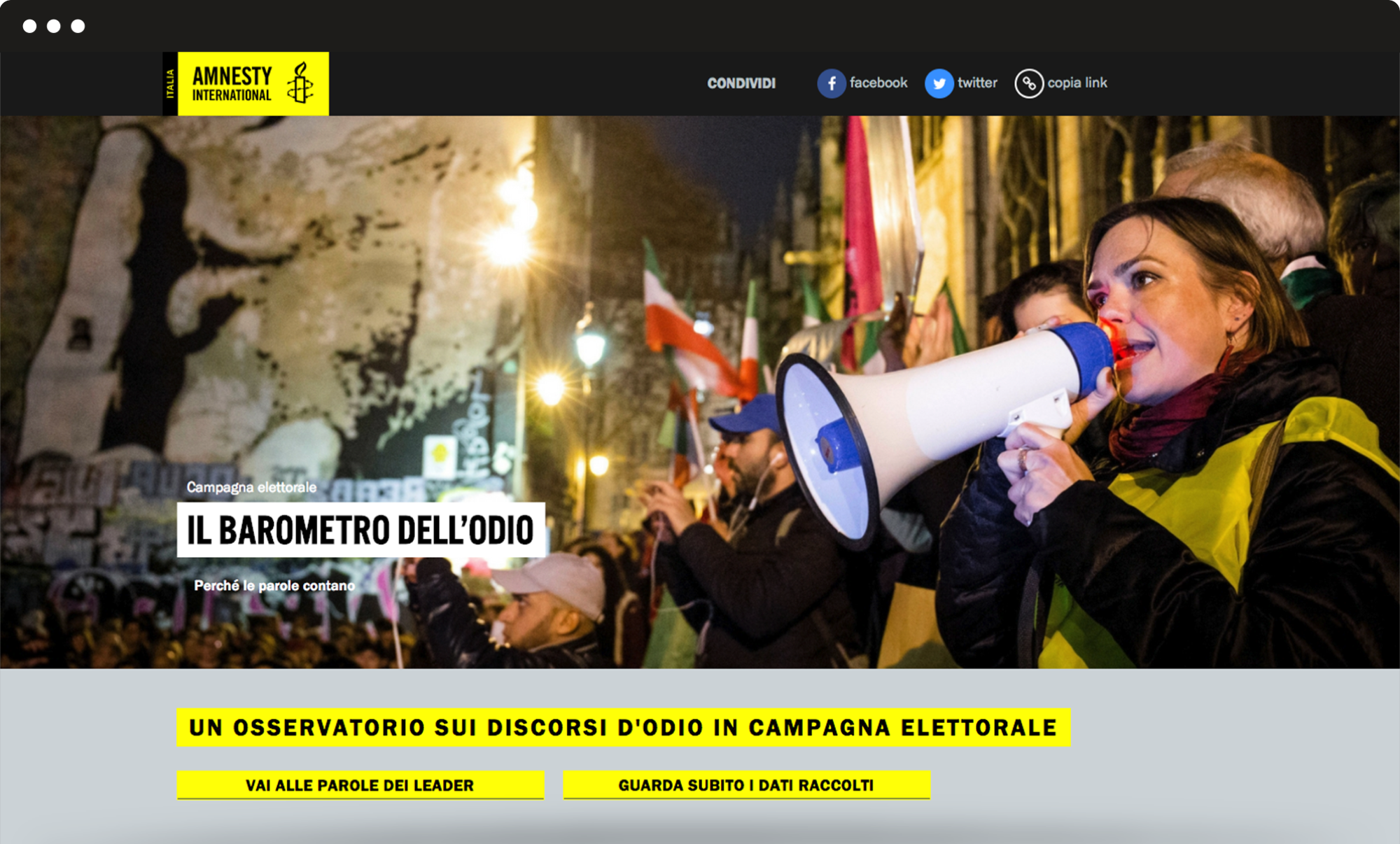
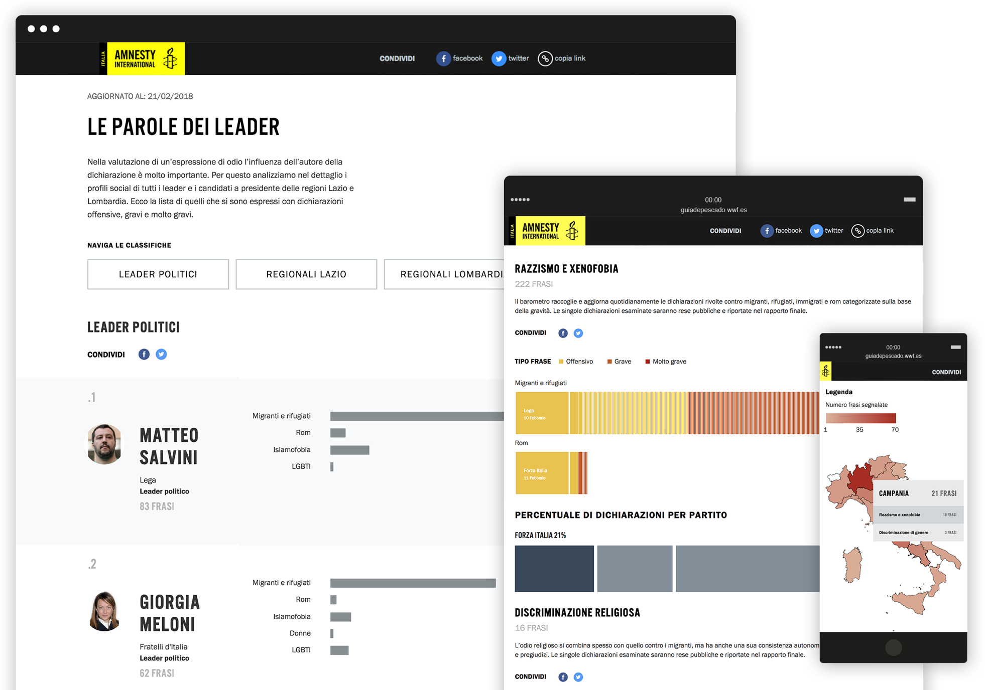
We built a microsite to track and display data about the hate speech of candidates during the 2018 Italian political elections campaign. The different data were uploaded every day and displayed in accessible dynamic graphics, to provide users with an engaging tool and a smooth navigation experience.
Data visualization
An intuitive backend to allows uploading the data every day during the campaign.
We had to transform the methodology to track and evaluate hate speech sentences said by hundreds of candidates, into dynamic charts and graphics. This allows to show all the different data at once: the topic of each sentence, how bad it is, who said it and where/when, which political party is doing worst, which candidate has said the highest number of sentences and much more. We developed a stable frontend to visualize such data smoothly and encourage the user’s interaction with the charts.
Restarting the future –
Corruption emergency
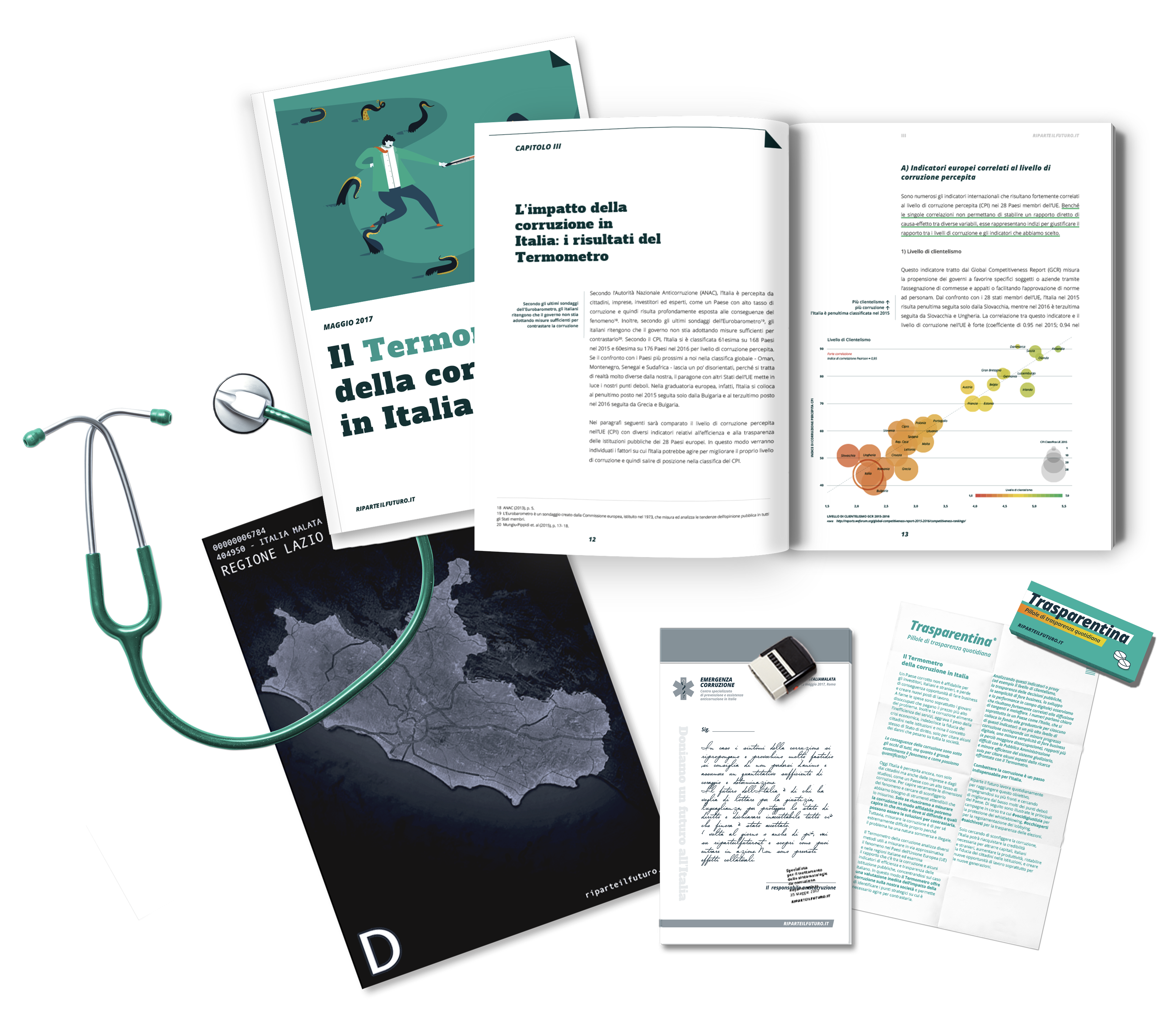
Starting from the corruption report produced by Restarting the future, we developed the website section about the report on corruption produced by Riparte il futuro, and provided creative coordination and communication materials for the “Emergenza Corruzione”, an anti-corruption flash mob, which happened in Rome right after the official presentation of the report at the Italian Parliament.

Data visualisation
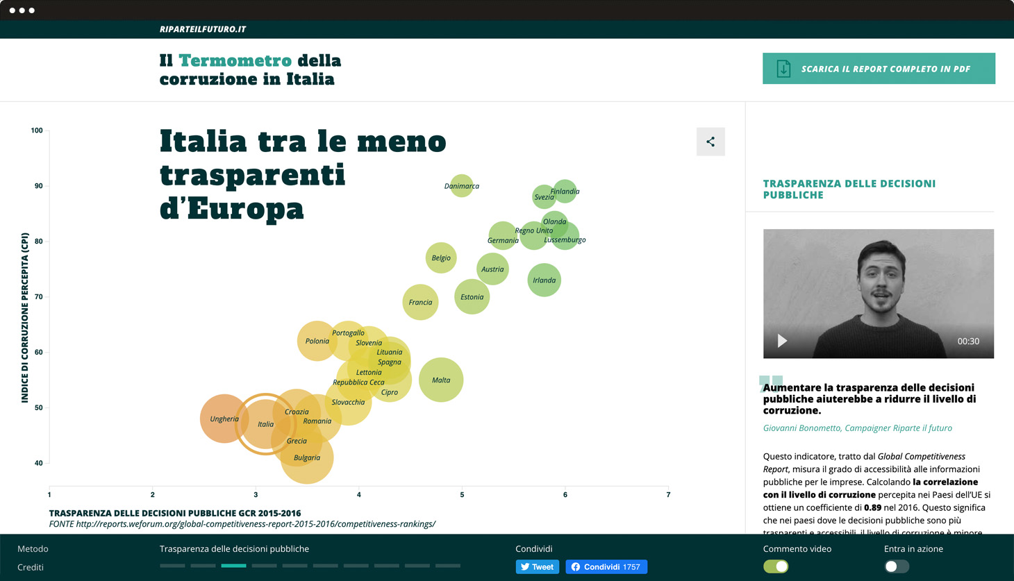
A mobile-first approach providing shareable, interactive graphs and explanatory videos for each topic.
The structure includes a swipe interaction through the different graphs on the left and descriptive videos and texts on the right. Thanks to the colourful charts, data are shown in an analytical, dynamic and intuitive way. A fixed console works as a compass and allows the user to see and download the corruption report. Finally, this console gives you the chance to activate or deactivate some contents, such as videos and calls to action. This allows different kinds of users to customise the page.
Ambient
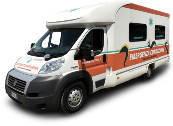
A unique anti-corruption ambulance.
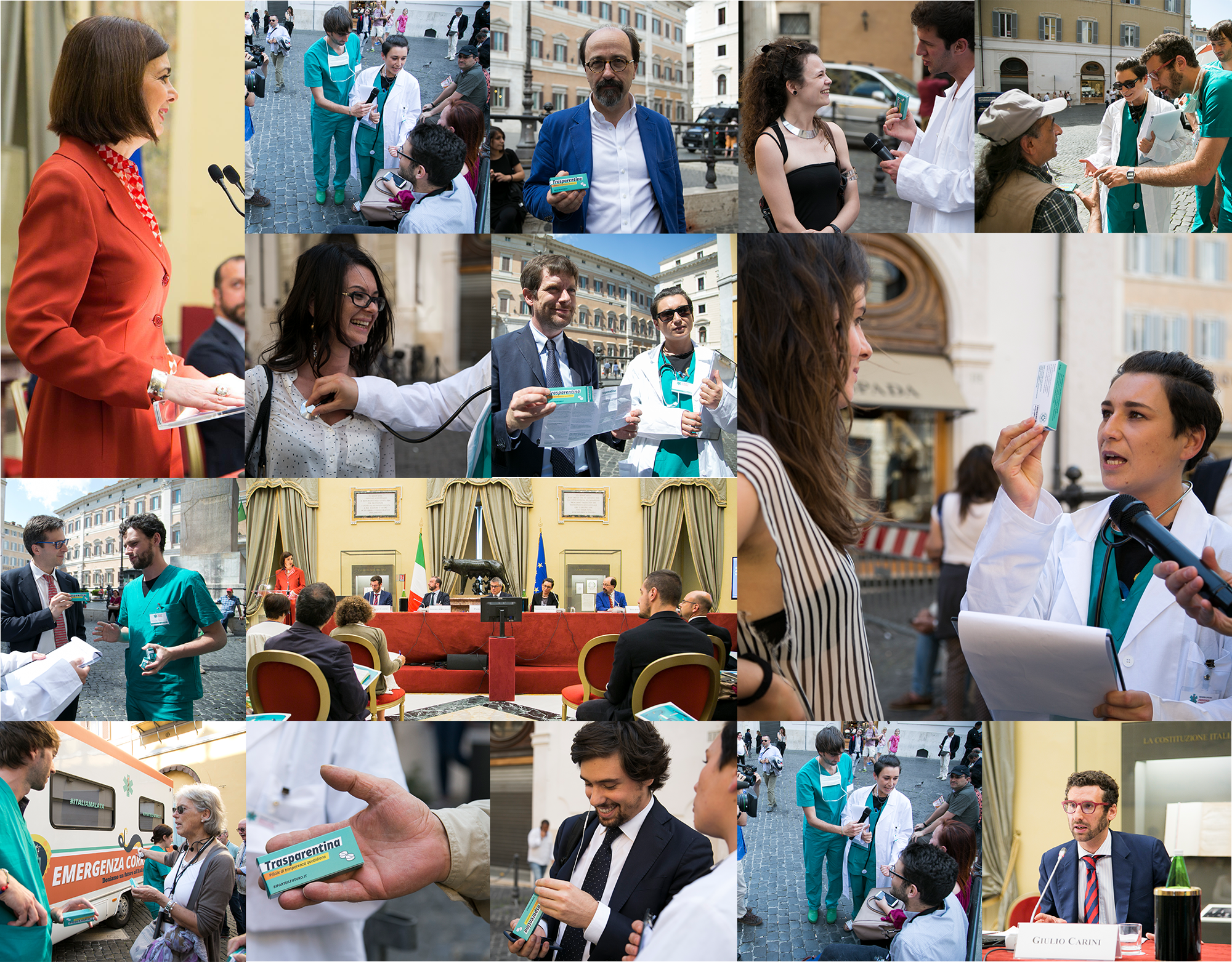
We elaborated an ambient communication strategy that saw its full potential on the day the report was presented at the Italian Parliament. We created a specific design to transform an average van into a unique anti-corruption ambulance.
Action
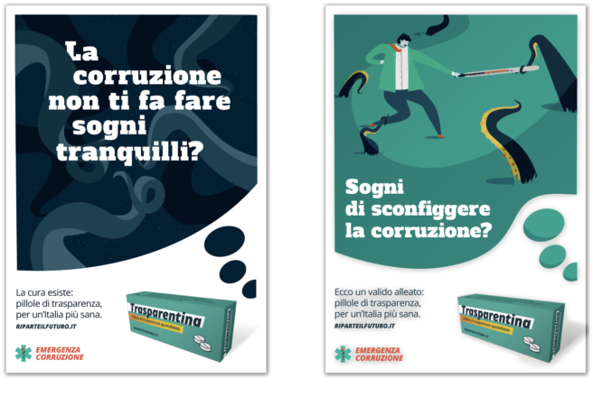
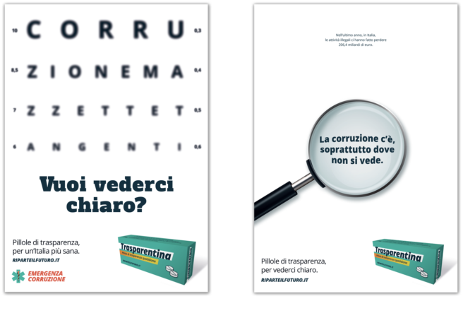
The streets of Rome played a central role in conveying the main message of the anti-corruption report: more transparency means less corruption.
This project wasn’t just online. #EmergenzaCorruzione came to life when, in and out a special anti-corruption ambulance, 12 campaigners dressed up as doctors distributed a special medicine named Trasparentina to pedestrians and politicians. When corruption affects people’s lives, Trasparentina can be the solution!
Visual identity
The metaphor of corruption as a tentacular villain.
The visual approach, both for the report and the ambient communication, was developed around the metaphor of corruption as a tentacular villain. Indeed, for the report cover, we imagined a fight between a man and an octopus, symbol of corruption. The first is defending himself with a thermometer (Termometro) against this “corrupted octopus”. This motive is recalled on the titles and graphics applied on the anti-corruption vehicle.
Votewatch Europe –
My vote 2014
MyVote2014 aims to help and inform first-time young voters, enabling them to understand the decisions taken by the EU Parliament, by presenting politics in a fun and comprehensive way.
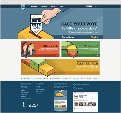
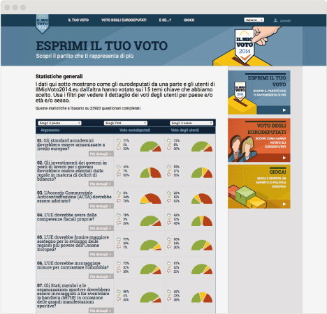
For the next EU Parliament elections that will take place in May 2014, we collaborated with VoteWatch Europe, an independent organization promoting transparency in EU decision making, analyzing parliamentary activities and providing data, to grab the attention of young potential voters, encouraging them to actively participate in the elections.
Website
We created a multilevel, integrated and interactive platform to reach young and first time voters as well as the visual identity, illustrations, mobile apps, widget, Facebook app and style guideline. The concept and the development is managed by our collaborator VoteWatch Europe.
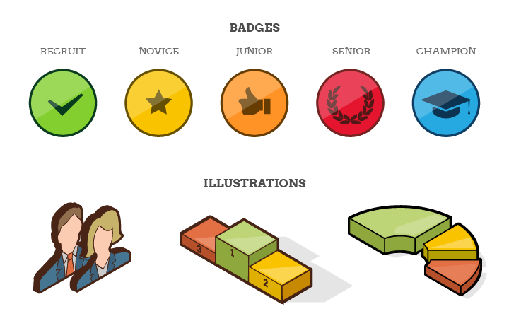
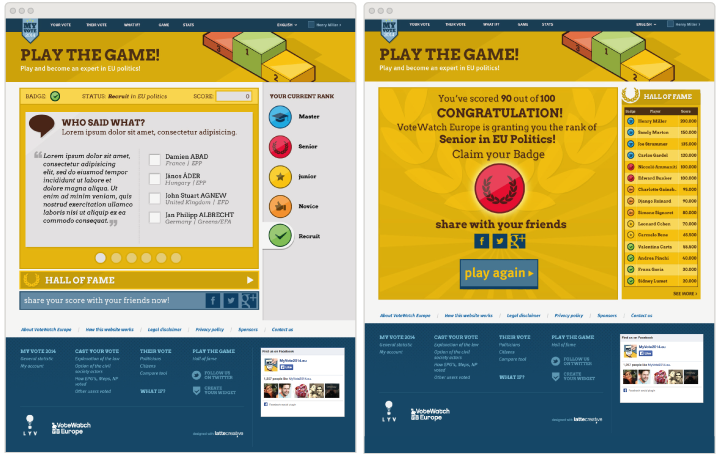
To engage young people and inform them about the elections, we came up with a fresh and young design: illustrations referring to the gaming world, badge system, results and prizes to make politics as easy and accessible as a game.
Interactivity
Ply the game!
We created interactive games, such as simulations of the legislative process and fun quizzes about the European Union and European Parliament.
Mobile app
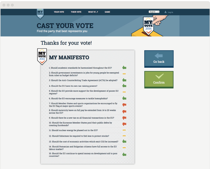
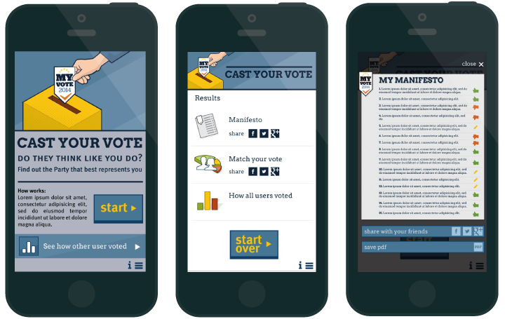
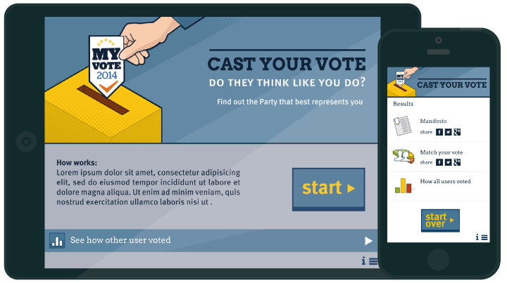
The MyVote2014.eu mobile application allows users to cast their votes and find out who is representing them the best, through a game where the user can put himself in the shoes of MEP and make a decision on a particular issue of interest.
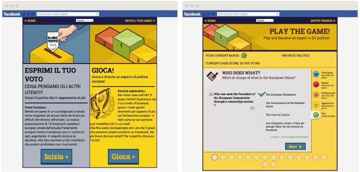
MyVote2014EU Facebook app covers two sections of the website: “Cast Your Vote” and “Play the Game!”. The “Manifesto” and the overall scores can be shared via Facebook.
Video
Last autumn the project MyVote2014 was launched to the wider audience within an important press conference that took place at the Parlamentarium in Brussels. It was really significant for us to present our work there and for that, we design a loop animation using the visual identity of the campaign.
Results
In March 2014, MyVote2014 has 1.566 likes on Facebook, 2.842 followers on Twitter, 1.044 downloads for MyVote Mobile App, 40.733 people took the “Cast Your Vote” test and 75.000 people visited the MyVote2014.eu website.