Technology: icon and symbols
Italia non profit –
The Italian guide to nonprofit sector
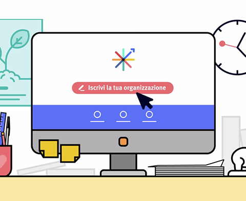
Italia non profit collects, organizes and provides detailed information on hundreds of organizations, gathered in a single website. Our goal was to write, design and produce the launch video, in order to explain the project in an easy and clear way and invite organizations to register on the portal.

Motion graphic
Thorough research on new trends in 2D animation led us to identify a fresh and appealing illustrational style, in which smooth transitions between the scenes are combined with character animation techniques, to let the audience feel a deeper involvement and develop a stronger internal point of view.


Multiple targets
Italia non profit targets both Italian organizations, donors and citizens. The launch video had to address primarily the first ones and get them to sign up, but also explain future users what the website can be useful for and start raising awareness around the project. The script focuses on both targets and their activities on the platform – the prospective donor who explores the site, and the organization that registers its information – but the final call to action is strongly addressed to the organizations.
Icon and symbols
The most difficult challenge was to visually depict the “nonprofit world”, which includes many types of organizations operating in very different fields and at the same time it’s an extremely abstract concept. We decided to portray it as a town, a skyline shaped by a series of symbolic buildings, on top of which are standing-out icons that represent many of the causes citizens care about.
