Technology: multiple target
CEJI –
Together against the hate speech monster
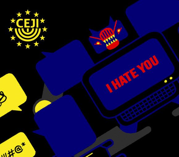
CEJI asked us to create a video to launch an online training program within the Facing Facts Project about the hate speech theme. The main target are students, institutions, organizations trainees, but also generalist public. We used an informative and engaging tone. We described hate speech as an aggressive, transformer/like a monster.
Character animation
We designing characters without falling into stereotype.
We put a lot of effort into designing characters that respect ethnic, religious, gender and orientation diversity without falling into stereotype. Instead of character neutrality, we opted for plurality for what include the script, the voice over and the arts: we represented a large number of categories to show that everyone can be hate speech targets.
Multiple targets
A public with an awareness of the subject, but also a more generalist audience, needing more information.
Hence the need to inform and raise awareness of the overall framework and at the same time the use of an ironic, metaphorical tone of voice to attract and engage viewers that are not used to this kind of content or do not know the subject. The final call to action invites everyone to join the Facing Facts community and start the fight against hate speech.

Compagnia di San Paolo Foundation –
Riconnessioni: a school for the future
Riconnessioni is a project that wants to bring systemic change to primary and lower secondary schools.
All the pieces perfectly fit together: new brand identity for the project, an elaborate website for multiple audiences (teachers, parents, stakeholders, and the general public), an animated promotional video and a communication plan supported by print and digital assets.
Brand identity
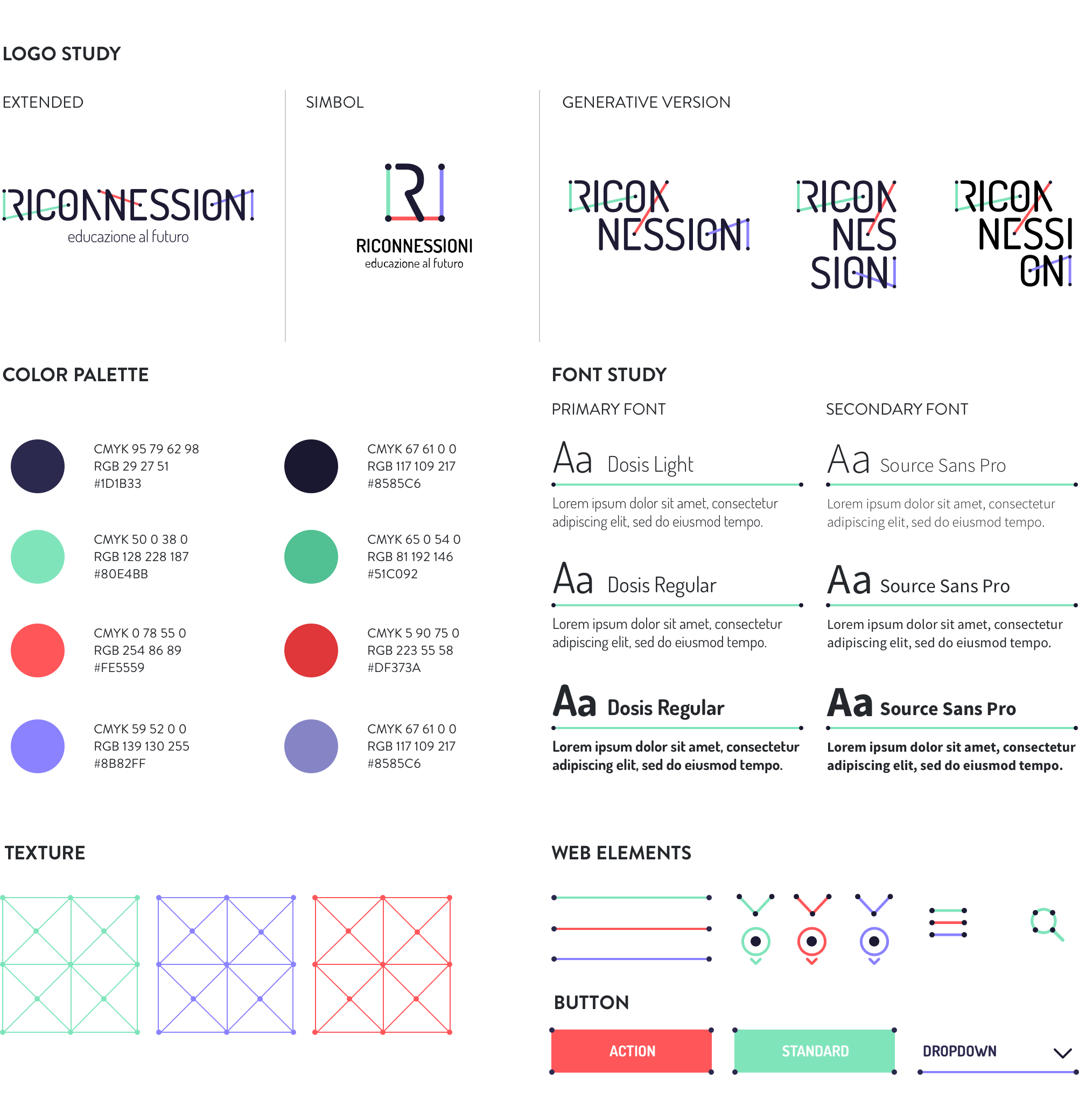
An impactful and communicative logo able to show the three faces of the project: digital, education, community.
We worked on the typography to emphasize the concepts of connection and collaboration, which are recalled by the network of coloured segments connecting the dots within the title. The graphic treatment allows for several declinations of the logotype itself and graphic paths (icons, texture), while the ratio behind the segments ensures homogeneity and consistency. The result is immediate, simple, readable, recognizable and extremely flexible.
Website
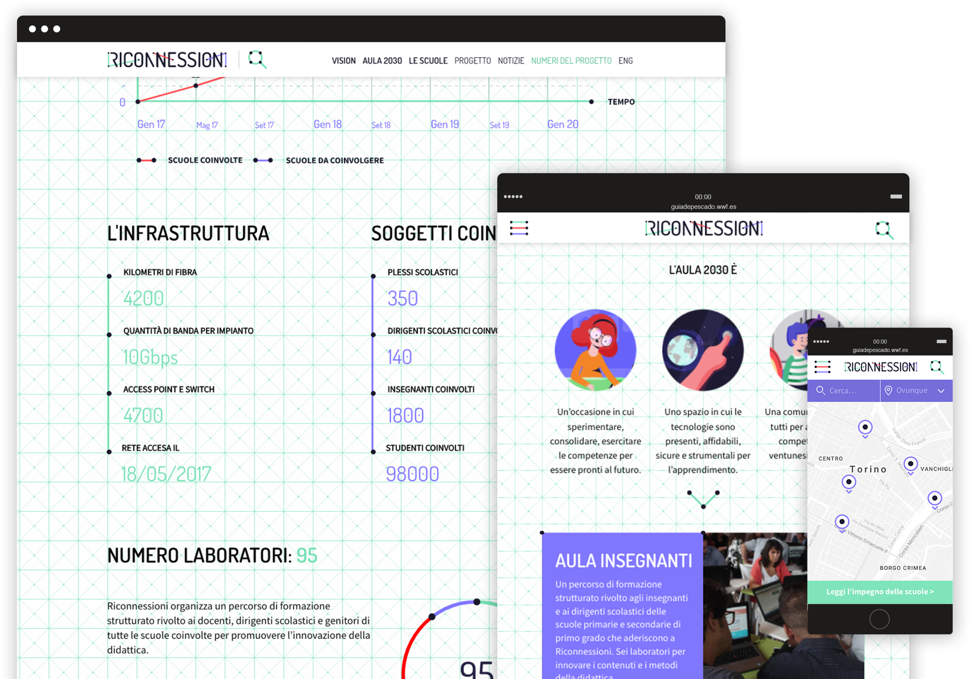
A website for many audiences.
Riconnessioni is made by and for teachers, headmasters, parents, kids, institutional stakeholders, and a number of professionals from different areas of expertise. All these segments need to easily find the right contents on the website, navigate through the pages, interact with articles and be able to retrieve useful information in a few clicks.
Animated video
The story of Viola looking for her future.
We produced a 2D animated video addressed to all the target audiences involved in the project. The smooth and emotional characters animation helps to explain complex technical and pedagogical issues, by telling the story of Viola, a little girl who is looking forward to discovering her exciting professional future!
Engaging the community
From smiling to discussing, from liking to resharing.
After a careful analysis of the different target segments we wanted to reach through social media, we created an animated video and 3 series of cards in which catchy graphics and fun copywriting engage the audience on different levels.
A fresh way to explain the project and invite people to become part of the community!
A change of direction –
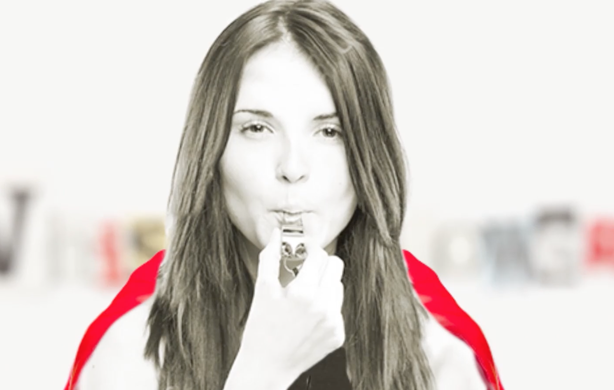
What does it take to be a whistleblower?
A change of directions is committed to safeguarding the rights of those who report in Europe from abuses and threats.
We designed a website and we produced 8 videos to explain the project and to report misconduct within governments and companies. We adopted an informative and engaging tone to invite organizations to fight corruption together.
Motion graphic
For this video we combined mixed animation techniques: motion graphics and frame by frame footage animation, to let the audience feel a deeper involvement and develop a stronger internal point of view.


Multiple targets
The campaign targets different audiences: stakeholders, institutions, NGOs, schools, as well as a generic segment of citizens who need more information. The video addresses all targets and provides a clear view of the issues related to corruption, and it ends with a call to action directly aimed at the institutions
Italia non profit –
The Italian guide to nonprofit sector
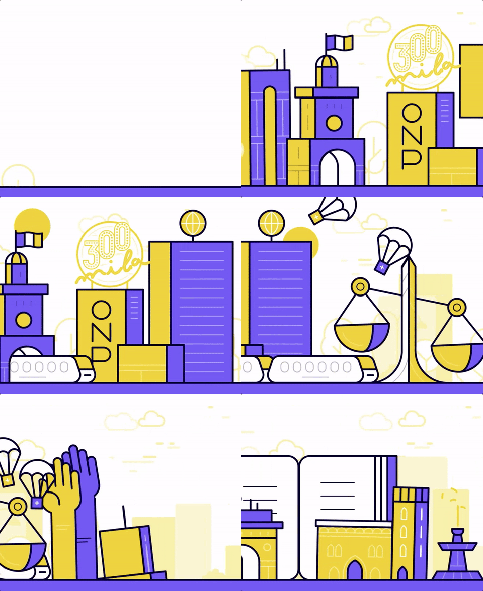
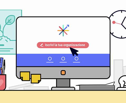
Italia non profit collects, organizes and provides detailed information on hundreds of organizations, gathered in a single website. Our goal was to write, design and produce the launch video, in order to explain the project in an easy and clear way and invite organizations to register on the portal.

Motion graphic
Thorough research on new trends in 2D animation led us to identify a fresh and appealing illustrational style, in which smooth transitions between the scenes are combined with character animation techniques, to let the audience feel a deeper involvement and develop a stronger internal point of view.

Multiple targets
Italia non profit targets both Italian organizations, donors and citizens. The launch video had to address primarily the first ones and get them to sign up, but also explain future users what the website can be useful for and start raising awareness around the project. The script focuses on both targets and their activities on the platform – the prospective donor who explores the site, and the organization that registers its information – but the final call to action is strongly addressed to the organizations.
Icon and symbols
The most difficult challenge was to visually depict the “nonprofit world”, which includes many types of organizations operating in very different fields and at the same time it’s an extremely abstract concept. We decided to portray it as a town, a skyline shaped by a series of symbolic buildings, on top of which are standing-out icons that represent many of the causes citizens care about.
