Topic: fundraising
L’albero della vita –
A social experiment in defence of indigent mothers
After the success of the organization’s last social experiment, we worked on a new video and a brand new campaign to talk about poverty in a different way: this time the focus is on a young mom and her daughter, but most importantly on the reactions, people show when hearing their request. The aim was to raise awareness around families in Italy and their daily fight against poverty.
Social experiment
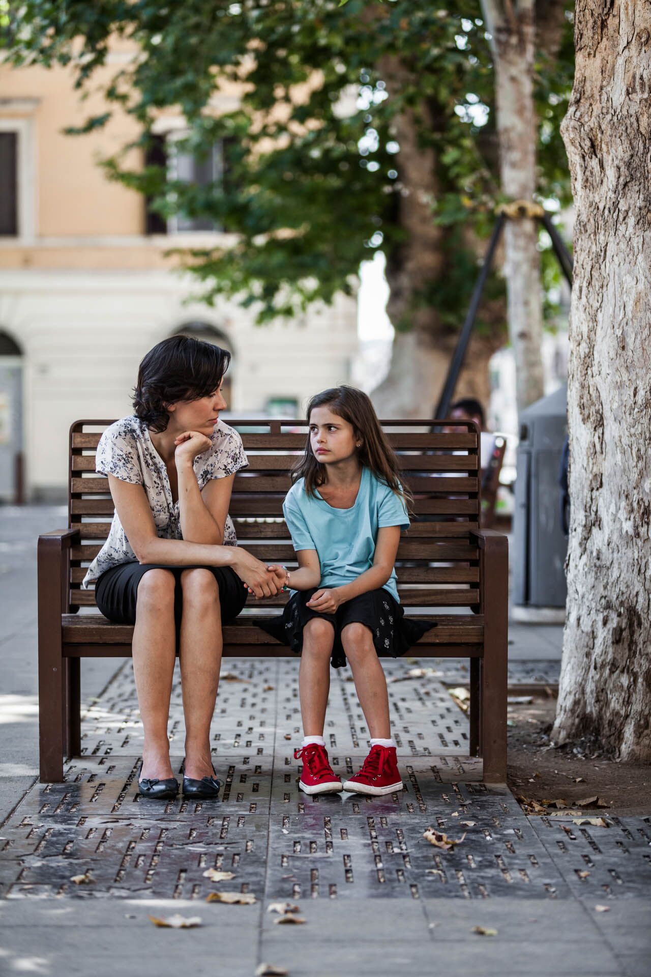
An unemployed mother with a little daughter.
An actress walks around a crowded place in the centre of Rome, with a little girl asking for people’s help.
We wanted to show how desperate a lonely unemployed mother can be, and how poverty can affect anyone.
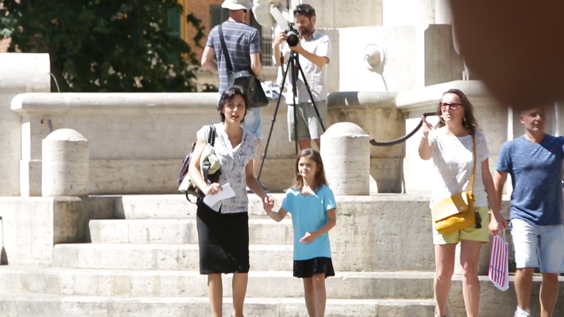
2 cameras and 1 Go-pro were placed in hidden spots to catch spontaneous reactions from people who passed by: and such reactions were surprisingly positive.

Campaign strategy
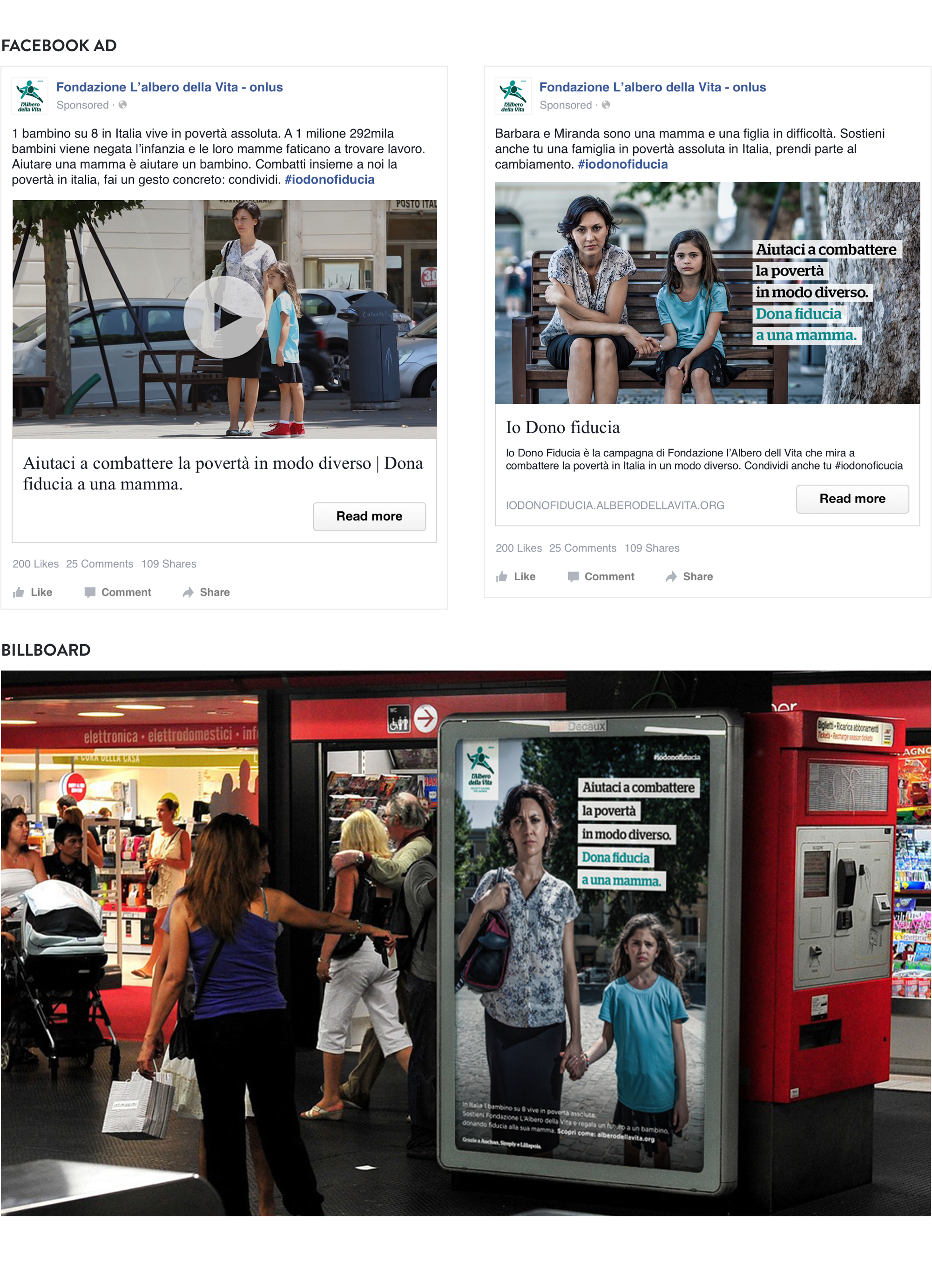
Social media campaign and billboards to increase donations.
The social experiment video is part of an integrated communication strategy aimed at increasing online donations to Albero della Vita’s project dedicated to families with limited means.
We developed and implemented a social media paid campaign and we designed visual assets for billboards in public places.
Restarting the future –
Christmas without corruption
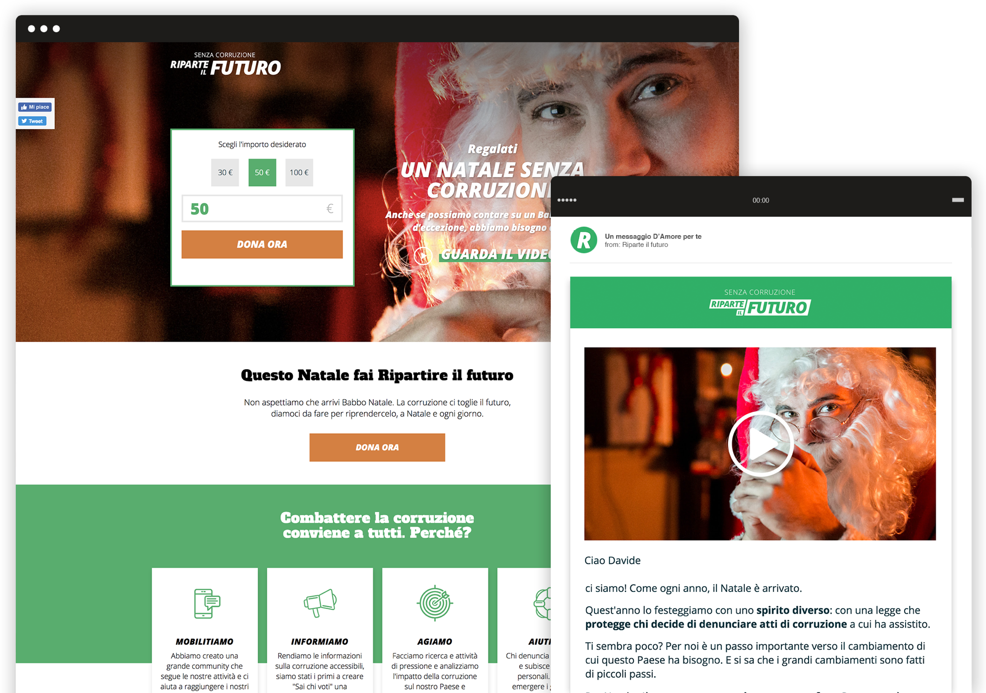
We made a multichannel campaign for the Christmas fundraising activity against corruption. We directed the campaign video and designed and developed the donation landing page. We had the pleasure to work with the “bad guy” from Gomorra, Marco D’Amore, whom we transformed into the best character ever: Santa Claus. We also worked on the social media campaign and email marketing activities.

Video
An ironic and unconventional video to lead viewers to the donation page.
We produced a video for the web emphasizing the stereotypical Christmas atmosphere. Thanks to the participation of Marco D’Amore, an Italian actor famous for his criminal yet charming roles, we played with the ironic contrast of having him play a frustrated Santa Claus who struggles with ordinary problems of a corrupted country. The final fundraising request motivates users to help Santa Claus help Italians, with a donation to the cause.
Fundraising strategy
An integrated campaign involving social media and email marketing.
We developed and designed an email marketing campaign with multiple A/B tests in order to improve the KPIs of the organization. The main aim is collecting one-off donations directing users towards the donation landing page. Moreover, to increase the number of touchpoints, the social media strategy was included in the integrated campaign, involving organic and paid posts that use pictures taken during the video shooting.
Doctors Without Borders –
This is not my Europe
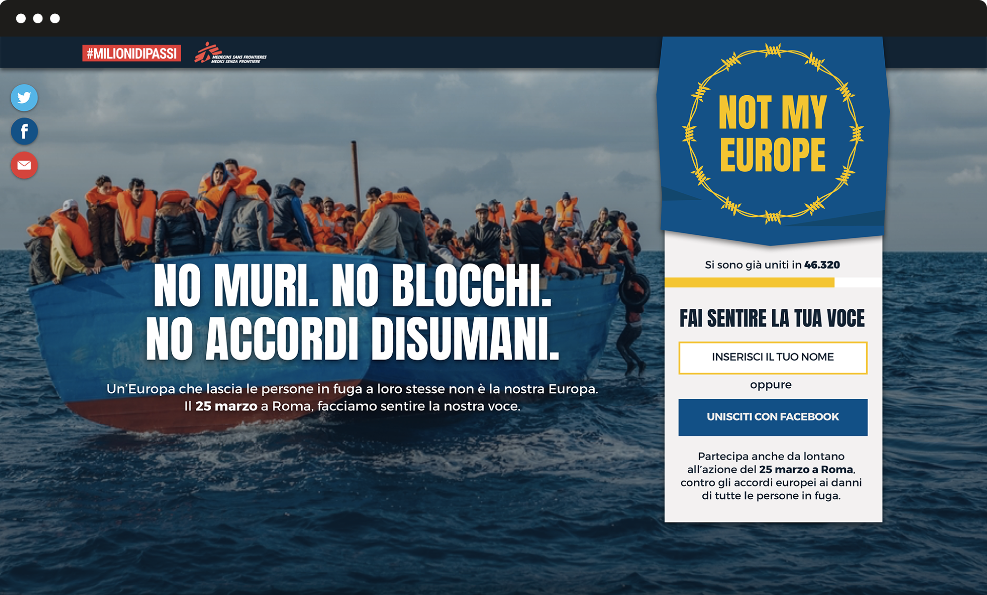
We developed the creative and visual concept and the landing page for Medici Senza Frontiere’s protest action to take the migrants side against EU blocks and walls. We identified the campaign claim and tagline and the campaign visual for the public action of March 25 in Rome, to contrast European leaders policies about forced returns and blocks of migrants and refugees. We designed a landing page to reach participants and engage those that are not able to be there with online activities.
Claim and tagline
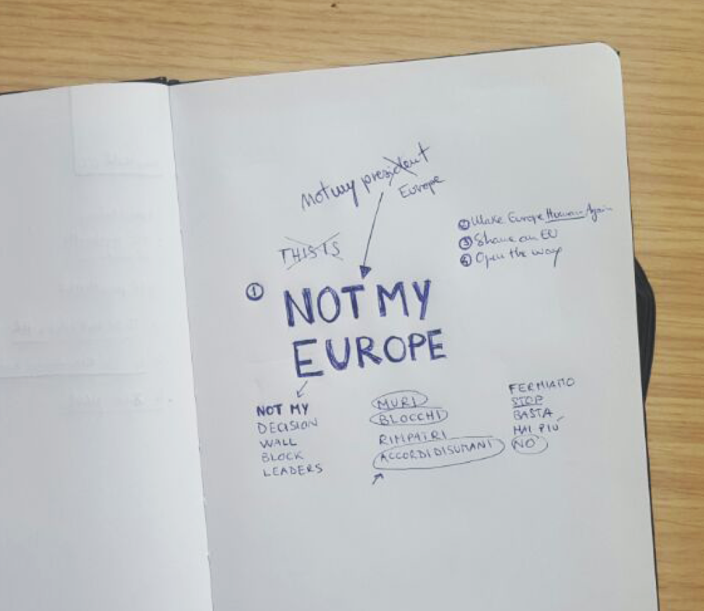
The claim is of an international movement understandable by an Italian audience.
We opted for 3 simple English words that are commonly used in other languages too. These words form an expression that is a popular US slogan often used to address unwanted leaders or to protest against an institution: for example “Not my president” or “Not my government”. “Not my Europe” is the voice of a European citizen that speaks in the first person, on behalf of an international community, who wants to take the distances from the EU policymakers.
The campaign visual
A representation of the recent EU’s policies about migrants and refugees.
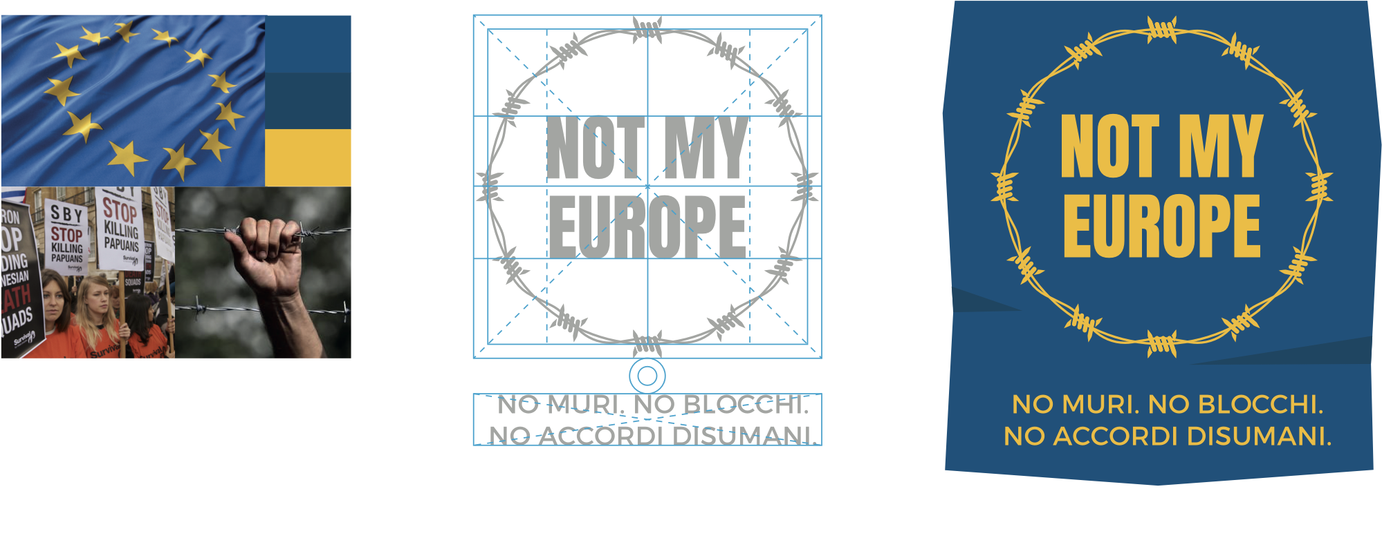
We brought some change to the European flag by replacing the stars of the official one with barbed wire in a circular shape.
The wire does not allow anyone to get in: that’s a huge metaphorical contrast with the principle of free movement of persons, that is one of the EU founding principles.
The landing page
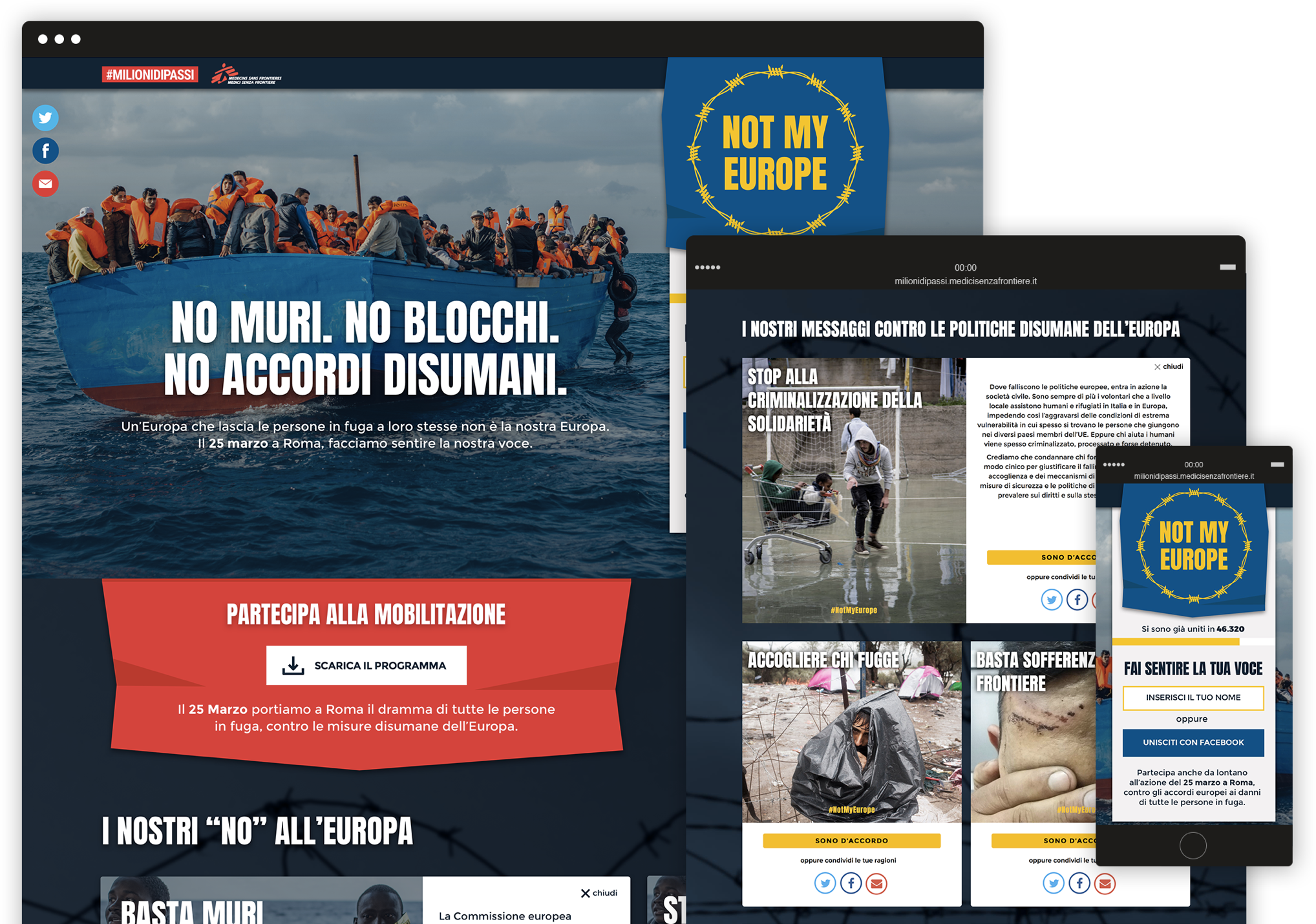
A place where people can get informed about the event going on.
On the top of the page, the user can download the program to join the mobilization in Rome or sign in to join the online protest. The page is functional for both offline and online demonstrators.
In the lower part, we put six boxes where users can examine in depth the six reasons why Medici Senza Frontiere and several other organizations are gathering against European policies and than share their agreement to the “Not my Europe” campaign.
In defence of animals –
Make a difference for animals
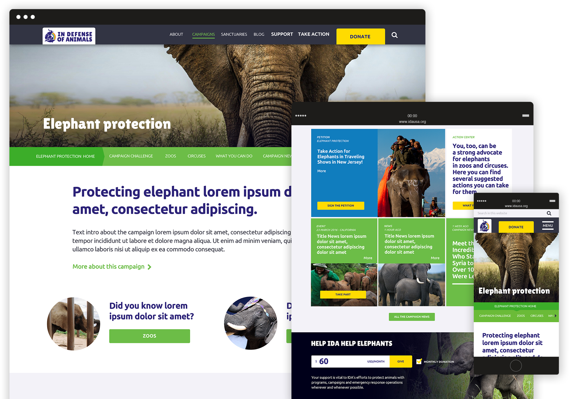
Since 1983 IDA US fights for animal rights. They asked us to renovate the organization’s brand identity, developing a new logo and restyling the website. Our main challenge was to create a new identity in which key visual elements were maintained with a fresh and inspiring feeling. We also developed a new website based on multi-level information architecture, able to answer specific communication needs for every single running campaign.
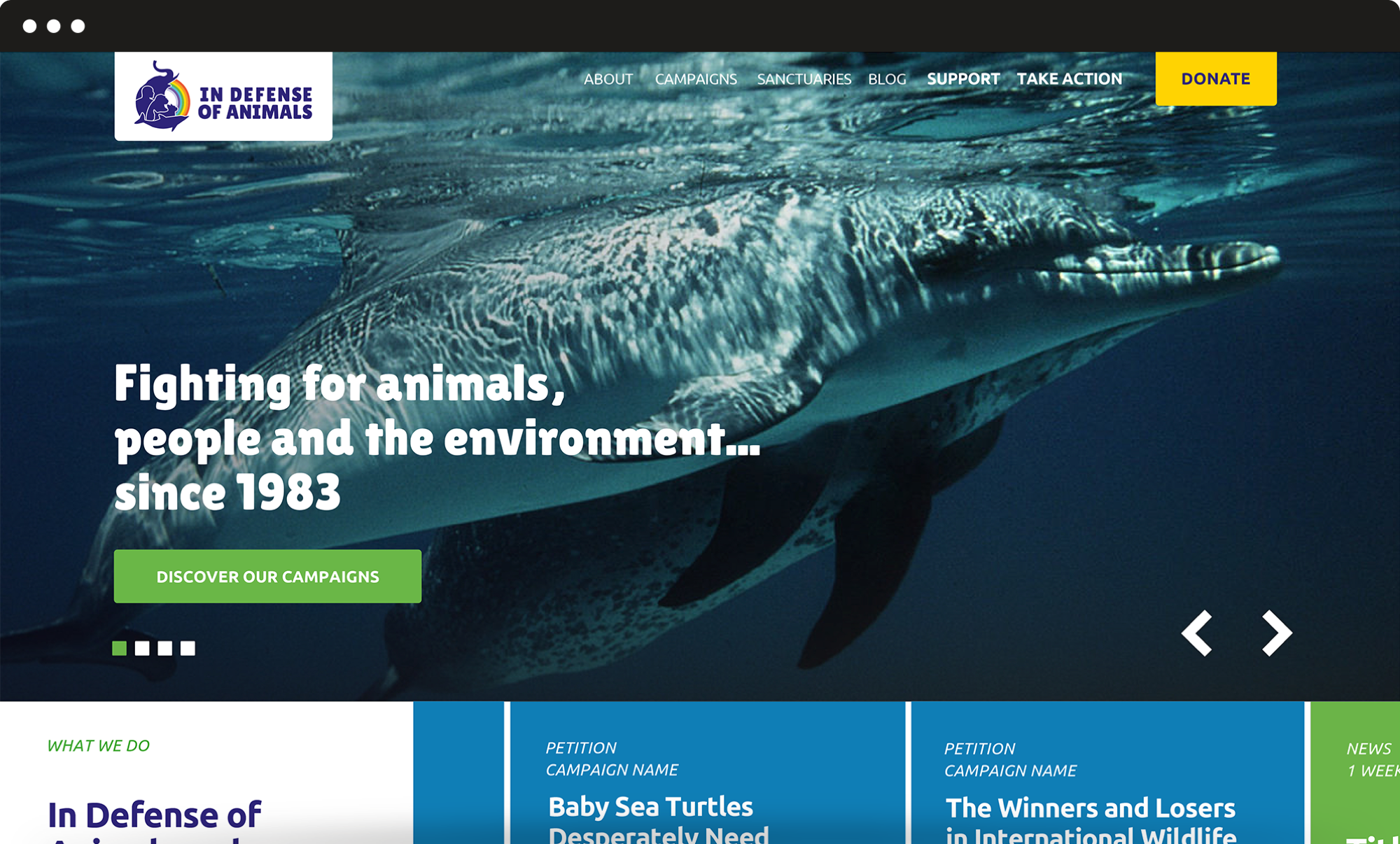
Rebranding
A new visual identity original and durable.
For the redesign of the logo, we developed a composition to renovate the pivotal elements of IDA US brand identity. We identified a new colour palette and a new font that ensure an original and yet durable result. The overall rebranding process resulted in a new visual identity able to better convey the organization’s values and objectives.
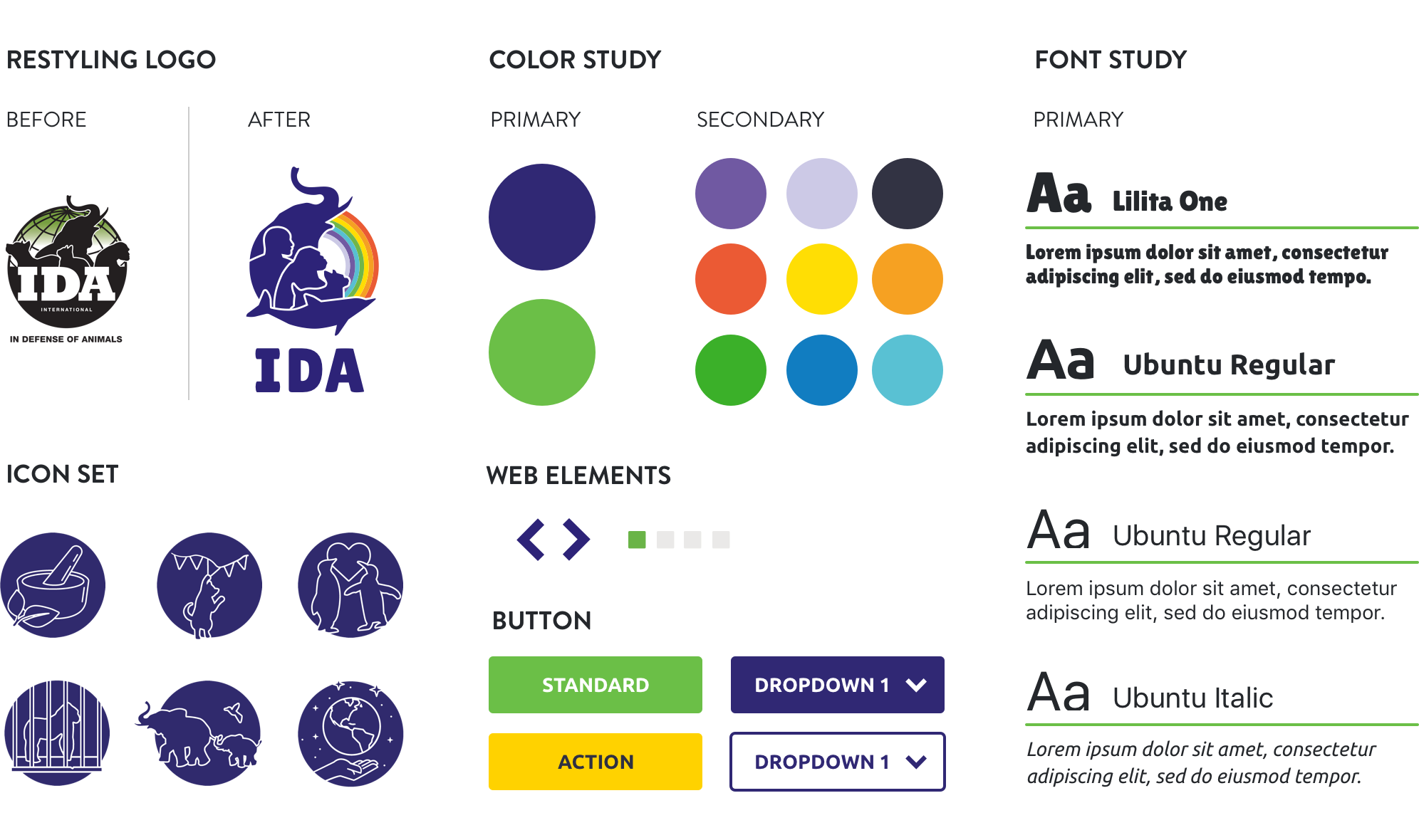
Information architecture
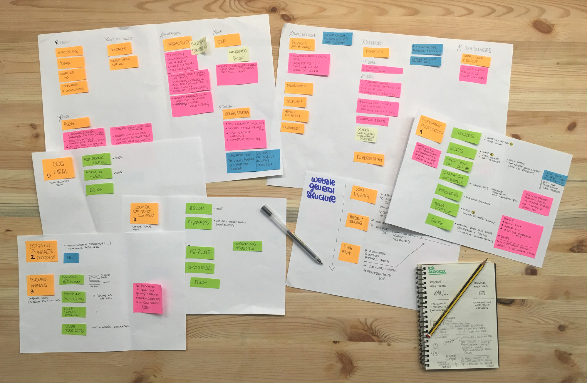
A new structure for a great number of contents.
The main goal of the website was to finalize a new structure for a great number of contents that required to be featured online. We analysed the website performances and analytics and identified scenarios and personas as well as high-priority activities.
User flow
A simpler process for accessing information.
We organized the user flow around graphic elements and shortcuts. These solutions allowed for a huge improvement of the user experience and simplified the process of accessing information, by offering alternative routes and an optimized funnelling mechanism.
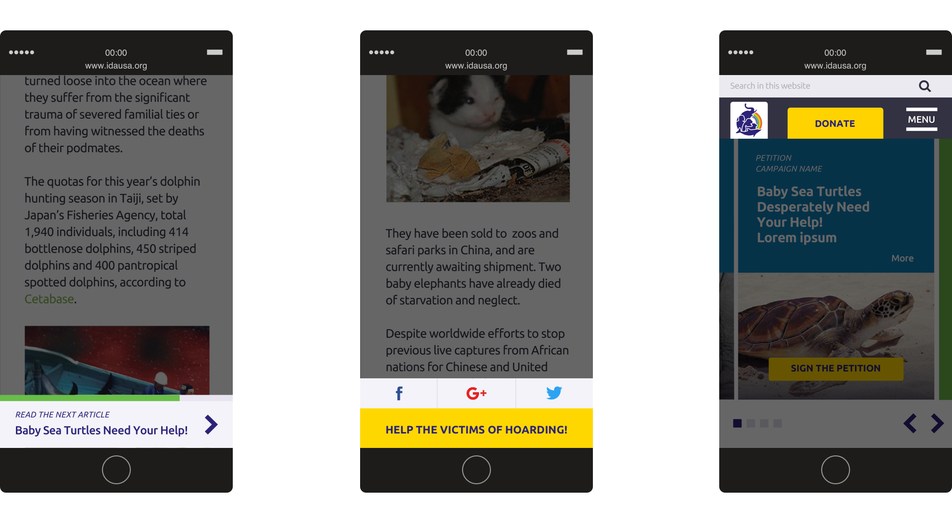
Mini-sites
A flexible and customizable template.
The activities of IDA US are based on multiple campaigns that run simultaneously. To answer these communication needs, we designed a flexible template for campaign mini-sites, which can be easily customized with text, visual elements and specific calls to action.
Amnesty international Italy –
We take injustice personally
We worked with Amnesty International Italy to redesign their website: our main challenge was to simplify the user experience and optimize the information structure. The first step towards a redesign of the user experience. We identified scenarios, personas, activities to meet the user’s needs.
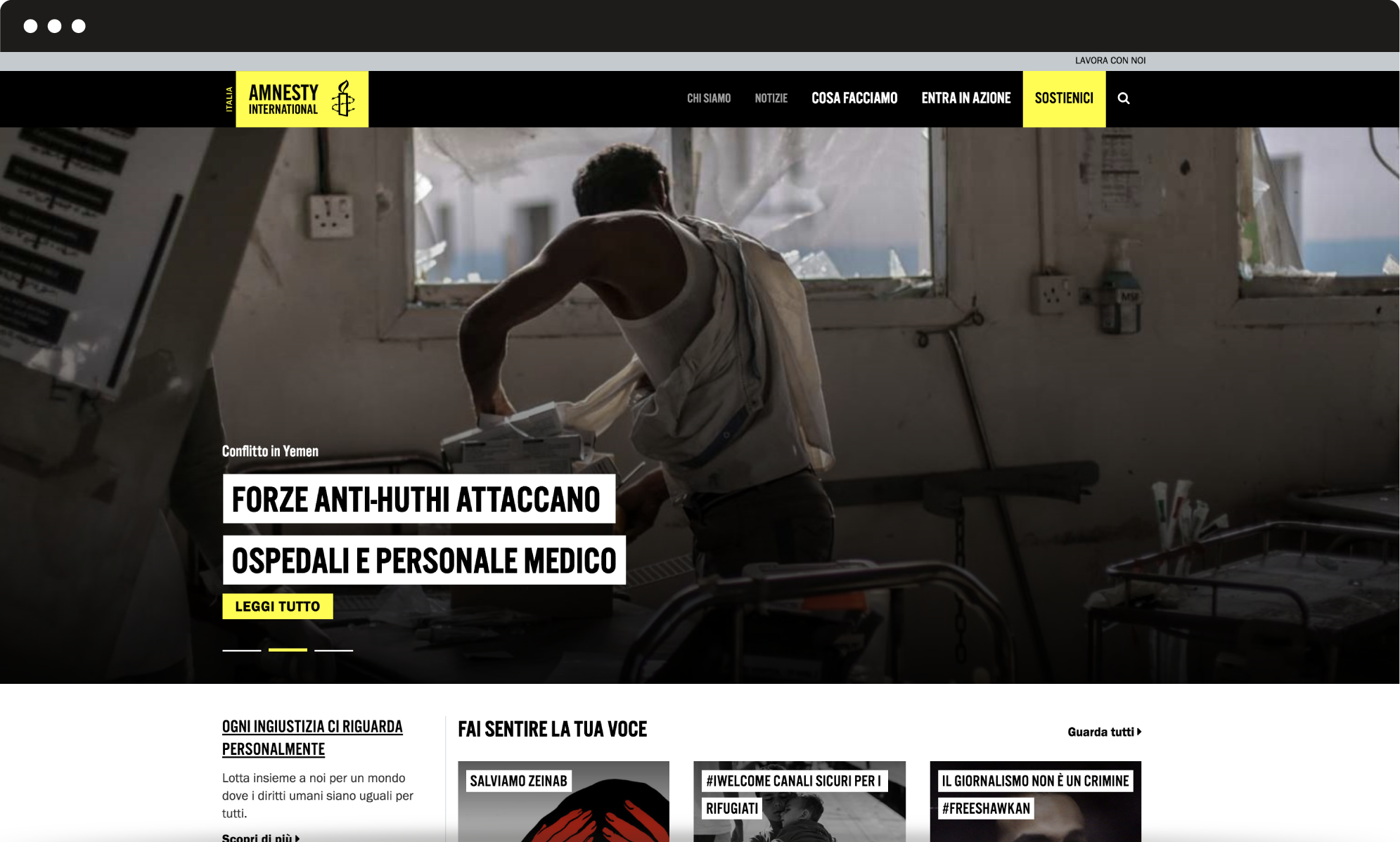
Human centered design
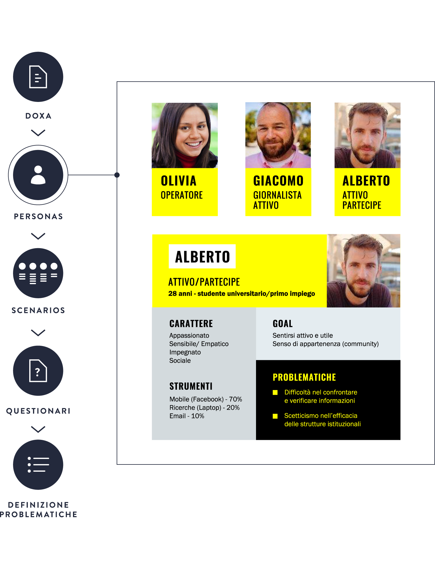
Who is the user of Amnesty International Italia website and what does she/he look for?
Answering such questions was the first step towards a redesign of the user experience. Through an accurate user research based on a poll and several tests, we were able to identify scenarios and personas, define high-priority activities and effectively meet the user’s needs.
Information architecture
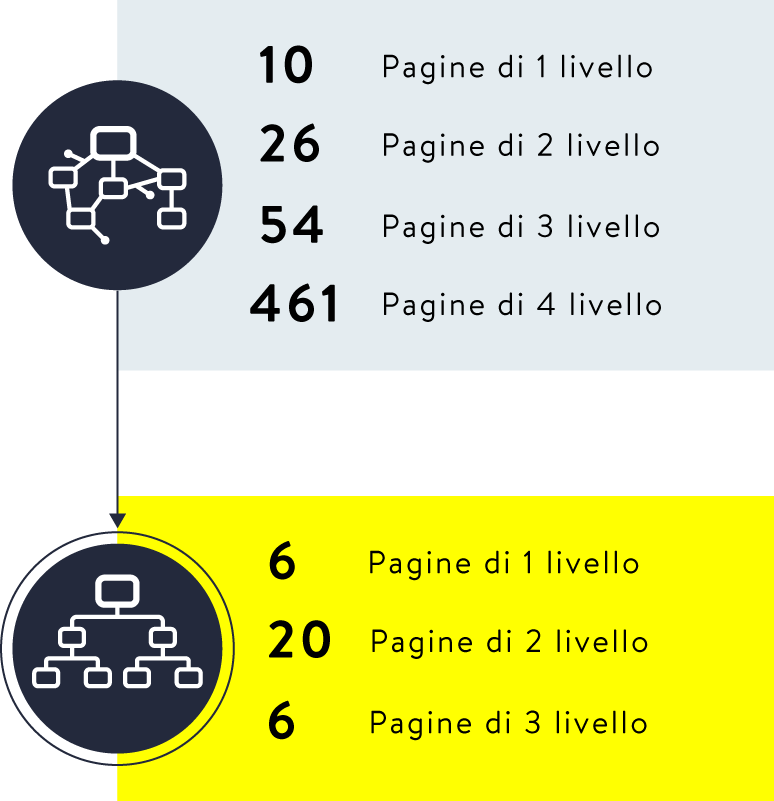
A simplified user flow that allows actions and offers information.
Amnesty International website is a multi-layered environment: we simplified the user flow by reducing first-level pages and optimizing the organization of second-level and additional pages. Thanks to internal shortcuts and the search function, users can easily move from information to action.
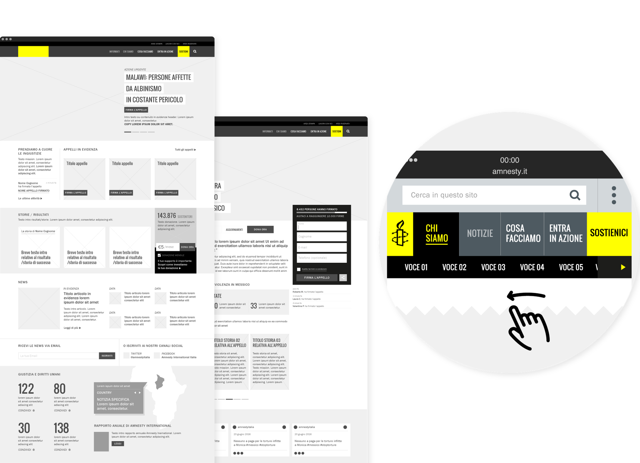
User experience
A unified experience and user recognition.
Today web users are multi-screen users, thus we designed a unified experience, which provides a coherent passage from one device to another: you can start a session on your desktop computer and complete it from mobile. We implemented the signing-up flow with specific features, such as the recognition of the user and his/her previous actions.
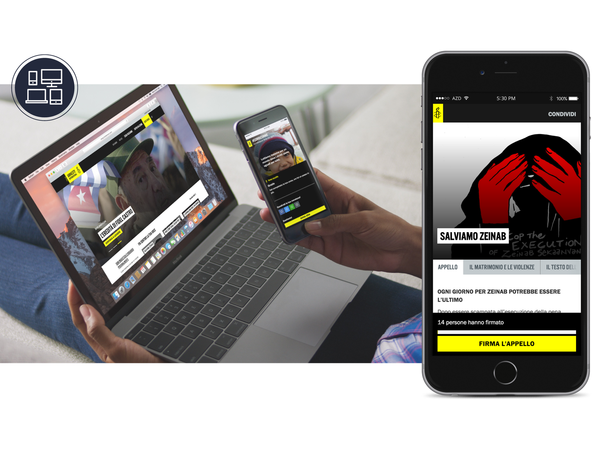
User interface
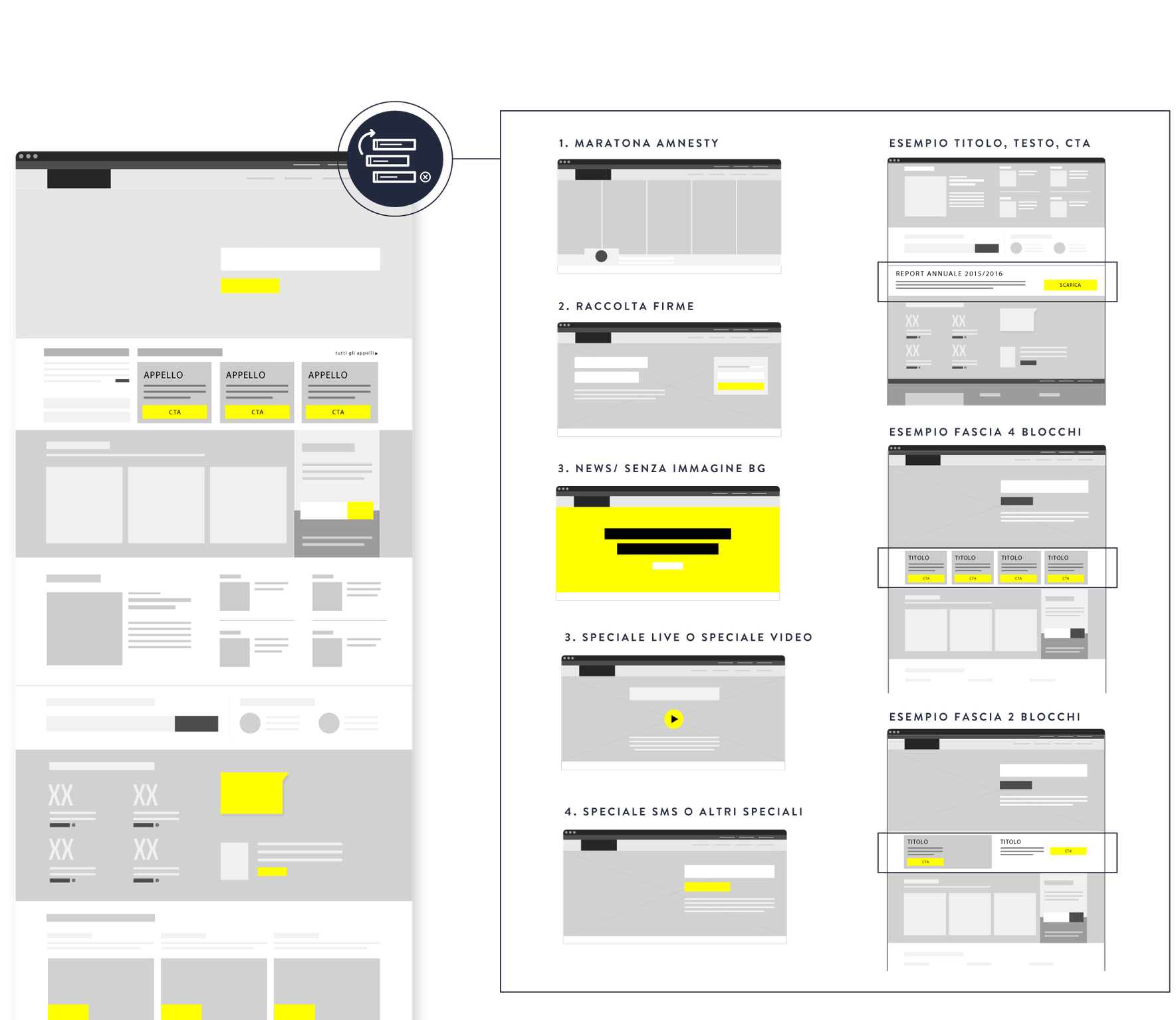
A flexible and maintainable interface.
Amnesty International Italia is a dynamic website that needs to be frequently updated: new actions, campaigns and petitions are the main tools to fight for human rights. We designed a flexible and maintainable interface based on customizable templates, which can easily be adjusted to any specific situation.
Italia non profit –
The Italian guide to nonprofit sector
Italia non profit collects, organizes and provides detailed information on hundreds of organizations, gathered in a single website. Our goal was to write, design and produce the launch video, in order to explain the project in an easy and clear way and invite organizations to register on the portal.

Motion graphic
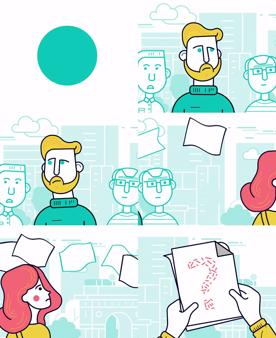
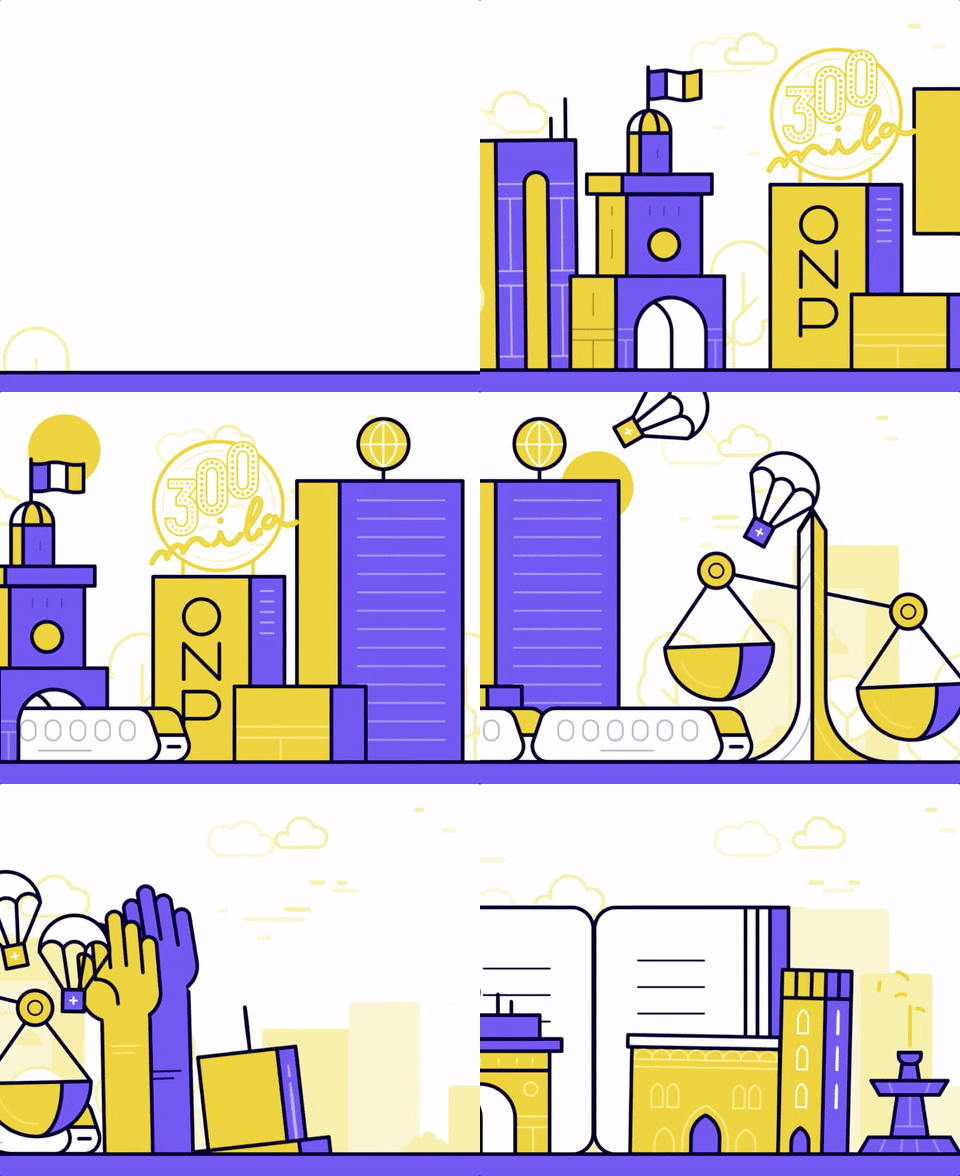
Thorough research on new trends in 2D animation led us to identify a fresh and appealing illustrational style, in which smooth transitions between the scenes are combined with character animation techniques, to let the audience feel a deeper involvement and develop a stronger internal point of view.
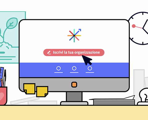
Multiple targets
Italia non profit targets both Italian organizations, donors and citizens. The launch video had to address primarily the first ones and get them to sign up, but also explain future users what the website can be useful for and start raising awareness around the project. The script focuses on both targets and their activities on the platform – the prospective donor who explores the site, and the organization that registers its information – but the final call to action is strongly addressed to the organizations.
Icon and symbols
The most difficult challenge was to visually depict the “nonprofit world”, which includes many types of organizations operating in very different fields and at the same time it’s an extremely abstract concept. We decided to portray it as a town, a skyline shaped by a series of symbolic buildings, on top of which are standing-out icons that represent many of the causes citizens care about.
FAI Fondo Ambiente Italiano –
A world of support for the Italian heritage.
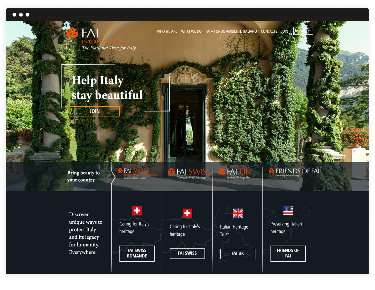
We were asked to create a website that could communicate the mission of the foundation and share contents from the different national groups of volunteers. Working on both the back-end and the front-end, we designed an optimized information architecture, available in several languages, which smoothly guides users through FAI International activities and opportunities.
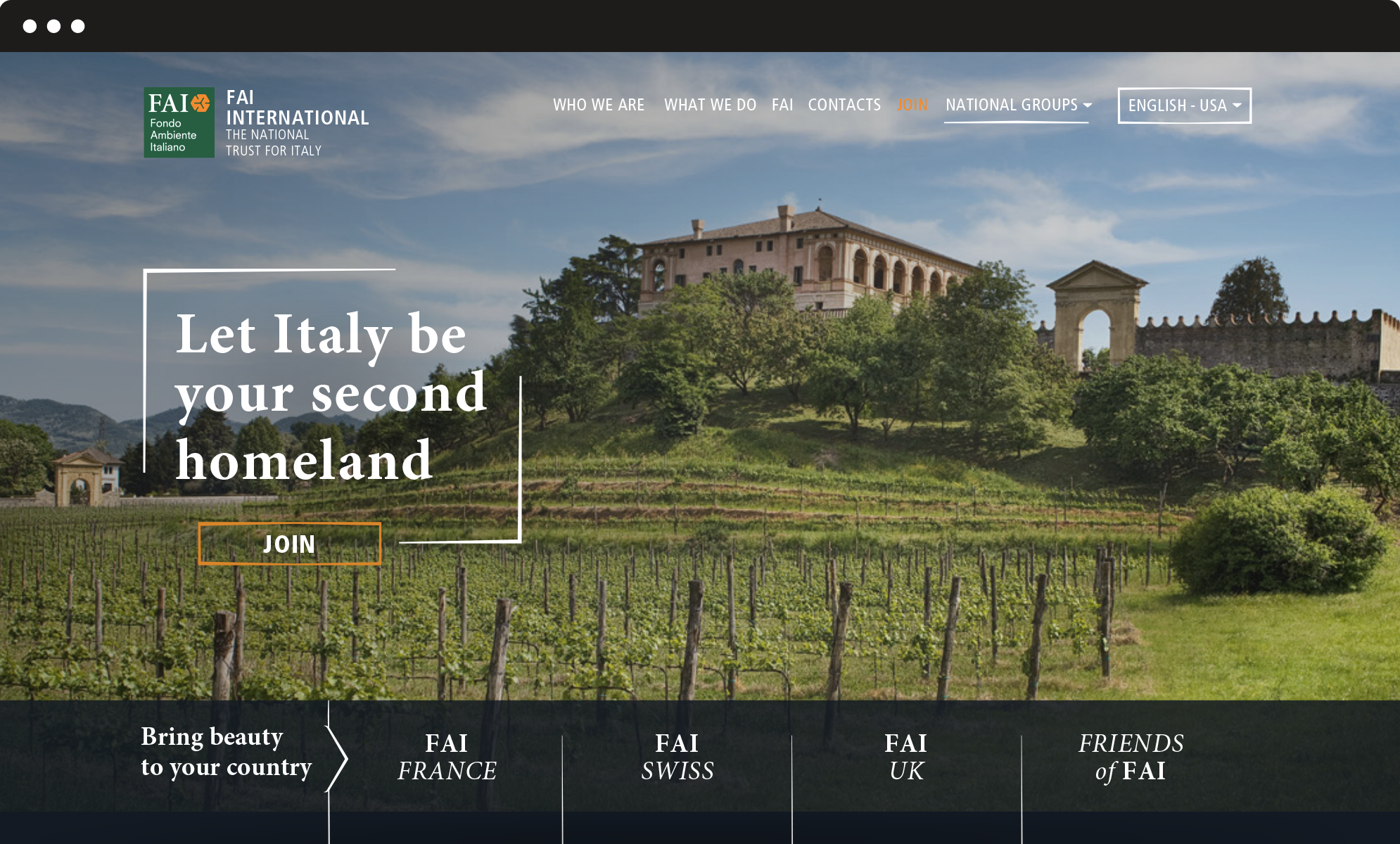
Vertical structure
From the main landing page, designed to welcome the visitor, users are invited to explore the vertical layers which correspond to the national websites, as well as the different calls to action, such as become a member, donate, join us. The vertical structure ensures clear and simple navigation and progressively involves the user in the vast and diverse world of FAI.
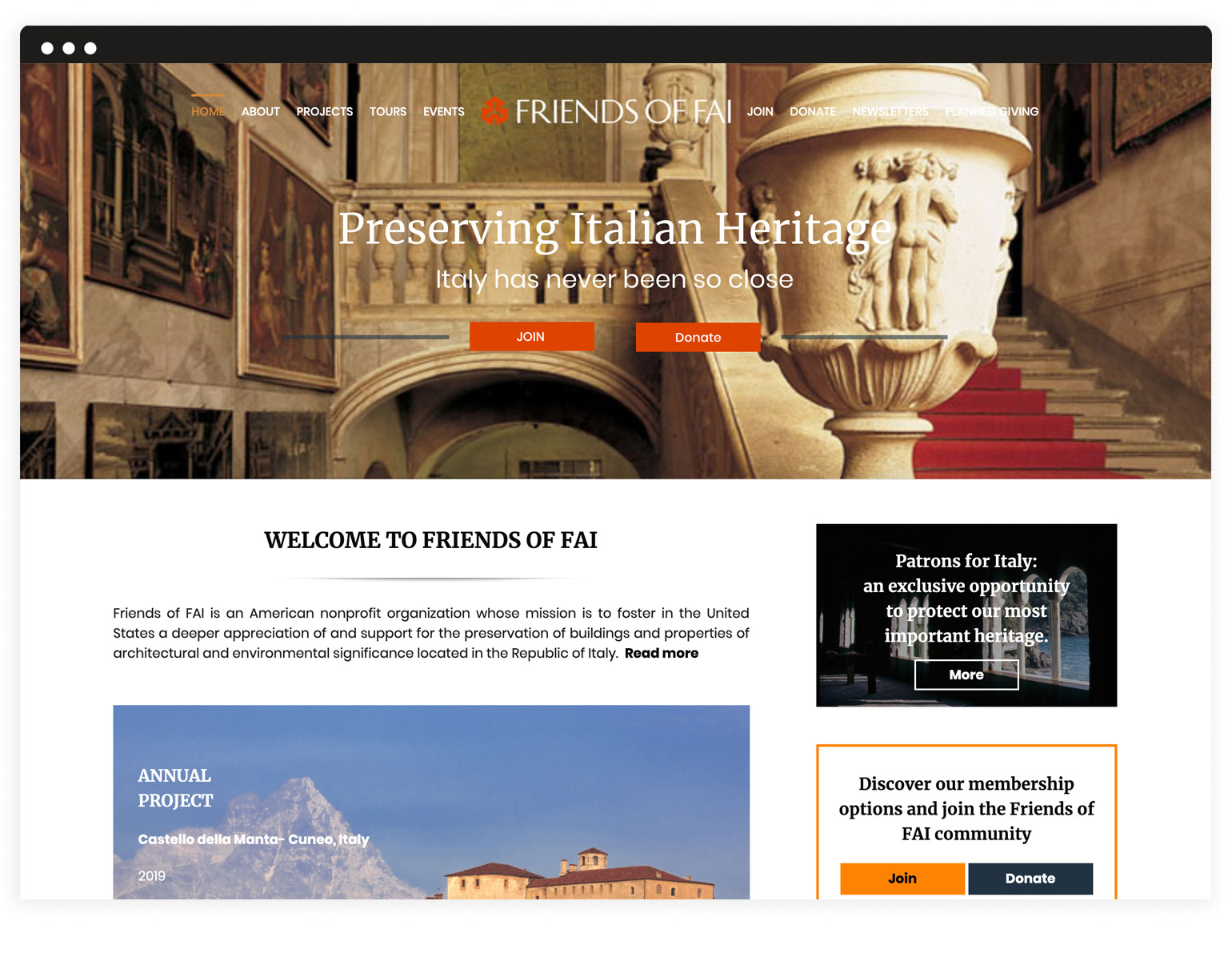
Graphic layout
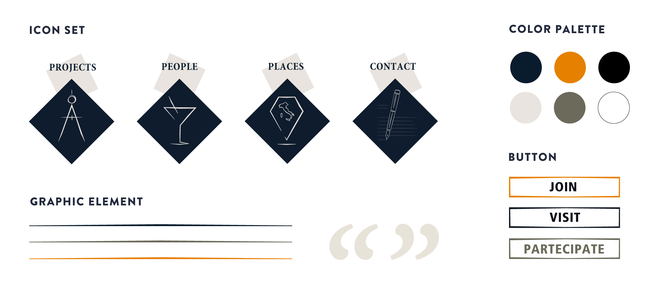
With its elegant and evocative aesthetics, the graphic layout enhances the easy navigation and emphasizes the official and coherent image of the foundation. It answers the need for a unique and solid image of FAI, apt to be shared through its different national groups.
Multisites
In order to facilitate the use of the websites by FAI volunteers worldwide, who do not have professional technical skills, we chose WordPress as CMS. Besides a common set of functions, we selected a range of sections that can be activated according to specific national group’s requests. A multisite network which ensures integrated and centralized management and maximum graphical coherence.
Woocommerce plugin
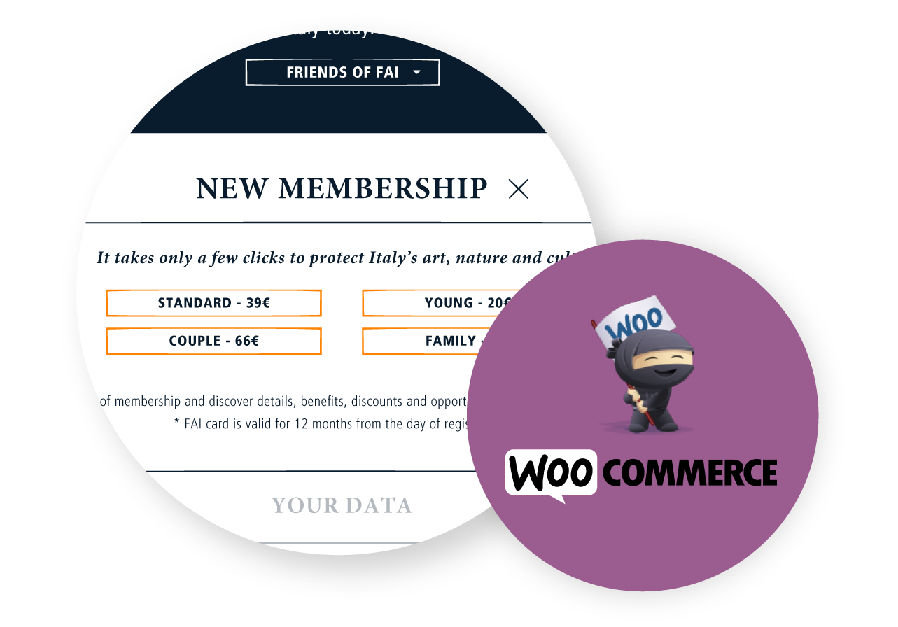
We implemented the subscription and the donation forms with customizable options available for each specific national site. We chose Woocommerce to manage and optimize the membership and donation process, so that every step is handled through the website: both the user and the admin do not have to involve other systems and all the processed data are already in one place.
Latte Creative –
Worth Wearing
Latte Creative has launched its first self initiated project: Worth Wearing, an online platform that promotes and supports causes for NGOs, associations or single individuals and funds their ideas by selling customized T-shirts. The aim is to create a widespread social awareness network based on e-commerce and provide customers with a way to support and simultaneously spread their causes.
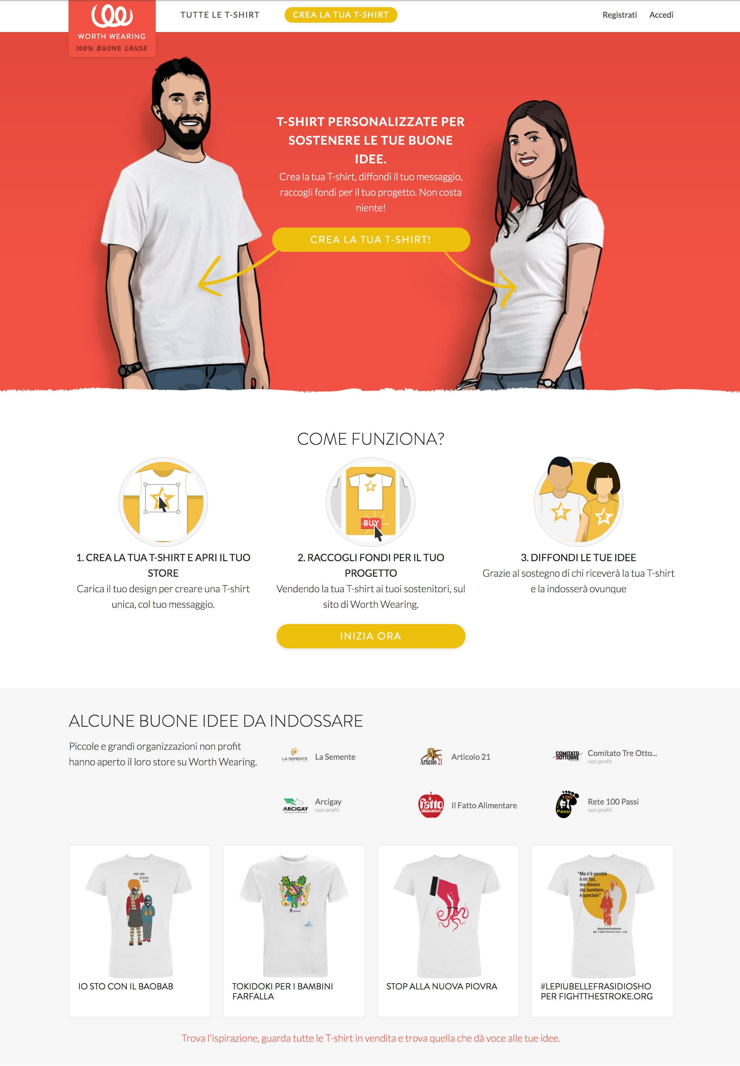
The concept is simple and it was inspired by a T-shirt’s versatility.
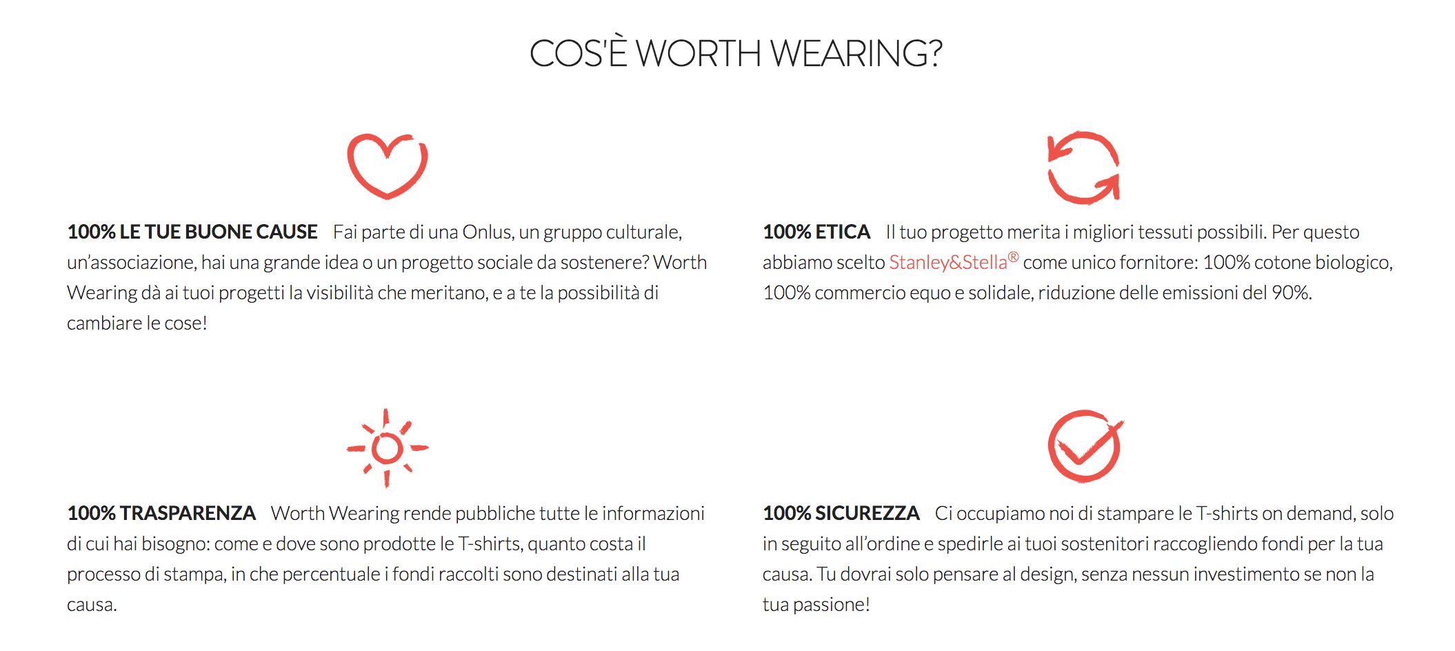
We offer a quality product, environmentally friendly and sustainable; the revenues from this sale fund a worthy cause and contribute to its spreading and promotion, both online through the platform and offline, thanks to those who will wear the shirt.
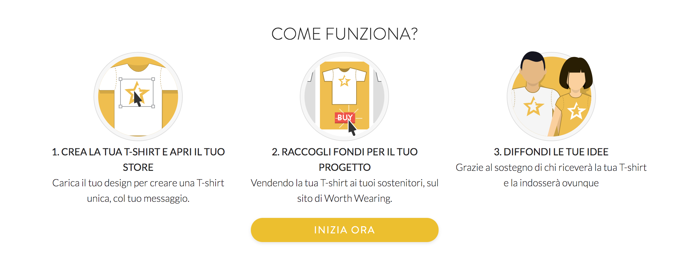
Anyone can upload their own graphics and sell the finished product without having to worry about logistics.
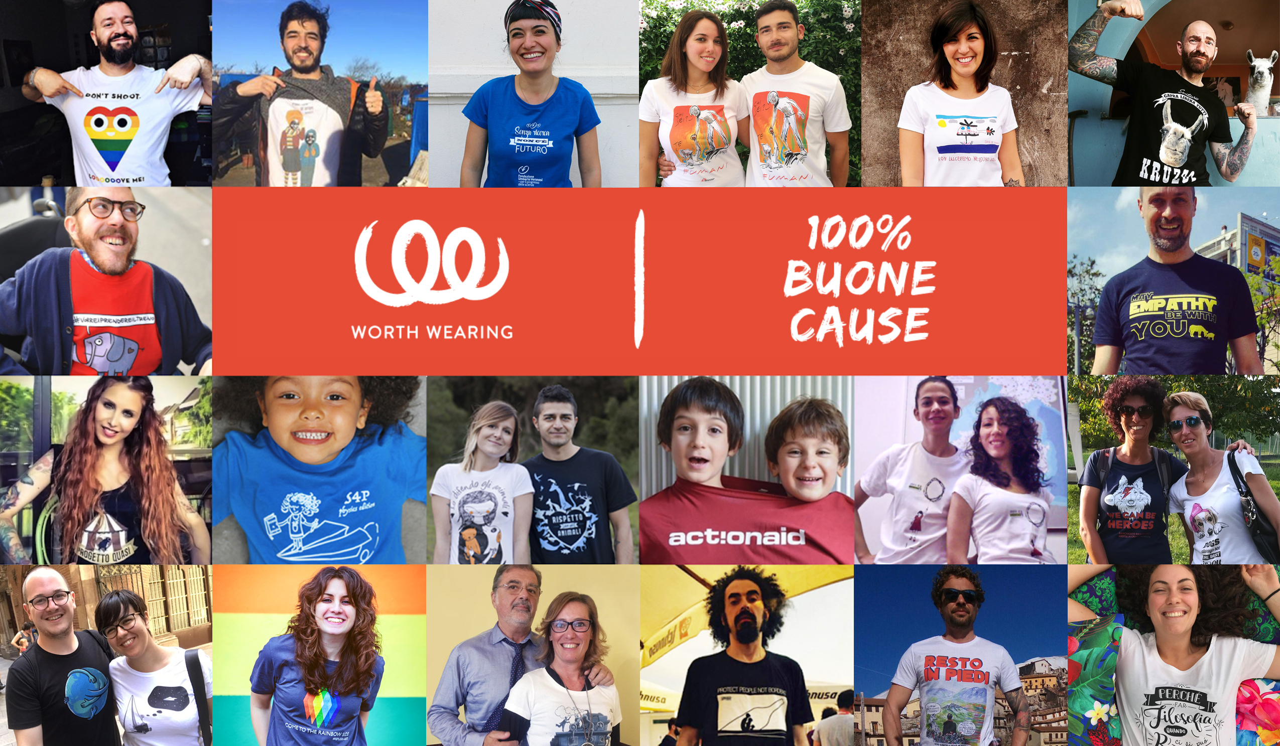
Our mission is to support the causes on the platform by returning the revenues from the sales to the campaigners, so that we can give them a hand realizing their ideas.
The platform
The project combines two established concepts: the dynamics of user generated campaigning and the simplicity of crowdfunding. On Worth Wearing the added value is not only the T-shirt but its association with the real world and the ability to spread the campaign everywhere.
It is a system open to everybody and it doesn’t require any money, so it is accessible by many more initiatives than other traditional types of activism.
Various organizations have already submitted their designs and were the first to be featured in our home page. Visit the website and send us your cause to make it real: http://worthwearing.org/
Functionalities
Worth Wearing is set to become a new channel to support social activism. It can provide new means to sustain many activities for charities/non-profits and a new type of support for the “micro activism” movement. Anybody can launch a T-shirt on Worth Wearing for any kind of project and invite friends, stakeholders or a whole community to fund their cause by purchasing a T-shirt.
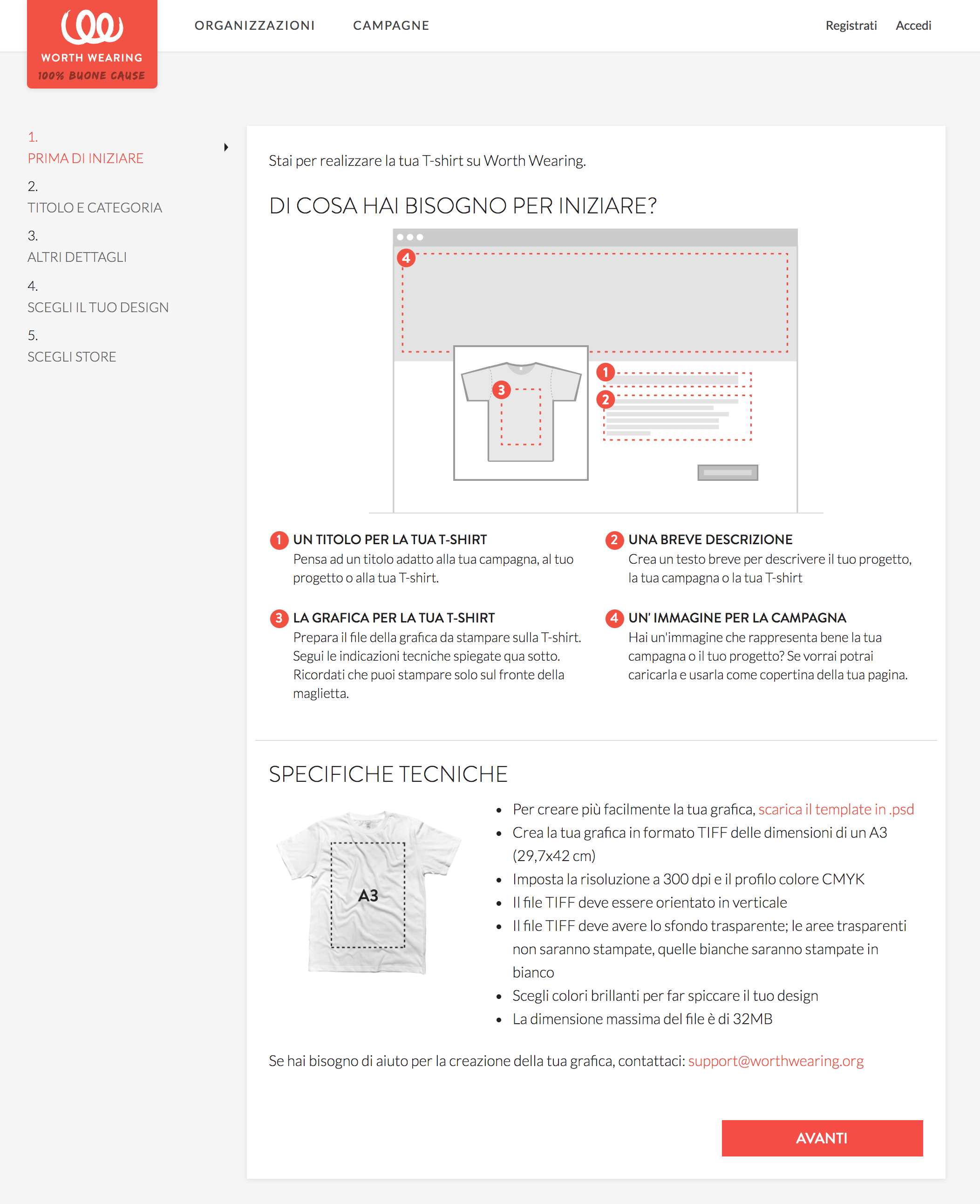
Our aim is to simplify the campaign creation process as much as possible and help users realize their campaigns or fund projects in few easy steps. Our aim is to highlight the campaign and the story behind it rather than the product itself. The T-shirts are printed on demand after the buyer has placed the order, thus limiting logistics costs.
All T-shirts are eco-friendly certified, made from soft organic cotton, supplied by Continental Clothing, printed with the newest printing technology “Direct To Garment” and water-based non-toxic colors.
The designs are user-generated, and a vendor can launch several campaigns or open a microstore. We will also provide design and consultancy features for interested users.
Stay tuned and subscribe to our newsletter to find out the best causes to support: http://worthwearing.org
Follow us
Facebook: Worth Wearing
Twitter: @WorthWearingOrg
Instagram: worthwearing_org
Ministry of Cultural Heritage and Activities and Tourism –
Art Bonus
In 2014, the Italian Ministry of Cultural Heritage and Activities and Tourism promoted Art Bonus, a Decree Law to increase private investments in art and cultural projects.
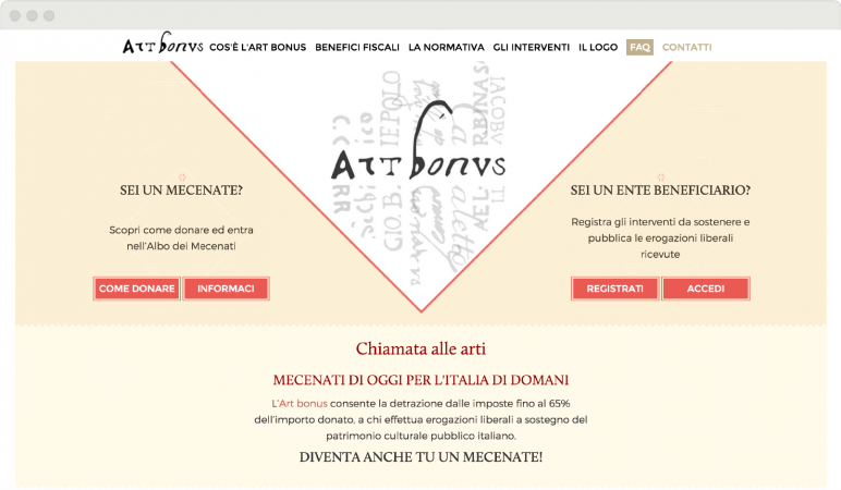
In order to inform and organize different users involved in this complex project, we designed and realized a graphic proposal that combines elements of tradition and modernity.
Logo and tagline
A link with tradition.
Illustrations, chromatic choices, graphic elements, front-end design are the visible parts of a complex project, with multiple levels of development and a layered structure.
The name of the project – Art Bonus – and the logo are both linked to tradition: the name is in Latin, the logo fonts are taken from manuscripts of past centuries. We proposed a tagline that would add a hint of modernity, a brief sentence to complete and freshen up the logo: “Chiamata alle arti” [Call for Arts] is a way to link the traditional elements of the logo and of the Italian cultural heritage to all the aspiring patrons who want to be involved in the future of this heritage.
Brand Identity
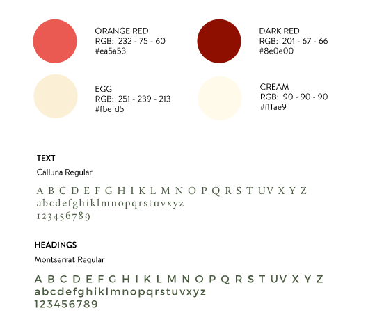
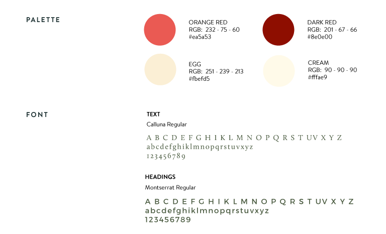
Colours and fonts were chosen to give the website a feeling of order and stability.
The main colours are neutral except for the two shades of red, the real “fil rouge“, a sort of path highlighting the important contents and guiding the users through the pages. Red is also an emotional colour, appropriate for the purpose of the campaign: to involve private individuals into art patronage.
The chosen font for headings is an elegant and contemporary sans serif, while the font for texts is a modern serif: we created a contrast between modern and traditional, the same contrast recurring throughout the website.
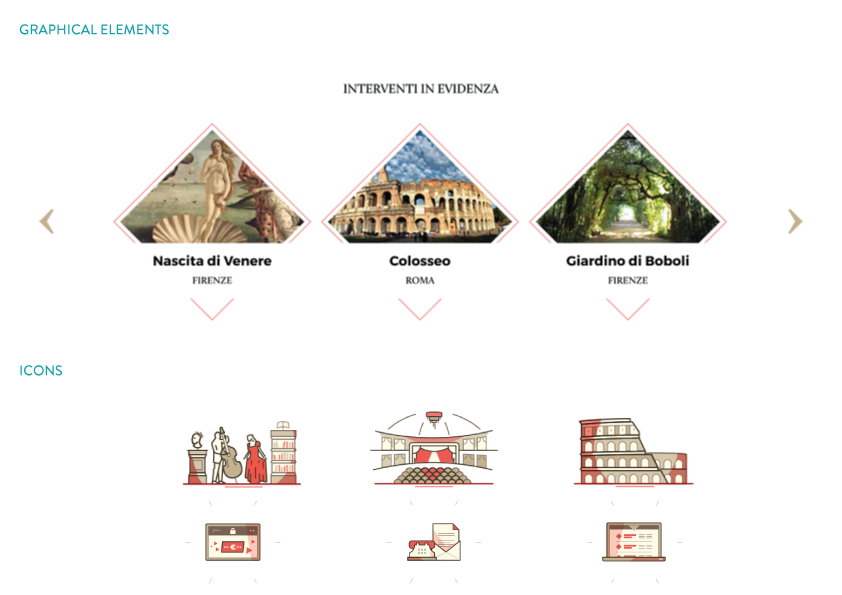
Graphic elements
The diamond.
To give the website a modern twist we chose a shape not commonly used in web design to stand out as the most prominent graphic element: the diamond.
This kind of element provides a formal exactness but at the same time, it feels innovative and original.