Topic: video
PagoPA S.p.A. –
IOApp
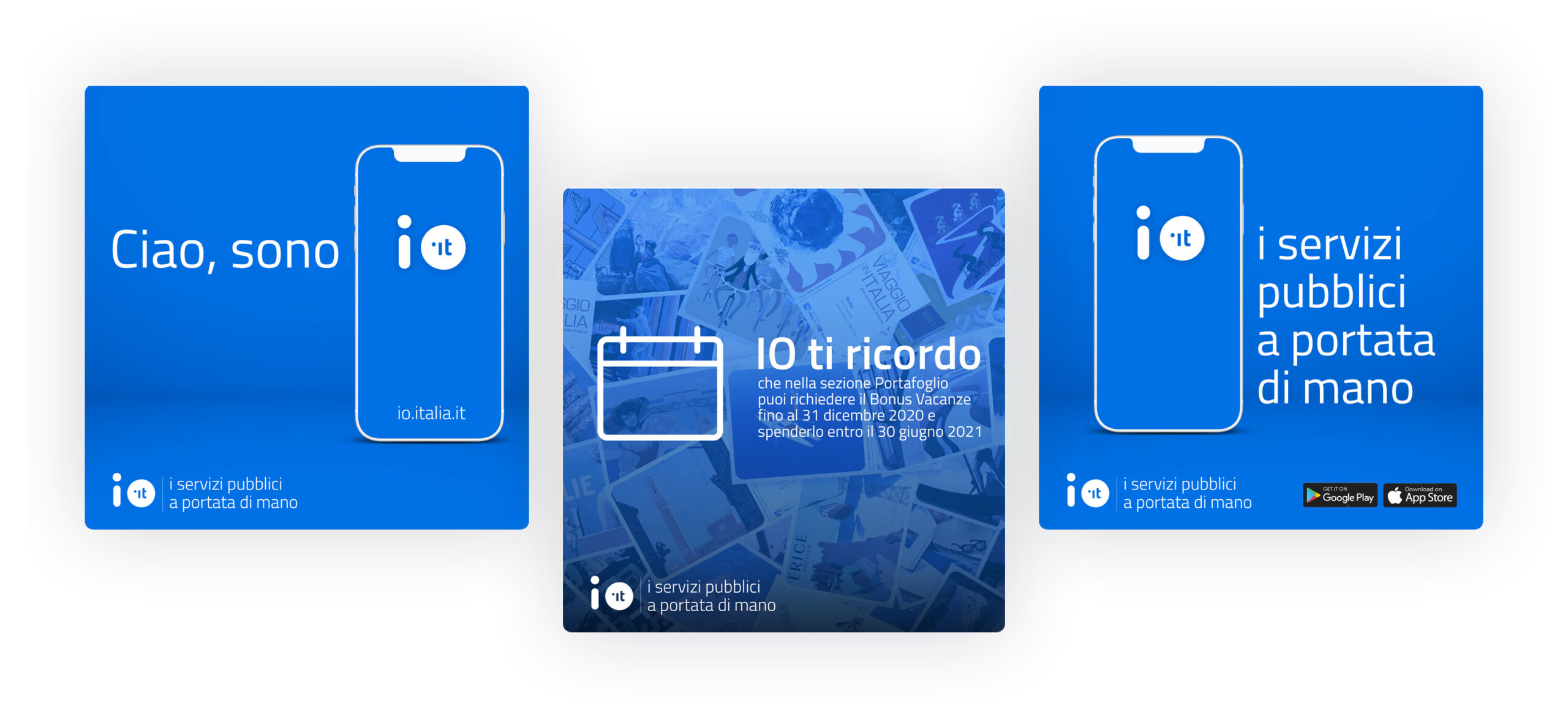
Latte took care of the communication of IO App, the application of Italian public services: an essential tool developed by PagoPA S.p.A. in order to ease the digitization of the Italian public administration system. IO was launched in beta version to keep improving in response to citizens’ needs.
Concept
At the heart of IO communication is simplicity. We wanted to dismantle the common perception that weighs on public administration, often perceived by citizens as something distant and complex. IO was created to overturn this idea making every operation quick and simple. Starting from its very name (io means I in Italian), it suggests the centrality of the people.


Video
Videos have been a fundamental tool in the communication of IO: we ideated promotional video and video tutorials that explain all the features of the application step by step, with the aim of making it accessible to as many people as possible. In doing so, we directed the work of Cut& studio.
Editorial plan
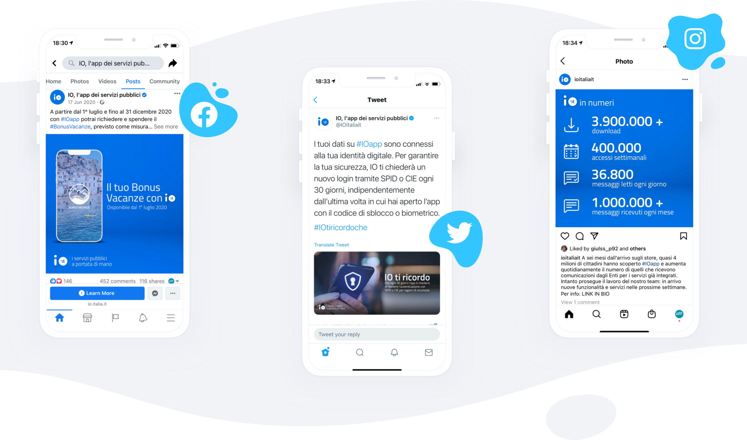
We created IO’s social media channels according to a multi-phased strategy and aiming at building broad, modular and – of course – simple storytelling. IO’s channels must help citizens use the app to the fullest. The editorial plan and its columns were the actualization of this goal: I am simple, I remind you, I in numbers, I am updated.
We also provided SEO support and took care of community moderation.


Compagnia di San Paolo Foundation –
Riconnessioni: a school for the future
Riconnessioni is a project that wants to bring systemic change to primary and lower secondary schools.
All the pieces perfectly fit together: new brand identity for the project, an elaborate website for multiple audiences (teachers, parents, stakeholders, and the general public), an animated promotional video and a communication plan supported by print and digital assets.
Brand identity
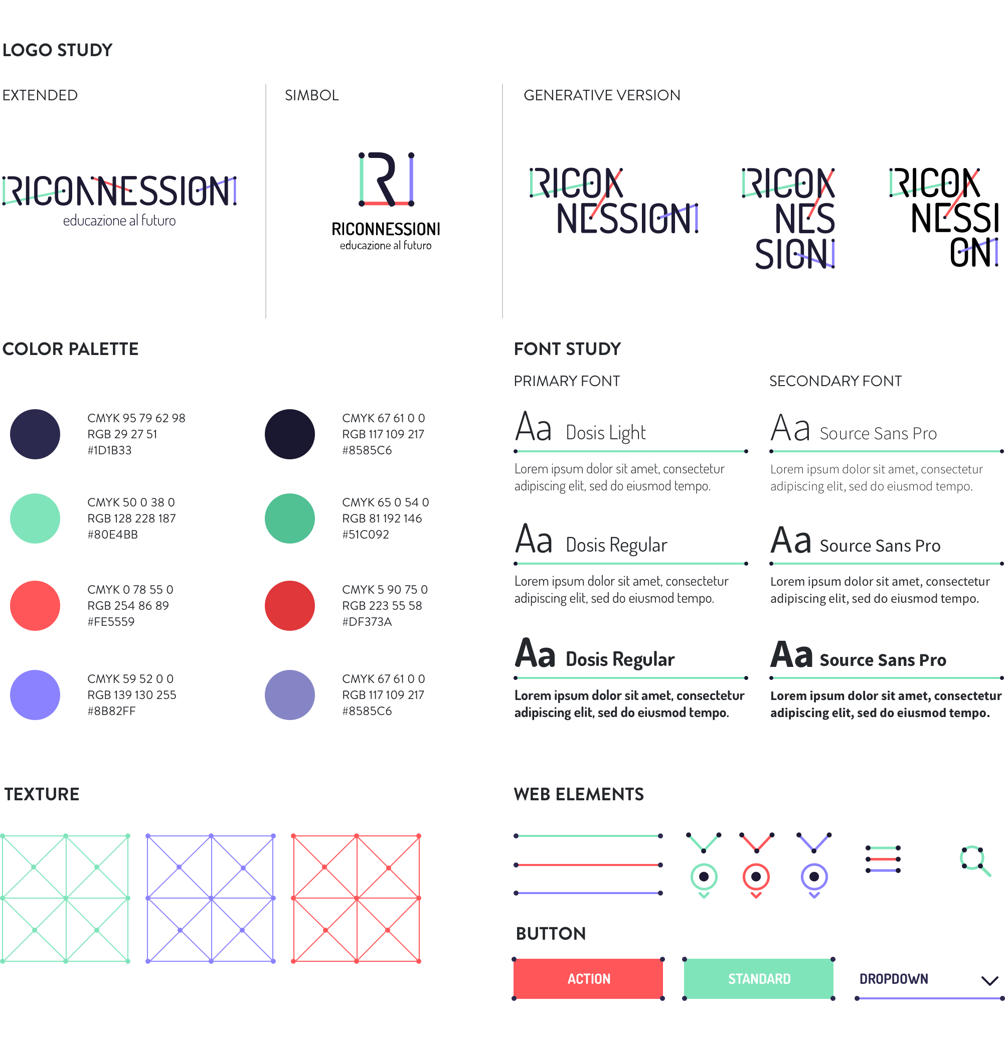
An impactful and communicative logo able to show the three faces of the project: digital, education, community.
We worked on the typography to emphasize the concepts of connection and collaboration, which are recalled by the network of coloured segments connecting the dots within the title. The graphic treatment allows for several declinations of the logotype itself and graphic paths (icons, texture), while the ratio behind the segments ensures homogeneity and consistency. The result is immediate, simple, readable, recognizable and extremely flexible.

Website
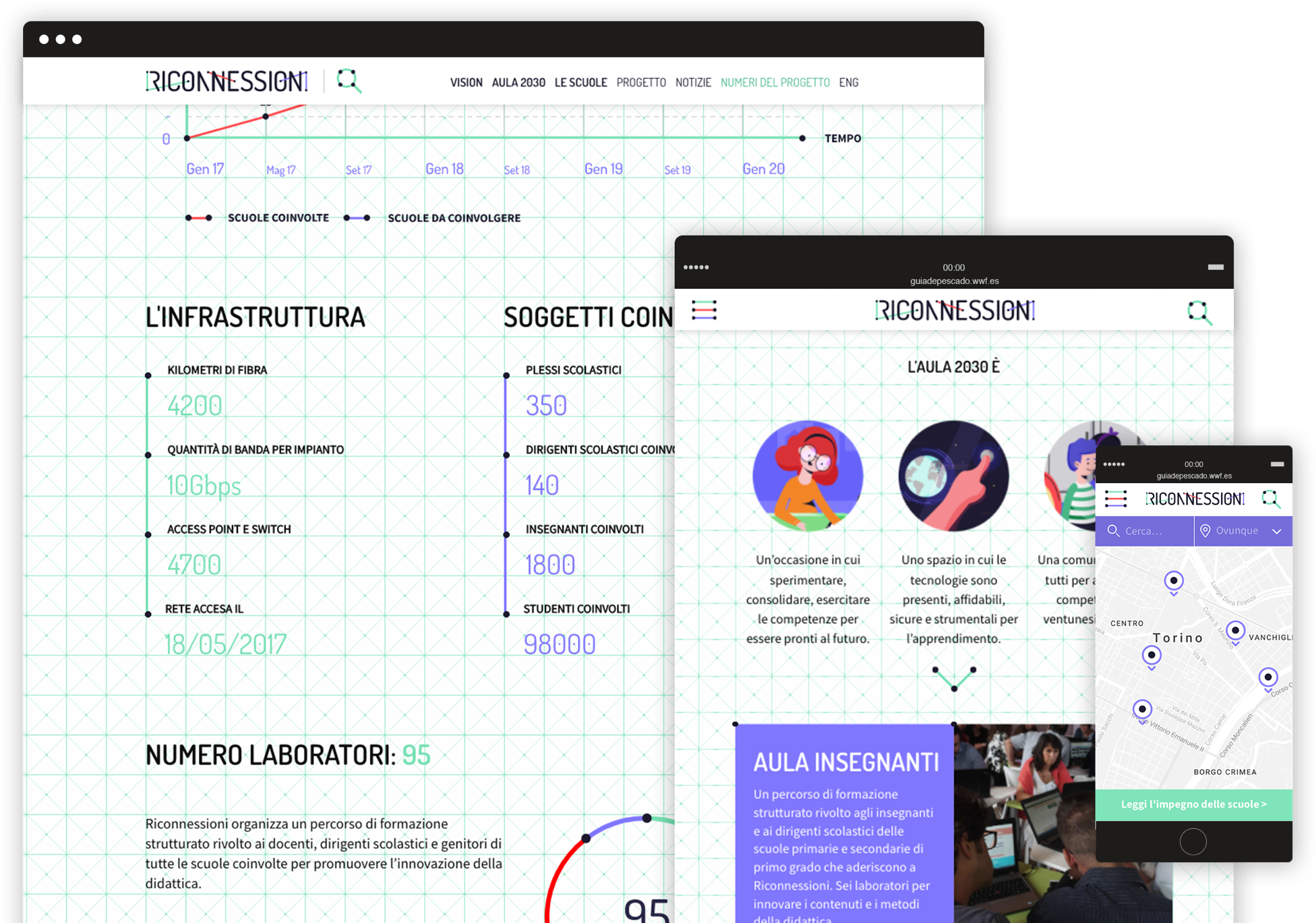
A website for many audiences.
Riconnessioni is made by and for teachers, headmasters, parents, kids, institutional stakeholders, and a number of professionals from different areas of expertise. All these segments need to easily find the right contents on the website, navigate through the pages, interact with articles and be able to retrieve useful information in a few clicks.

Animated video
The story of Viola looking for her future.
We produced a 2D animated video addressed to all the target audiences involved in the project. The smooth and emotional characters animation helps to explain complex technical and pedagogical issues, by telling the story of Viola, a little girl who is looking forward to discovering her exciting professional future!
Engaging the community
From smiling to discussing, from liking to resharing.
After a careful analysis of the different target segments we wanted to reach through social media, we created an animated video and 3 series of cards in which catchy graphics and fun copywriting engage the audience on different levels.
A fresh way to explain the project and invite people to become part of the community!