Technology: branding
Hyperloop Italy —
Innovation and technology brought to Italy by Bibop Gresta.
Our challenge was to create interest in the imminent arrival of Hyperloop in Italy and to inform about the new opportunities that this system will bring to the country.
Web design
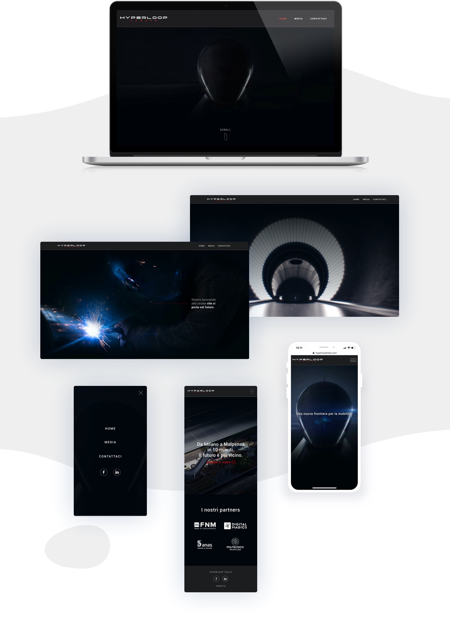
The website we created for Hyperloop Italia expresses the concepts of innovation and speed that represent the brand. The homepage features a dynamic structure showing Hyperloop images and some evocative concepts. Finally, there are the news, the team, the press releases and media of the brand.
Brand identity
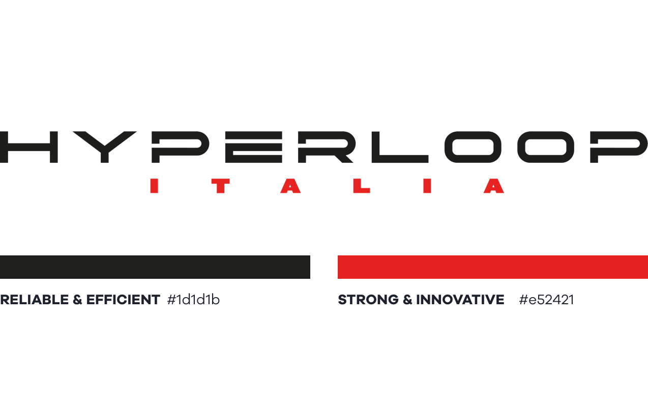
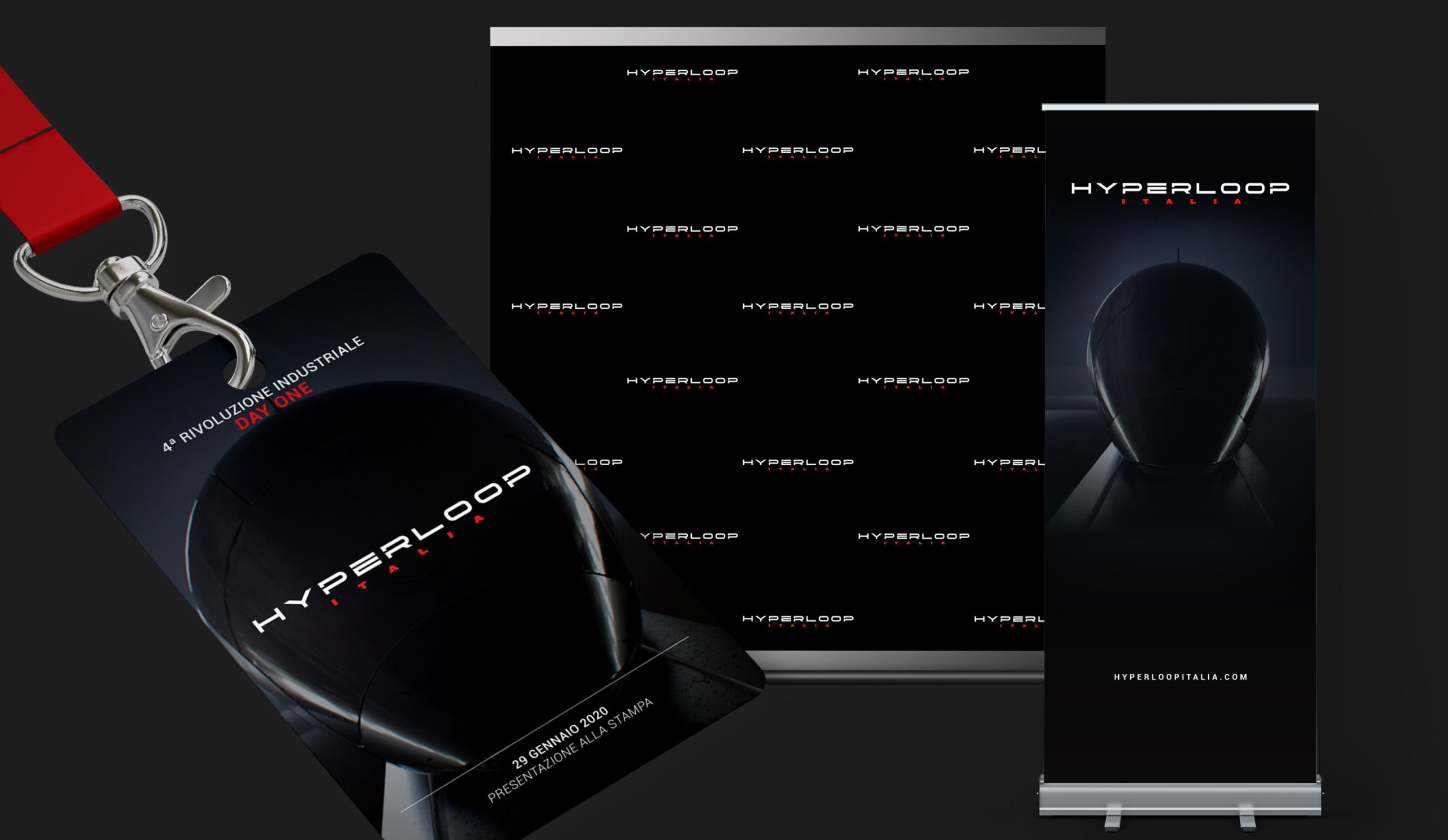
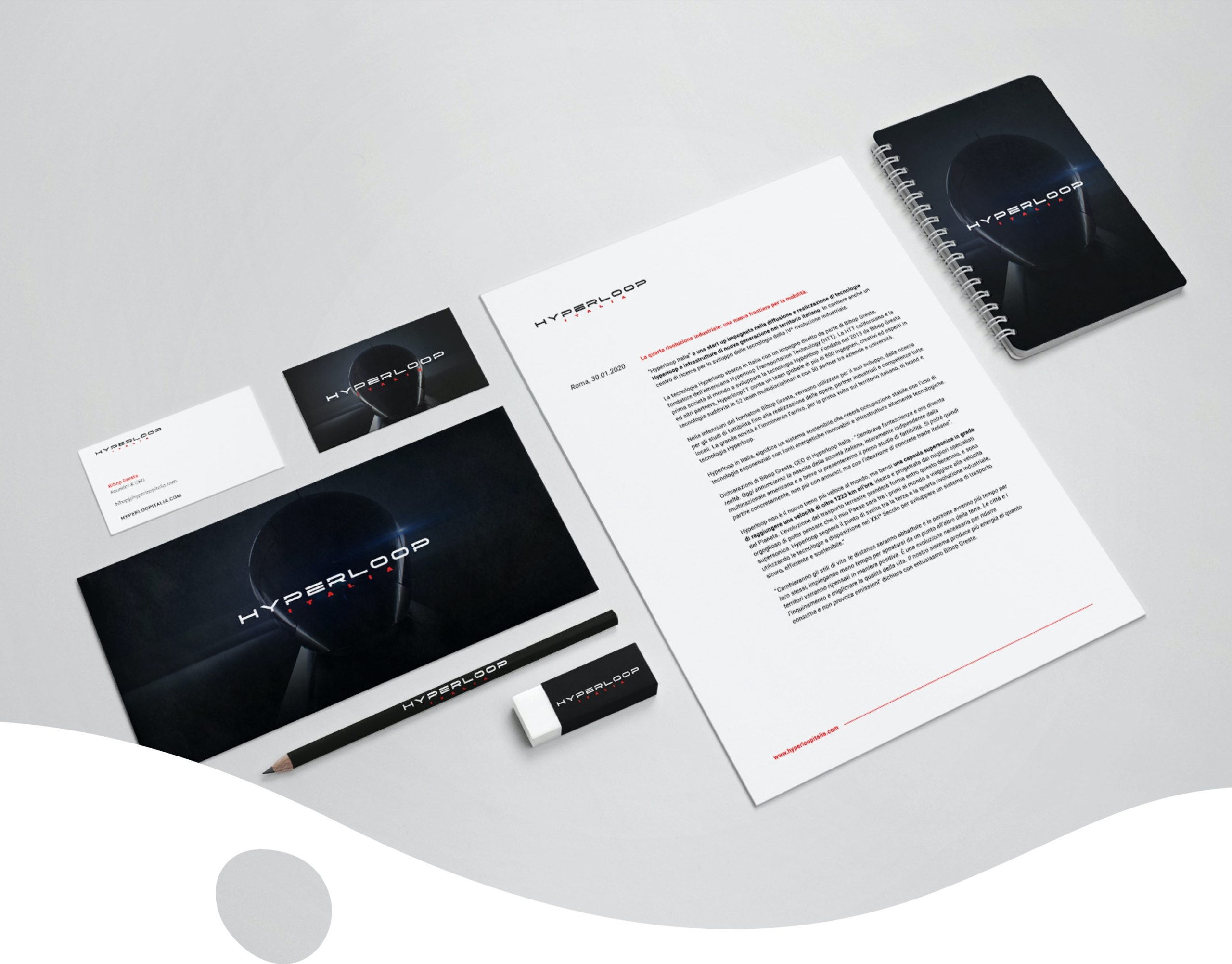
For Hyperloop Italia we have developed a new identity and a new logo that recalls the original. The focus of communication is to convey the concepts of innovation, technology and speed. Furthermore, we have created the press kit and the various presentation materials for the conferences.
Compassion In World Farming –
End the cage age
We collaborated with Compassion in World Farming (CIWF) and launched a campaign that aims to end the use of cages in the farming of animals across the European Union. The aim is to raise awareness and inspire people to take immediate action.
Branding
Vivid images and strong ideas.
We created and proposed various campaign concepts. Our first proposal was aiming to let people know what they have in their plates comes from pain and suffering. We created a strong visual and direct to the point straplines. “Made in Cage, Let Them Out” was a clear call to action and a statement for no quality can come from cruelty.
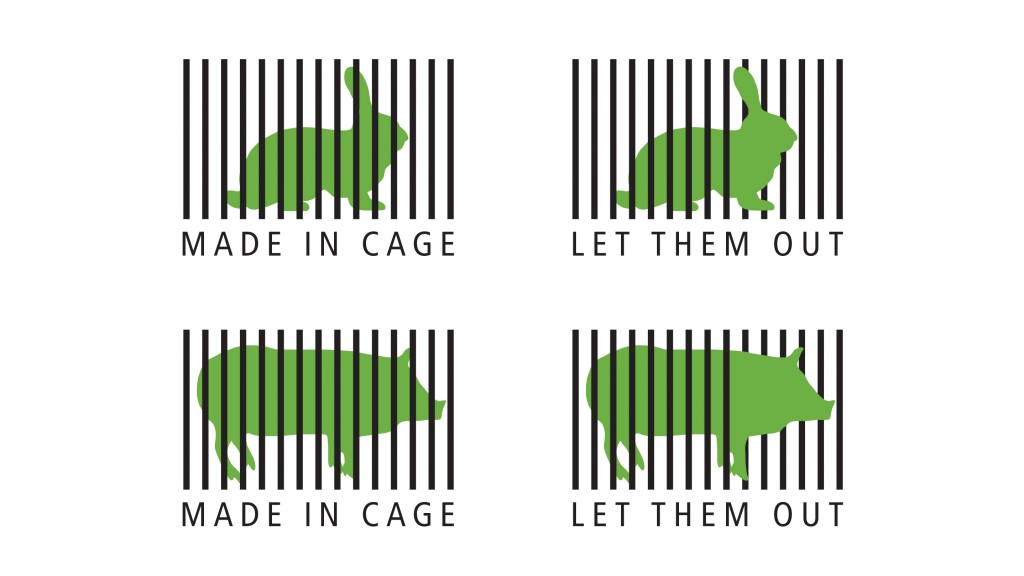
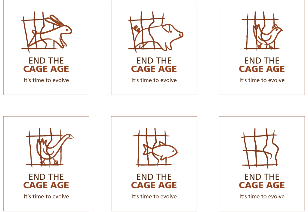
After so many trials and proposals we have reached our final design. Our aim was to trigger a sense of obviousness and urgency, and shouting out loud that “We need to take action now! Cages are against nature”.
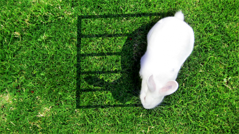
The sense of a paradigm shift “away from the age of the cage” is also reflected in the design with shapes of the animals in a cage created in the style of iron age artworks.
Naming
We didn’t want to push the “drama” button.
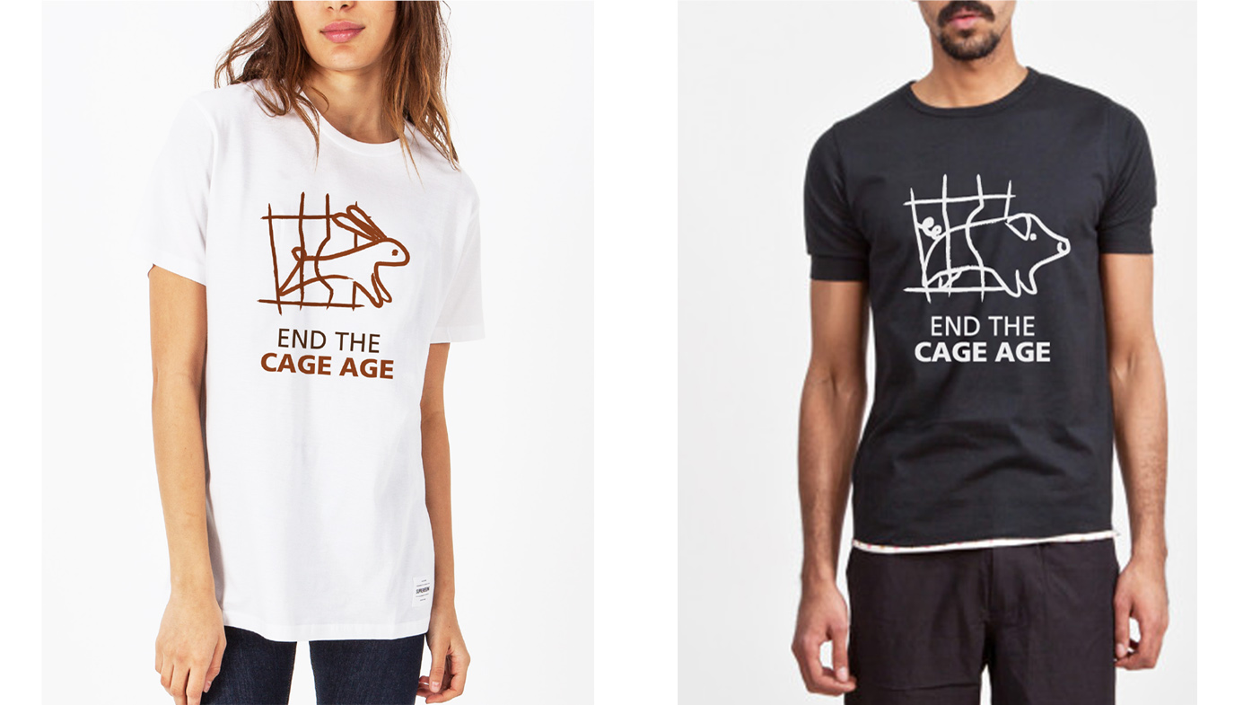
The Cage Age is a concept which immediately calls the image to mind. “End the Cage Age”, the campaign name, successfully called the people to action while denouncing the obvious problems of cage-farming. The tone we have chosen for this campaign is funny, catchy and striking.
Approach
We structured the campaign for being participatory and innovative.
We believe that action is a positive thing and we’d rather focus on that. We aimed to target people who are shaken up by the desire for social change everywhere. With this campaign, we wanted to raise awareness and change the approach to the animals in cages.
Latte Creative –
Worth Wearing
Latte Creative has launched its first self initiated project: Worth Wearing, an online platform that promotes and supports causes for NGOs, associations or single individuals and funds their ideas by selling customized T-shirts. The aim is to create a widespread social awareness network based on e-commerce and provide customers with a way to support and simultaneously spread their causes.
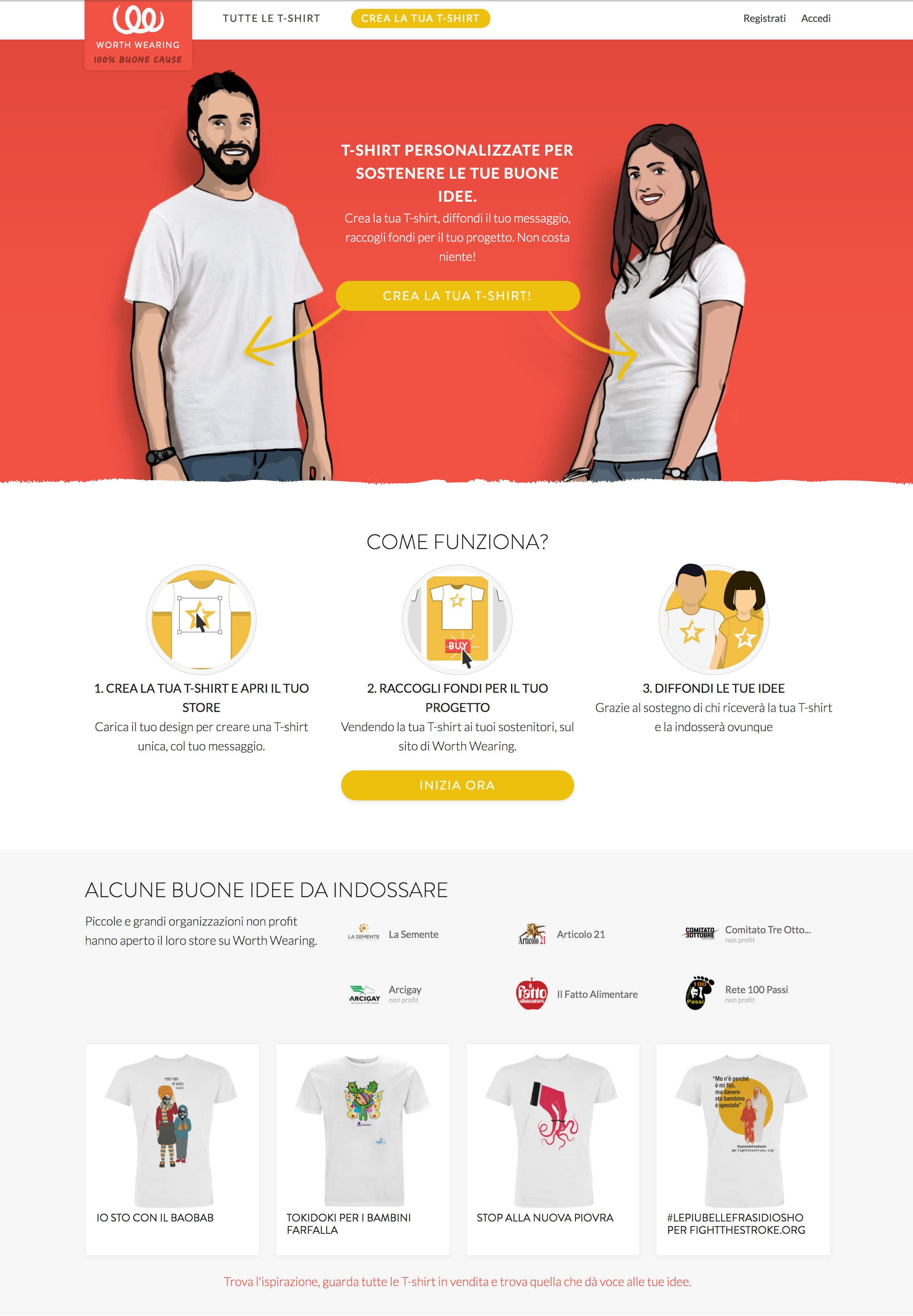
The concept is simple and it was inspired by a T-shirt’s versatility.
We offer a quality product, environmentally friendly and sustainable; the revenues from this sale fund a worthy cause and contribute to its spreading and promotion, both online through the platform and offline, thanks to those who will wear the shirt.
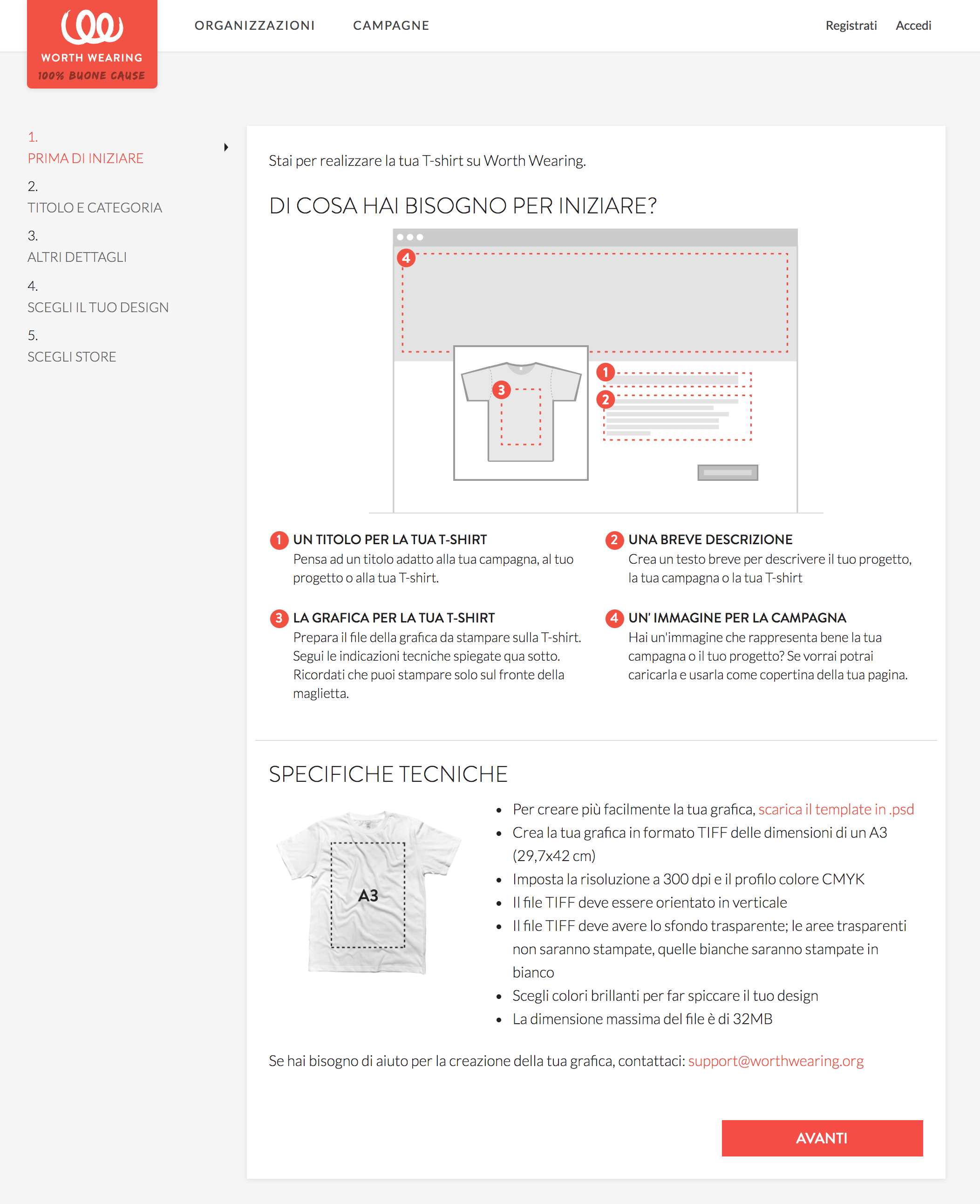
Anyone can upload their own graphics and sell the finished product without having to worry about logistics.
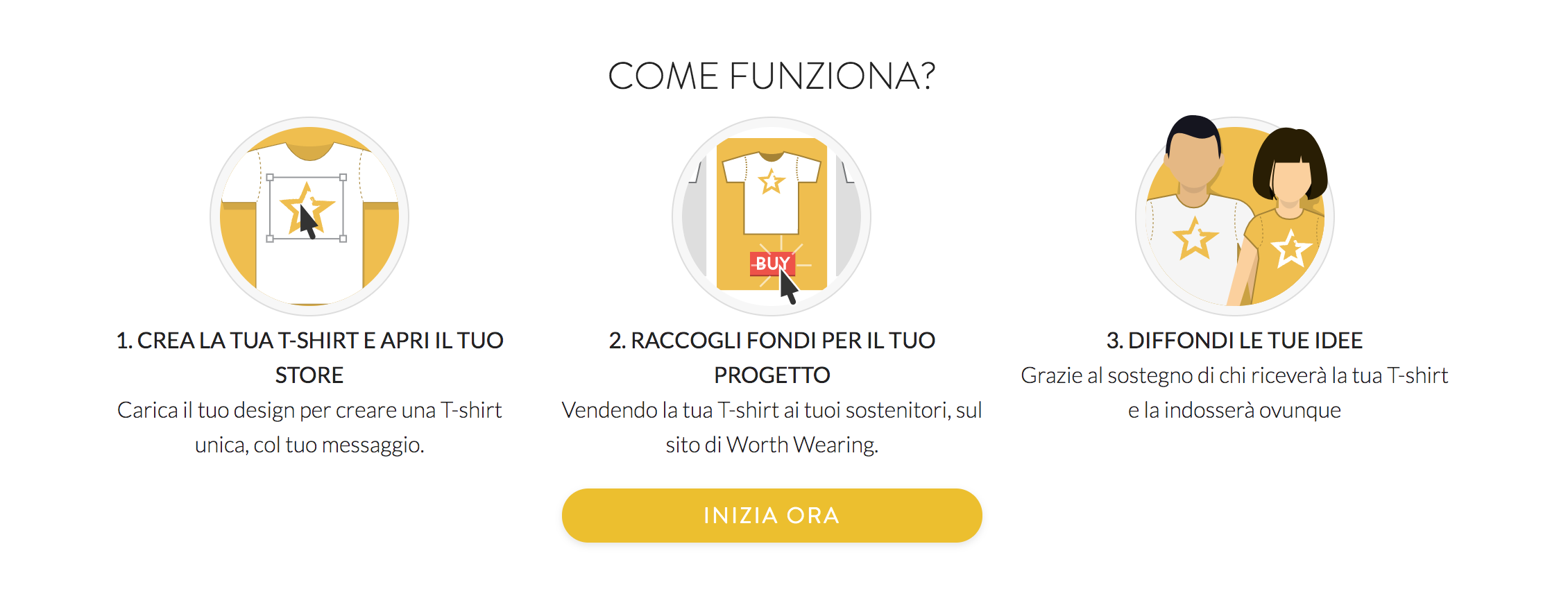
Our mission is to support the causes on the platform by returning the revenues from the sales to the campaigners, so that we can give them a hand realizing their ideas.
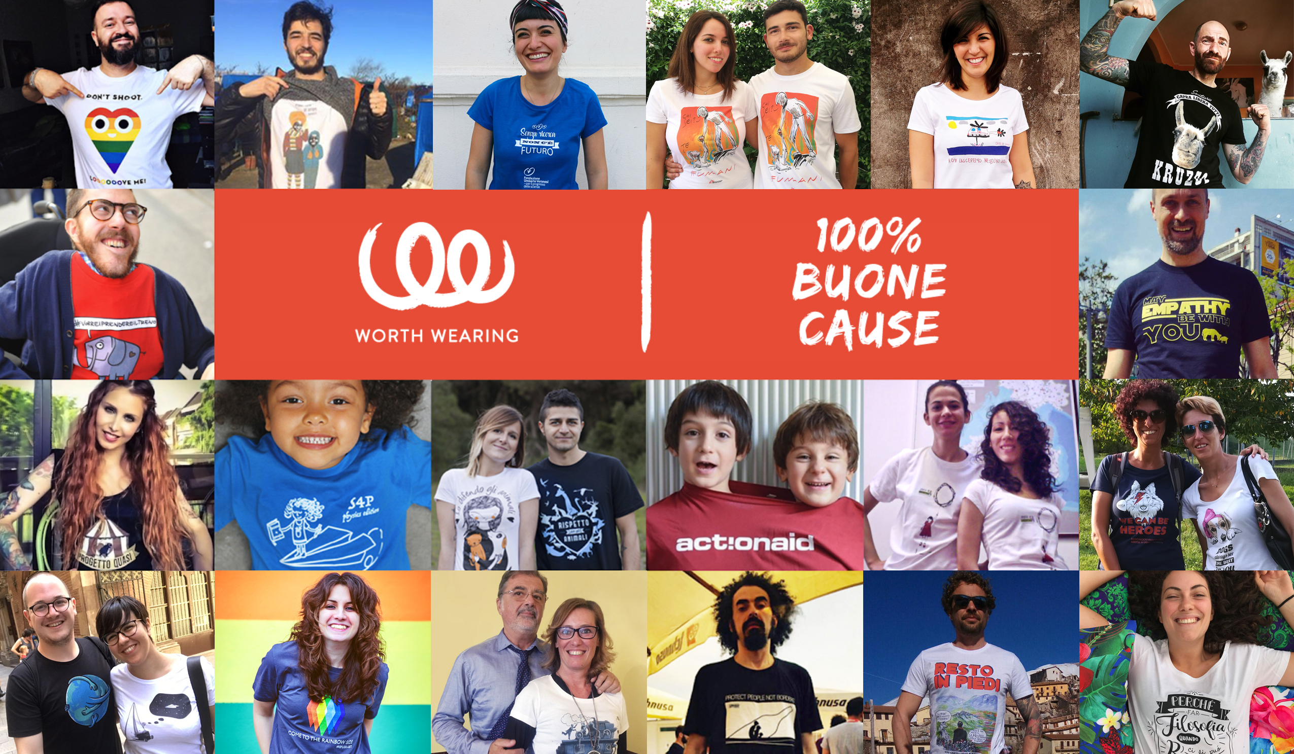
The platform
The project combines two established concepts: the dynamics of user generated campaigning and the simplicity of crowdfunding. On Worth Wearing the added value is not only the T-shirt but its association with the real world and the ability to spread the campaign everywhere.
It is a system open to everybody and it doesn’t require any money, so it is accessible by many more initiatives than other traditional types of activism.
Various organizations have already submitted their designs and were the first to be featured in our home page. Visit the website and send us your cause to make it real: http://worthwearing.org/
Functionalities
Worth Wearing is set to become a new channel to support social activism. It can provide new means to sustain many activities for charities/non-profits and a new type of support for the “micro activism” movement. Anybody can launch a T-shirt on Worth Wearing for any kind of project and invite friends, stakeholders or a whole community to fund their cause by purchasing a T-shirt.
Our aim is to simplify the campaign creation process as much as possible and help users realize their campaigns or fund projects in few easy steps. Our aim is to highlight the campaign and the story behind it rather than the product itself. The T-shirts are printed on demand after the buyer has placed the order, thus limiting logistics costs.
All T-shirts are eco-friendly certified, made from soft organic cotton, supplied by Continental Clothing, printed with the newest printing technology “Direct To Garment” and water-based non-toxic colors.
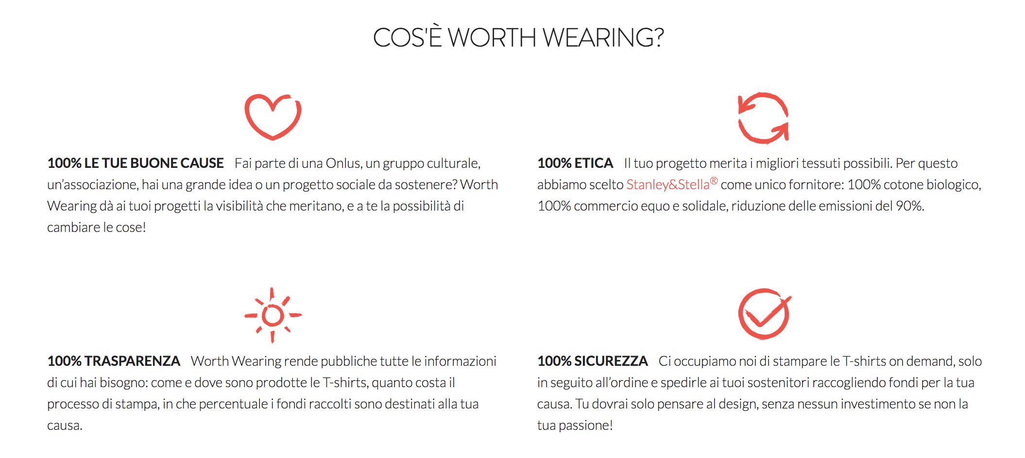
The designs are user-generated, and a vendor can launch several campaigns or open a microstore. We will also provide design and consultancy features for interested users.
Stay tuned and subscribe to our newsletter to find out the best causes to support: http://worthwearing.org
Follow us
Facebook: Worth Wearing
Twitter: @WorthWearingOrg
Instagram: worthwearing_org
Tax justice network –
Global alliance for tax justice
We collaborated with the Tax Justice Network, one of the most significant actors in raising awareness around tax justice on an international level, to design a logo for their new umbrella organization: the Global Alliance for Tax Justice. The Tax Justice Network mostly focuses on research and advocacy and it’s also active in creating partnerships with many campaigns, both on a local and a global level.
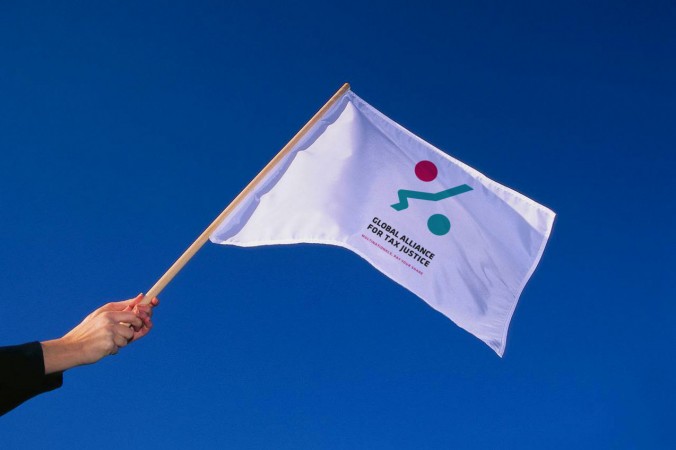
GATJ is a newly formed alliance of autonomous regional networks working together for shared objectives in solidarity based on equality. Each regional network leads the fight against tax dodging within its own regional political and socio-economic context, and the alliance comes in to support the regional work, to amplify and synergies the regional work at the global level.
Brand identity
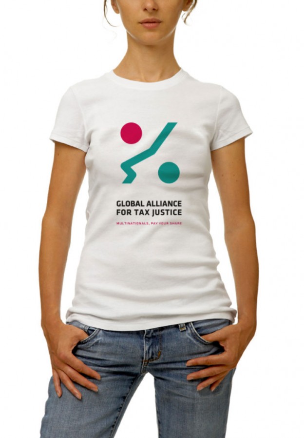
We gave tax justice one of the most important human attributes: a face.
The goal was to create a logo that would be both recognizable and credible, a common symbol for the Alliance. As tax justice is sometimes hard to grasp, we tried to give a positive spin to the subject. The expression is friendly and the profile is obtained by using the universal symbol of portions. Through the merge of these two simple and well recognizable shapes, we managed to convey the idea of fairness: tax justice, for all. The values and the mission of the alliance are reinforced by a direct and incentive pay-off: Multinationals Pay Your Fair Share! The idiom makes this sentence easy to remember and serves as a clear call to action.
Arcigay Italia –
A far l’Europa comincia tu
“A far l’Europa comincia tu” is an advocacy and awareness campaign launched in partnership with Arcigay, the Italian LGBTI (lesbian, gay, bisexual, transexual, intersexual) association, in sight of the European Parliament elections.
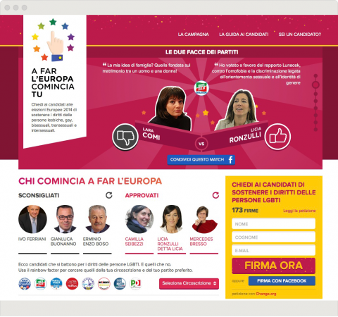
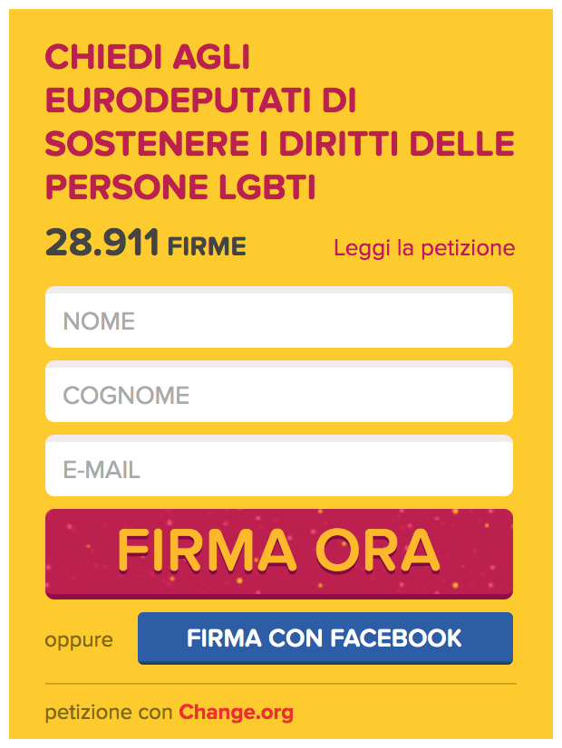
The objective of the project is twofold. On the one hand, it promotes a petition encouraging the engagement of Italian candidates on the protection and promotion of LGBTI rights in Europe. On the other hand, it highlights the opinions expressed by Italian candidates on LGBTI issues in order for the electorate to be prepared to make a fully informed decision when voting. As a consequence, voters have the possibility to identify the candidates who are LGBTI friendly in the party they want to vote and in their electoral district.
Website
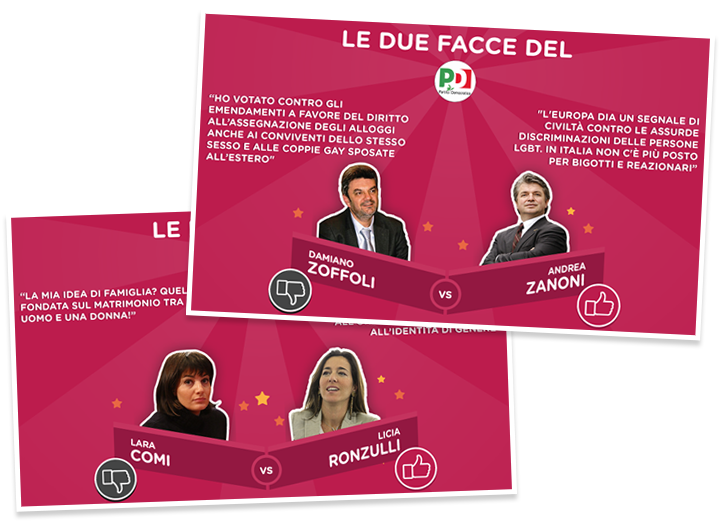
The “match” among selected candidates shows comparatively the two extremes on the subject coexisting in the main parties.
In the website, the architecture of the user experience is created to give visibility to the very different opinions on LGTBI rights expressed by Italian candidates even within the same party. Users are also asked to express their approval or disapproval to the candidates based on their engagement on LGBTI rights, through a voting tool that determines the candidate’s “rainbow factor”.
Video
The video teaser of the campaign expresses how the European Parliament can play a crucial role in the defence and promotion of LGBTI rights and makes a strong call to express a conscious choice to this end at the next European elections.
Ministry of Cultural Heritage and Activities and Tourism –
Art Bonus
In 2014, the Italian Ministry of Cultural Heritage and Activities and Tourism promoted Art Bonus, a Decree Law to increase private investments in art and cultural projects.
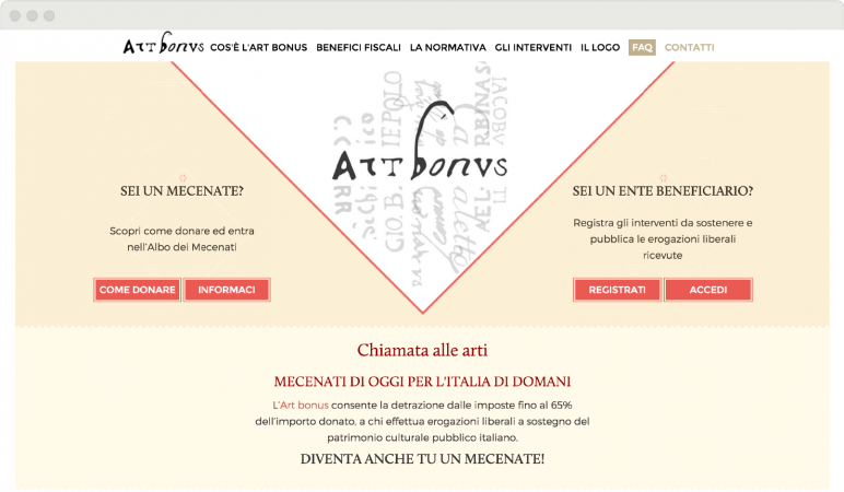
In order to inform and organize different users involved in this complex project, we designed and realized a graphic proposal that combines elements of tradition and modernity.
Logo and tagline
A link with tradition.
Illustrations, chromatic choices, graphic elements, front-end design are the visible parts of a complex project, with multiple levels of development and a layered structure.
The name of the project – Art Bonus – and the logo are both linked to tradition: the name is in Latin, the logo fonts are taken from manuscripts of past centuries. We proposed a tagline that would add a hint of modernity, a brief sentence to complete and freshen up the logo: “Chiamata alle arti” [Call for Arts] is a way to link the traditional elements of the logo and of the Italian cultural heritage to all the aspiring patrons who want to be involved in the future of this heritage.
Brand Identity
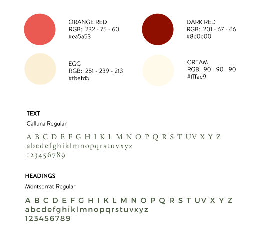
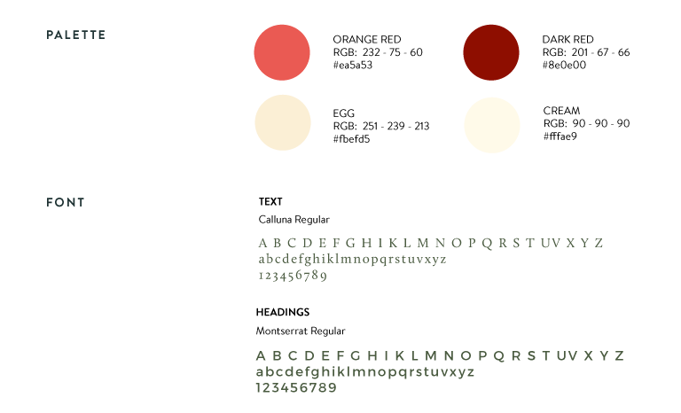
Colours and fonts were chosen to give the website a feeling of order and stability.
The main colours are neutral except for the two shades of red, the real “fil rouge“, a sort of path highlighting the important contents and guiding the users through the pages. Red is also an emotional colour, appropriate for the purpose of the campaign: to involve private individuals into art patronage.
The chosen font for headings is an elegant and contemporary sans serif, while the font for texts is a modern serif: we created a contrast between modern and traditional, the same contrast recurring throughout the website.
Graphic elements
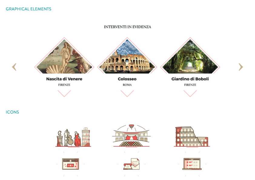
The diamond.
To give the website a modern twist we chose a shape not commonly used in web design to stand out as the most prominent graphic element: the diamond.
This kind of element provides a formal exactness but at the same time, it feels innovative and original.
Libera and Gruppo Abele –
Restarting the future
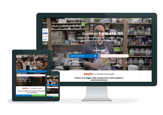
“Restarting the future” is an advocacy campaign developed in partnership with Libera, the most important Italian anti-mafia NGO. The project is aimed at creating public awareness on the subject of corruption and advocating to strengthen the law against corruption by reforming the Penal Code.
Video
The video teaser of the campaign sums up the goal of “Restarting the future” and makes a strong call to sign the petition.
Website
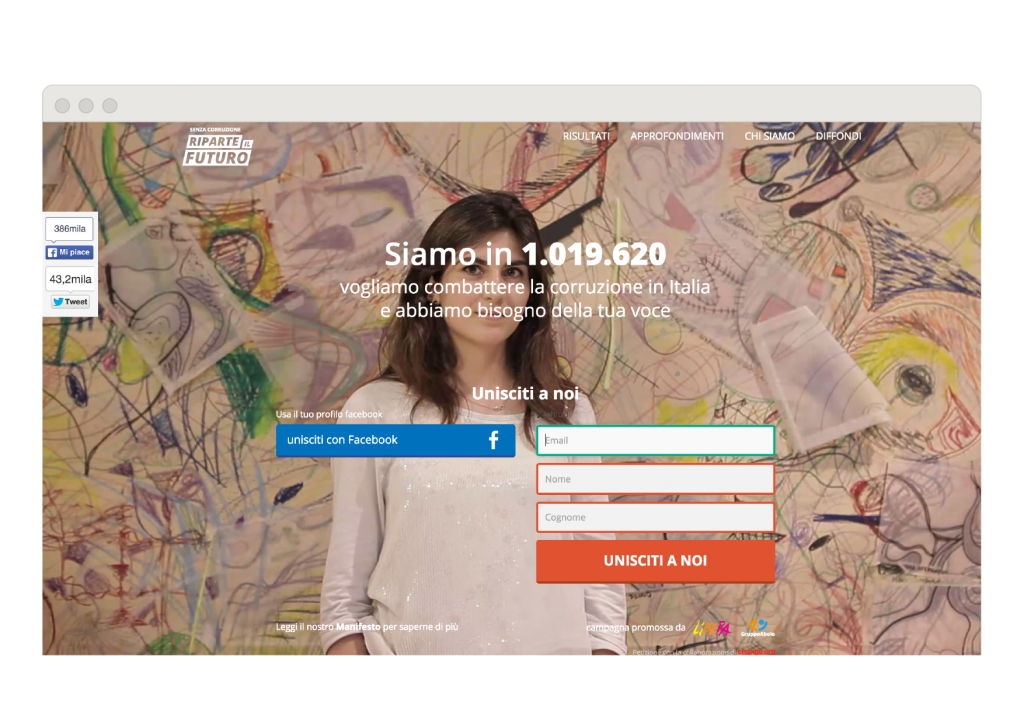
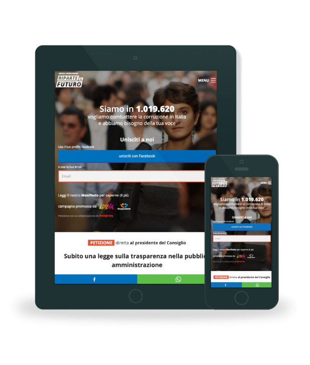
The architecture of the user experience is created to give the strongest possible visibility to the signup form. We need action from Italian citizens and we are not shy to ask it.
It is not easy to score 100.000 signatures in an online petition, so let’s celebrate! And by the way: this is just the beginning.

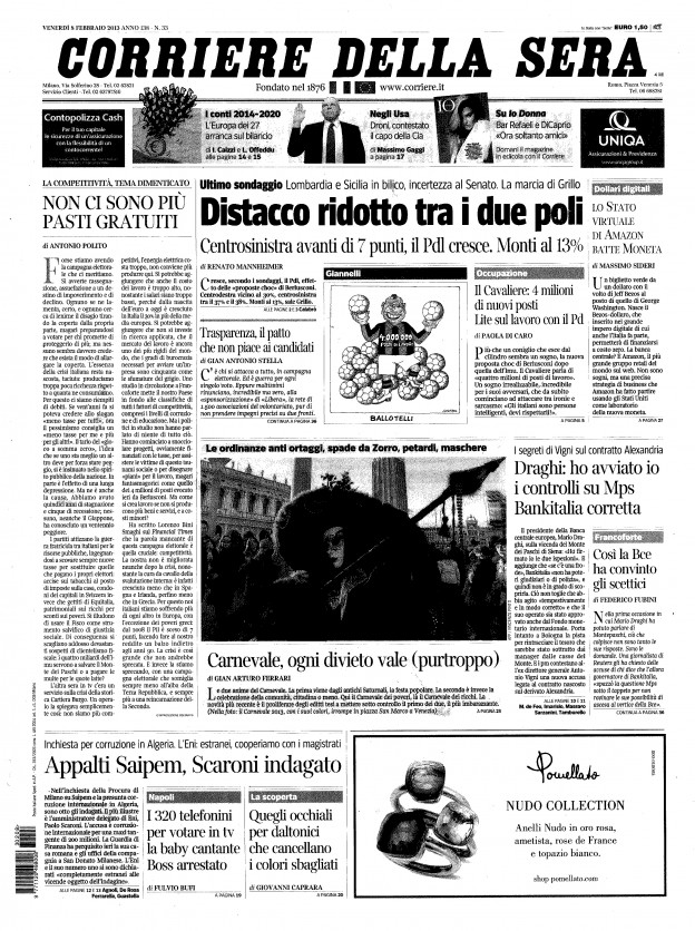
Corriere della sera, the most important Italian newspaper, wrote an impressive editorial about Restarting the future. Yes, we have been on the news many times before. No, we had never reached the first page before. That was a great day!
Results
Scoring 300.000 signatures are even more challenging so we need to celebrate more. Here is an amateur video that grabbed the authenticity of the moment and the happiness of those who saw their wish for change becoming reality.
A new video for a new campaign spin off: bringing transparency in the health sector.
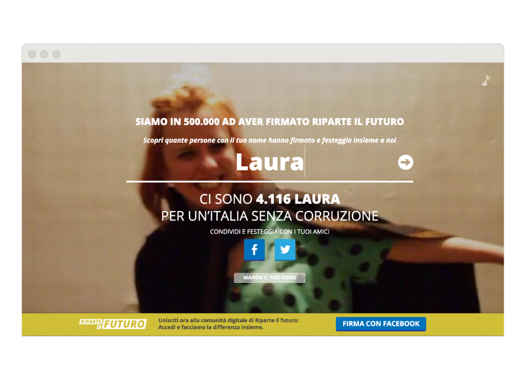
After having reached 500.000 signatures, we created a landing page to celebrate our goal: entering the page you can add your name to see how many people with the same name have signed the petition.
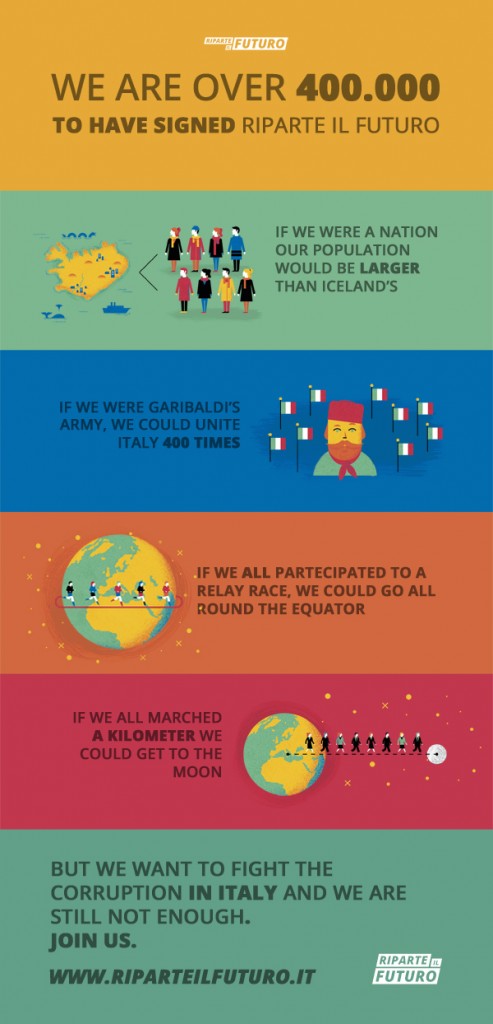
Data visualisation
800.000 is a big number and we were really excited.
Do you know how many signatures are 800.000?
We don’t know either, so we decided to find it out.
It seems that they are a lot (going and coming to the moon, huh?), but the finish line is still far: let’s do better!
We want to fight the corruption in Italy and we are still not enough.
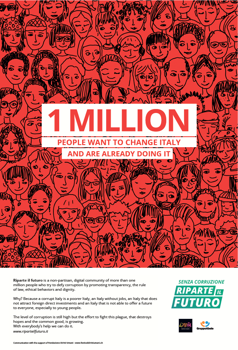
The long-awaited goal! Now we are a 1 million community!
Are we stopping now?
Not at all!
New goals are coming: together we can really make the difference!
This is our national campaign (we were on Corriere della Sera and Repubblica) to celebrate the event!
Share it!
Do you wanna share one of our petition or just sign in with a social network? Yes you can!
Every petition on the website can be signed, not only by email, but also with Facebook and Twitter, and, on these social networks, you can share your signature and invite your friends.
If you’re browsing the website from a tablet or a smartphone, you can share contents and petitions through Whatsapp.
Music crossroads –
The importance of music
“Give a child an instrument and you give them a dream. Teach that child to play and you give them a future”.
We worked with Music Crossroads to renew their website and to refresh their visual identity.
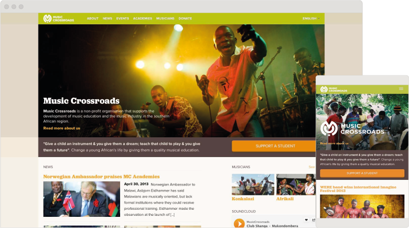
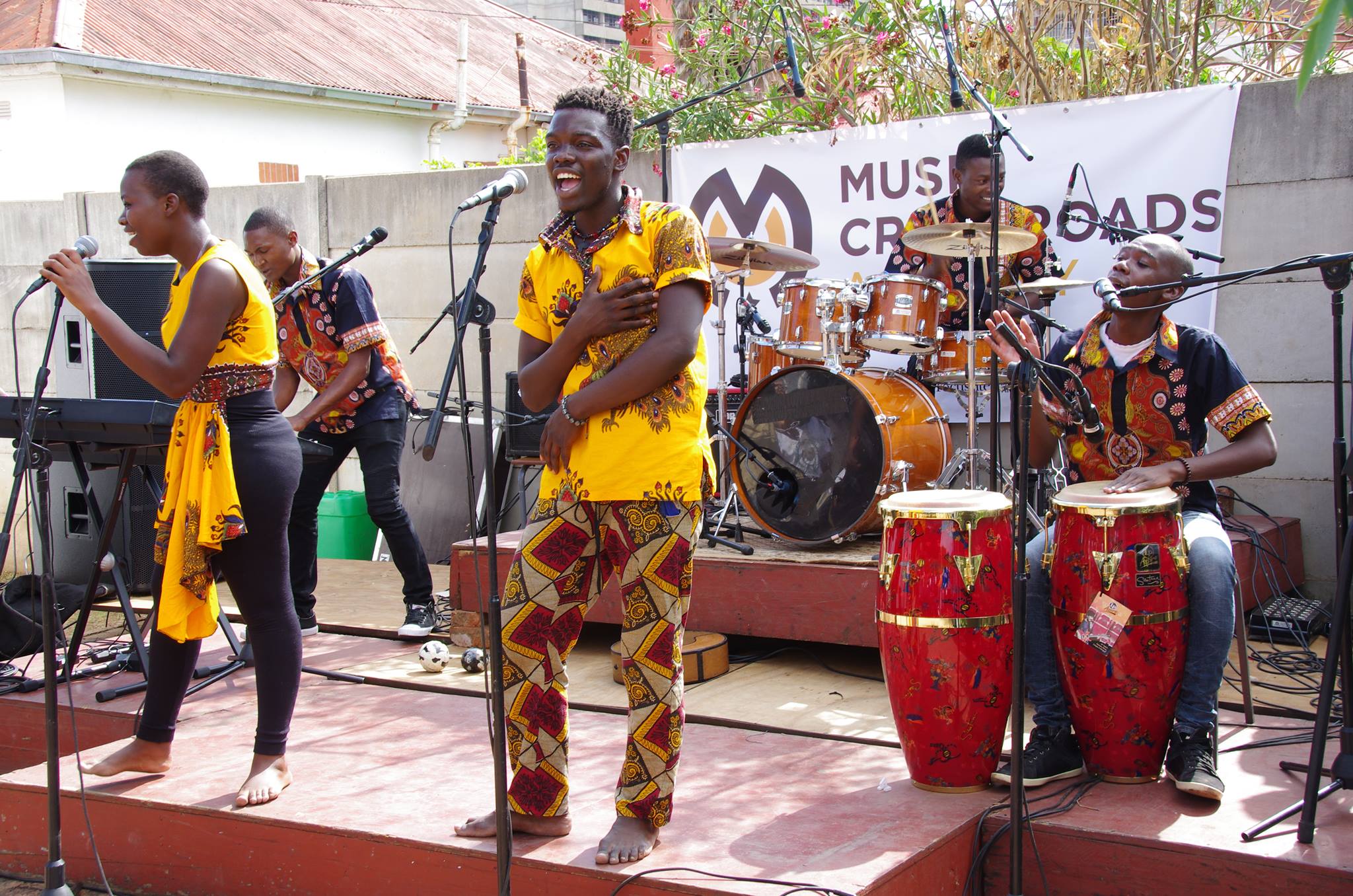
Music Crossroads is a non-profit organization that supports the development of music education and the music industry in the Southern African region with the mission of empowering young Africans throughout the music. In 2013 they established Crossroads Academies in Malawi, Mozambique and Zimbabwe, to support talented young musicians with accessible and innovative music education program offering the necessary tools for them to create.
Rebranding
Music Crossroads told us that they need to actualize their website and brand. So we revised their corporate branding by giving them a modern and sophisticated look while preserving their legacy of refinement as the overall feeling.
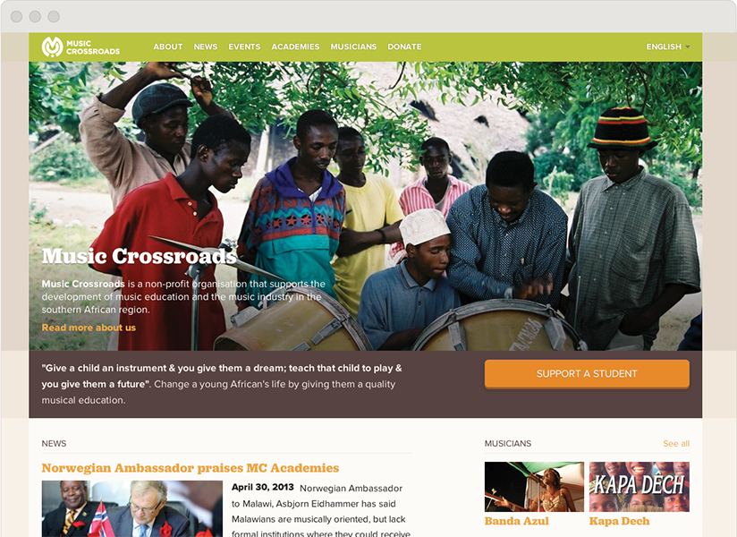
Website
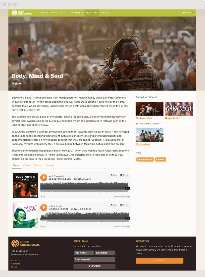
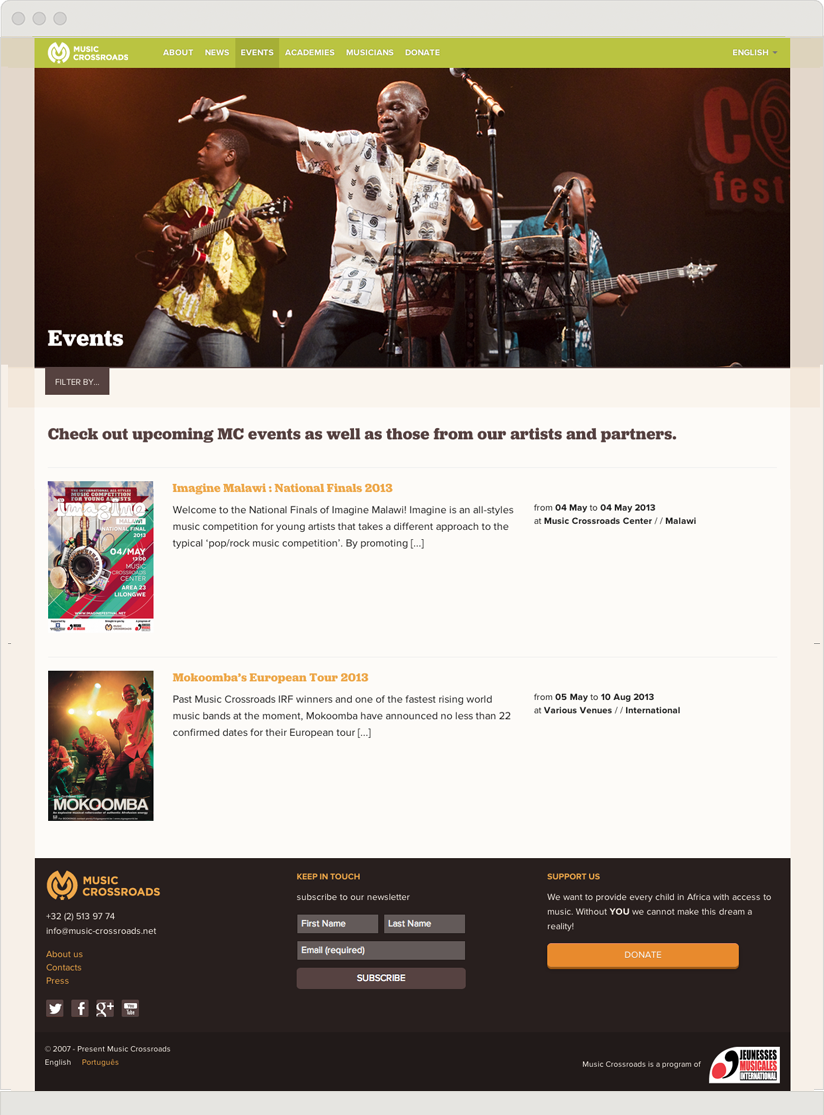
We built up and redesigned the website, with special care for the mobile version. Also, we organized the sections of the website such as original music from featured artists, photo galleries, information about the academies and donation pages. For easy managing, we developed an interface through WordPress.
If global –
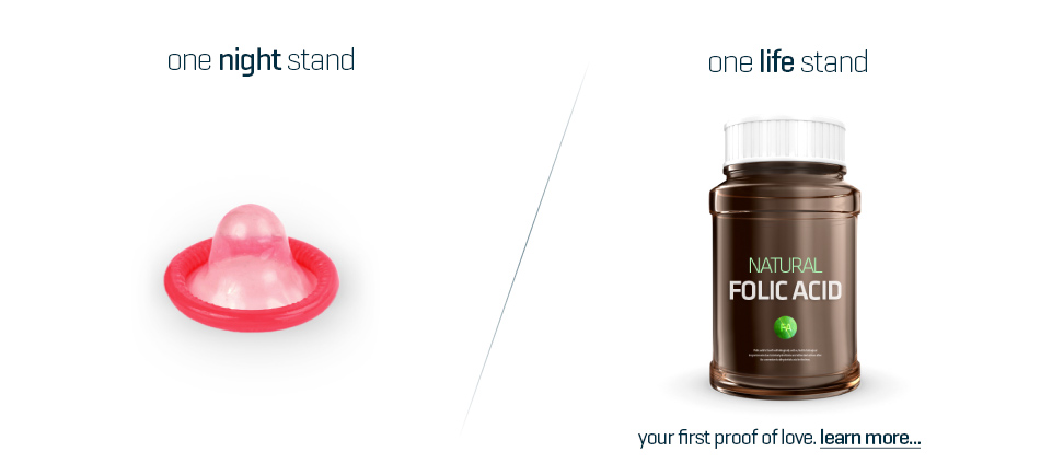
One life stand
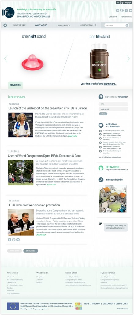
The International Federation for Spina Bifida and Hydrocephalus (IF) needed help to better disseminate the vital information about this otherwise possibly preventable condition. We build them a new website and the brand around it.
Web design
We developed the website using Joomla! thinking especially about people with disabilities and made it very accessible for them. Keywords, simple, clean and understandable was our goal in the design process. We supported our concept with larger than usual scale images.

Campaign
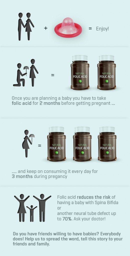
We designed an effective visual for social networks to spread around the world and save more children.
We kicked off a small campaign to create awareness on how to prevent the risk of Spina Bifida and Hydrocephalus by using folic acid before and during pregnancy.
