Technology: information architecture
Greenpeace –
Make smthng week
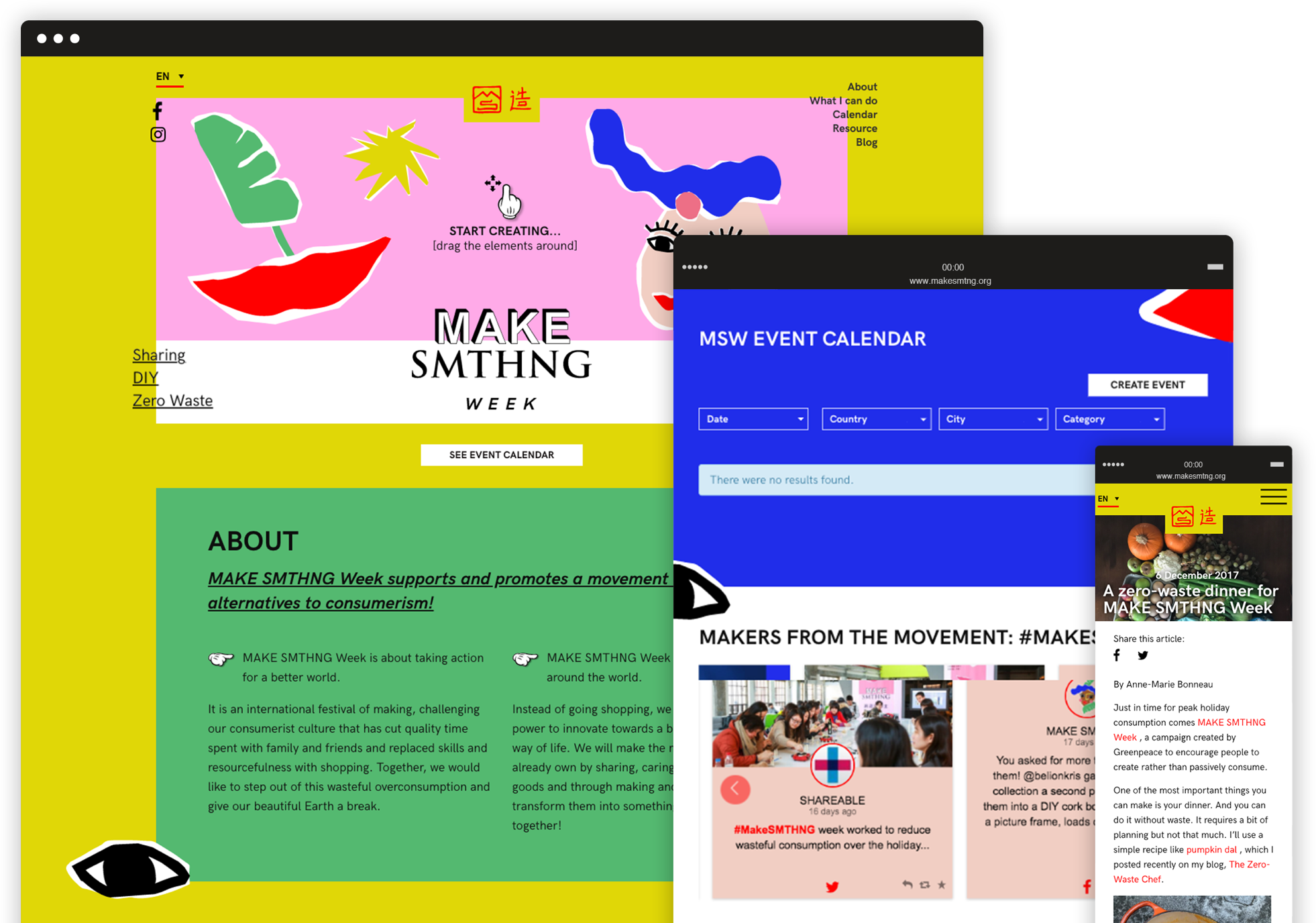
We designed a light, fresh brand identity and an highly engaging website to promote a global movement of makers and a week of fun events all around the world.
Inclusive design
Give shape to your very own cover picture.
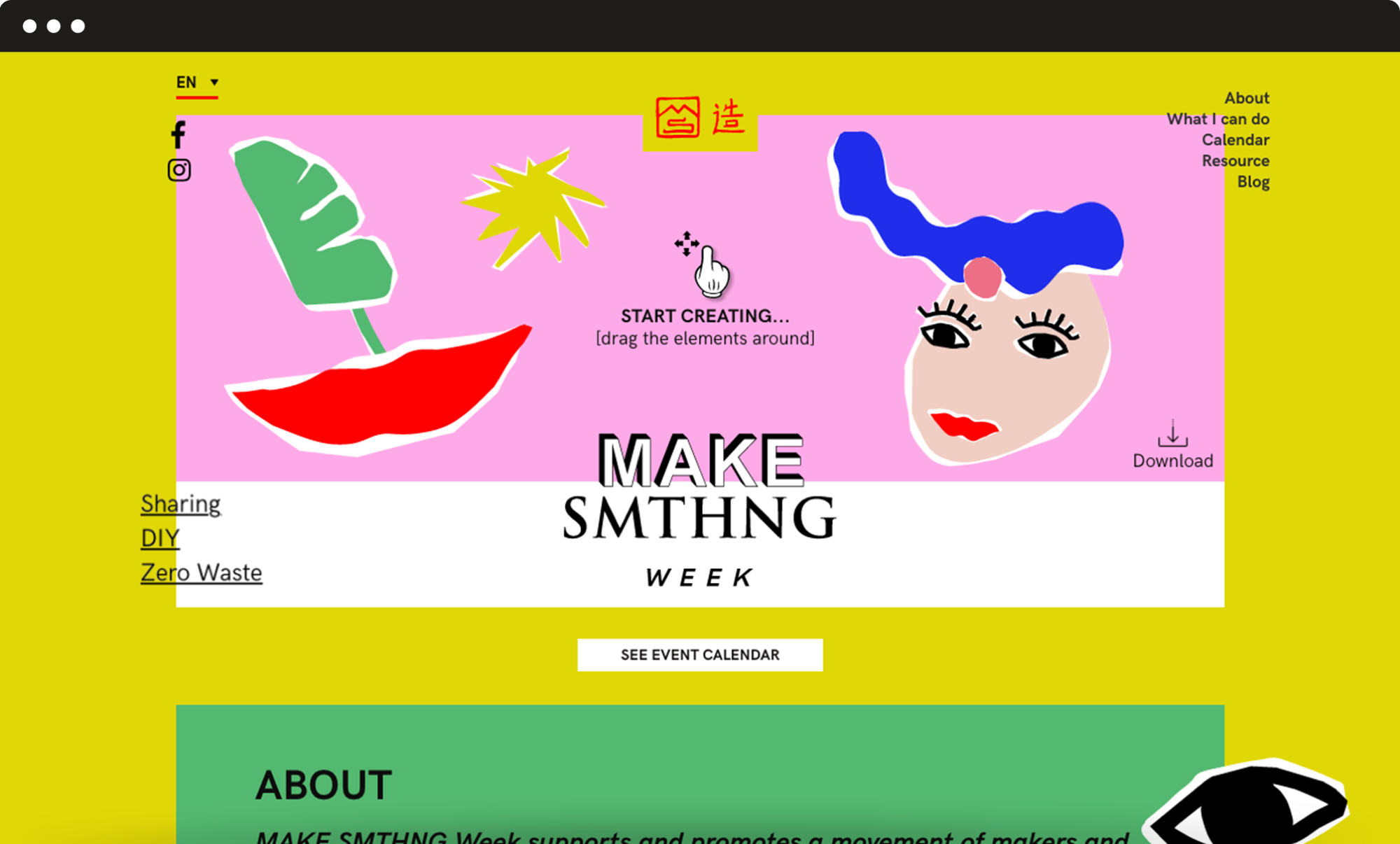
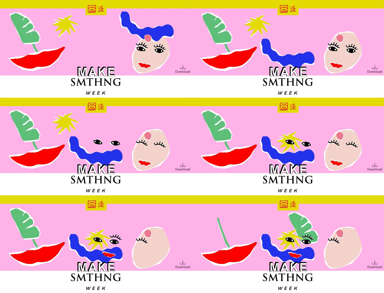
We decided to build a simple and engaging top section where users can drag and drop graphic elements, giving shape to their very own “cover picture”. This tool is very much consistent with the principles of creativity, upcycling and DIY that are at the campaign’s core. It also helped to grab the users’ attention so that they would stay on the website and get interested in offline events.
Information architecture
A series of flexible but consistent modules.
The page had to feature a great variety of contents. We played with the colour palette and graphic elements and designed a series of flexible but consistent modules to make the page navigation smooth and give each piece of content the right importance. We also added a fixed menu with anchor links to the different sections, so that users can easily reach any module with just a click.
Doctors Without Borders –
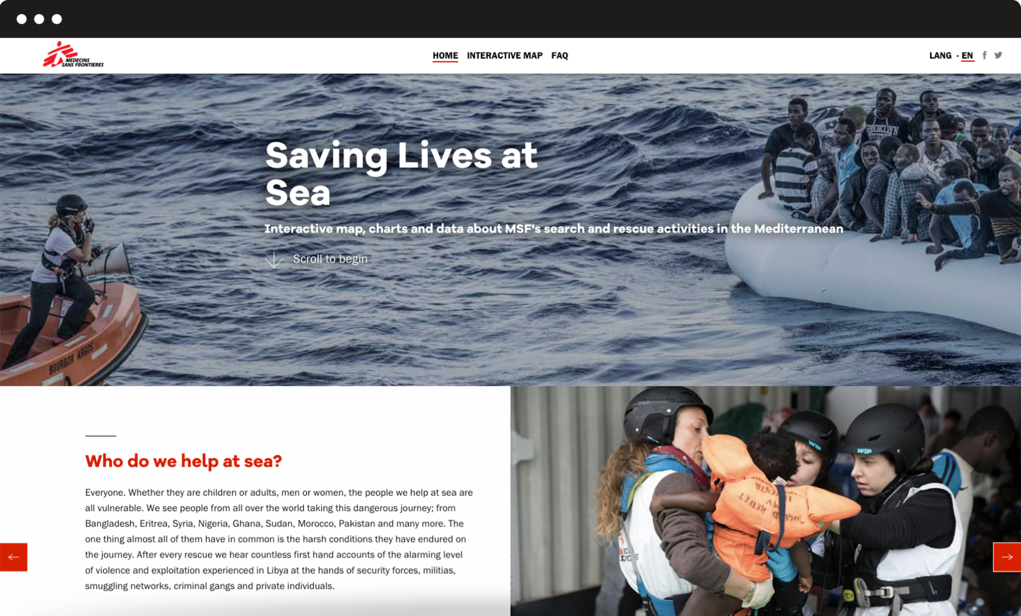
Search and rescue: saving lives at sea
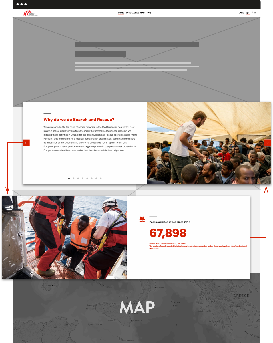
A website with all the information about Search and Rescue activities to show how huge and important is the work done by MSF in the Mediterranean, with an interactive map and detailed graphs.
Data visualization
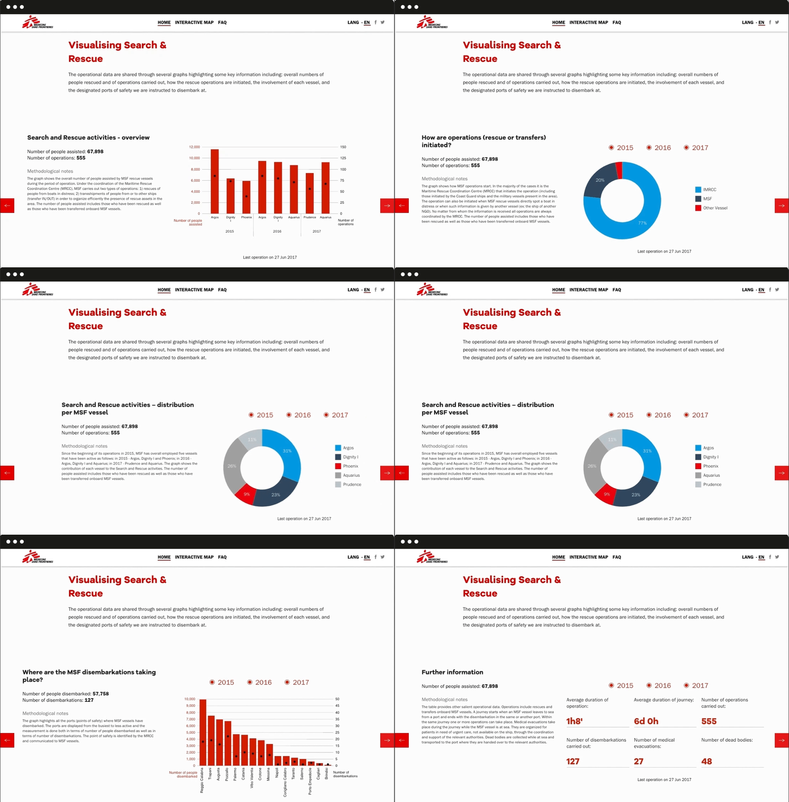
Images work better than words when explaining complex facts.
Data and visual reports allow the user to easily interpret MSF activities: everyone can quickly grasp the most significant information on MSF rescue operations in the Mediterranean from 2015 until today thanks to mouseover functions and filters to select specific years of activity.
Interaction
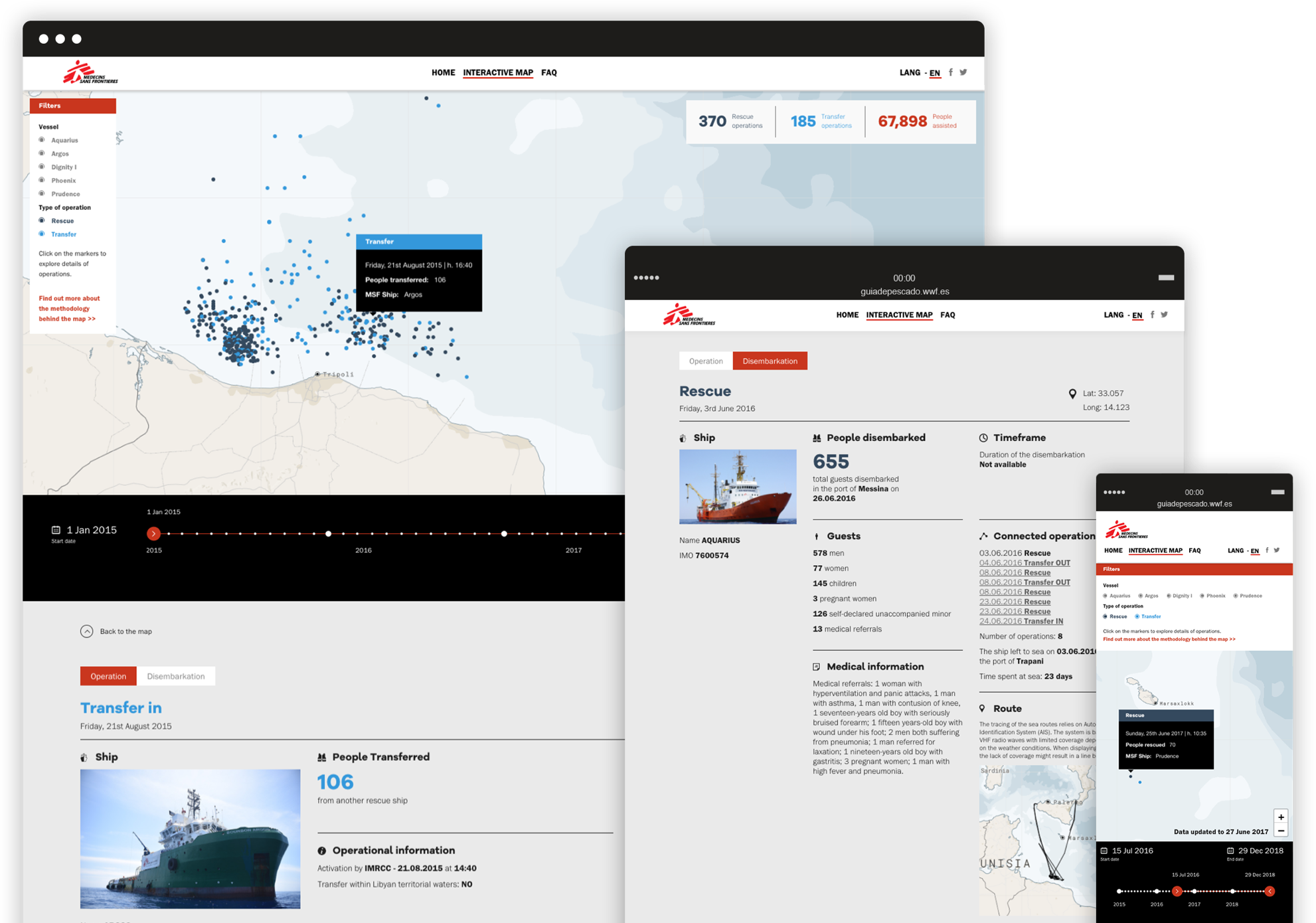
An interactive map that allows the user to explore a lot of information in an engaging and easy way.
Together with Code for Africa we implemented the interactive map, a tool that allows the user to explore a lot of information in an engaging and easy way.
Filters can be used to select specific vessels and different types of the operation, while ships are displayed by dots that, when clicked, open a data sheet with detailed information such as the number of people rescued and the duration of every operation.
Flexibility
A modular structure that doesn’t interfere with the stability of the site.
The entire website has been designed and developed in a very short time, while different contents were being constantly produced, updated and translated even after the launch. The need for it to be as much flexible and yet stable as possible was crucial, so we built a structure based on modules that can be filled and assembled in different ways without affecting the site’s overall stability and always ensuring smooth navigation throughout the pages.
Greenpeace –
Save the Arctic 2.0
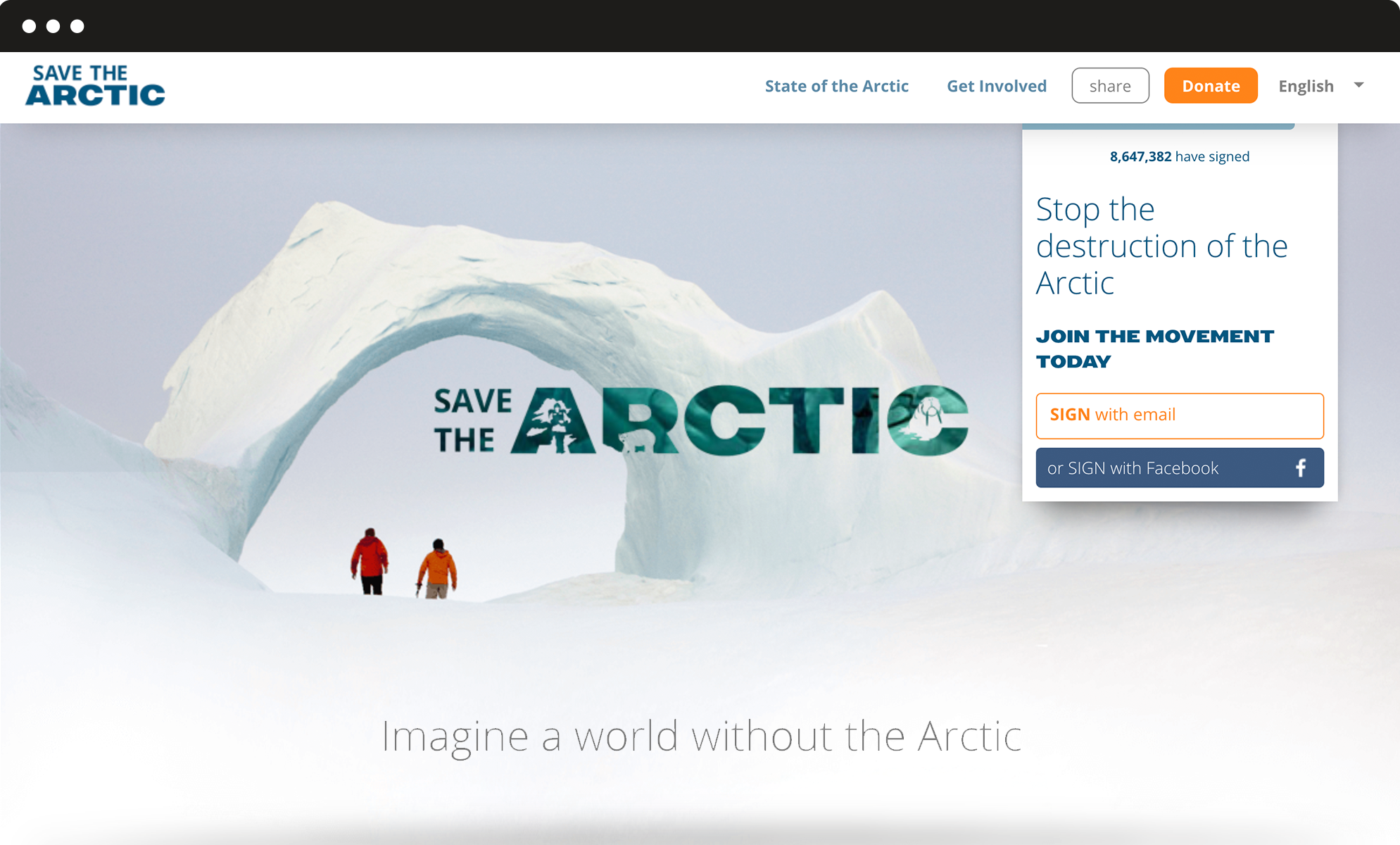
Greenpeace International asked us to redesign the main site of the Arctic campaign. After our successful redesign of the platform, it was time to move from an overarching single homepage to a richer and more complex website.
Information architecture
A first-level menu for the important sections and a second-level menu for other pages.
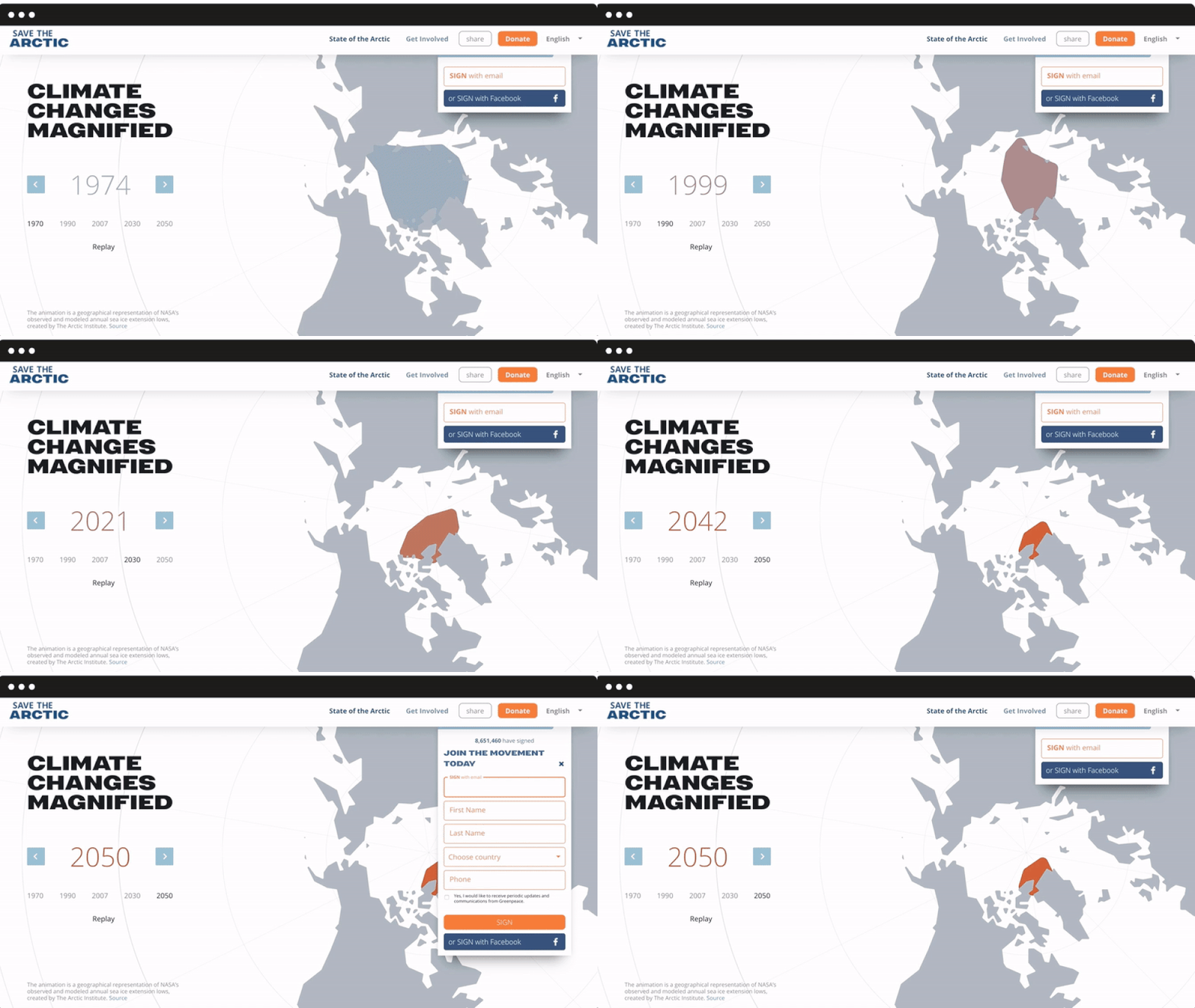
We ran a survey to identify existing strong features as well as expectations, which allowed us to design the site’s structure and new internal pages. We added a first-level menu for the most important sections: State of the Arctic (with interactive charts to display more scientific information) and Get Involved, but also a second-level menu for pages dedicated to the campaign’s history and main petitions. The form behaviour was also revisited, in order to be always visible and fully integrated into the navigation flow.
Mobile responsive
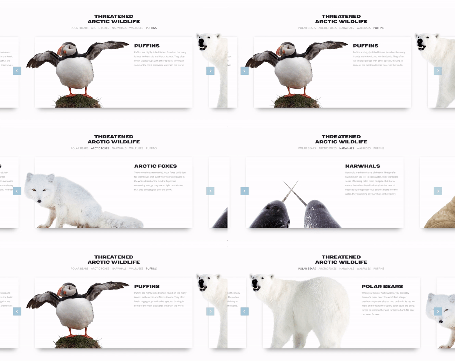
An internal narrative based on sliders and cards to display the most iconic protagonists of the campaign.
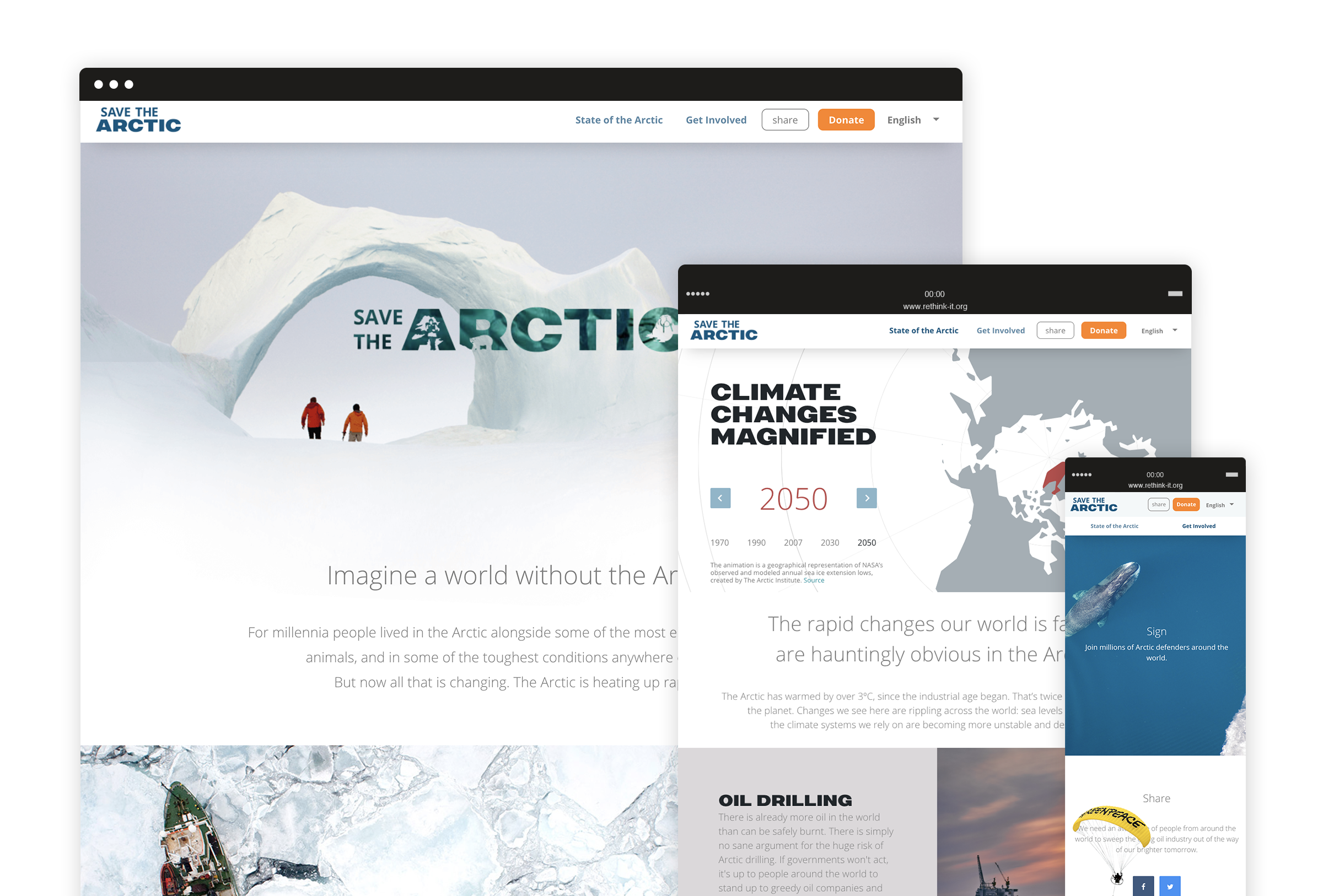
Throughout the website are highlight achievements and list the actions people can make every day to support the Arctic. Such horizontal structure is highly usable on mobile devices and it allows users to smoothly discover different contents with the top of a finger. We also designed a super lightweight petition template optimized for slower connections and mobile use, focusing on key contents and, of course, the signup form.
A new visual language
A new way to talk about the Arctic and communicate key concepts through visual design.
We got inspired by how Greenpeace describes the Arctic today: a fragile sanctuary, a gorgeous, almost sacred place that belongs to everyone and needs to be protected. We used airy spaces, top view photography, light typography and white shades to convey the concepts of untouchable beauty and fragility, whereas urgency and calls to action stand out thanks to brighter colours and bold fonts. All over the website, we used carefully selected images to visually guide the user through the campaign and reinforce the storytelling.
C.N.G.E.I. –
Between past and future
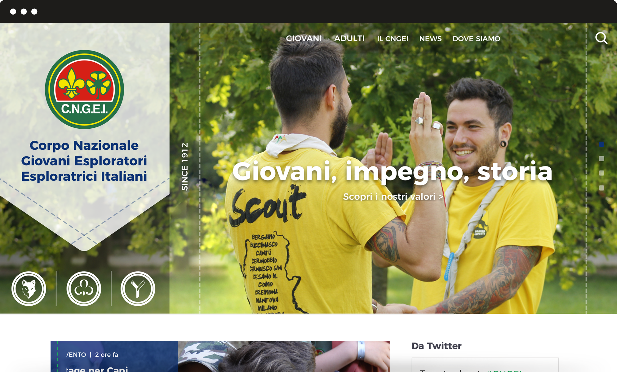
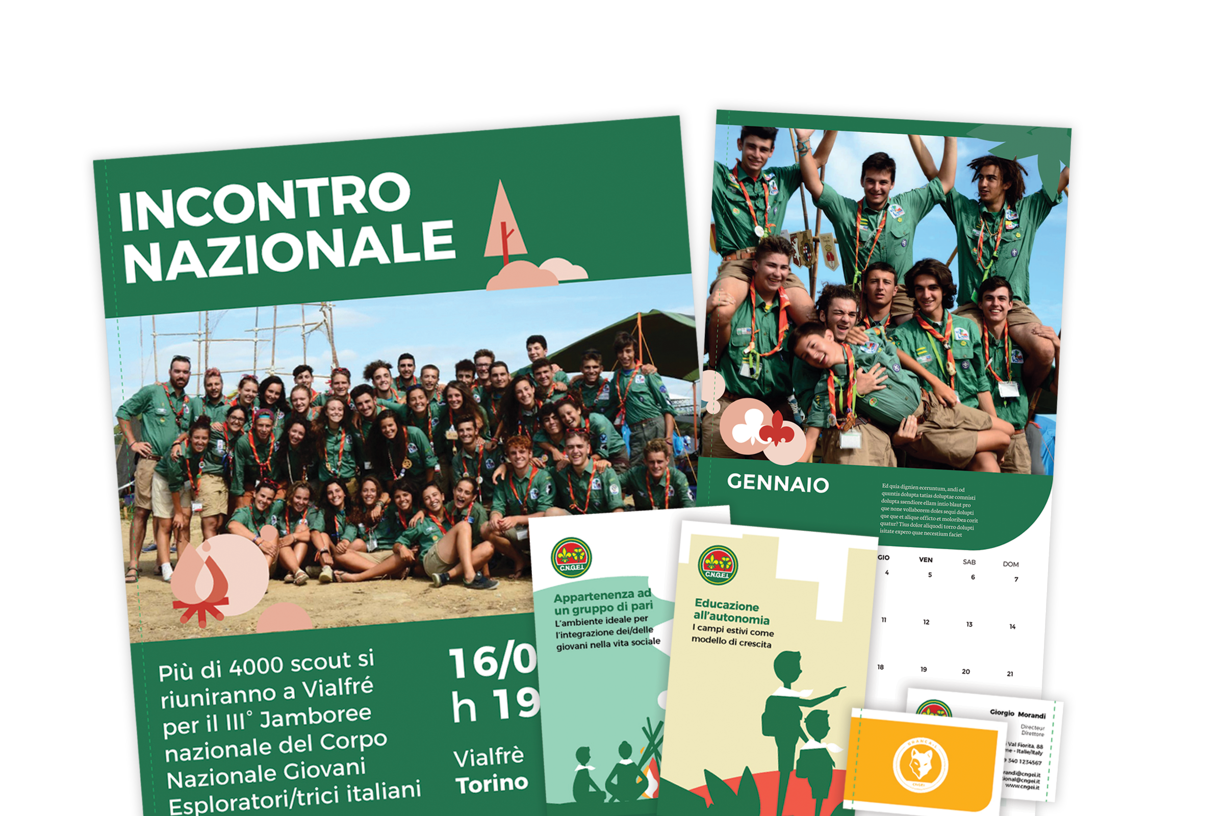
Our challenge was to restyle the visual identity of the CNGEI association, creating a system for both online and offline communication able to preserve traditional symbols while also moving them towards the future.
Brand identity
New logos for each section and branch.
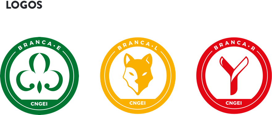
CNGEI is an association structured in branches and sectors that need their own logo. We developed a colour palette and designed brand new logos for each section and branch. The circular shape ensures homogeneity and consistency with the main CNGEI logo provided by the Association.
The result is immediate, simple, readable, recognizable and extremely flexible.
Visual identity
A suitable visual for all levels and structures.
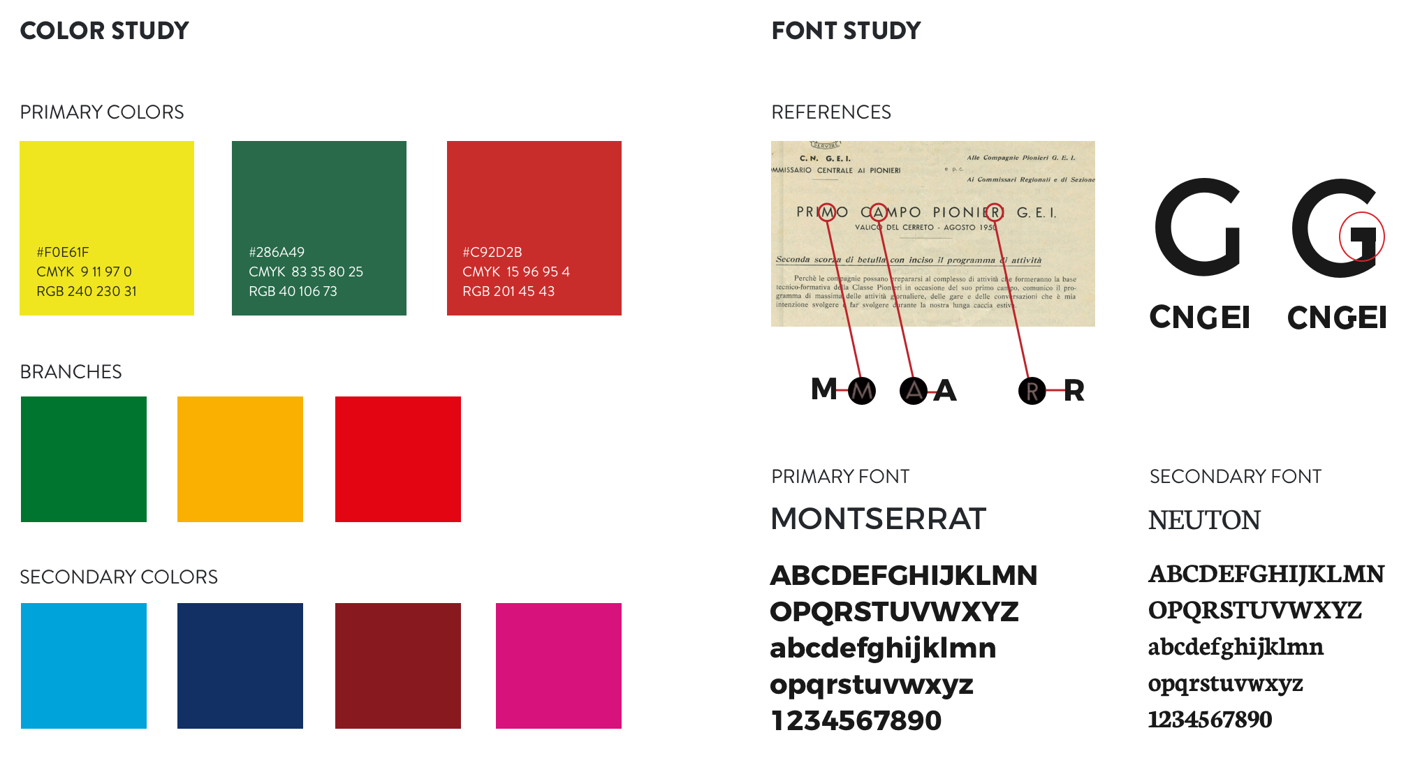
Our main challenge was to provide a precise and consistent visual approach, suitable for all levels and structures within the organization. We also designed patterns to renovate the main templates for both online and offline communication.
Information architecture
A website that simplifies and optimize the navigation flow.
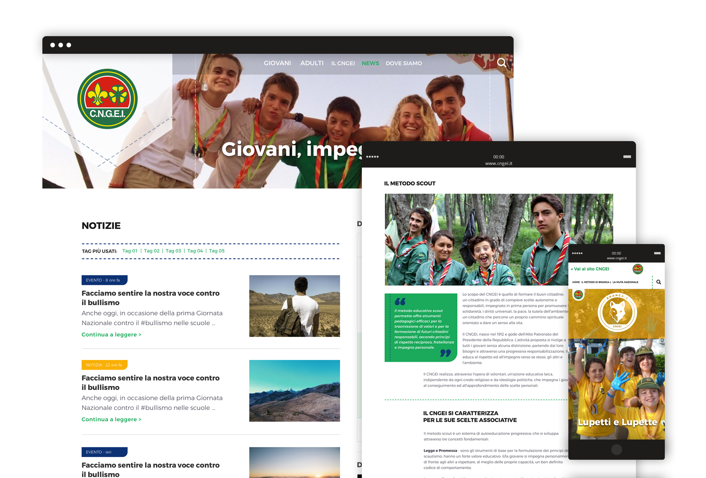
We completely redesigned the information architecture of CNGEI website to simplify and optimize the navigation flow. The header serves as a launcher to access the three mini-sites related to specific sections, in order to meet the interests and needs of different kinds of users.
In defence of animals –
Make a difference for animals
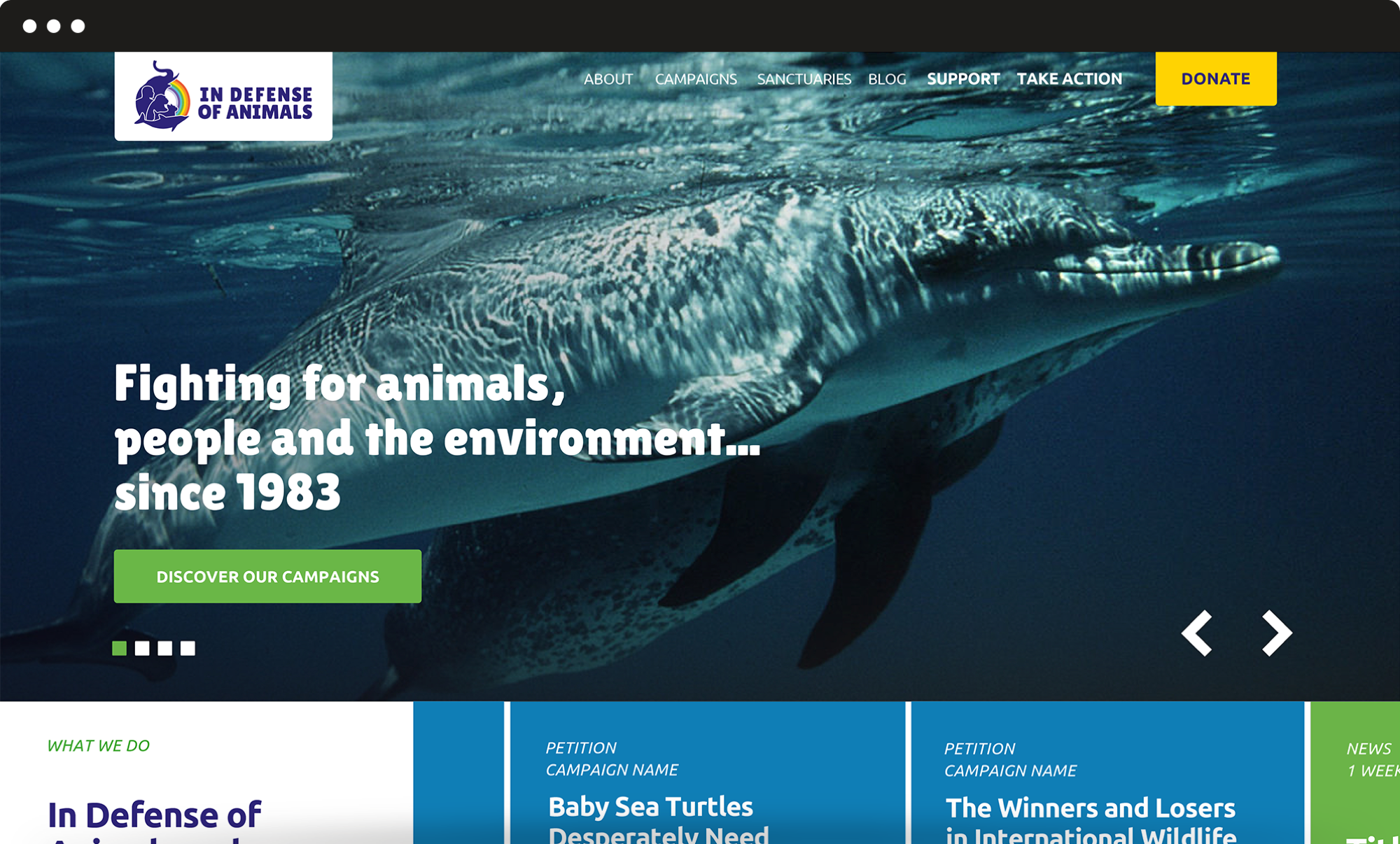
Since 1983 IDA US fights for animal rights. They asked us to renovate the organization’s brand identity, developing a new logo and restyling the website. Our main challenge was to create a new identity in which key visual elements were maintained with a fresh and inspiring feeling. We also developed a new website based on multi-level information architecture, able to answer specific communication needs for every single running campaign.
Rebranding
A new visual identity original and durable.
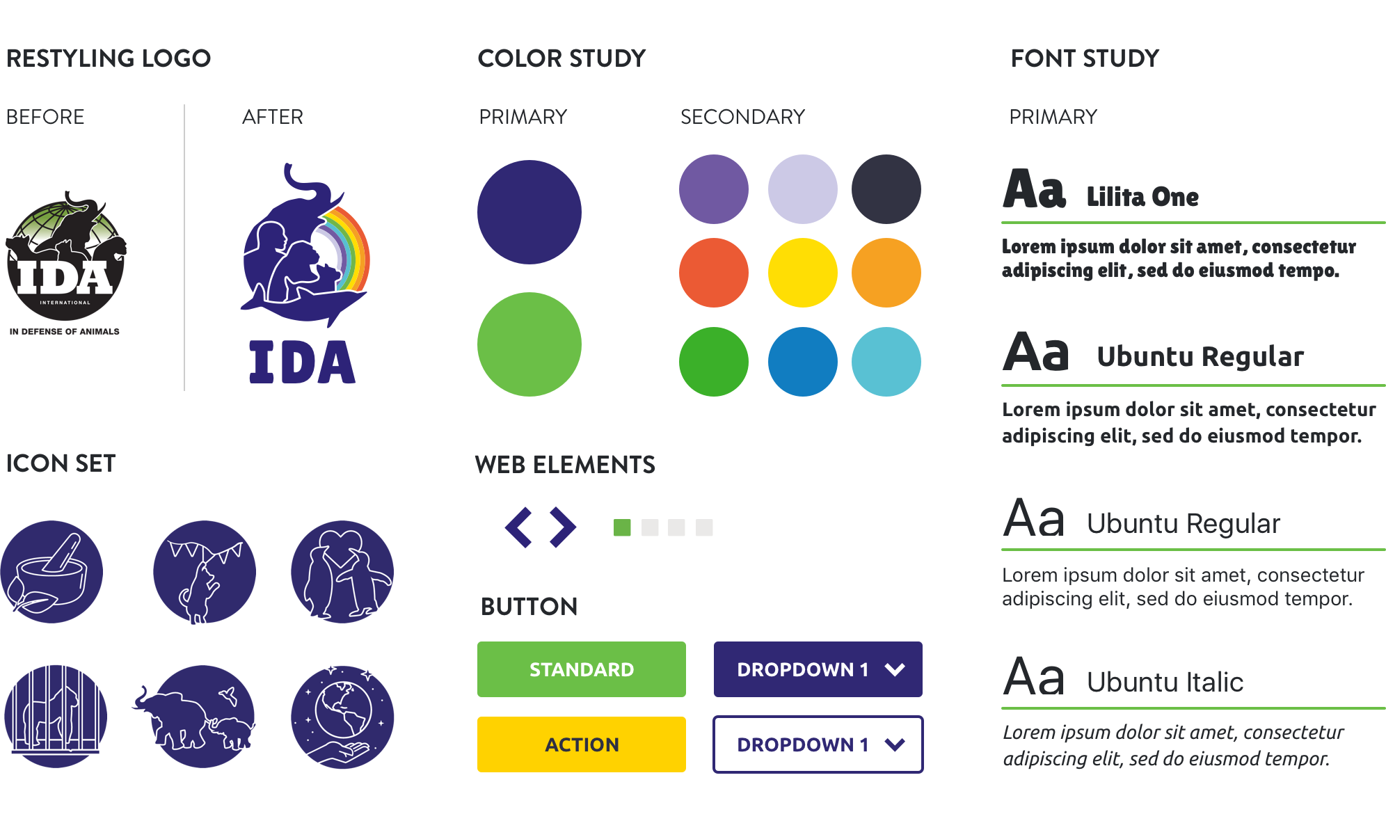
For the redesign of the logo, we developed a composition to renovate the pivotal elements of IDA US brand identity. We identified a new colour palette and a new font that ensure an original and yet durable result. The overall rebranding process resulted in a new visual identity able to better convey the organization’s values and objectives.
Information architecture
A new structure for a great number of contents.
The main goal of the website was to finalize a new structure for a great number of contents that required to be featured online. We analysed the website performances and analytics and identified scenarios and personas as well as high-priority activities.
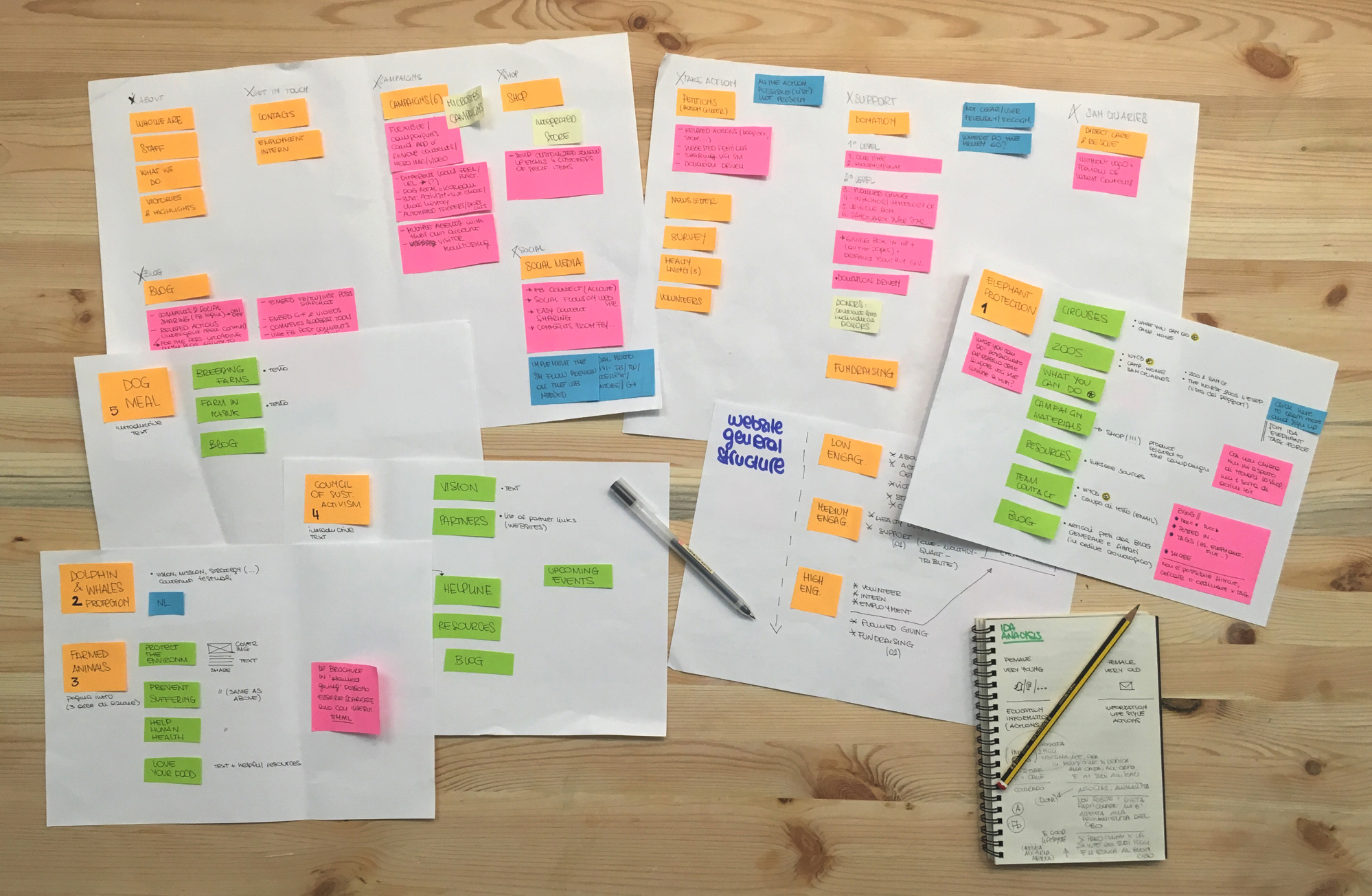
User flow
A simpler process for accessing information.
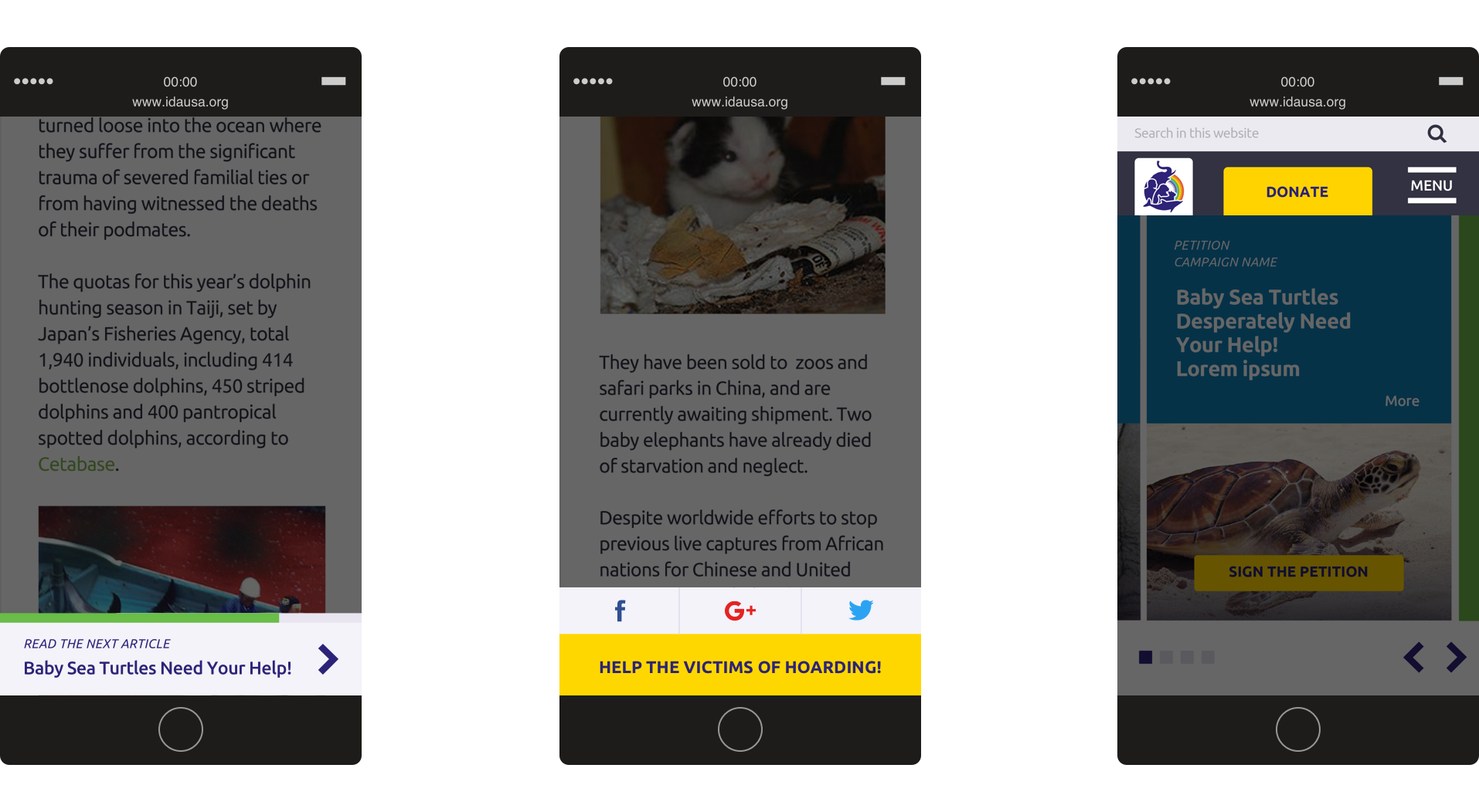
We organized the user flow around graphic elements and shortcuts. These solutions allowed for a huge improvement of the user experience and simplified the process of accessing information, by offering alternative routes and an optimized funnelling mechanism.
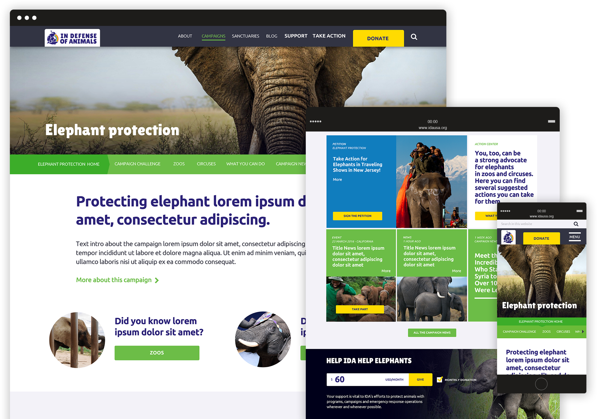
Mini-sites
A flexible and customizable template.
The activities of IDA US are based on multiple campaigns that run simultaneously. To answer these communication needs, we designed a flexible template for campaign mini-sites, which can be easily customized with text, visual elements and specific calls to action.
Amnesty international Italy –
We take injustice personally
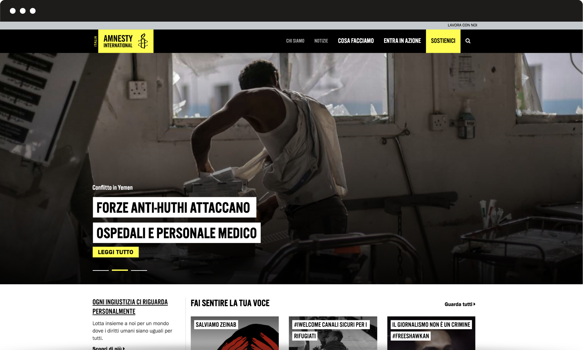
We worked with Amnesty International Italy to redesign their website: our main challenge was to simplify the user experience and optimize the information structure. The first step towards a redesign of the user experience. We identified scenarios, personas, activities to meet the user’s needs.
Human centered design
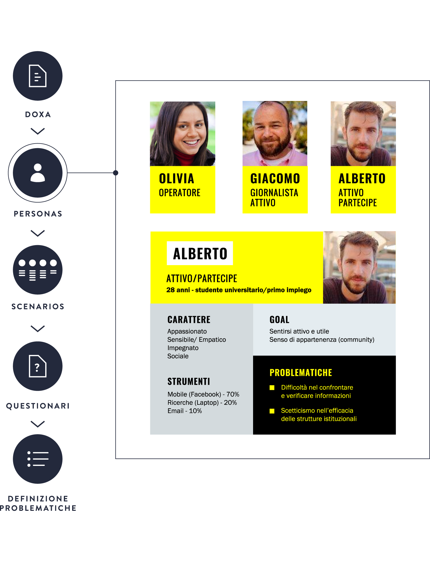
Who is the user of Amnesty International Italia website and what does she/he look for?
Answering such questions was the first step towards a redesign of the user experience. Through an accurate user research based on a poll and several tests, we were able to identify scenarios and personas, define high-priority activities and effectively meet the user’s needs.
Information architecture
A simplified user flow that allows actions and offers information.
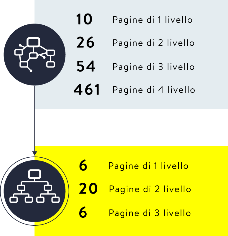
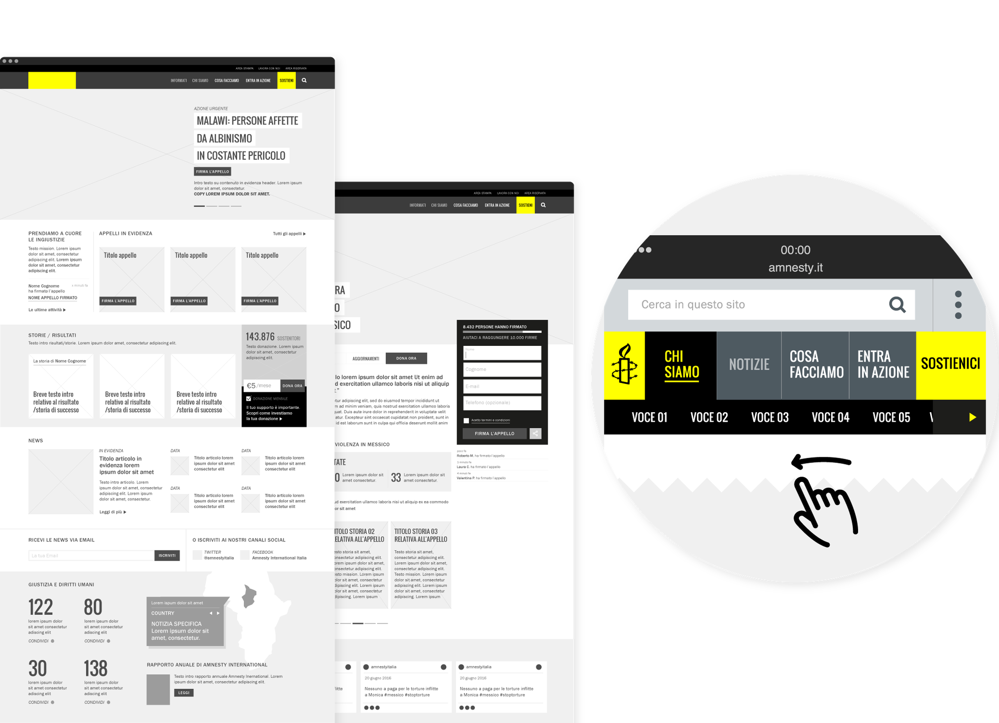
Amnesty International website is a multi-layered environment: we simplified the user flow by reducing first-level pages and optimizing the organization of second-level and additional pages. Thanks to internal shortcuts and the search function, users can easily move from information to action.
User experience
A unified experience and user recognition.
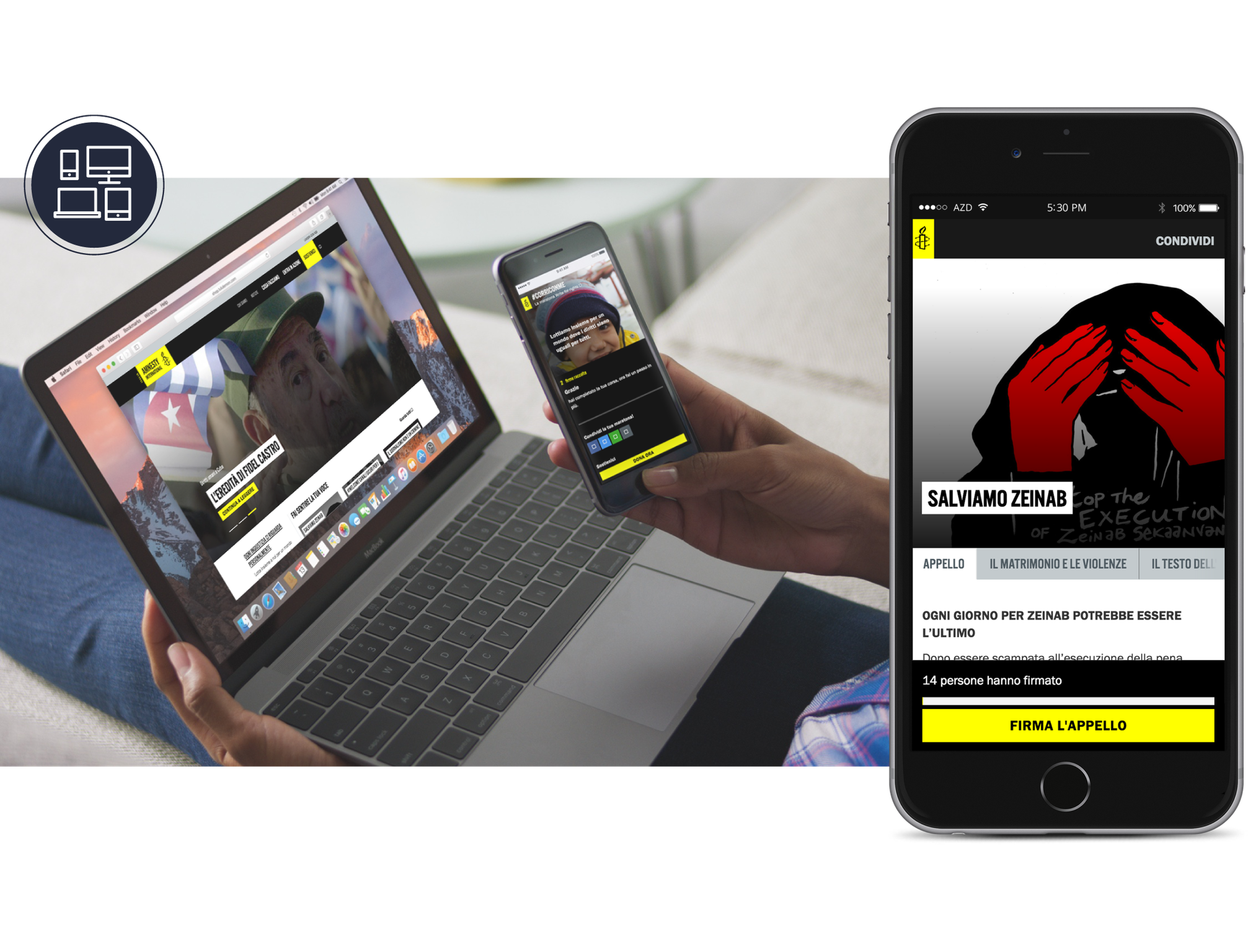
Today web users are multi-screen users, thus we designed a unified experience, which provides a coherent passage from one device to another: you can start a session on your desktop computer and complete it from mobile. We implemented the signing-up flow with specific features, such as the recognition of the user and his/her previous actions.
User interface
A flexible and maintainable interface.
Amnesty International Italia is a dynamic website that needs to be frequently updated: new actions, campaigns and petitions are the main tools to fight for human rights. We designed a flexible and maintainable interface based on customizable templates, which can easily be adjusted to any specific situation.
Agesci –
Redesigning the tradition
Agesci contributes to the education promoting out-of-school activities following the principles of scouts. We built a multi-level information architecture for the website and designed a new visual identity, in order to meet the needs of local groups as well as national departments. We worked with Agesci in creating a new path towards the future.
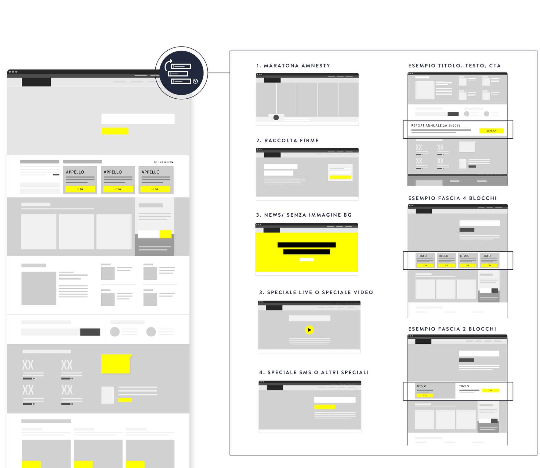
Information architecture
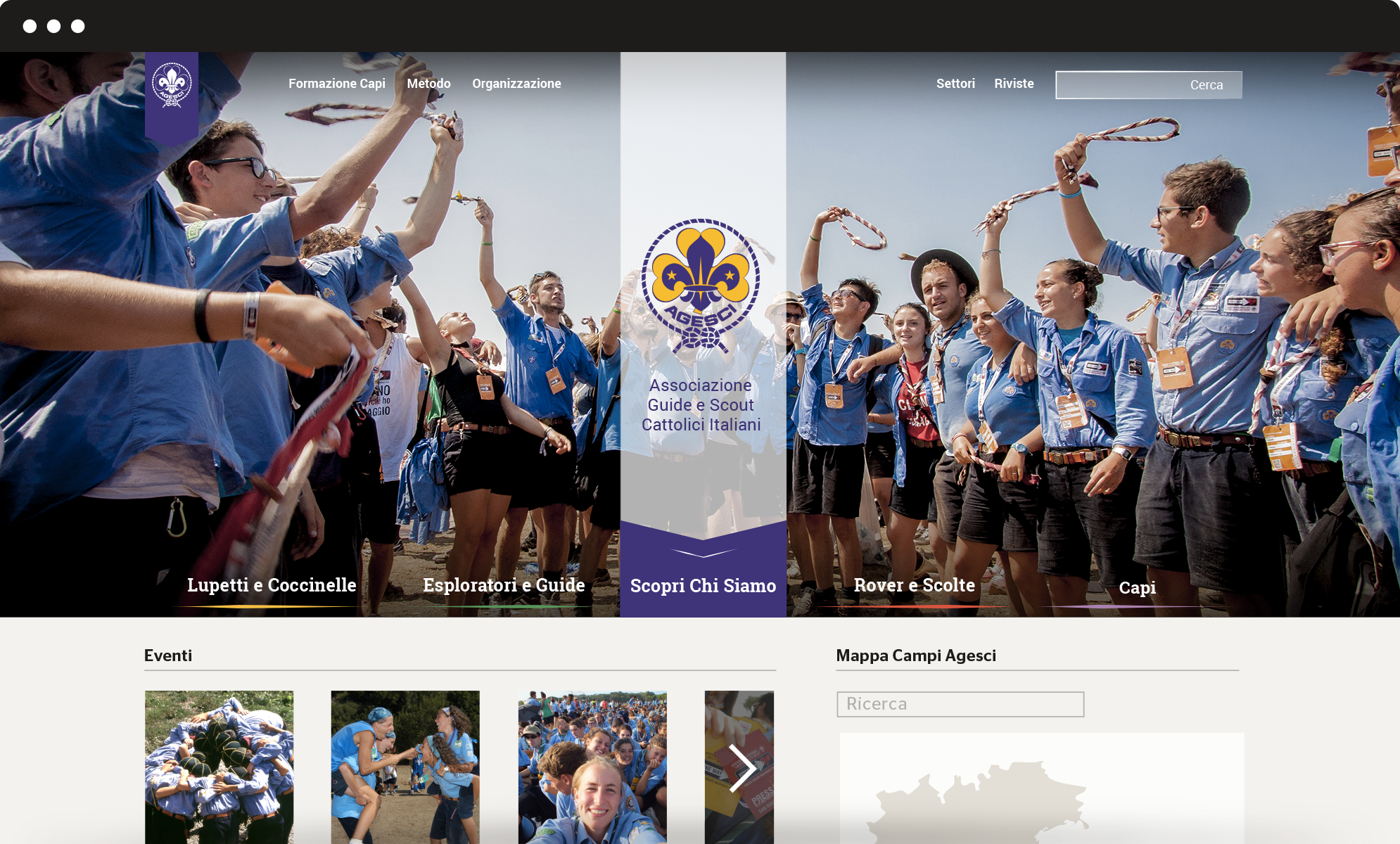
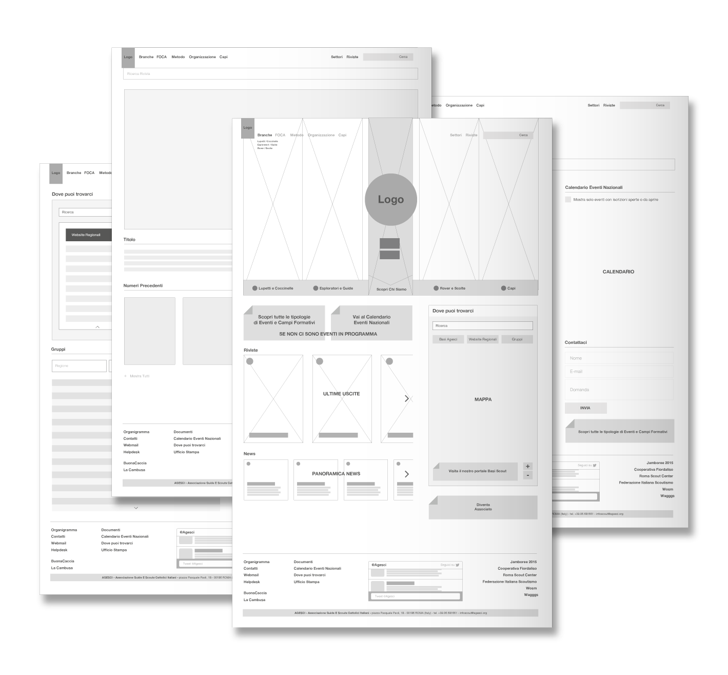
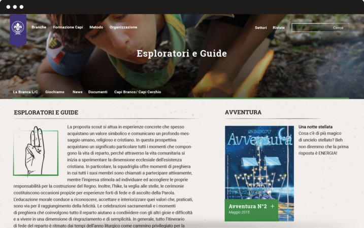
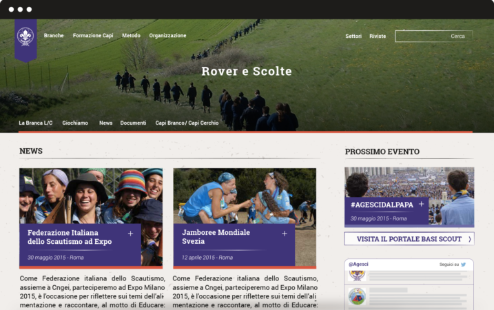
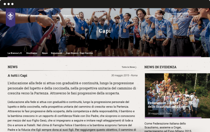
We completely redesigned the information architecture of Agesci website to simplify and optimize the navigation flow. The new vertical structure meets the interests of different kinds of users. The header plays a double role: it provides an overview of Agesci’s world and serves as a launcher to get access to specific sections.
We also created four mini-sites for every branch: Lupetti and Coccinelle (8 to 12 years old), Esploratori and Guide (12 to 16 years old), Rover and Scolte (16 to 21 years old), Capi (older than 21 years old). Each has its own colour.
Graphic layout
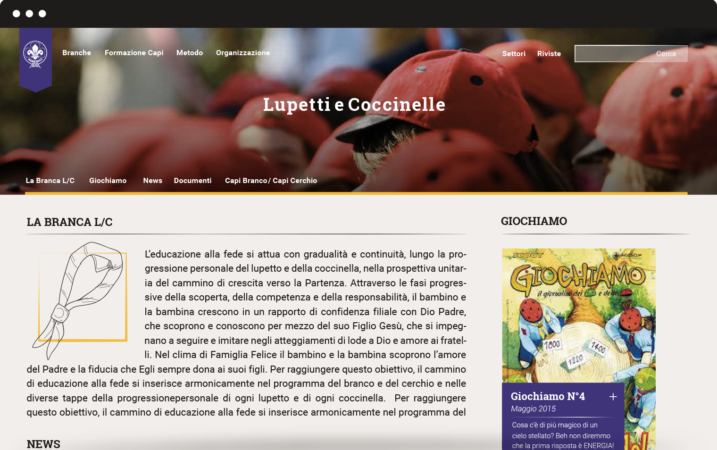
We succeeded in finding graphic solutions that hold together tradition and innovation. Gold and violet are the traditional colours of Agesci logo: we chose three different shades of violet and combined them with three complementary colours, to let the violet emerge as the prominent colour. To guarantee high readability we chose Roboto and its serif version Roboto Slab as font: this choice also reflects special care for tradition because it’s very similar to some fonts used for scouting manuals at the beginning of the century.
Visual identity
We worked on restyling the logo for regions, zones and groups and we designed a mono-colour logo mark to be used in informal contexts. We also designed patterns to renovate the main communication templates.
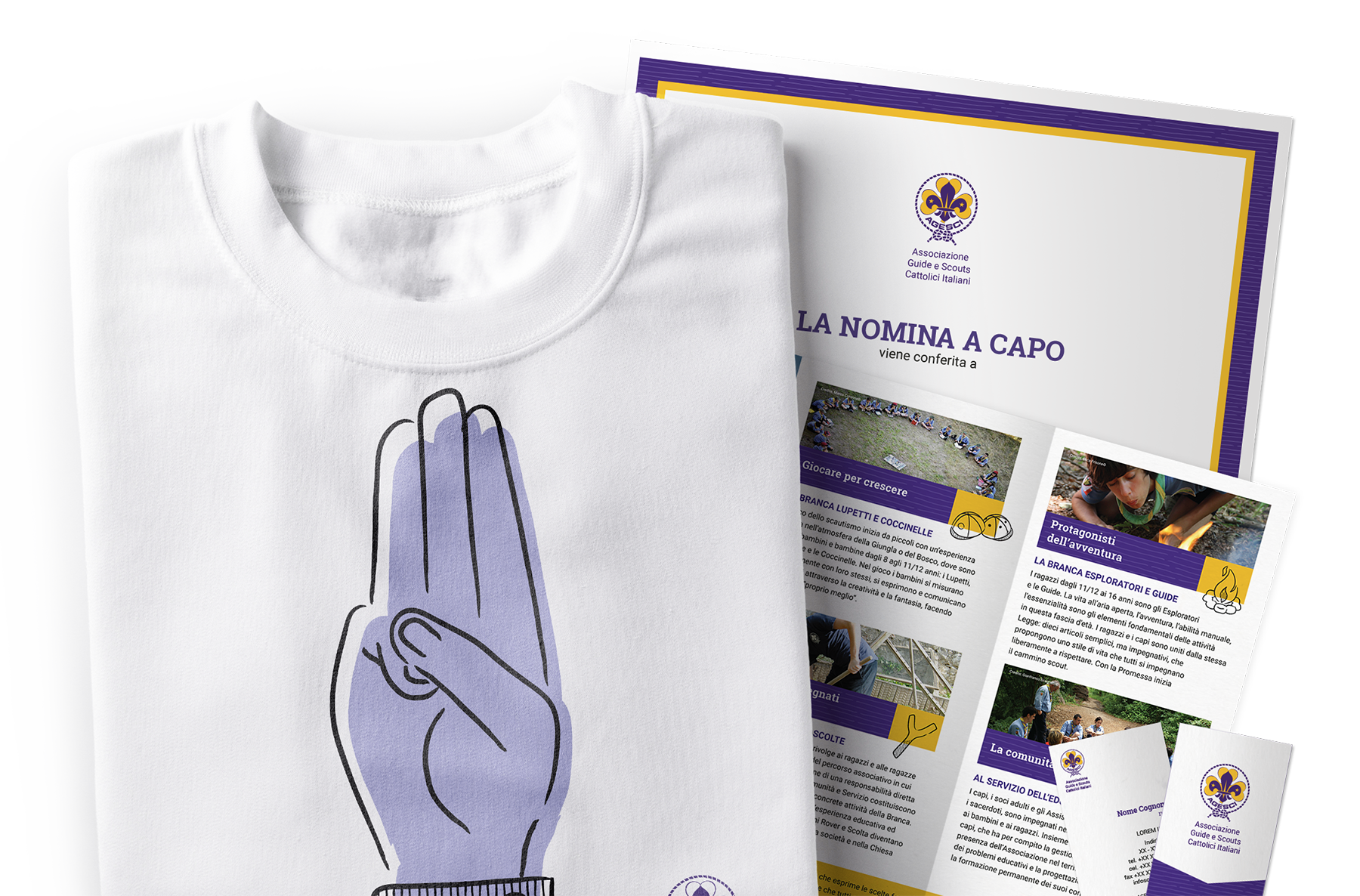
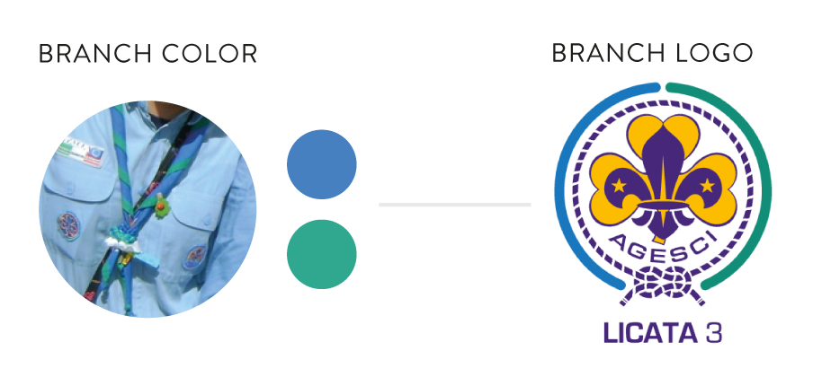
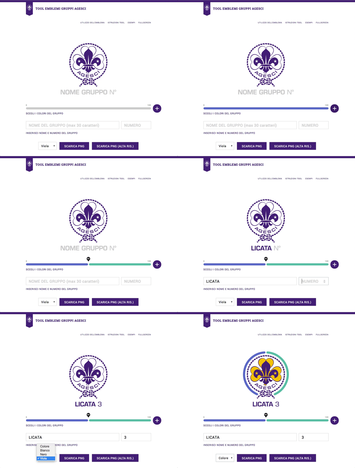
We designed an online tool to customize the logo based on the colours of each group’s iconical handkerchief. The tool allows creating a coloured circle that surrounds the official national logo, becoming the hallmark of the group. This is a user-centred solution that strengthens the coherence of Agesci visual identity while enhancing specific local dimensions.
