Technology: visual identity
Restarting the future –
Corruption emergency
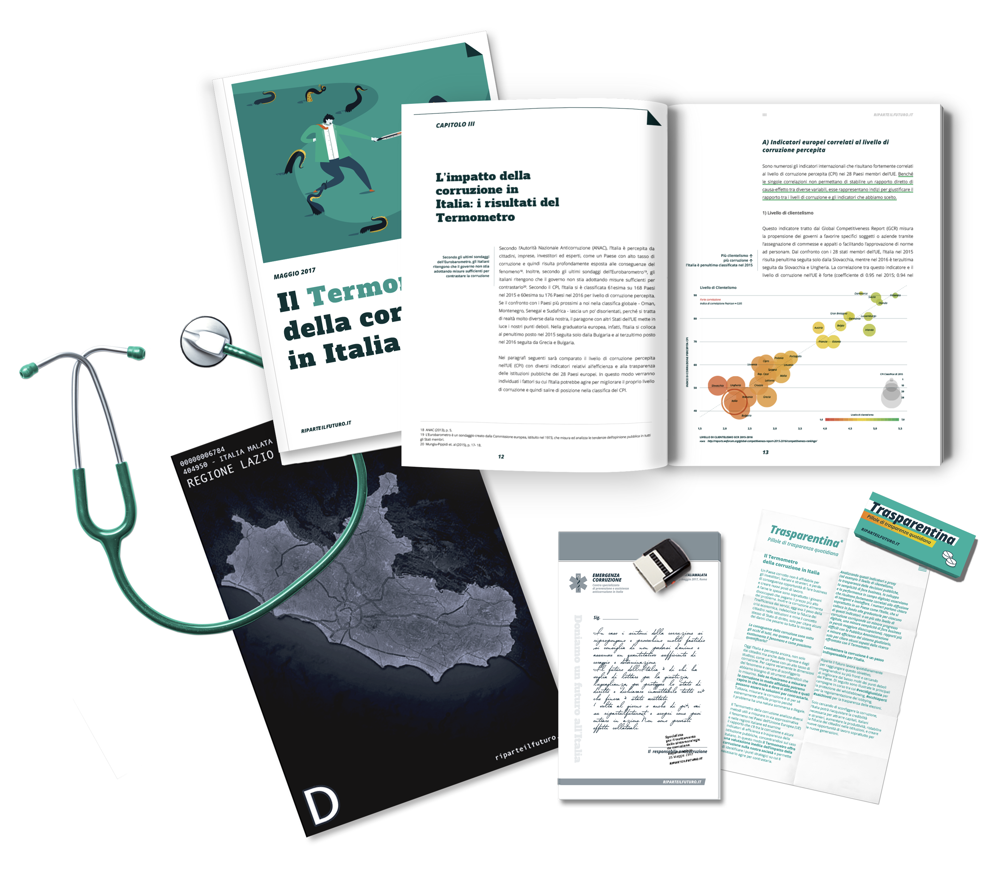
Starting from the corruption report produced by Restarting the future, we developed the website section about the report on corruption produced by Riparte il futuro, and provided creative coordination and communication materials for the “Emergenza Corruzione”, an anti-corruption flash mob, which happened in Rome right after the official presentation of the report at the Italian Parliament.
Data visualisation
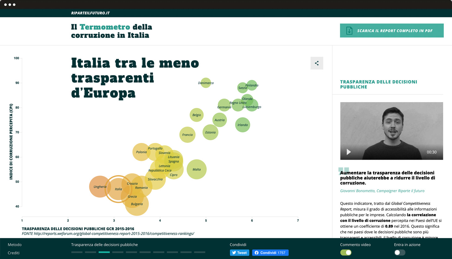
A mobile-first approach providing shareable, interactive graphs and explanatory videos for each topic.
The structure includes a swipe interaction through the different graphs on the left and descriptive videos and texts on the right. Thanks to the colourful charts, data are shown in an analytical, dynamic and intuitive way. A fixed console works as a compass and allows the user to see and download the corruption report. Finally, this console gives you the chance to activate or deactivate some contents, such as videos and calls to action. This allows different kinds of users to customise the page.
Ambient
A unique anti-corruption ambulance.
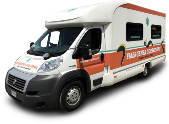
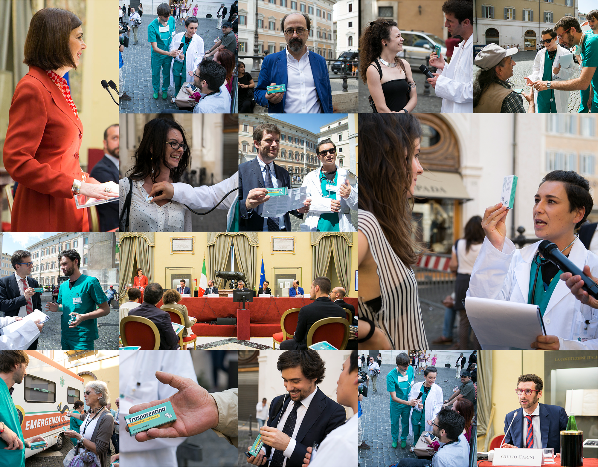
We elaborated an ambient communication strategy that saw its full potential on the day the report was presented at the Italian Parliament. We created a specific design to transform an average van into a unique anti-corruption ambulance.
Action
The streets of Rome played a central role in conveying the main message of the anti-corruption report: more transparency means less corruption.
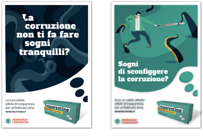
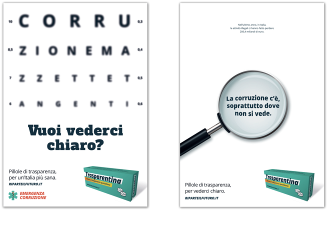
This project wasn’t just online. #EmergenzaCorruzione came to life when, in and out a special anti-corruption ambulance, 12 campaigners dressed up as doctors distributed a special medicine named Trasparentina to pedestrians and politicians. When corruption affects people’s lives, Trasparentina can be the solution!
Visual identity
The metaphor of corruption as a tentacular villain.
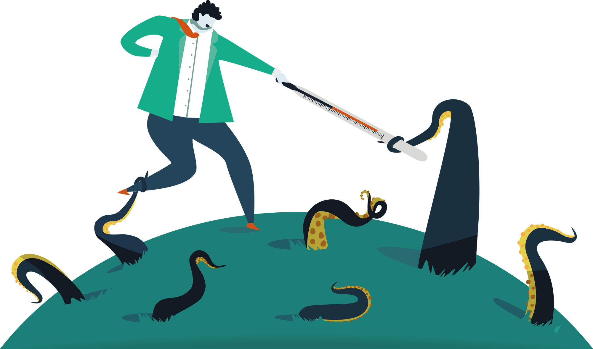
The visual approach, both for the report and the ambient communication, was developed around the metaphor of corruption as a tentacular villain. Indeed, for the report cover, we imagined a fight between a man and an octopus, symbol of corruption. The first is defending himself with a thermometer (Termometro) against this “corrupted octopus”. This motive is recalled on the titles and graphics applied on the anti-corruption vehicle.
Elephant Protection Initiative –
A meaningful future for elephants
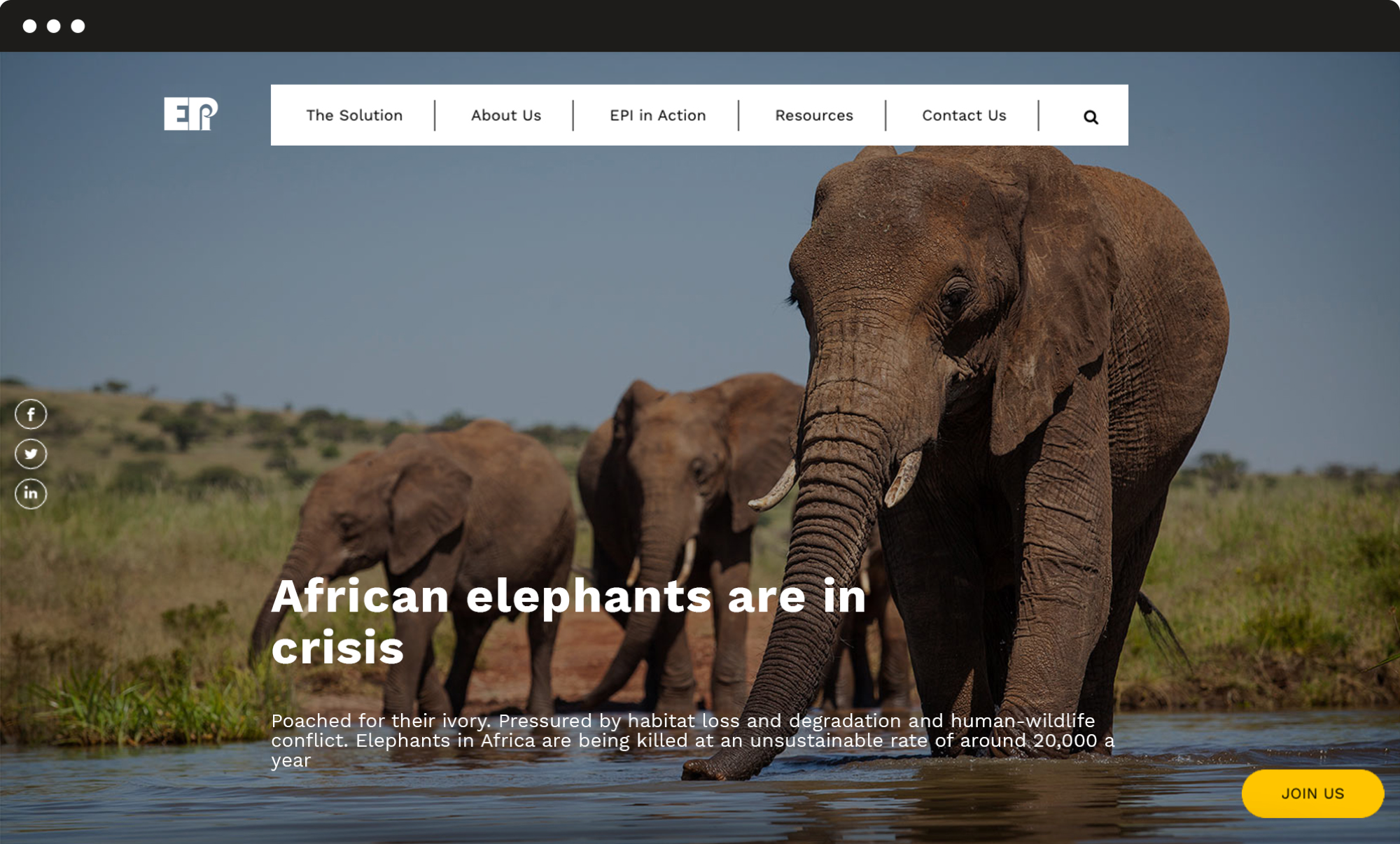
We redesigned the EPI website with a fully refreshed visual identity and a new organization of contents, to facilitate the navigation and drive more users to engage with the campaign.
Visual identity
A stronger and modern identity.
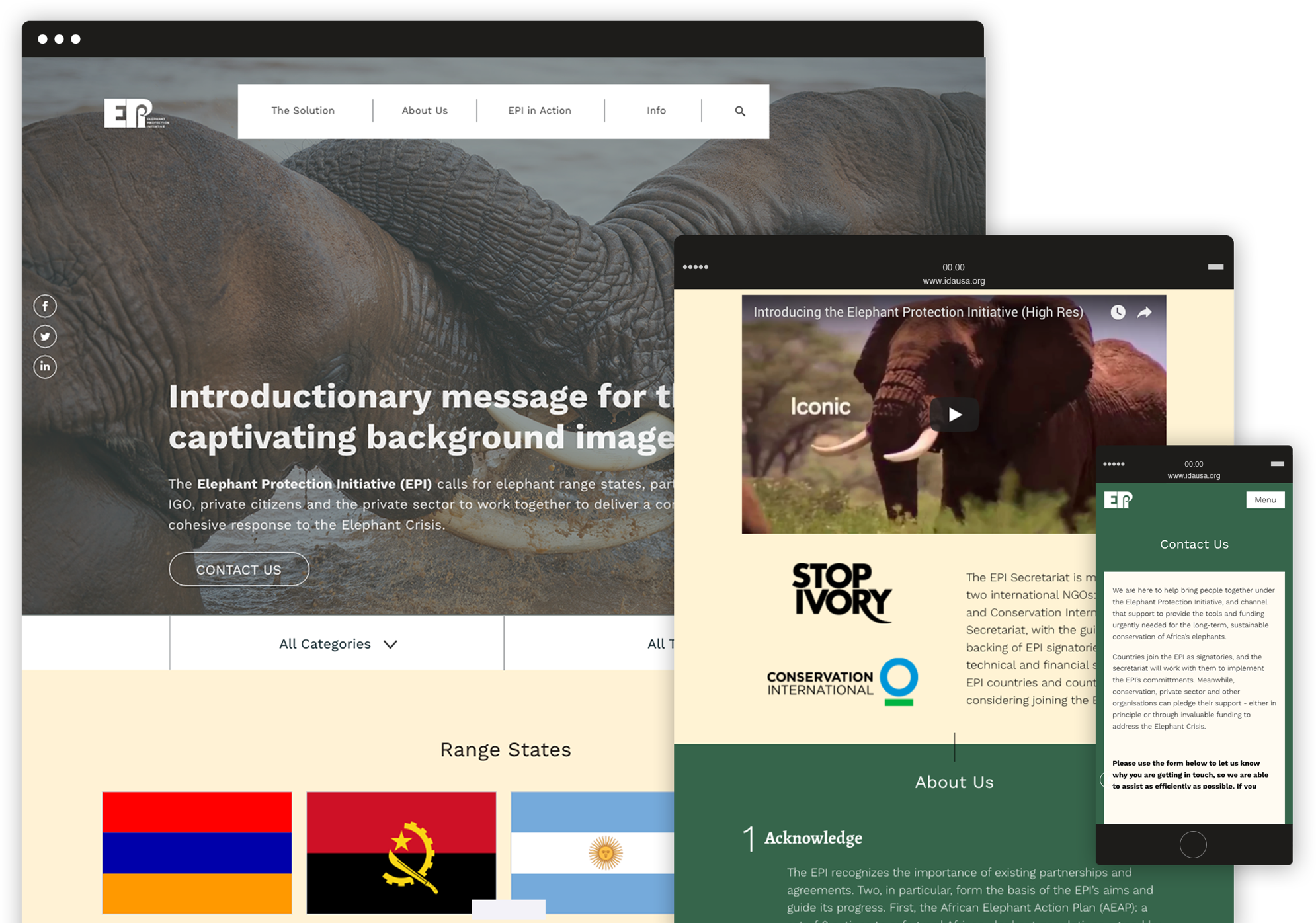
We completely restyled the website’s visual design, choosing a new colour palette and different layouts for the pages in order to provide the organization with a stronger, more modern identity, and support the users’ experience by highlighting the most important contents and calls to action.
User experience
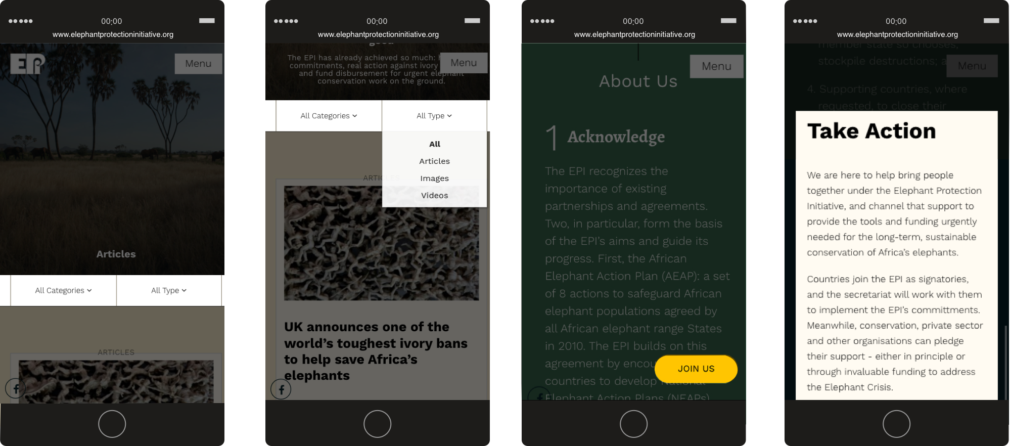
A new flowchart and implemented solutions.
We designed a new flowchart and implemented specific solutions for the main interactive actions that users can take on the website: a fixed Join us button that opens a pop-up form, and a filter system to navigate through many articles and easily find relevant pieces of content.
C.N.G.E.I. –
Between past and future
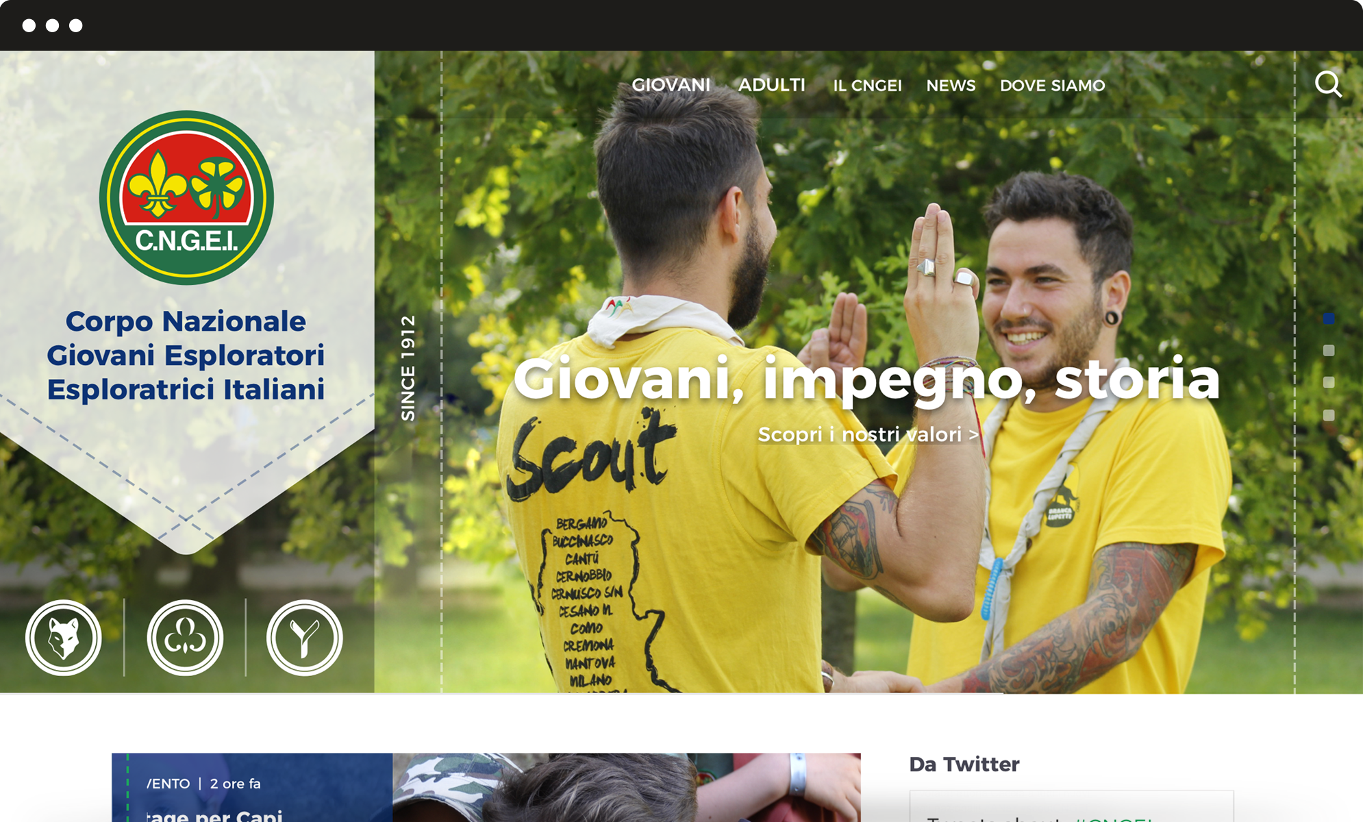
Our challenge was to restyle the visual identity of the CNGEI association, creating a system for both online and offline communication able to preserve traditional symbols while also moving them towards the future.
Brand identity
New logos for each section and branch.
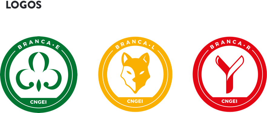
CNGEI is an association structured in branches and sectors that need their own logo. We developed a colour palette and designed brand new logos for each section and branch. The circular shape ensures homogeneity and consistency with the main CNGEI logo provided by the Association.
The result is immediate, simple, readable, recognizable and extremely flexible.
Visual identity
A suitable visual for all levels and structures.
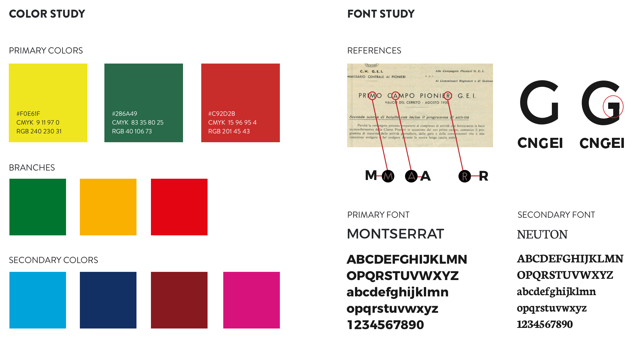
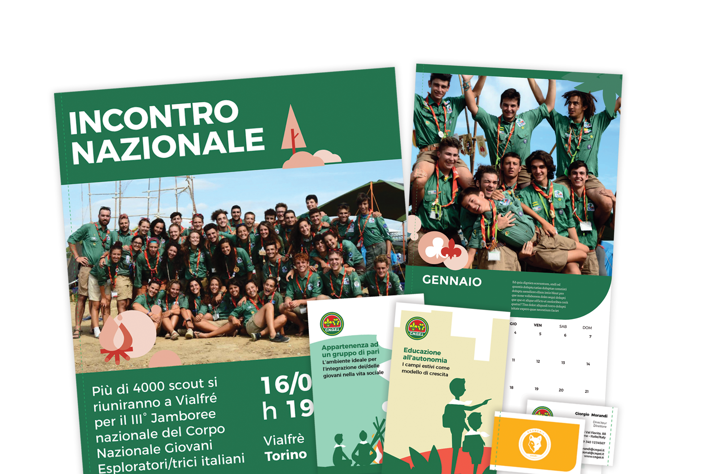
Our main challenge was to provide a precise and consistent visual approach, suitable for all levels and structures within the organization. We also designed patterns to renovate the main templates for both online and offline communication.
Information architecture
A website that simplifies and optimize the navigation flow.
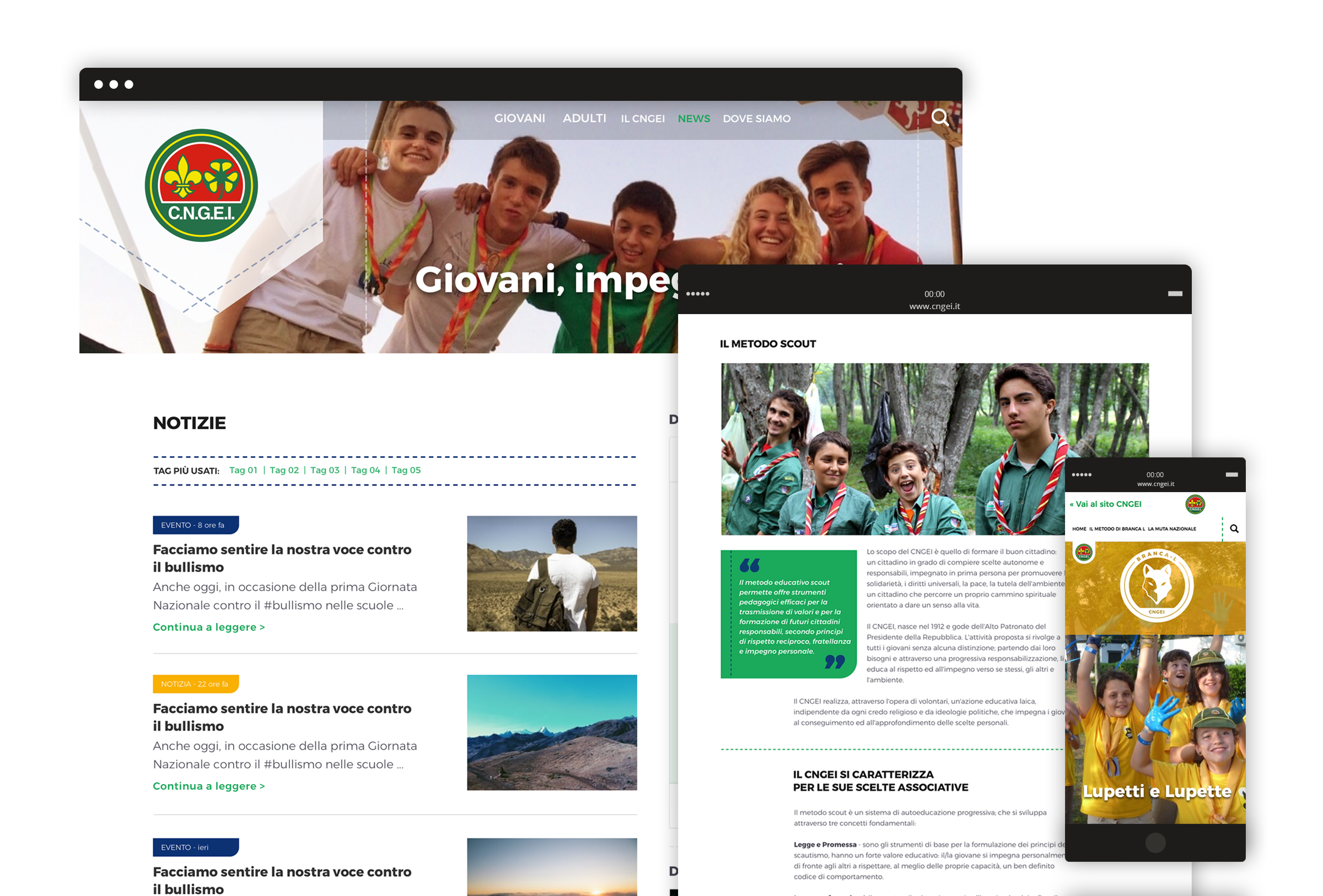
We completely redesigned the information architecture of CNGEI website to simplify and optimize the navigation flow. The header serves as a launcher to access the three mini-sites related to specific sections, in order to meet the interests and needs of different kinds of users.
Housing Europe –
Our homes are where Europe’s future starts
At a time when Europe is confronted with a major housing challenge, Housing Europe presents its campaign for the European Elections 2019. We produced this 2D animated video to show how more people can access affordable housing. The video shows us some of the multiple benefits of living in public, cooperative and social housing, leading up to the call for further support at EU level on the occasion of the Elections.
Narrative choice
For the storytelling structure, we chose a personal perspective in order to create a sense of familiarity in the audience’s mind.
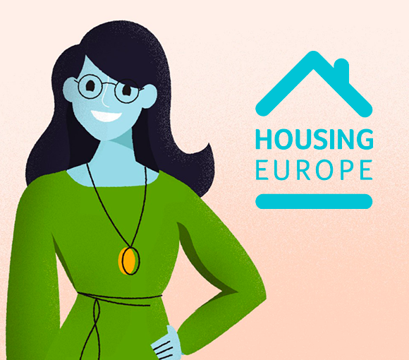
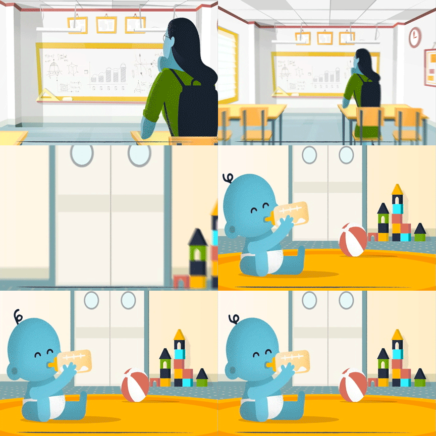
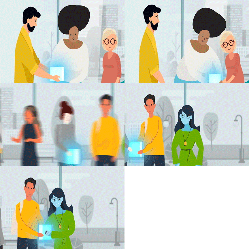
The video thus represents the narrative journey of Christine’s experience in Social Housing, showing its positive outcomes through her point of view.
Visual identity
In addition to being based on the most recent 2D animation’s techniques, the video embodies a fresh and vibrant mood. For its visual identity, we chose a sketchy-illustrated style and pastel shades, suitable for a young target.
Agesci –
Redesigning the tradition
Agesci contributes to the education promoting out-of-school activities following the principles of scouts. We built a multi-level information architecture for the website and designed a new visual identity, in order to meet the needs of local groups as well as national departments. We worked with Agesci in creating a new path towards the future.
Information architecture
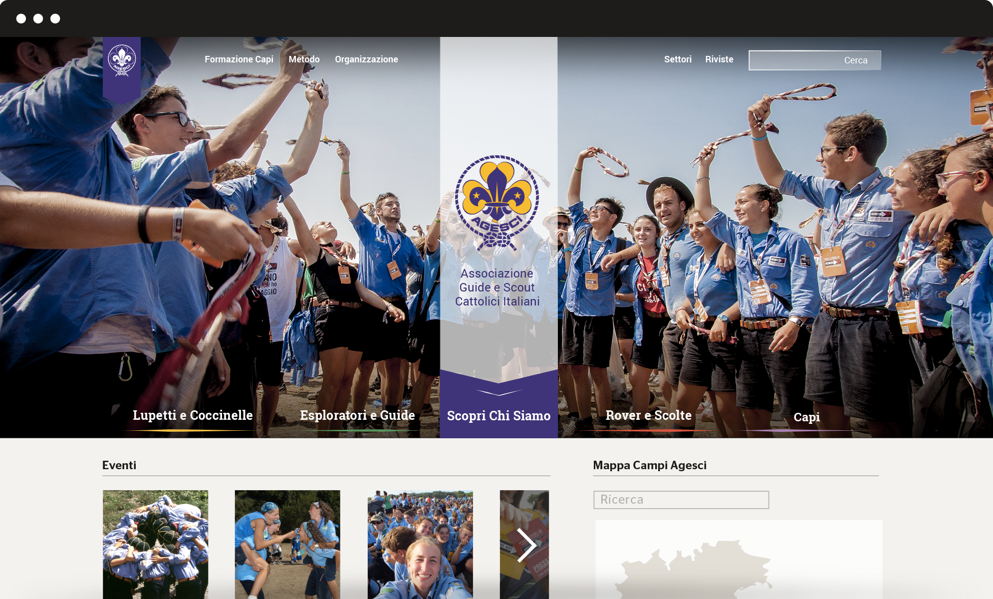
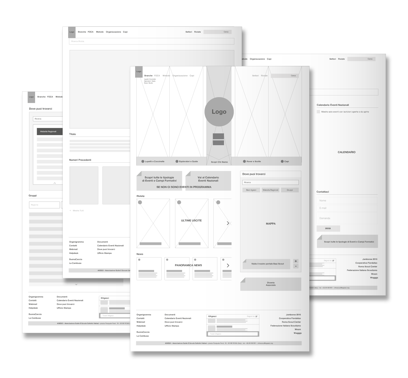
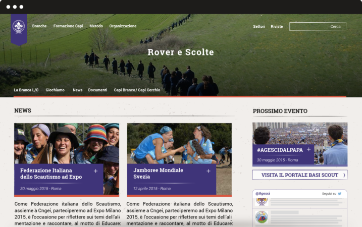
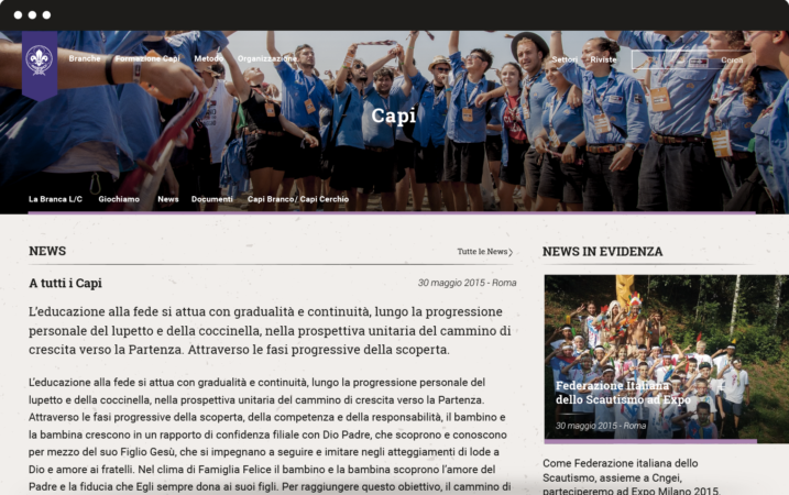
We completely redesigned the information architecture of Agesci website to simplify and optimize the navigation flow. The new vertical structure meets the interests of different kinds of users. The header plays a double role: it provides an overview of Agesci’s world and serves as a launcher to get access to specific sections.
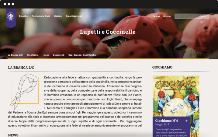
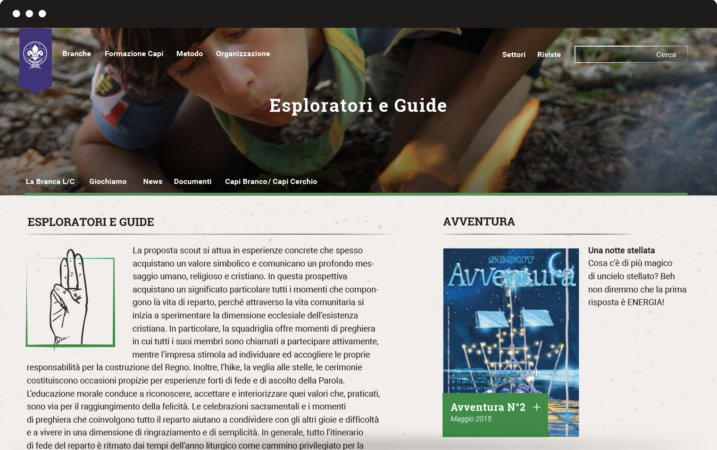
We also created four mini-sites for every branch: Lupetti and Coccinelle (8 to 12 years old), Esploratori and Guide (12 to 16 years old), Rover and Scolte (16 to 21 years old), Capi (older than 21 years old). Each has its own colour.
Graphic layout
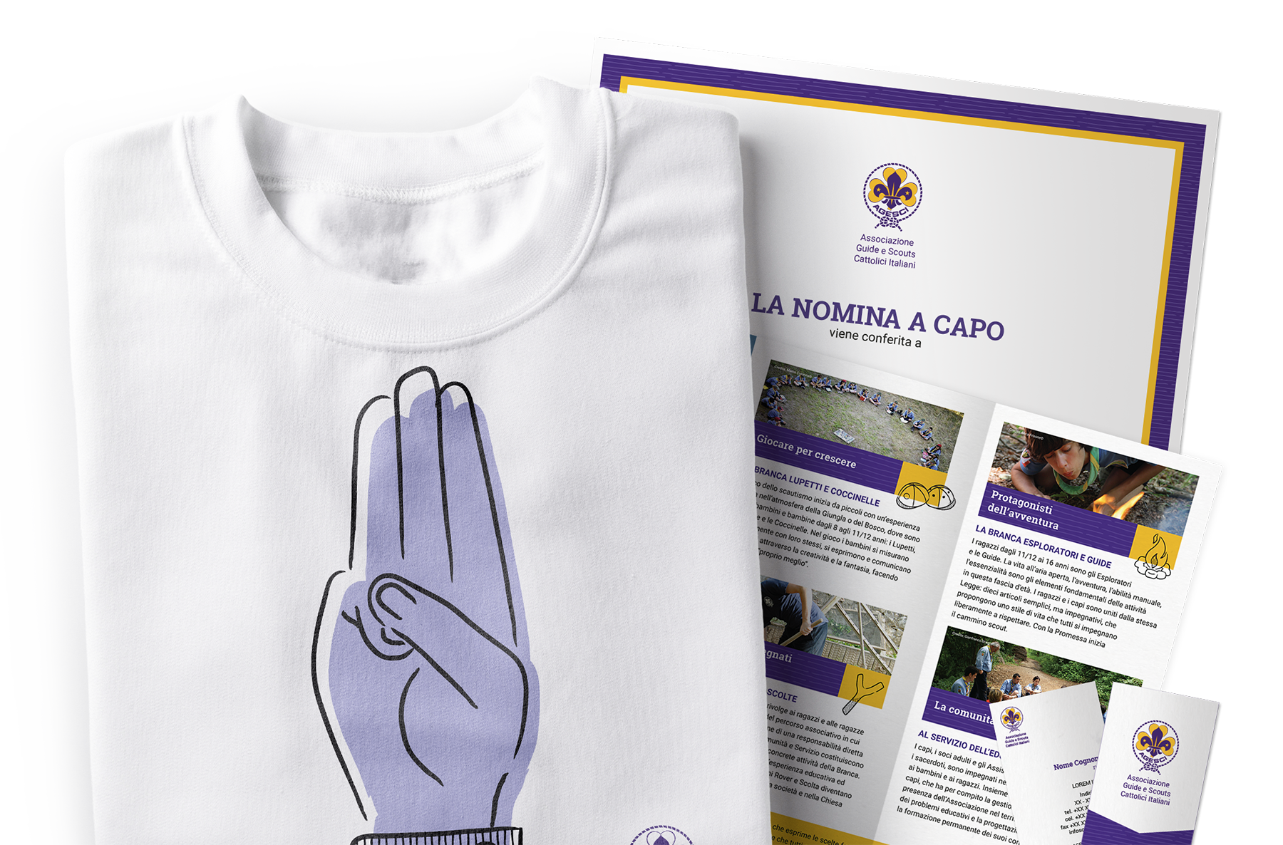
We succeeded in finding graphic solutions that hold together tradition and innovation. Gold and violet are the traditional colours of Agesci logo: we chose three different shades of violet and combined them with three complementary colours, to let the violet emerge as the prominent colour. To guarantee high readability we chose Roboto and its serif version Roboto Slab as font: this choice also reflects special care for tradition because it’s very similar to some fonts used for scouting manuals at the beginning of the century.
Visual identity
We worked on restyling the logo for regions, zones and groups and we designed a mono-colour logo mark to be used in informal contexts. We also designed patterns to renovate the main communication templates.
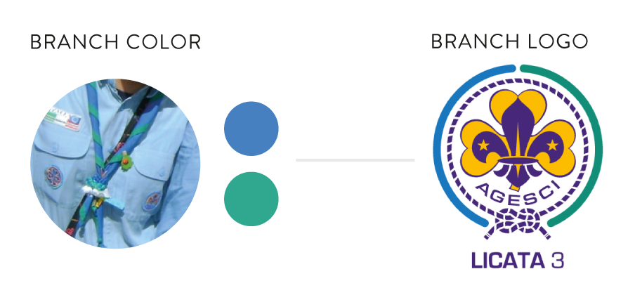
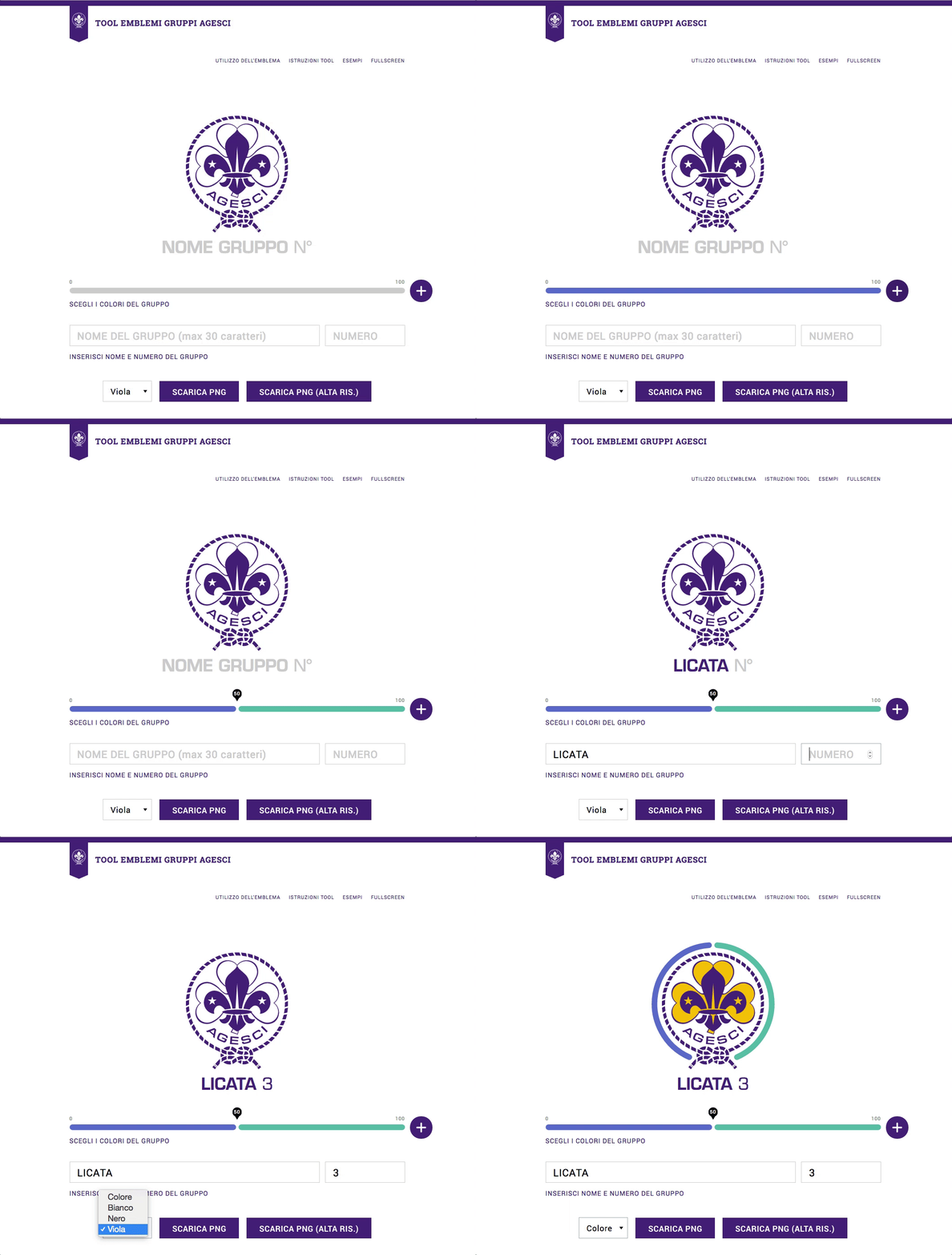
We designed an online tool to customize the logo based on the colours of each group’s iconical handkerchief. The tool allows creating a coloured circle that surrounds the official national logo, becoming the hallmark of the group. This is a user-centred solution that strengthens the coherence of Agesci visual identity while enhancing specific local dimensions.
Council of Europe
No hate speech movement
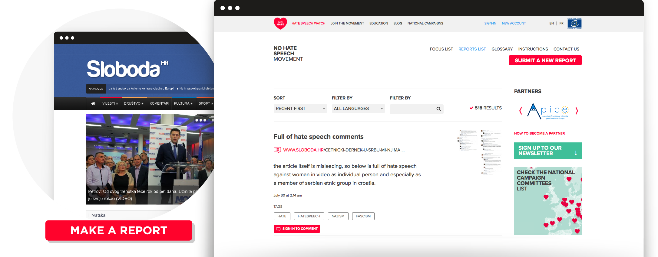
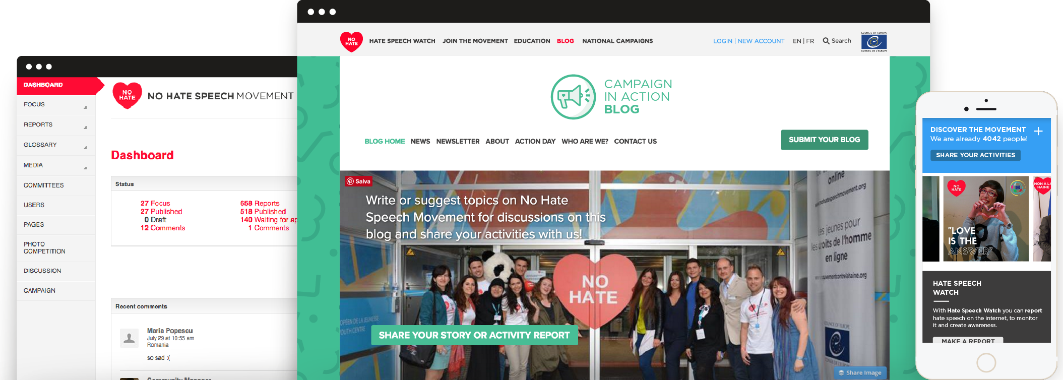
The Council of Europe asked us to design a campaign to empower European youth in taking action against hate speech online. We created No Hate Speech Movement concept, identity and web platform. Young people are both the target and the main actors. We designed a website, developed on a LAMP based platform, and interactive tools.
Visual identity
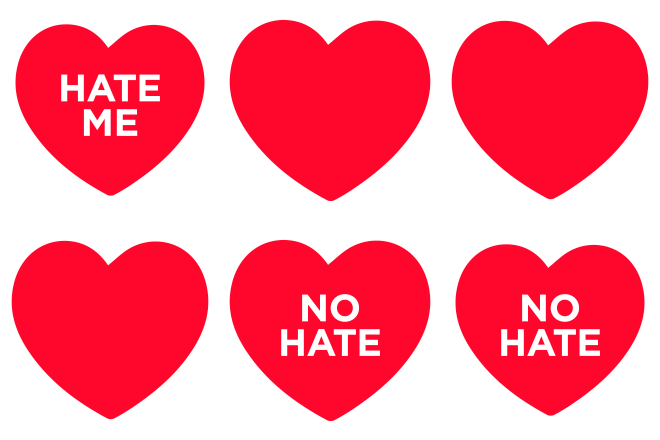
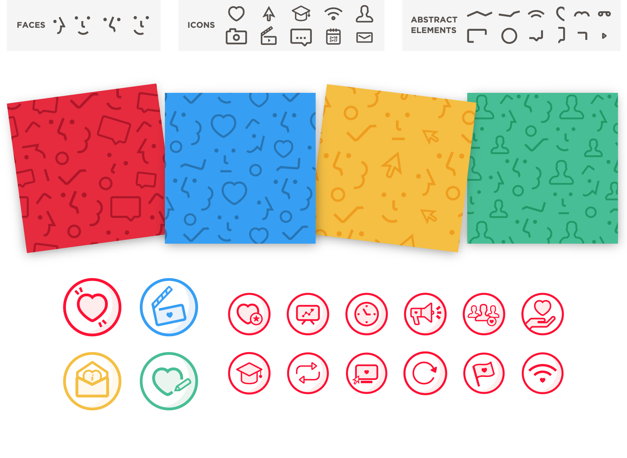
We designed the No Hate heart logo to spread the campaign’s positive message among young people of different cultures and languages. In the first graphic proposal we utilized a logo animated version, that reflected different aspects of hate speech. In the 2016 update, to enhance the brand awareness of the campaign, we realized patterns composed by two main elements: icons and faces, that recall the actions available on the platform and the community dimension.
Costume maid CMS
We have developed a Content Management System tailored on the needs of the Council of Europe itself. A custom software allows high flexibility, ease-of-use, increased security and the possibility for us to provide extended future support. The result is a high performance website with complex and diverse functions, a very flexible online environment that can be extended and customized according to the needs of the campaign.
Intuitive user experience
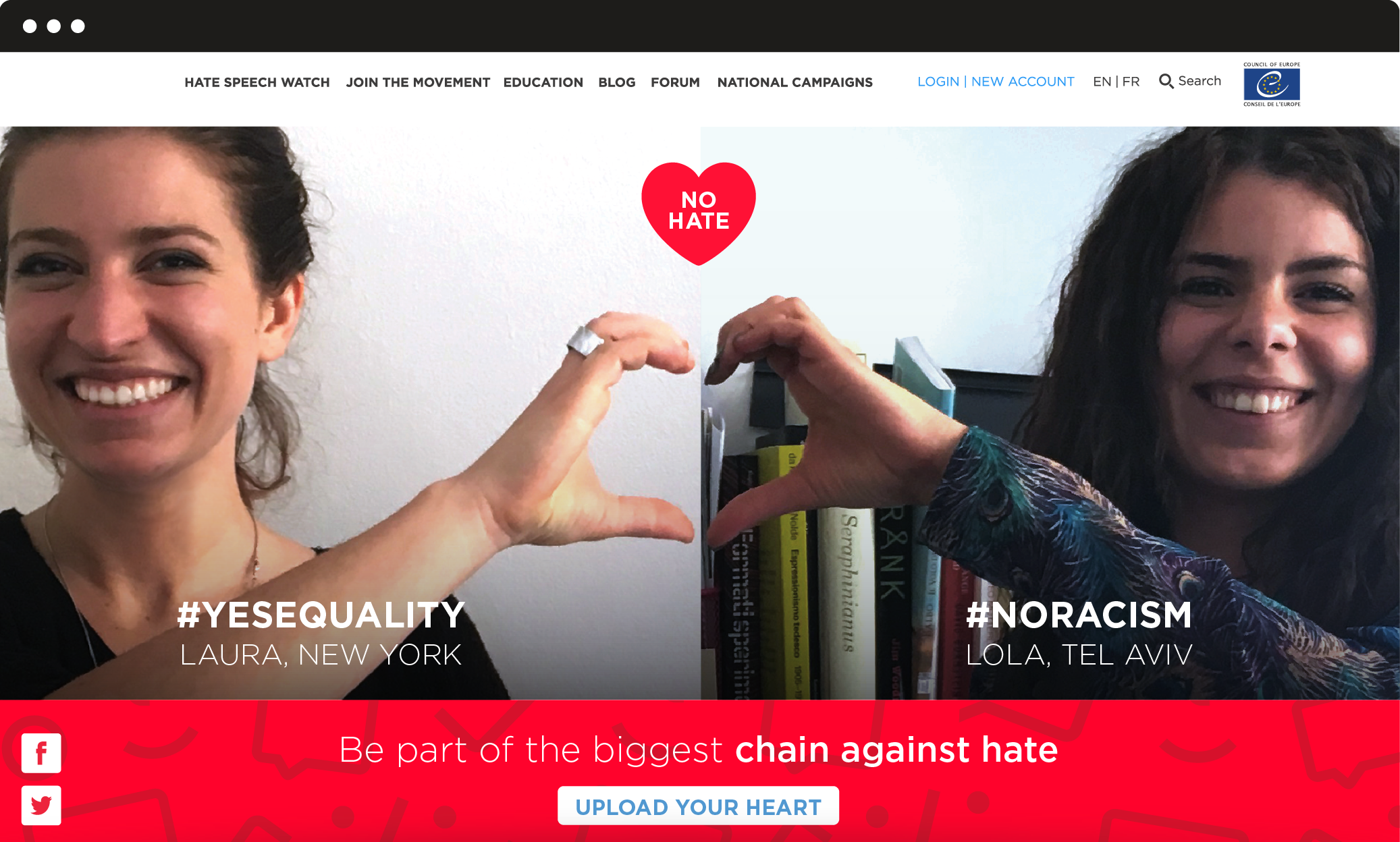
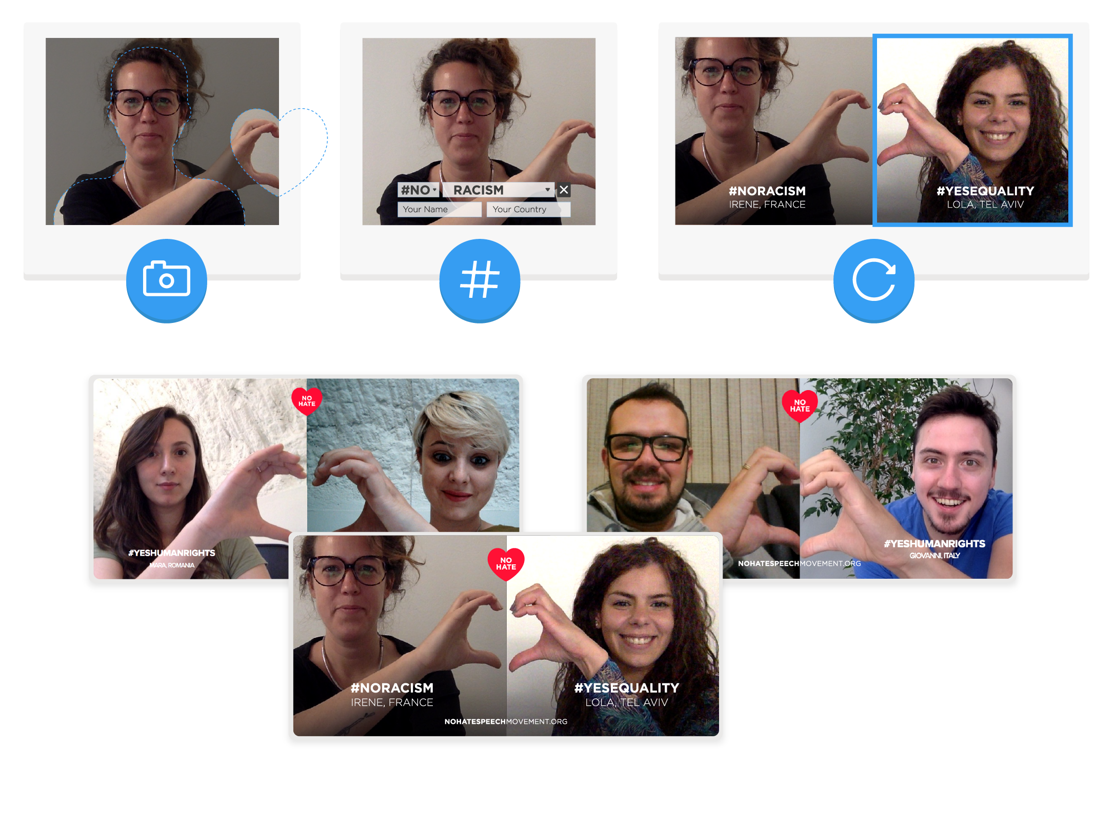
We designed a user-generated content experience inspired by the heart logo. Through an interactive Web App, linked to personal computer camera, users are easily guided to upload their own pictures and associate a personal No Hate #WORD. These pictures appear on the navigable interactive homepage: the result is a never ending No Hate Chain, made by faces and thoughts connected to each others.
User engagement
The NoHate activities available on the platform are organized and optimized to generate an increasing level of user’s engagement. Users can suggest and write posts for the blog and also become NoHate activists, by reporting hate speech online through the dedicated tool. National campaigns from all the countries involved in the movement are reachable through an interactive map, showing contact information. The action can continue offline.
