Topic: activism
WWF –
Protect wildlife
WWF asked us to create an engaging social media pack to get as many European citizens as possible to participate in the Commission’s public consultation on the Water Framework Directive.
Our challenge was to encourage our supporters to share this message with people who are not so engaged in water/environmental issues.
Social cards
The missing posters.
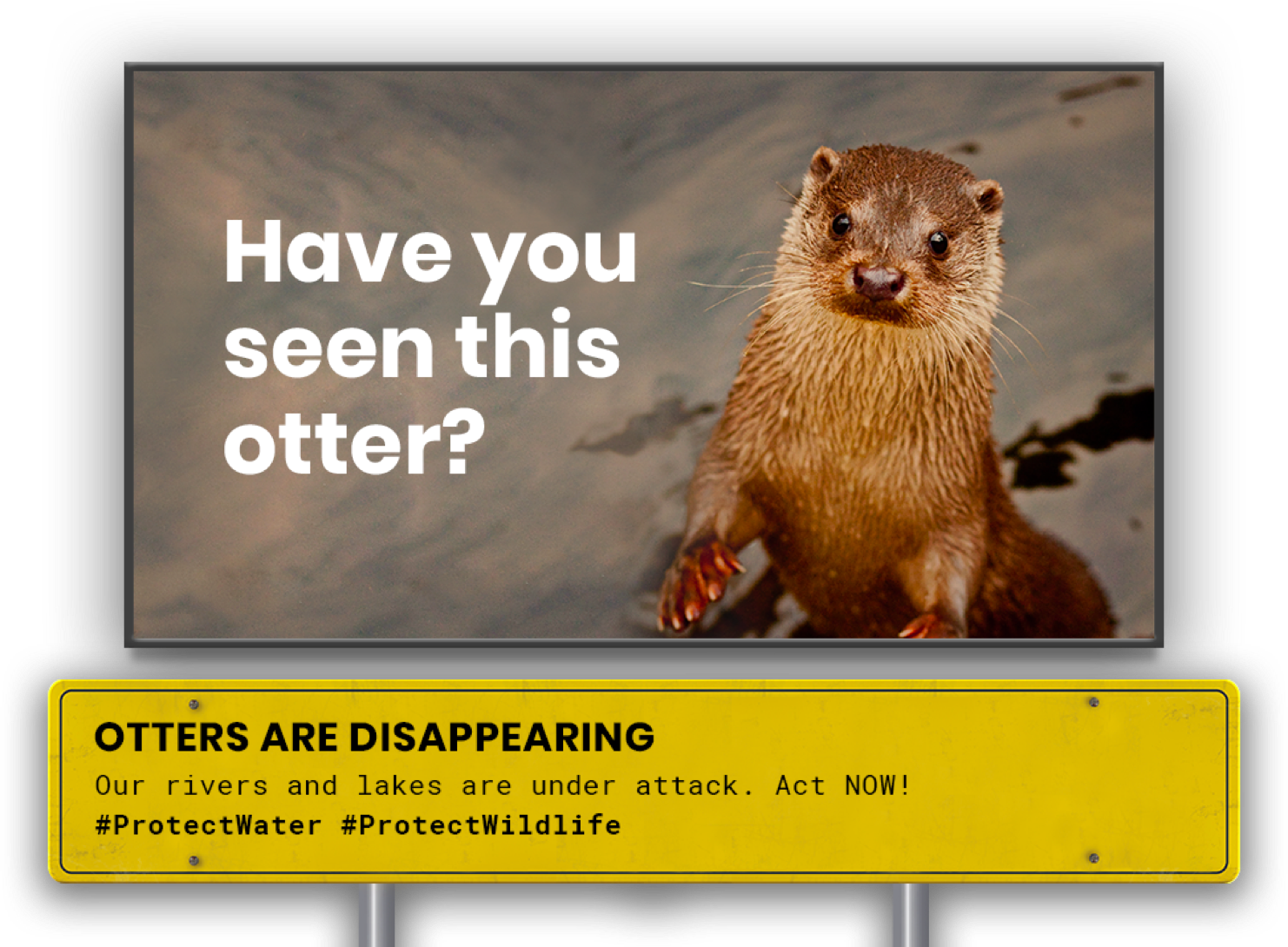
Inspired by the famous “missing” posters, we created 3 series of catchy and colourful social media cards to promote the campaign. We explored traditional and new forms of “missing” posters, in order to give more emphasis to the photograph of the species at risk.


Amnesty International Italy –
Il barometro dell’odio
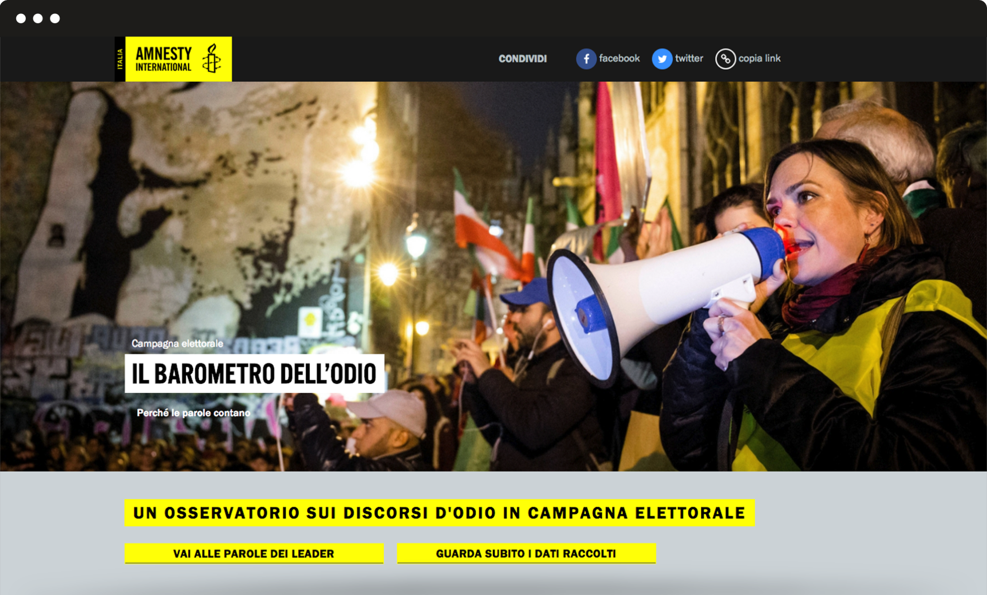
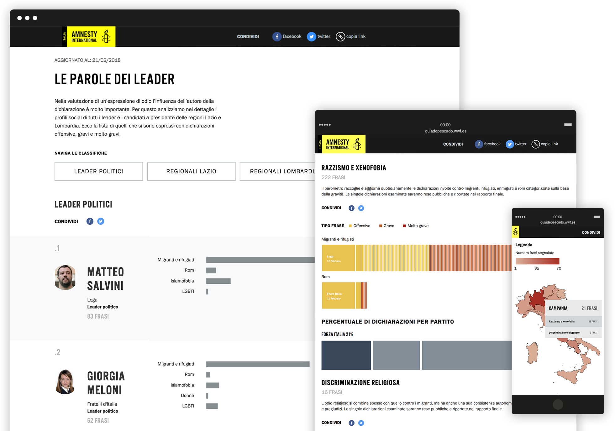
We built a microsite to track and display data about the hate speech of candidates during the 2018 Italian political elections campaign. The different data were uploaded every day and displayed in accessible dynamic graphics, to provide users with an engaging tool and a smooth navigation experience.
Data visualization
An intuitive backend to allows uploading the data every day during the campaign.
We had to transform the methodology to track and evaluate hate speech sentences said by hundreds of candidates, into dynamic charts and graphics. This allows to show all the different data at once: the topic of each sentence, how bad it is, who said it and where/when, which political party is doing worst, which candidate has said the highest number of sentences and much more. We developed a stable frontend to visualize such data smoothly and encourage the user’s interaction with the charts.
Intersos –
È un attimo
Intersos asked us to create a campaign to widen the impact of their mission and increase the number of supporters. The goal was to raise awareness about worldwide serious emergencies and engage the audience into taking action. Our challenge was to present and spread the mission of the organization in the most effective way.
Creative concept
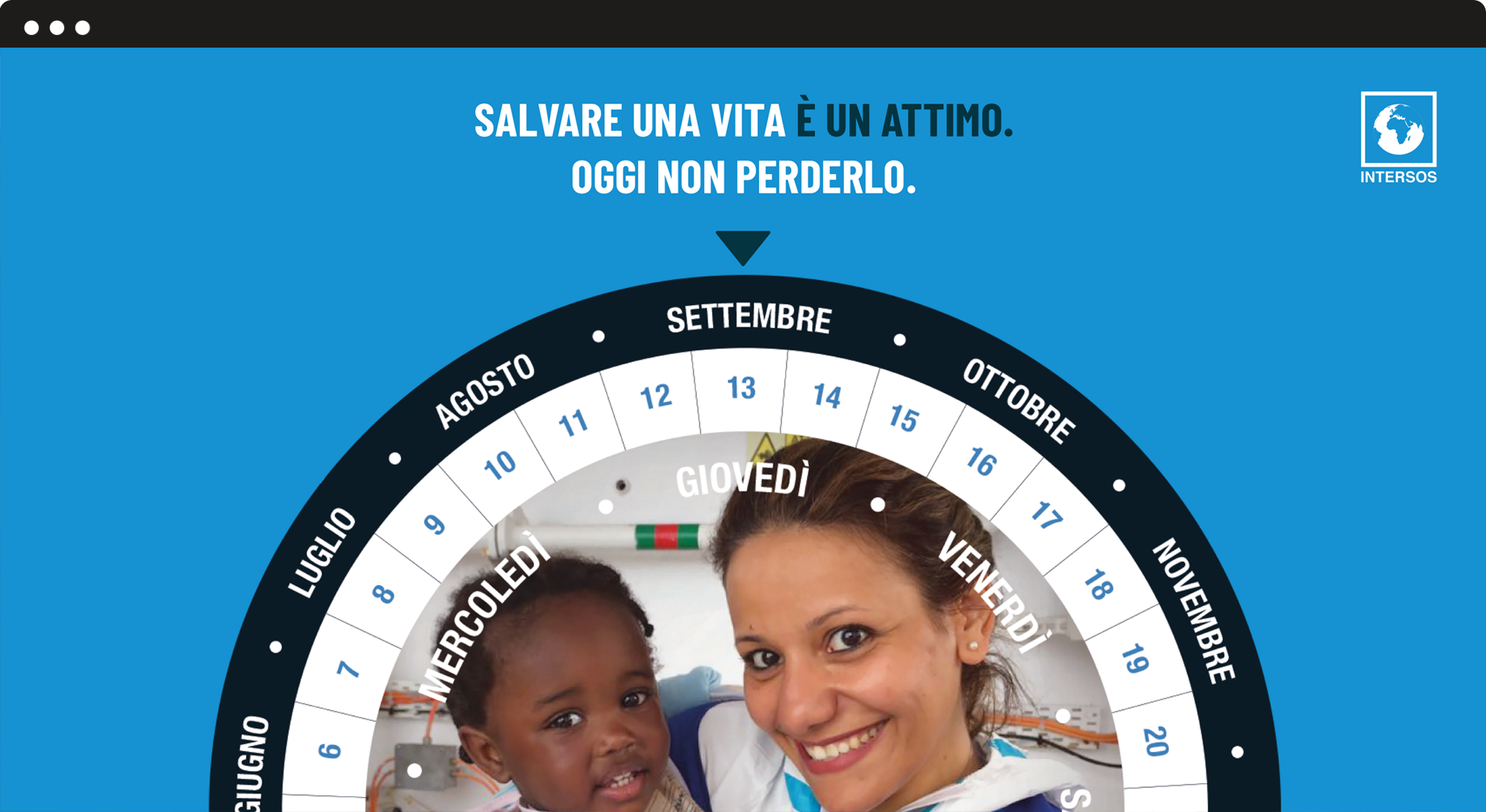
“It only takes a moment to help people and make a lifelong change in others’ lives”.
With this campaign, we wanted to describe Intersos’ work, emphasizing how they have to respond and act quickly in emergency situations. To help raise funds for the organisation, we aimed to convey the urgency needed to support their work. Therefore, we designed the project around a simple yet powerful concept.
Communication materials
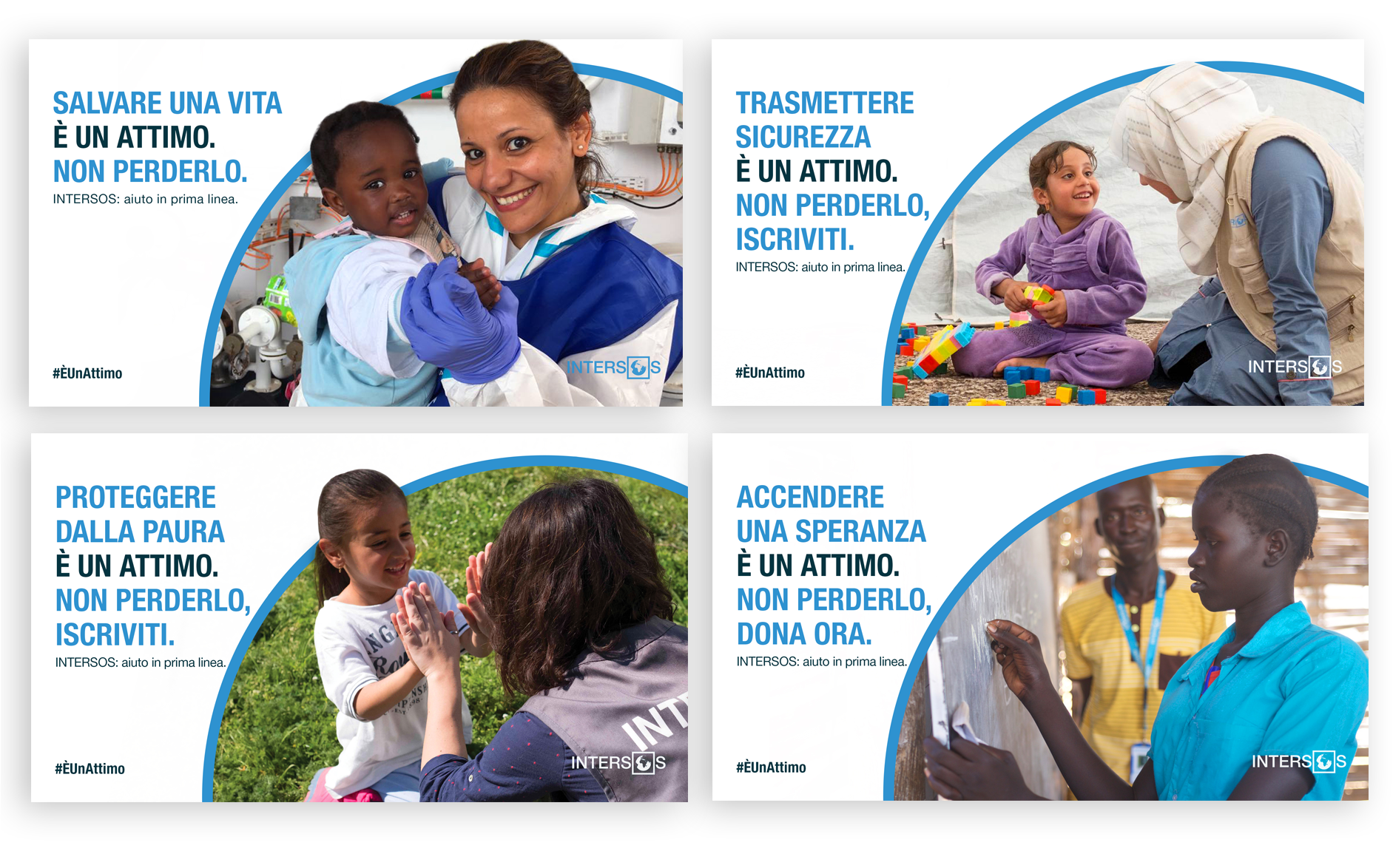
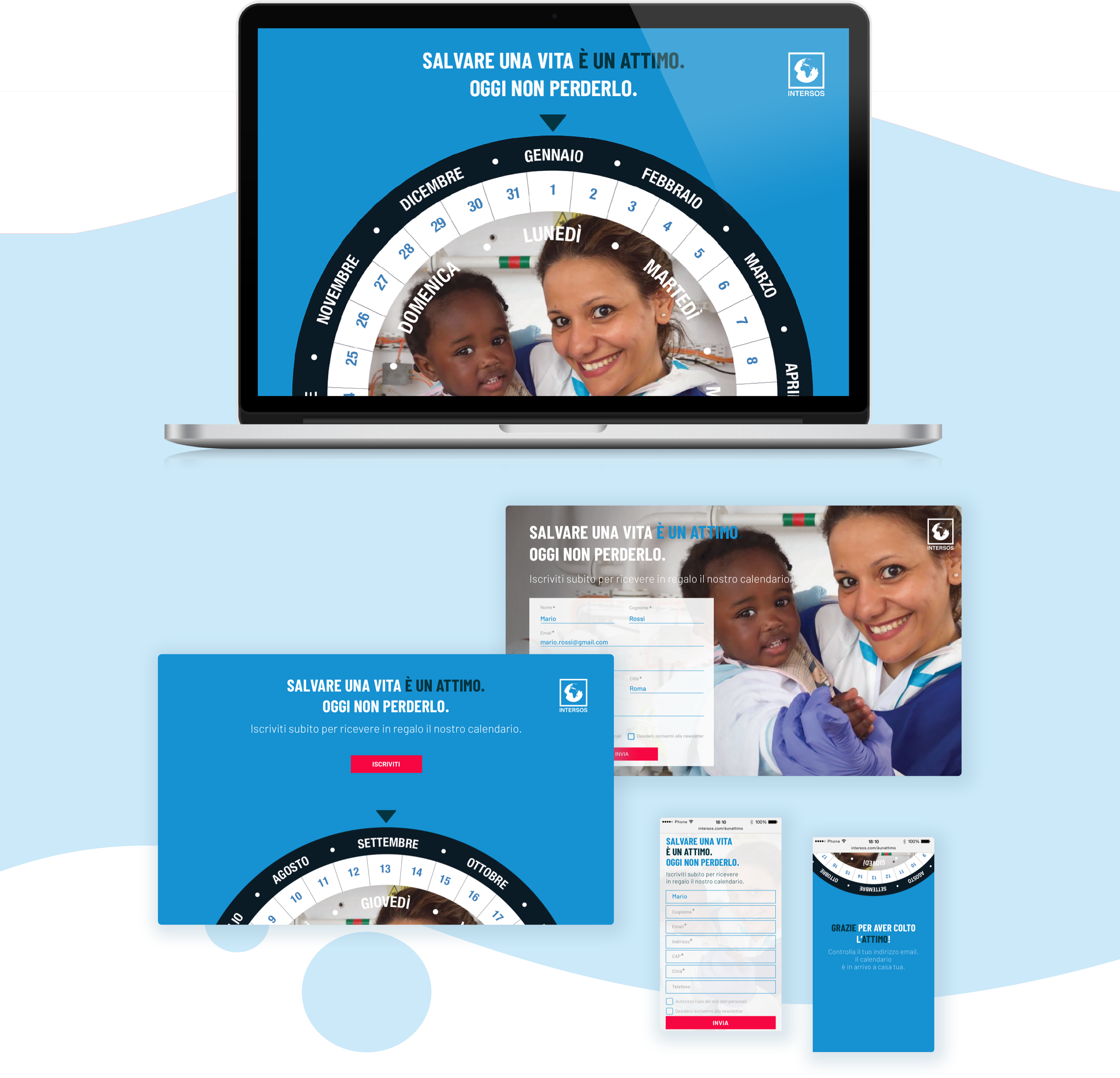
Gadget, social media cards and landing page.
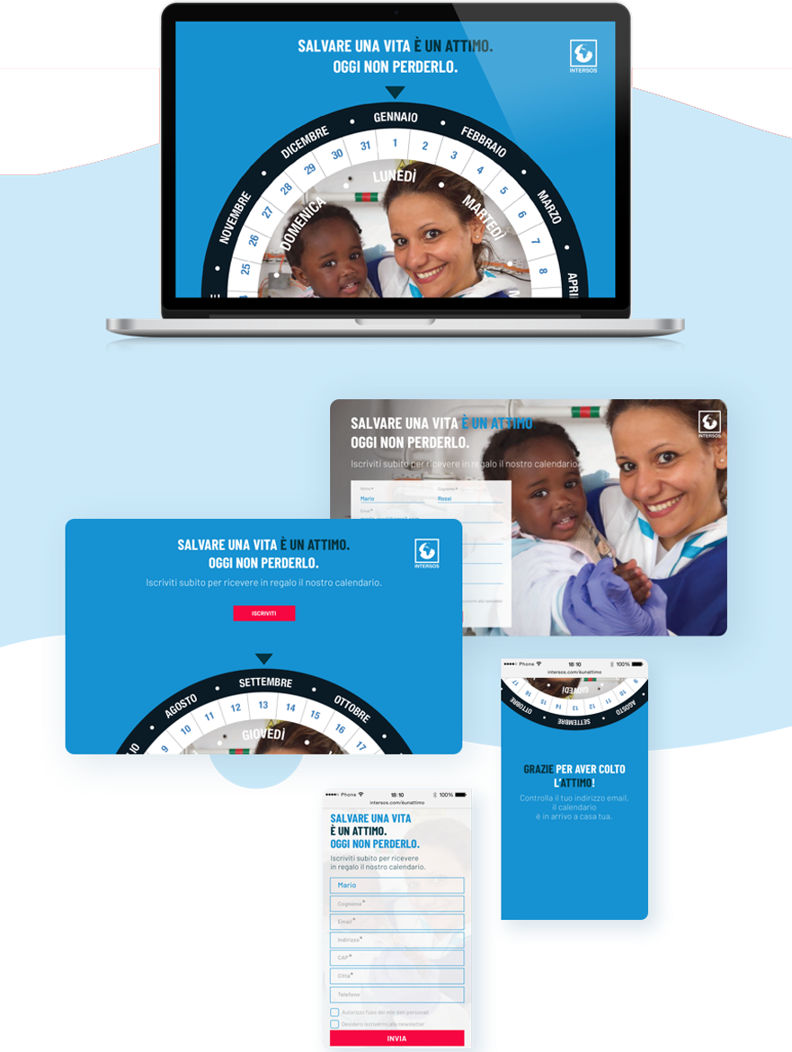
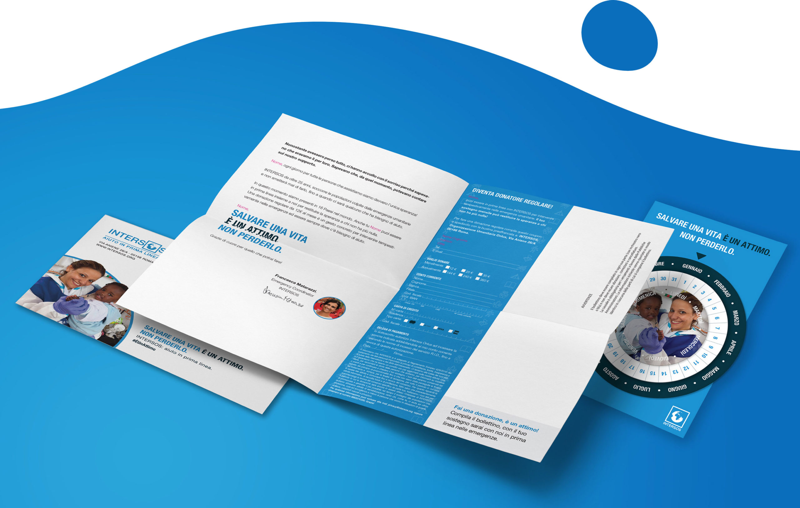
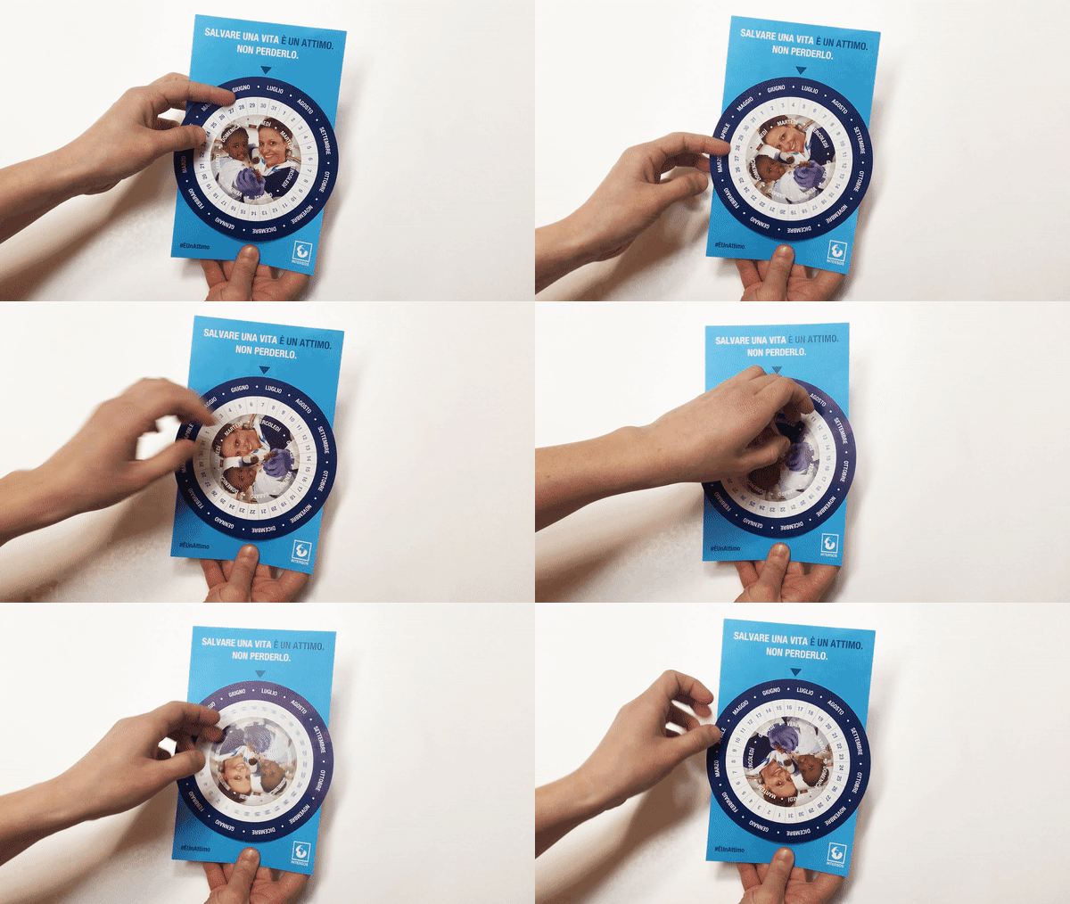
Following on from the concept of time, we came up with the idea of a meaningful gadget for the campaign and we designed a perpetual calendar. In addition to being a key symbol of time, the perpetual calendar reminds us that each moment represents a unique opportunity to help people.
To better engage and lead users within the campaign, we also created a set of catchy social media cards and a landing page.
Restarting the future –
Restarting the future Labs
Our challenge was to create an engaging video to bring young people closer to social communication and the mission of fighting corruption. How? With an innovative workshop promoted by Riparte il Futuro.
We produced a captivating video in line with our target’s imaginary and visual language.
Animated video
Encourage young audiences to sign up for one or more workshops.
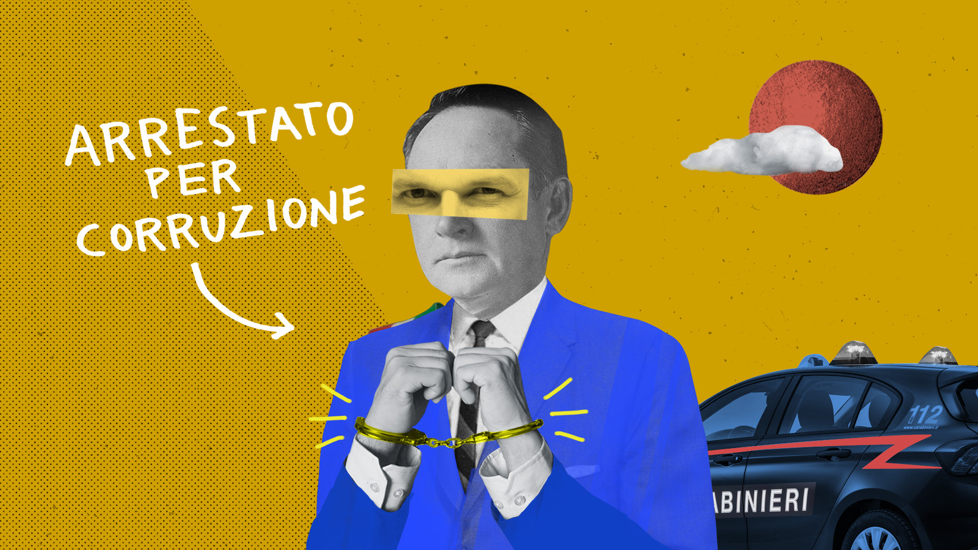
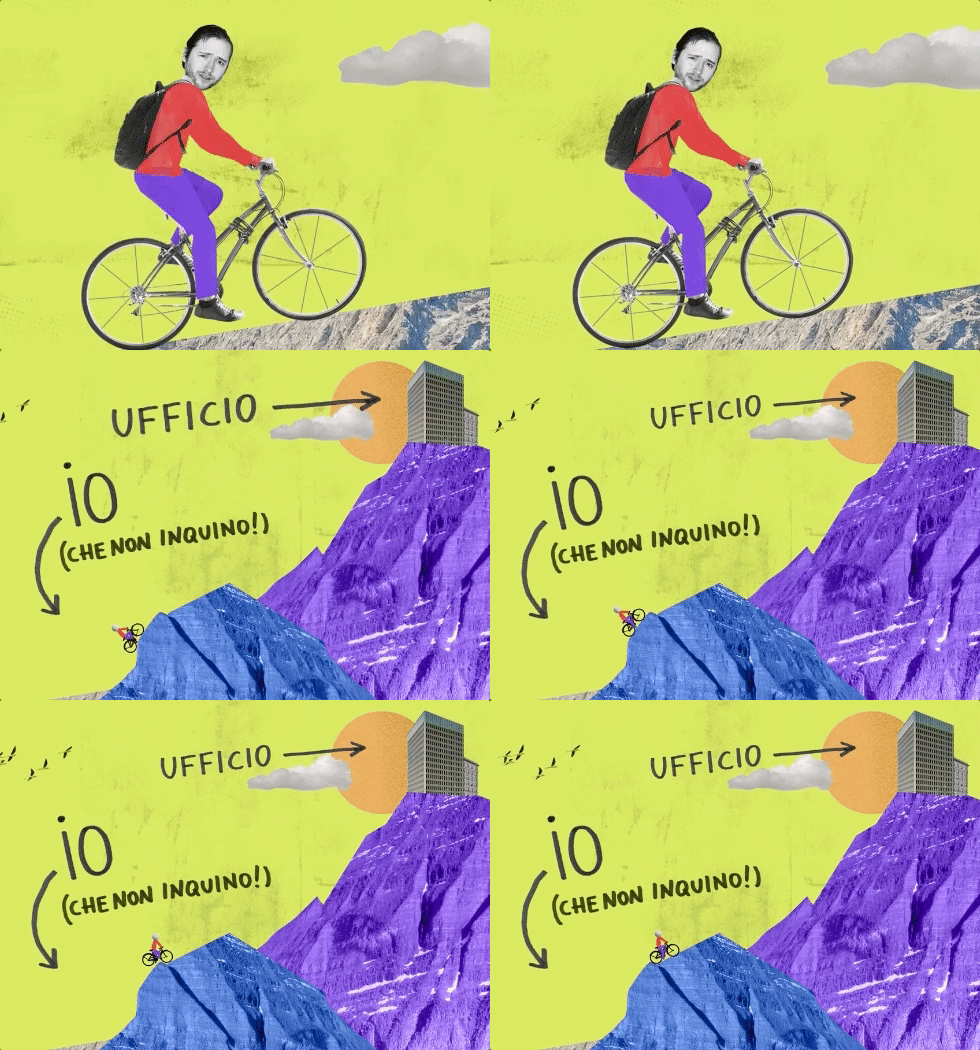
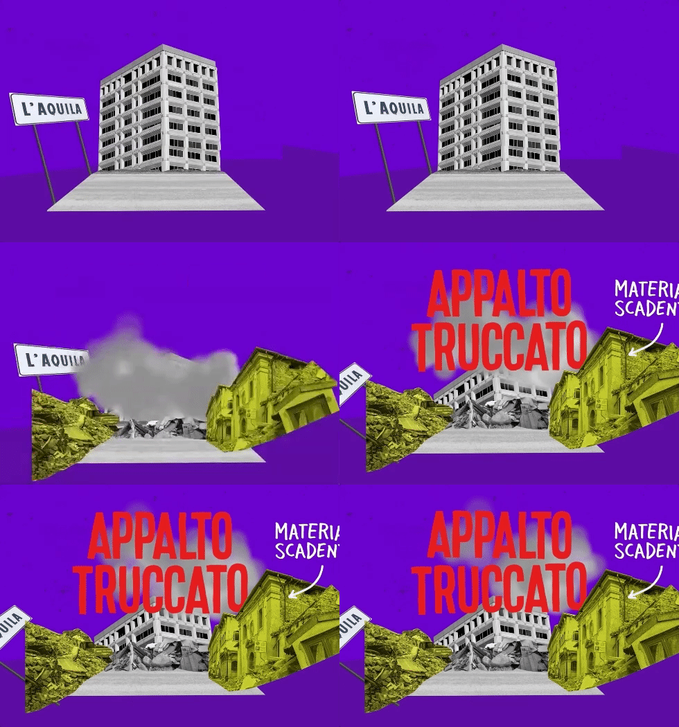
The emotional characters animation helps to explain complex ethical and political issues, by showing a few things people can’t deal with and finally the call to action to take part in the training.

Motion graphic
Mixed animation techniques, motion graphics and frame by frame footage animation.
We produced the video using a mixed motion graphic and animation frame by frame technique to let the audience feel a deeper involvement and develop a stronger internal point of view. We adopted a pop and captivating colour palette in line with our target’s imaginary and visual language greandly created by the illustrator Nazario Graziano.

Restarting the future –
A generation against corruption
The “Restarting the future tour” is a special project launched by “Restarting the future”, the largest Italian digital community that has been fighting for years to defeat corruption in our country.
Our challenge was to create and share a multimedia narrations about everyday anti-corruption heroes.
Brand identity
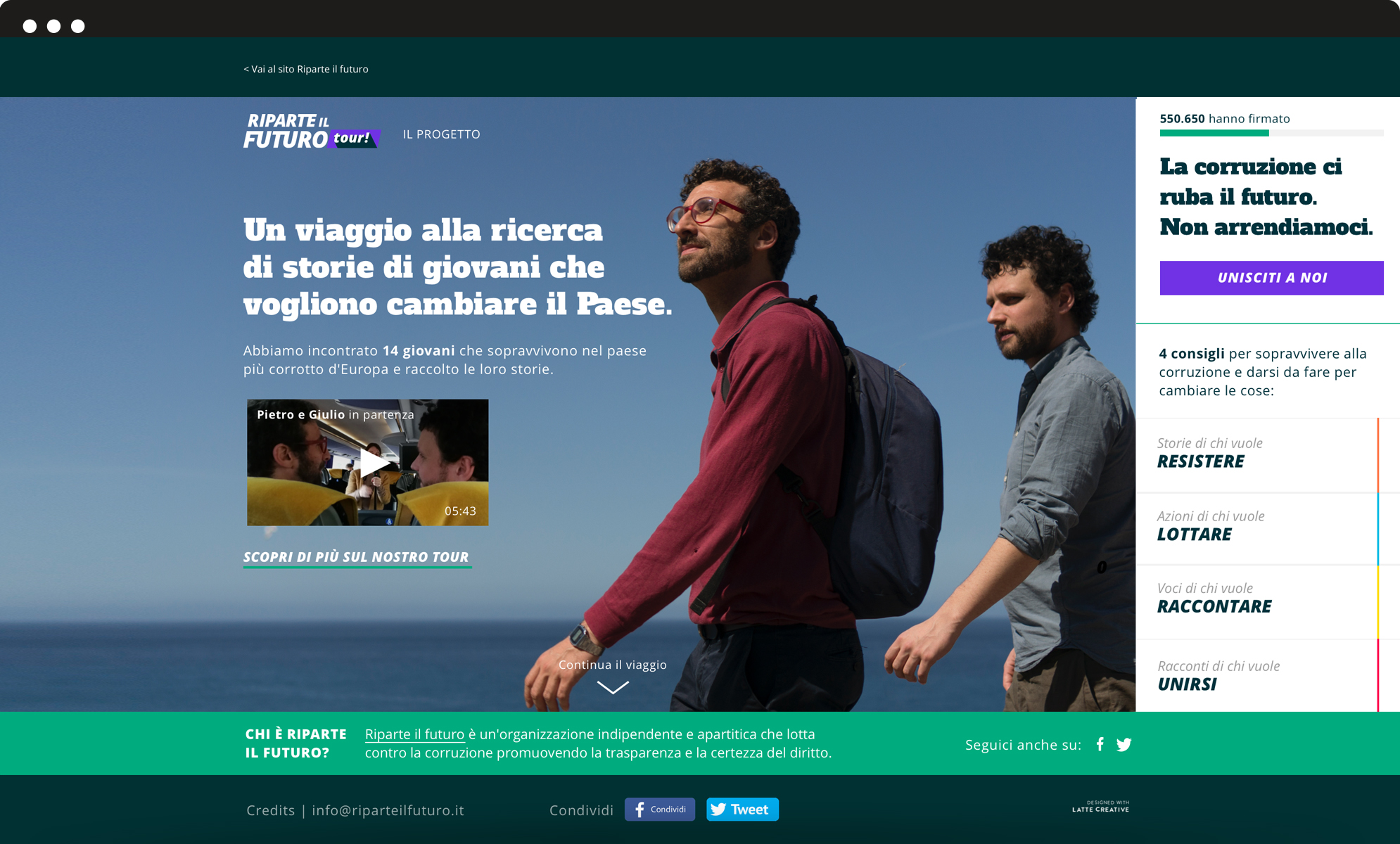
A dynamic and colourful identity.
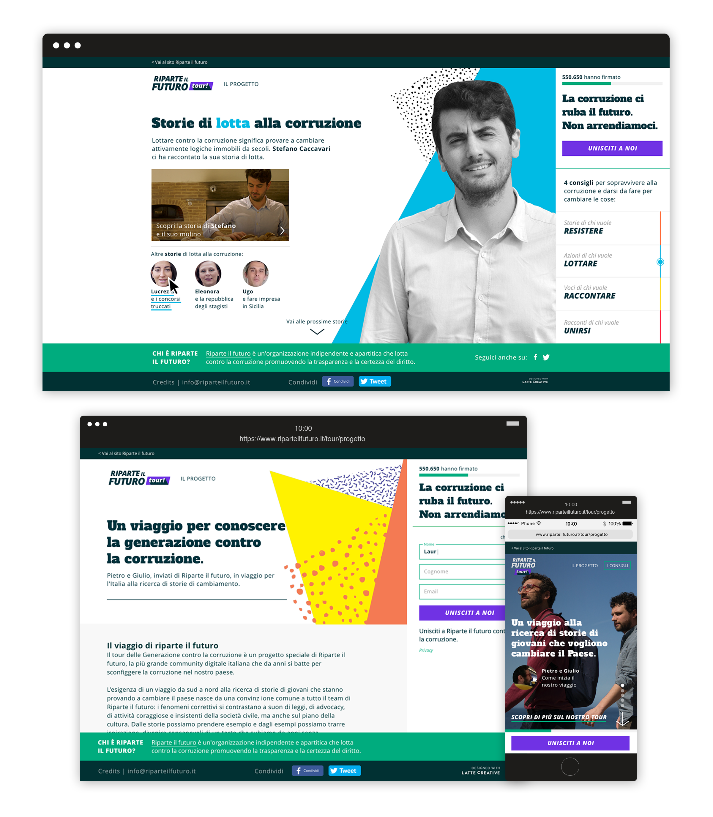
Since we had built the website for “Restarting the future” a while back, we could carry out the previous branding process, integrating new elements based on the tour’s features and scope. To do so, we chose a dynamic and colourful identity, which reflects the target’s attributes: mostly under the 30s.
Website
An interactive platform.
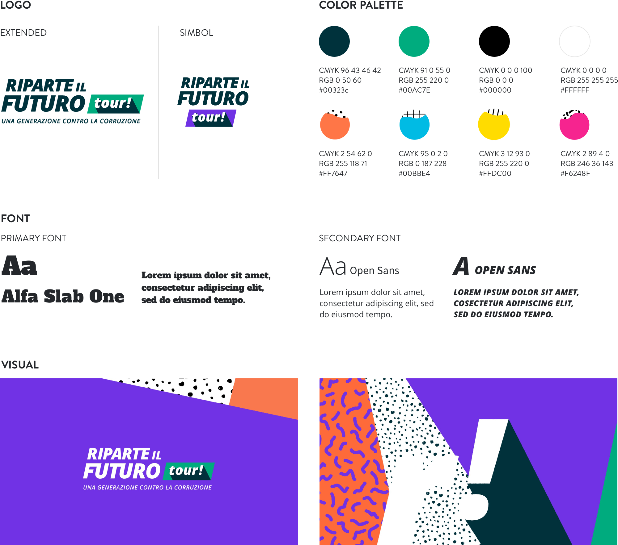
For the website we created an interactive platform, split into four subsequent sections. All sections are based on a set of concrete actions that users are encouraged to undertake: to resist, to fight, to narrate and to join. We shaped a reporting tour around the Country, documenting stories and collecting them on a dedicated interactive platform.
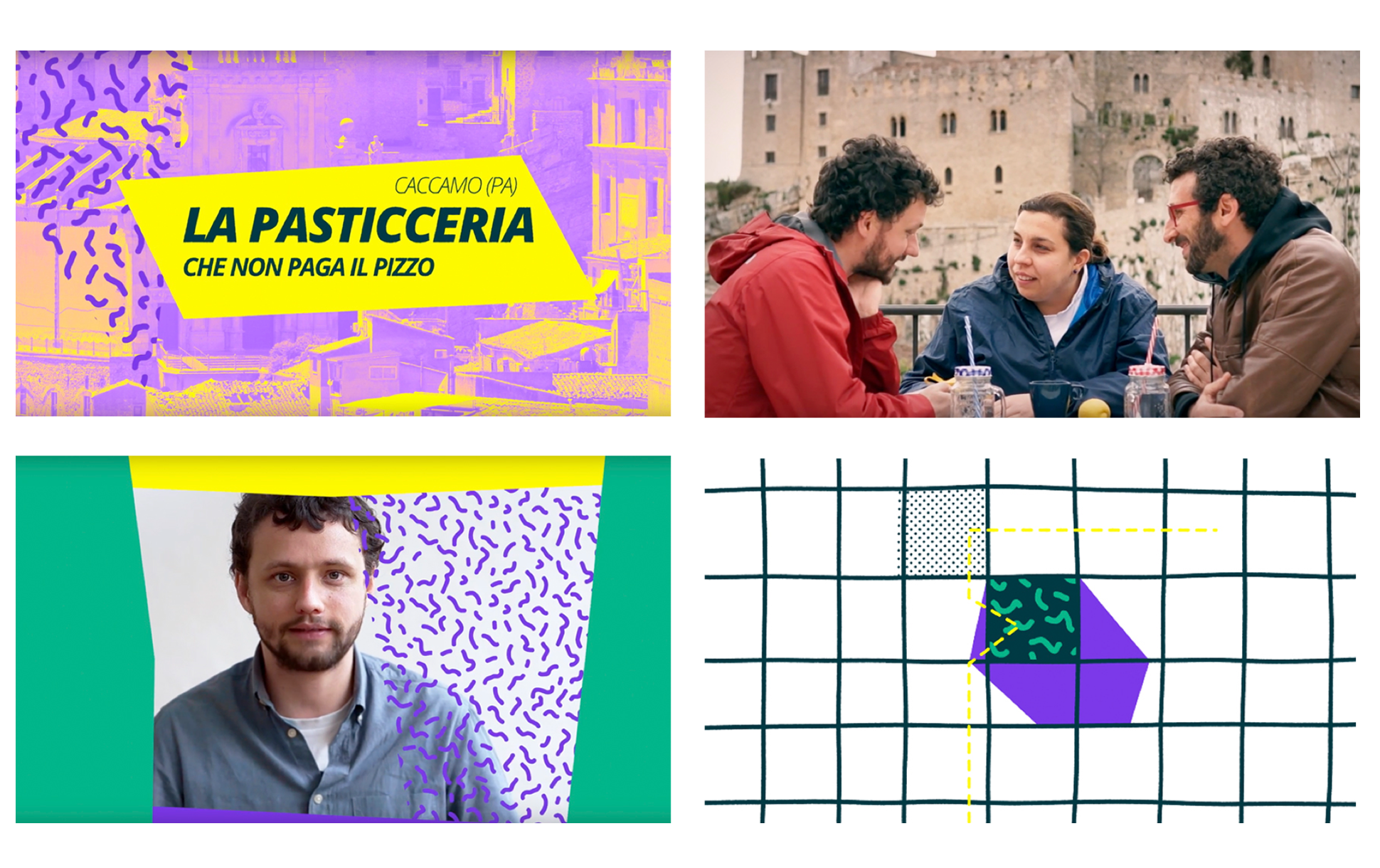
Docuvideo
We tracked down, found and met 11 young Italian heroes. They inspire people that constantly fight for their beliefs and for the welfare of our country.
Videos truly fulfill the reporting goal of the project and ensure greater engagement. The long and exciting quest was supported by the work of the investigative journalist Vittoria Iacovella, the award-winning director Giulia Amati and a professional troupe.
Our stories have met great media coverage, as they were shared by many people on social media and posted in a series of weekly appointments on the Italian newspaper “Il Fatto Quotidiano”.
Greenpeace –
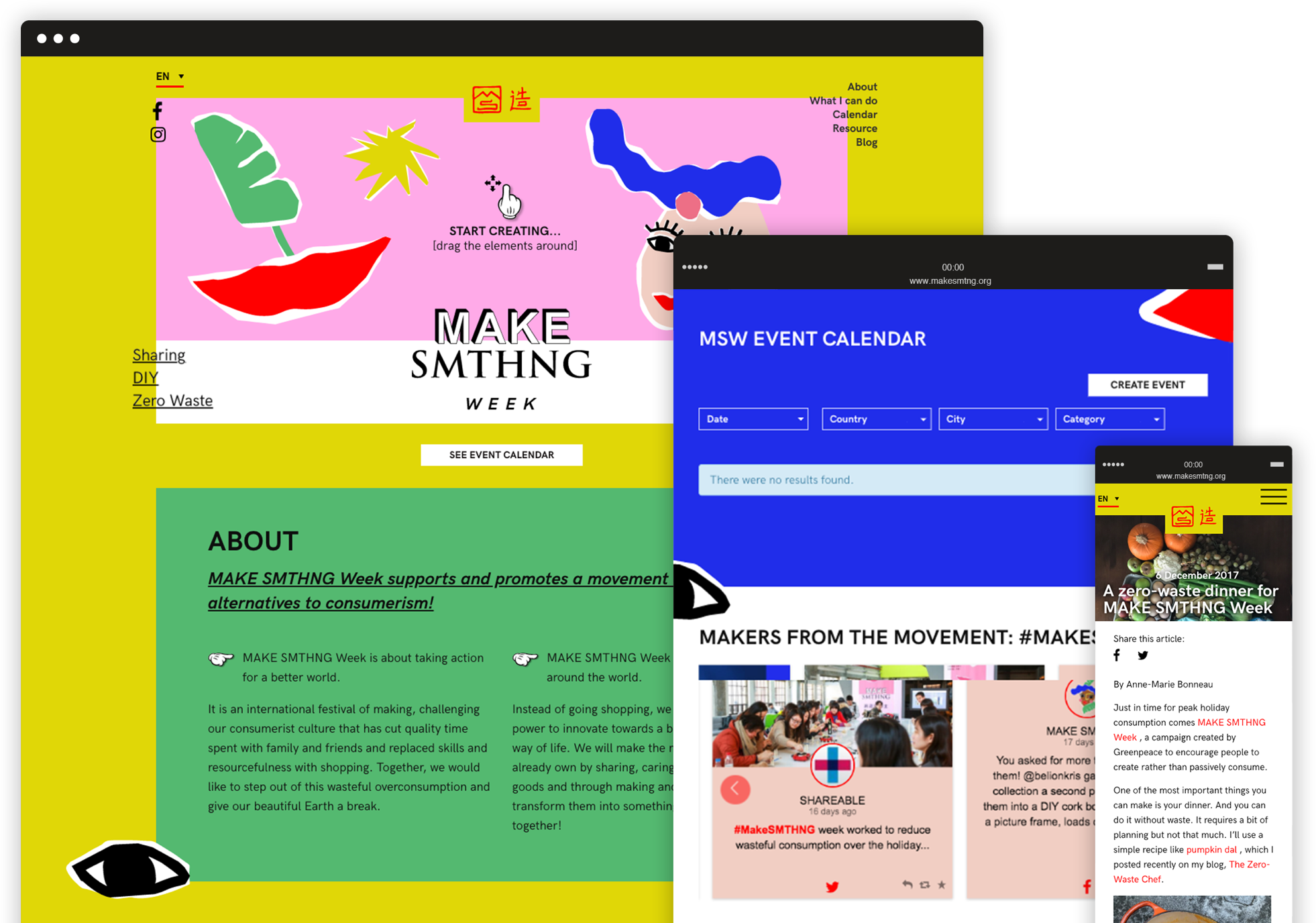
Make smthng week
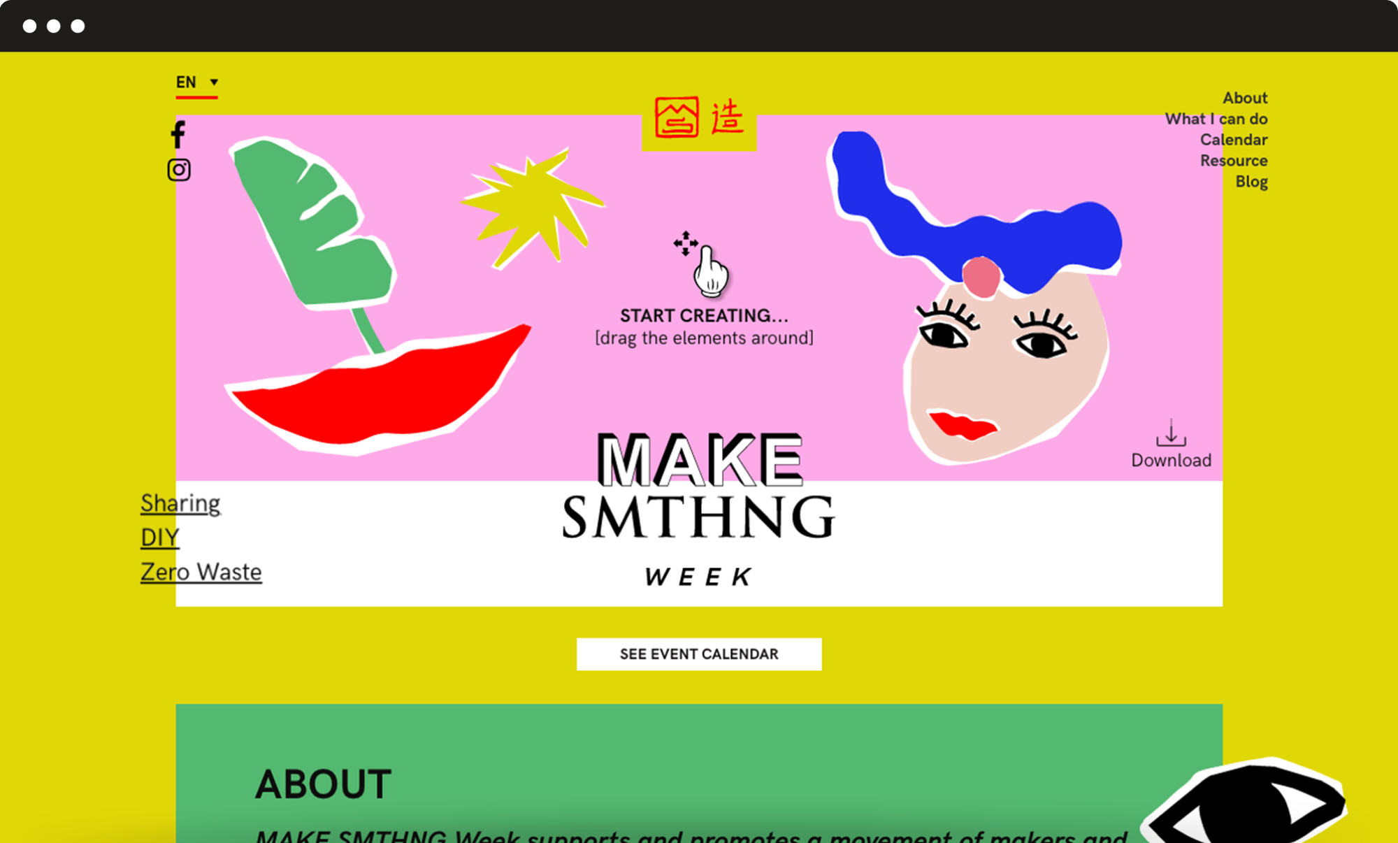
We designed a light, fresh brand identity and an highly engaging website to promote a global movement of makers and a week of fun events all around the world.
Inclusive design
Give shape to your very own cover picture.
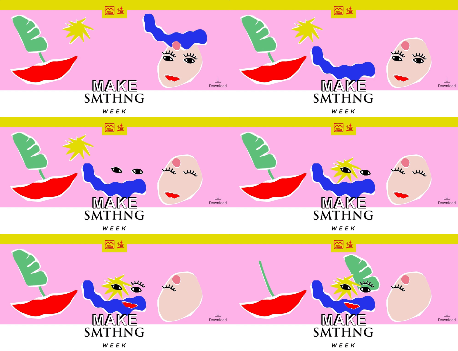
We decided to build a simple and engaging top section where users can drag and drop graphic elements, giving shape to their very own “cover picture”. This tool is very much consistent with the principles of creativity, upcycling and DIY that are at the campaign’s core. It also helped to grab the users’ attention so that they would stay on the website and get interested in offline events.
Information architecture
A series of flexible but consistent modules.
The page had to feature a great variety of contents. We played with the colour palette and graphic elements and designed a series of flexible but consistent modules to make the page navigation smooth and give each piece of content the right importance. We also added a fixed menu with anchor links to the different sections, so that users can easily reach any module with just a click.
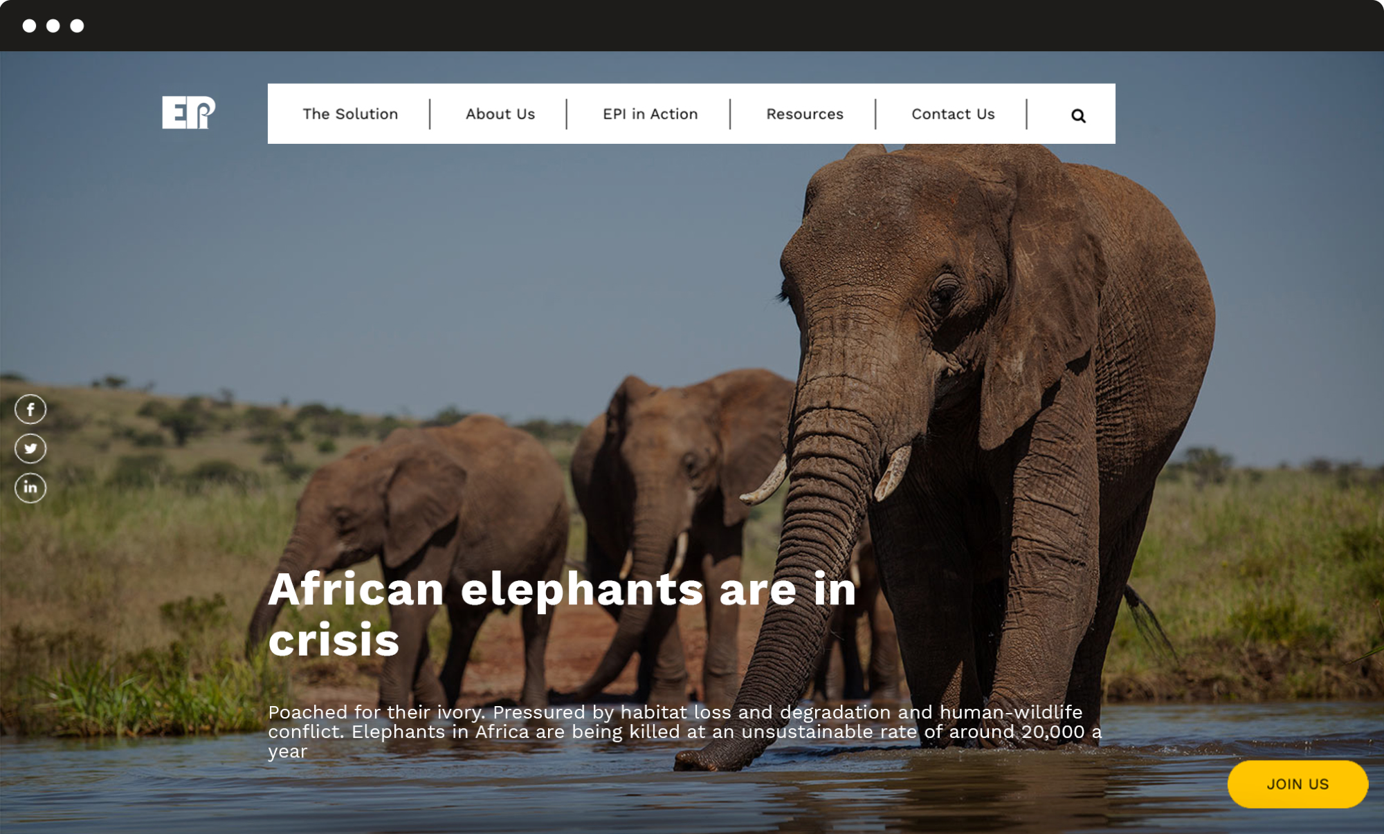
Elephant Protection Initiative –
A meaningful future for elephants
We redesigned the EPI website with a fully refreshed visual identity and a new organization of contents, to facilitate the navigation and drive more users to engage with the campaign.
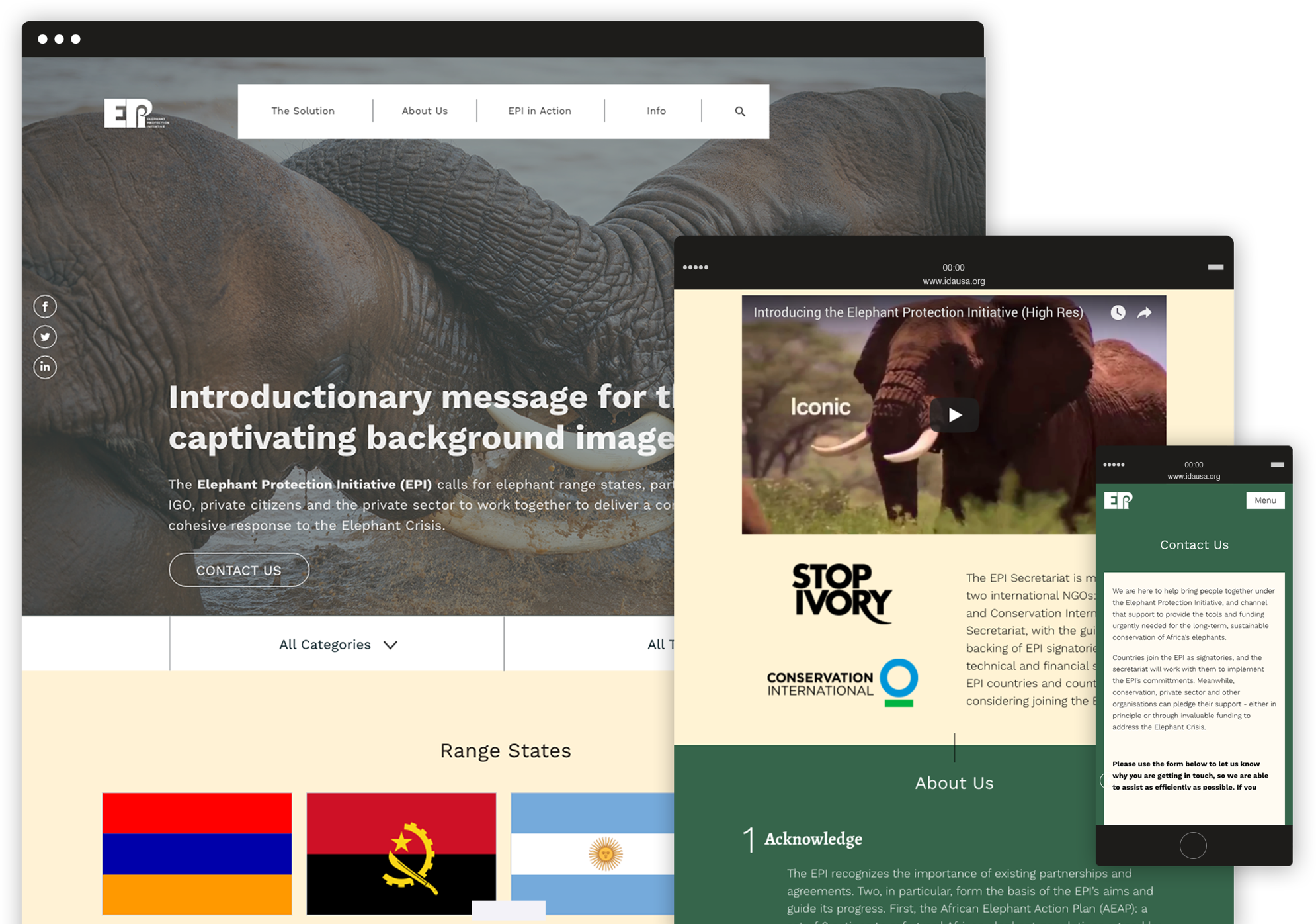
Visual identity
A stronger and modern identity.
We completely restyled the website’s visual design, choosing a new colour palette and different layouts for the pages in order to provide the organization with a stronger, more modern identity, and support the users’ experience by highlighting the most important contents and calls to action.
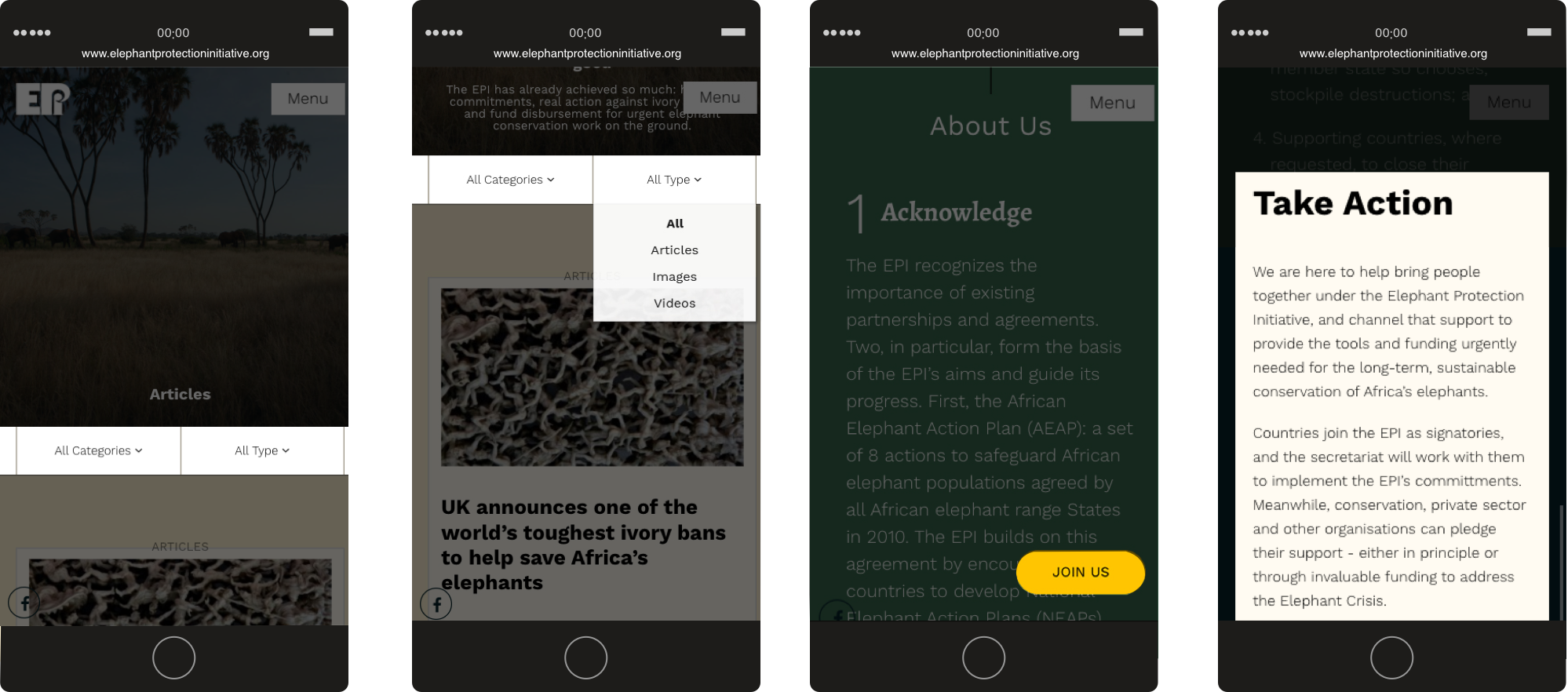
User experience
A new flowchart and implemented solutions.
We designed a new flowchart and implemented specific solutions for the main interactive actions that users can take on the website: a fixed Join us button that opens a pop-up form, and a filter system to navigate through many articles and easily find relevant pieces of content.
Greenpeace –
Save the Arctic 2.0
Greenpeace International asked us to redesign the main site of the Arctic campaign. After our successful redesign of the platform, it was time to move from an overarching single homepage to a richer and more complex website.
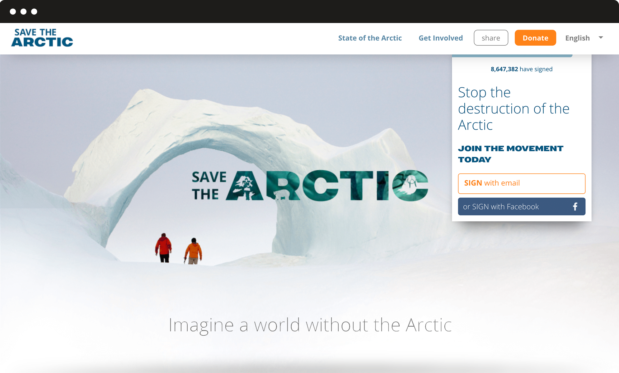
Information architecture
A first-level menu for the important sections and a second-level menu for other pages.
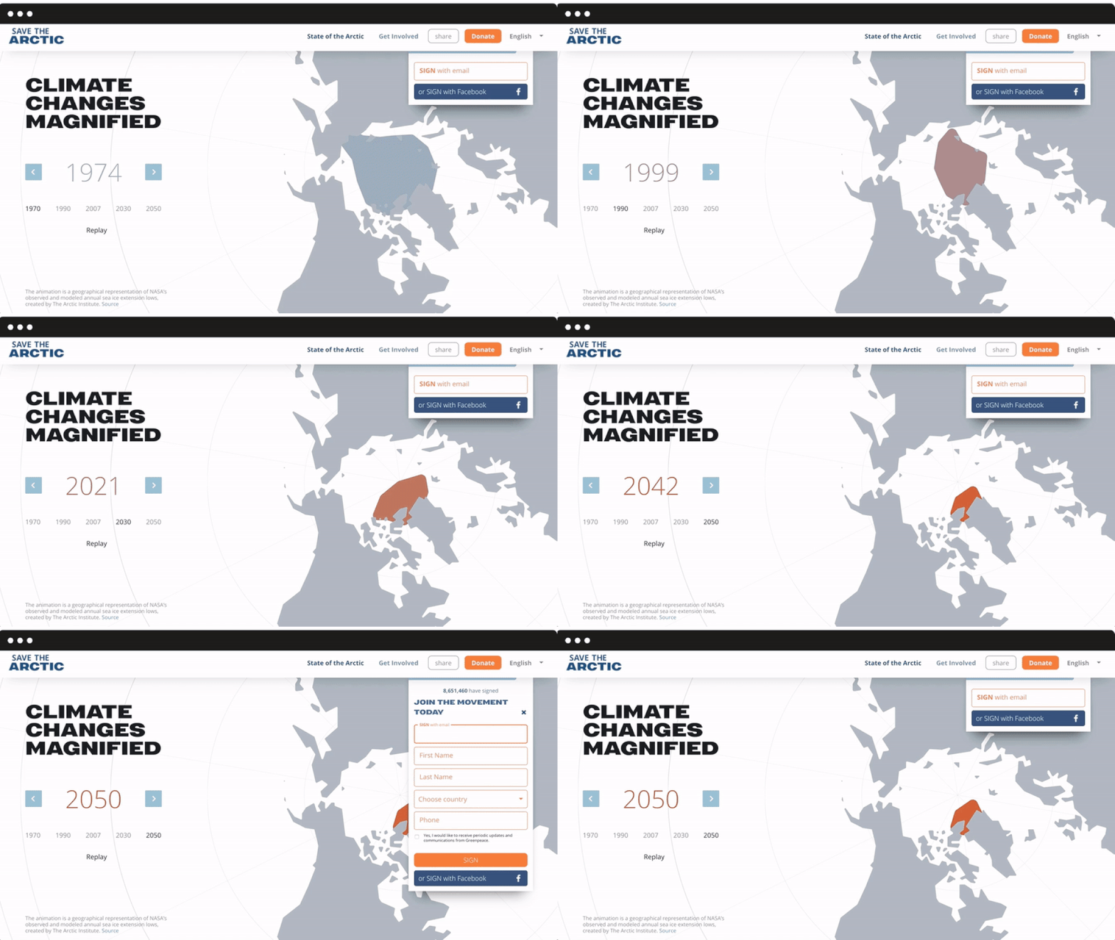
We ran a survey to identify existing strong features as well as expectations, which allowed us to design the site’s structure and new internal pages. We added a first-level menu for the most important sections: State of the Arctic (with interactive charts to display more scientific information) and Get Involved, but also a second-level menu for pages dedicated to the campaign’s history and main petitions. The form behaviour was also revisited, in order to be always visible and fully integrated into the navigation flow.
Mobile responsive
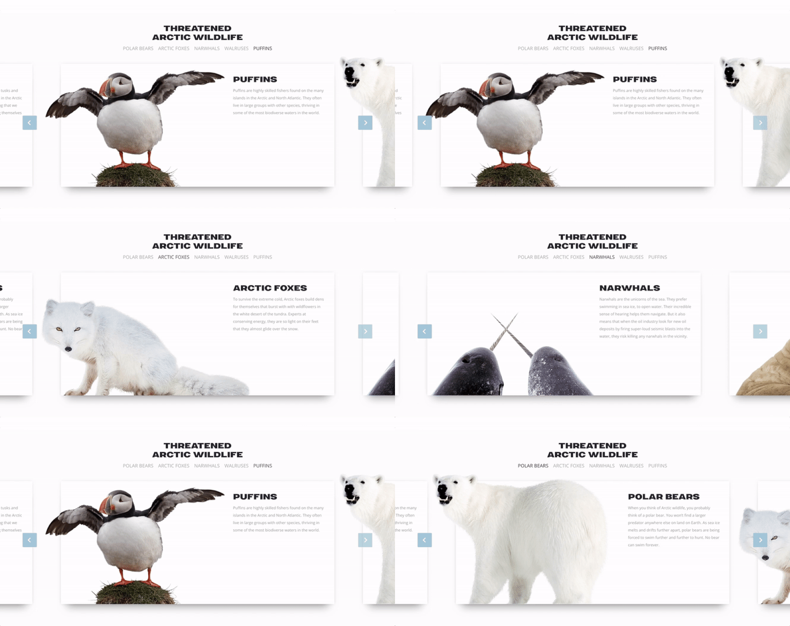
An internal narrative based on sliders and cards to display the most iconic protagonists of the campaign.
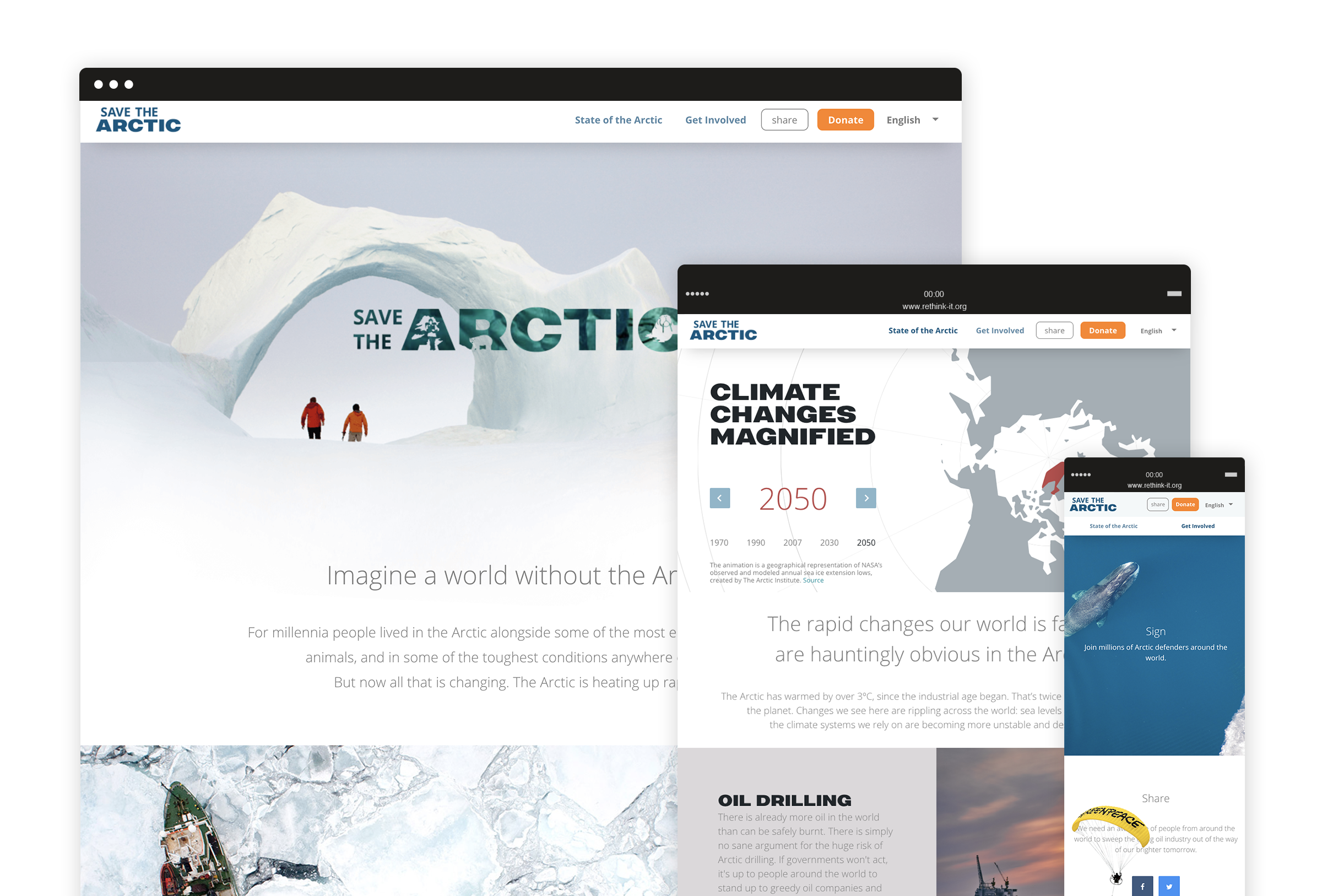
Throughout the website are highlight achievements and list the actions people can make every day to support the Arctic. Such horizontal structure is highly usable on mobile devices and it allows users to smoothly discover different contents with the top of a finger. We also designed a super lightweight petition template optimized for slower connections and mobile use, focusing on key contents and, of course, the signup form.
A new visual language
A new way to talk about the Arctic and communicate key concepts through visual design.
We got inspired by how Greenpeace describes the Arctic today: a fragile sanctuary, a gorgeous, almost sacred place that belongs to everyone and needs to be protected. We used airy spaces, top view photography, light typography and white shades to convey the concepts of untouchable beauty and fragility, whereas urgency and calls to action stand out thanks to brighter colours and bold fonts. All over the website, we used carefully selected images to visually guide the user through the campaign and reinforce the storytelling.
C.N.G.E.I. –
Between past and future
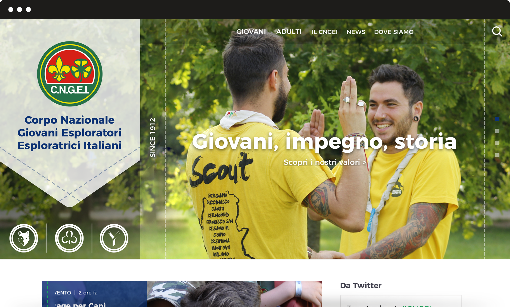
Our challenge was to restyle the visual identity of the CNGEI association, creating a system for both online and offline communication able to preserve traditional symbols while also moving them towards the future.
Brand identity
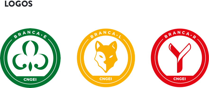
New logos for each section and branch.
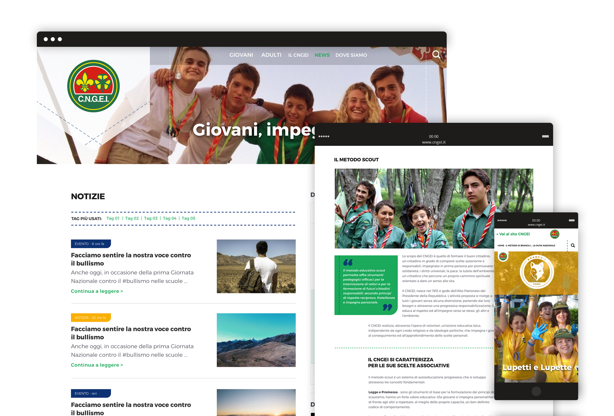
CNGEI is an association structured in branches and sectors that need their own logo. We developed a colour palette and designed brand new logos for each section and branch. The circular shape ensures homogeneity and consistency with the main CNGEI logo provided by the Association.
The result is immediate, simple, readable, recognizable and extremely flexible.
Visual identity
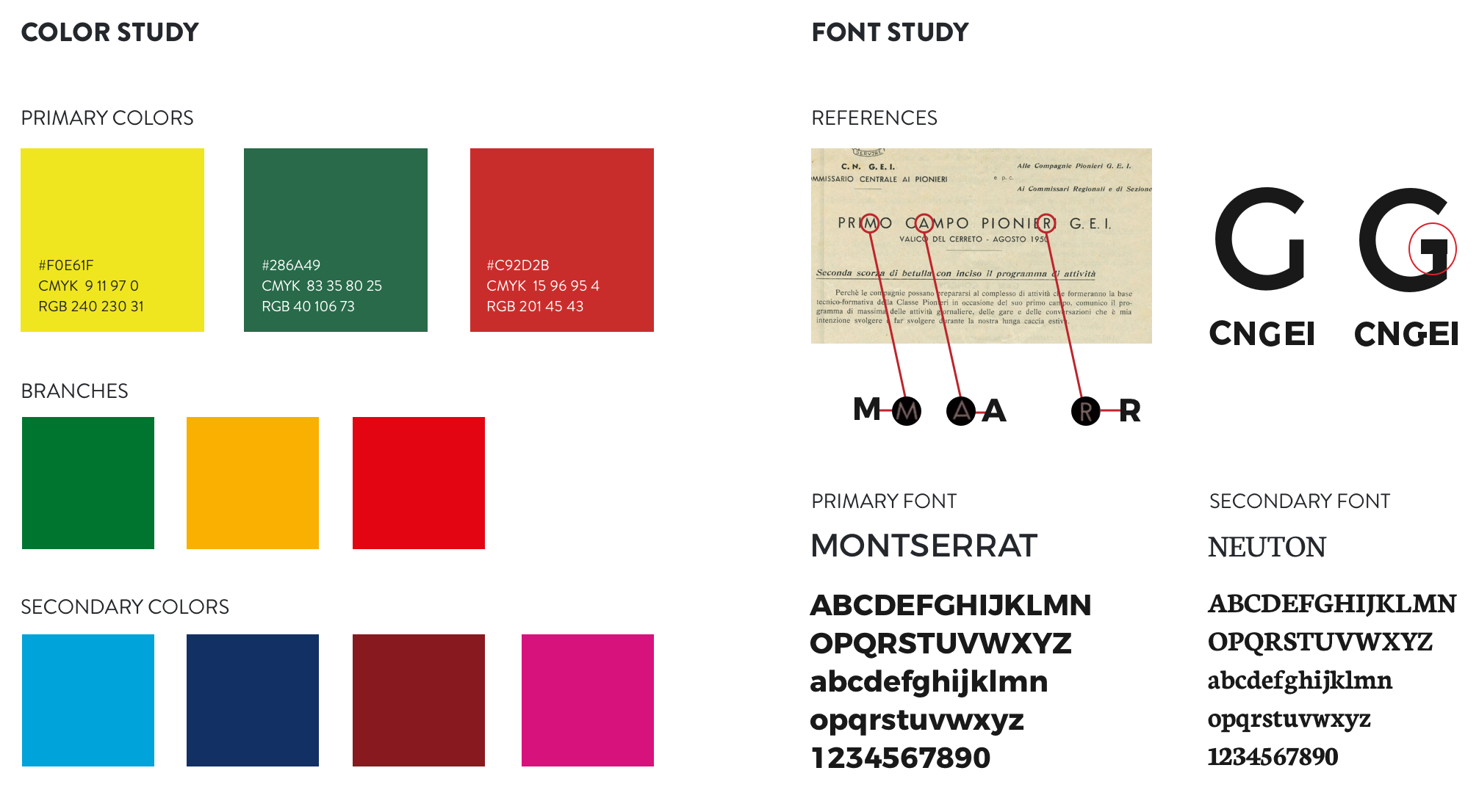
A suitable visual for all levels and structures.
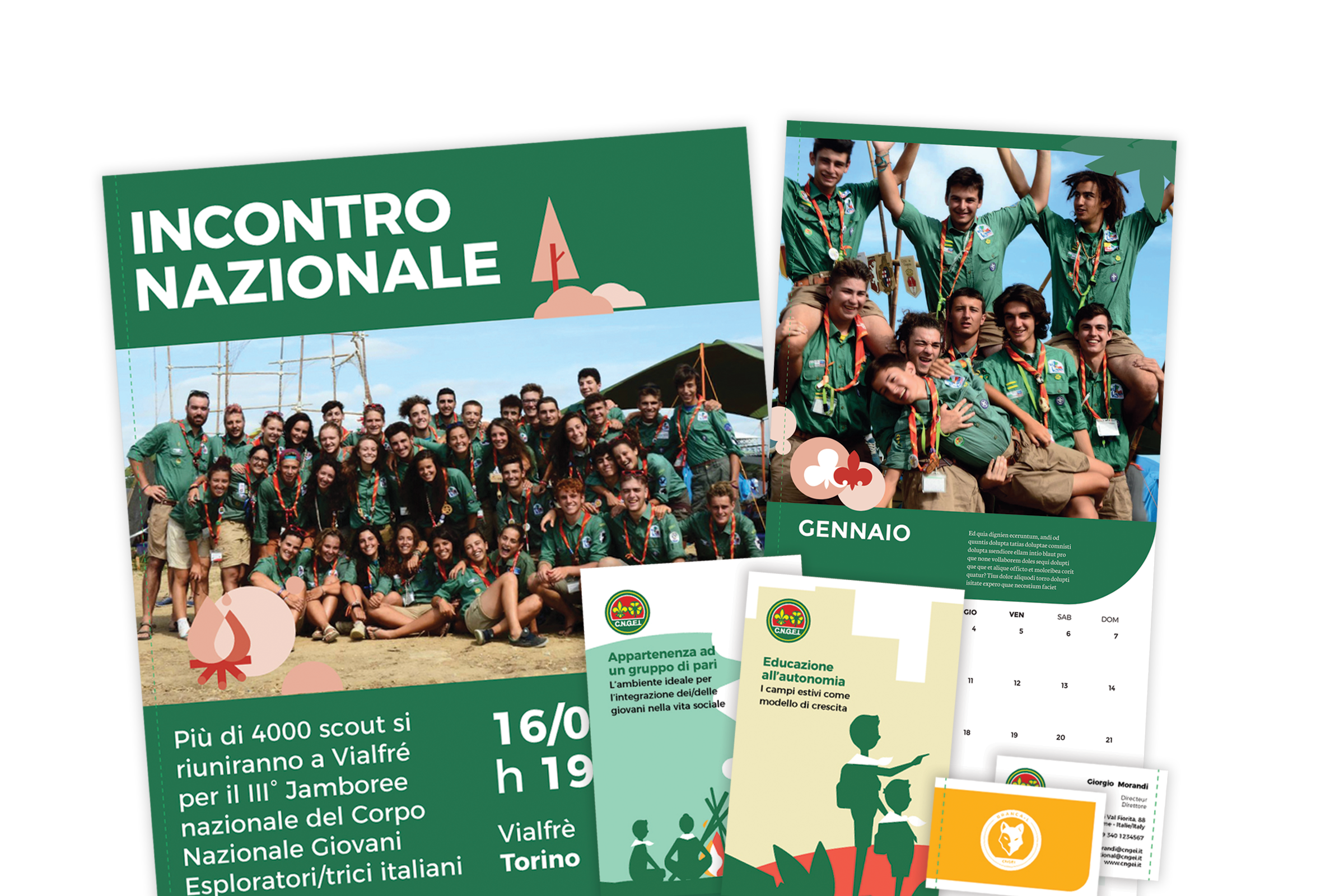
Our main challenge was to provide a precise and consistent visual approach, suitable for all levels and structures within the organization. We also designed patterns to renovate the main templates for both online and offline communication.
Information architecture
A website that simplifies and optimize the navigation flow.
We completely redesigned the information architecture of CNGEI website to simplify and optimize the navigation flow. The header serves as a launcher to access the three mini-sites related to specific sections, in order to meet the interests and needs of different kinds of users.
Agesci –
Redesigning the tradition
Agesci contributes to the education promoting out-of-school activities following the principles of scouts. We built a multi-level information architecture for the website and designed a new visual identity, in order to meet the needs of local groups as well as national departments. We worked with Agesci in creating a new path towards the future.
Information architecture
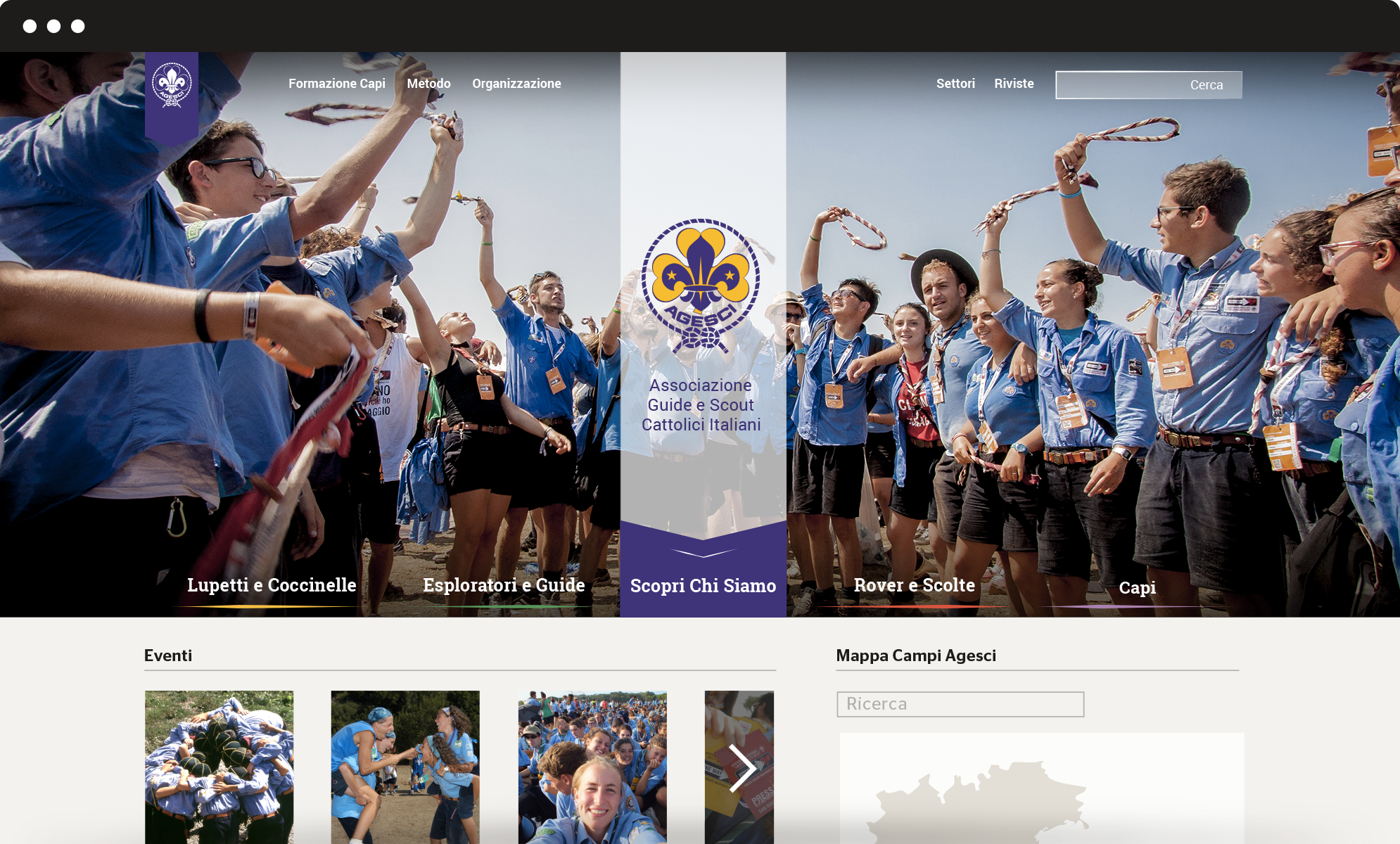
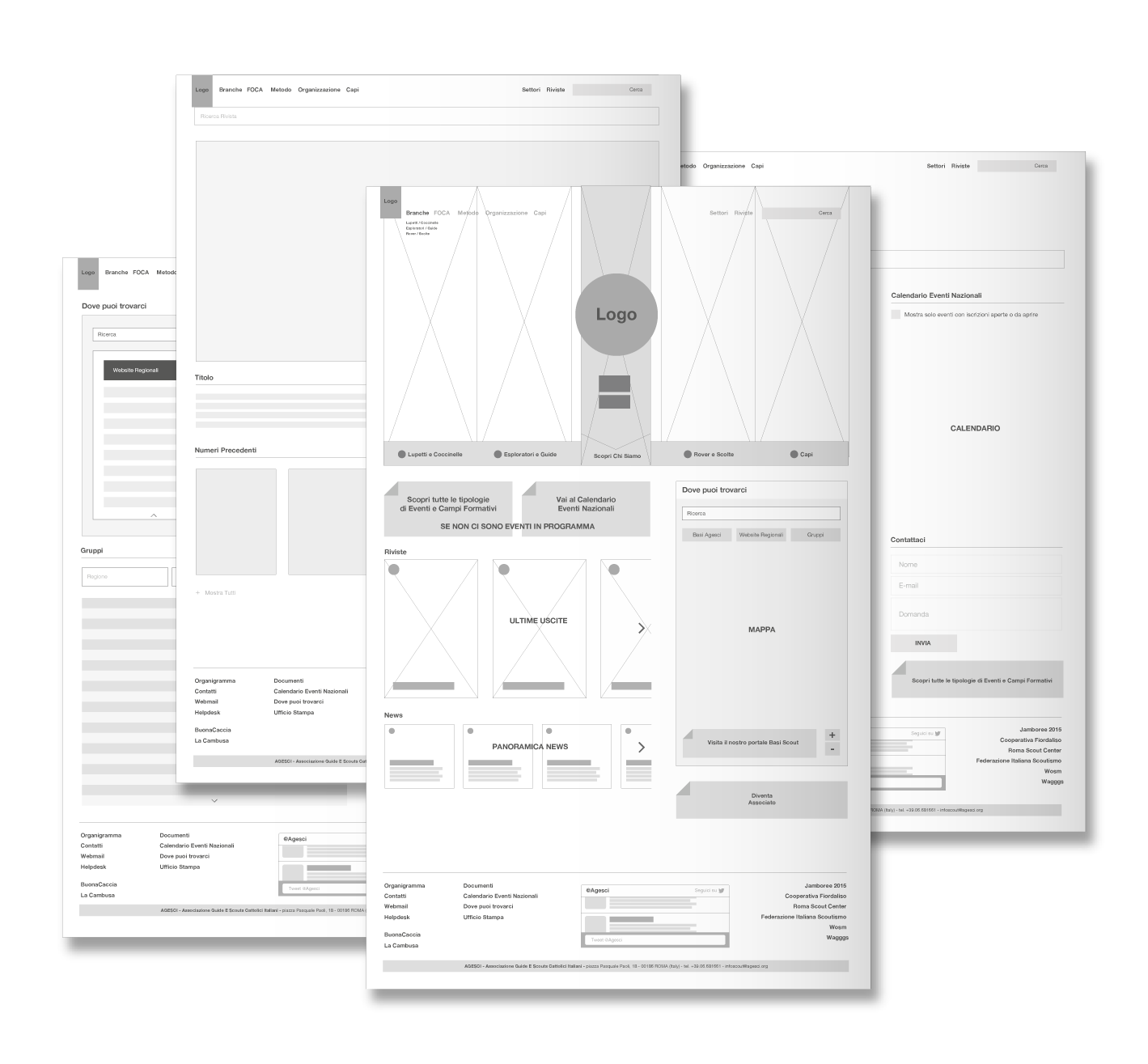
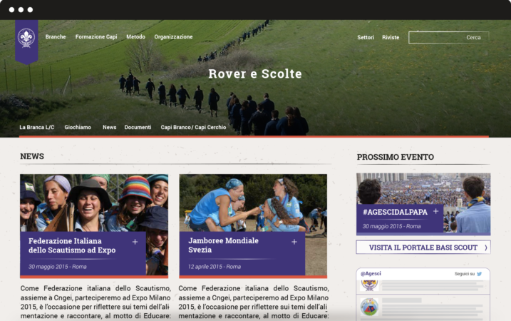
We completely redesigned the information architecture of Agesci website to simplify and optimize the navigation flow. The new vertical structure meets the interests of different kinds of users. The header plays a double role: it provides an overview of Agesci’s world and serves as a launcher to get access to specific sections.
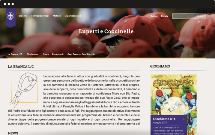
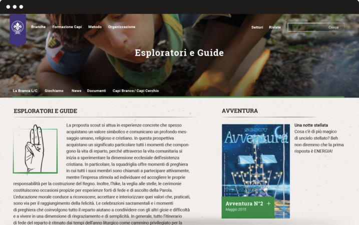
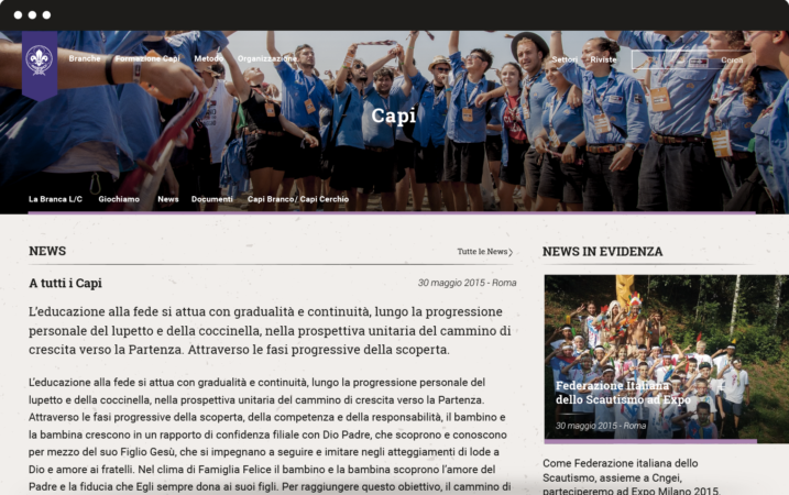
We also created four mini-sites for every branch: Lupetti and Coccinelle (8 to 12 years old), Esploratori and Guide (12 to 16 years old), Rover and Scolte (16 to 21 years old), Capi (older than 21 years old). Each has its own colour.
Graphic layout
We succeeded in finding graphic solutions that hold together tradition and innovation. Gold and violet are the traditional colours of Agesci logo: we chose three different shades of violet and combined them with three complementary colours, to let the violet emerge as the prominent colour. To guarantee high readability we chose Roboto and its serif version Roboto Slab as font: this choice also reflects special care for tradition because it’s very similar to some fonts used for scouting manuals at the beginning of the century.
Visual identity
We worked on restyling the logo for regions, zones and groups and we designed a mono-colour logo mark to be used in informal contexts. We also designed patterns to renovate the main communication templates.
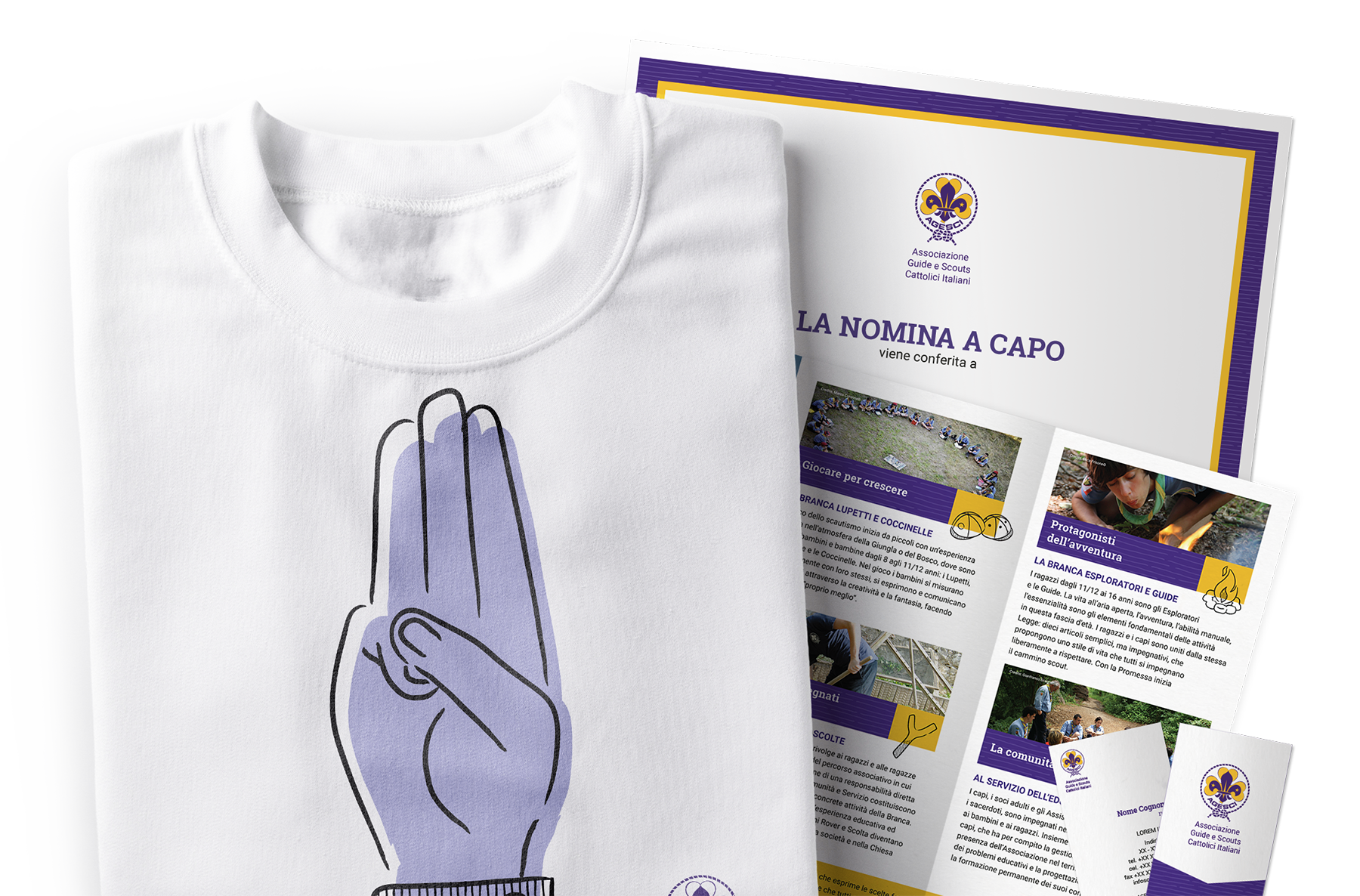
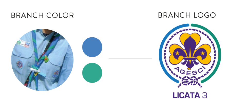
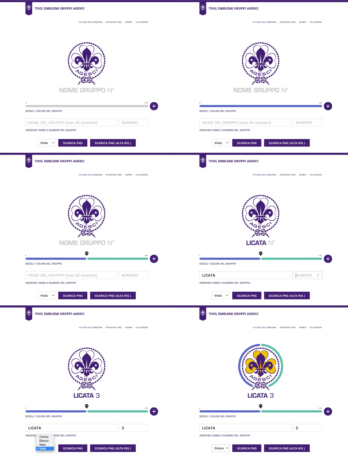
We designed an online tool to customize the logo based on the colours of each group’s iconical handkerchief. The tool allows creating a coloured circle that surrounds the official national logo, becoming the hallmark of the group. This is a user-centred solution that strengthens the coherence of Agesci visual identity while enhancing specific local dimensions.
