Topic: arts
FAI Fondo Ambiente Italiano –
A world of support for the Italian heritage.
We were asked to create a website that could communicate the mission of the foundation and share contents from the different national groups of volunteers. Working on both the back-end and the front-end, we designed an optimized information architecture, available in several languages, which smoothly guides users through FAI International activities and opportunities.
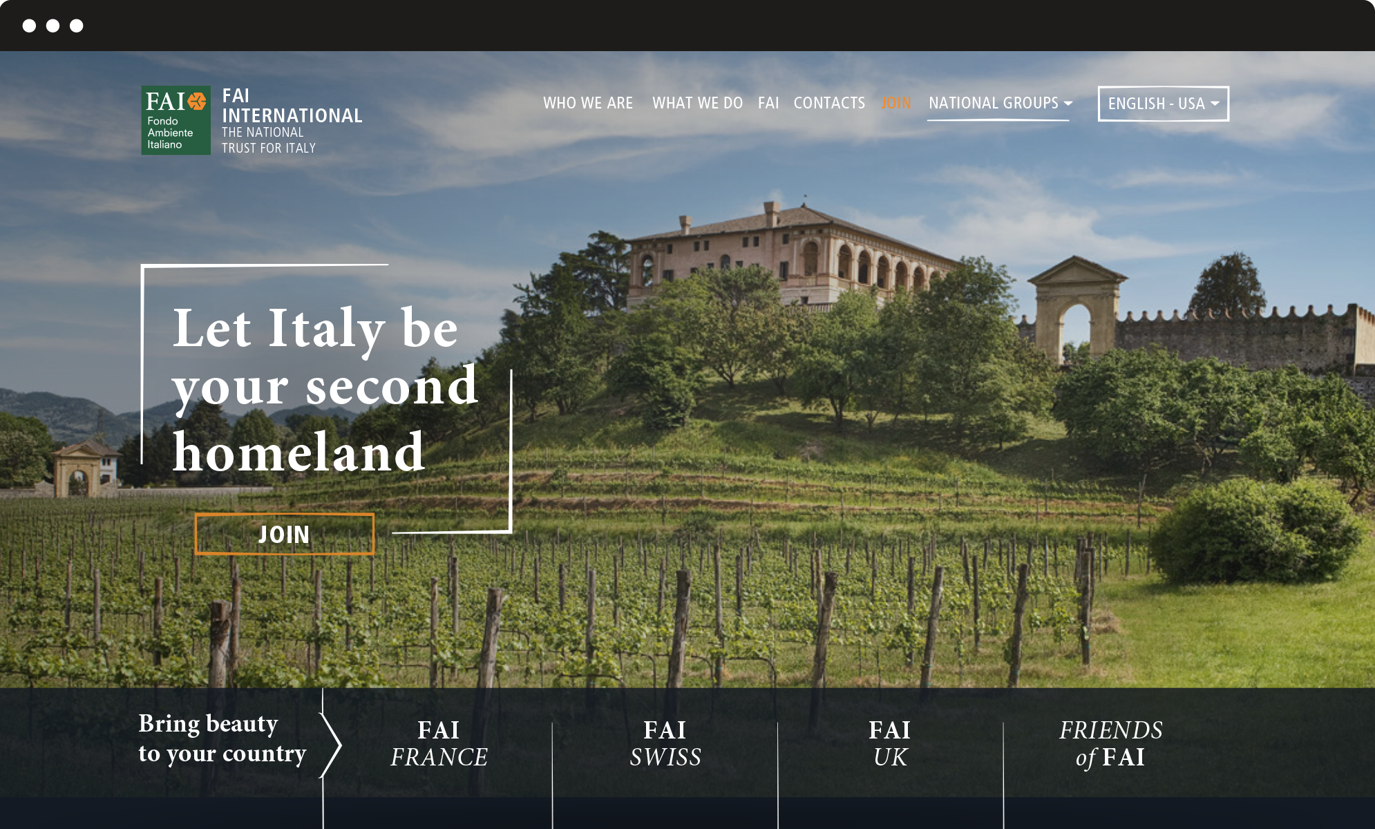
Vertical structure
From the main landing page, designed to welcome the visitor, users are invited to explore the vertical layers which correspond to the national websites, as well as the different calls to action, such as become a member, donate, join us. The vertical structure ensures clear and simple navigation and progressively involves the user in the vast and diverse world of FAI.
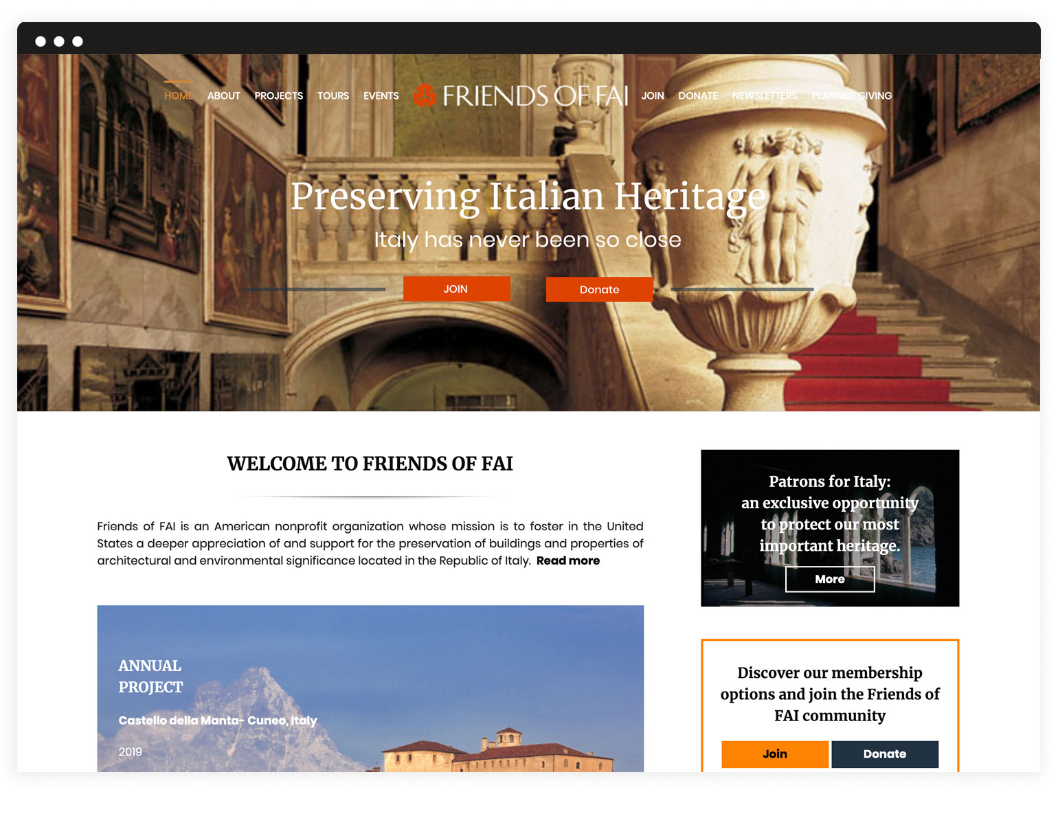
Graphic layout
With its elegant and evocative aesthetics, the graphic layout enhances the easy navigation and emphasizes the official and coherent image of the foundation. It answers the need for a unique and solid image of FAI, apt to be shared through its different national groups.
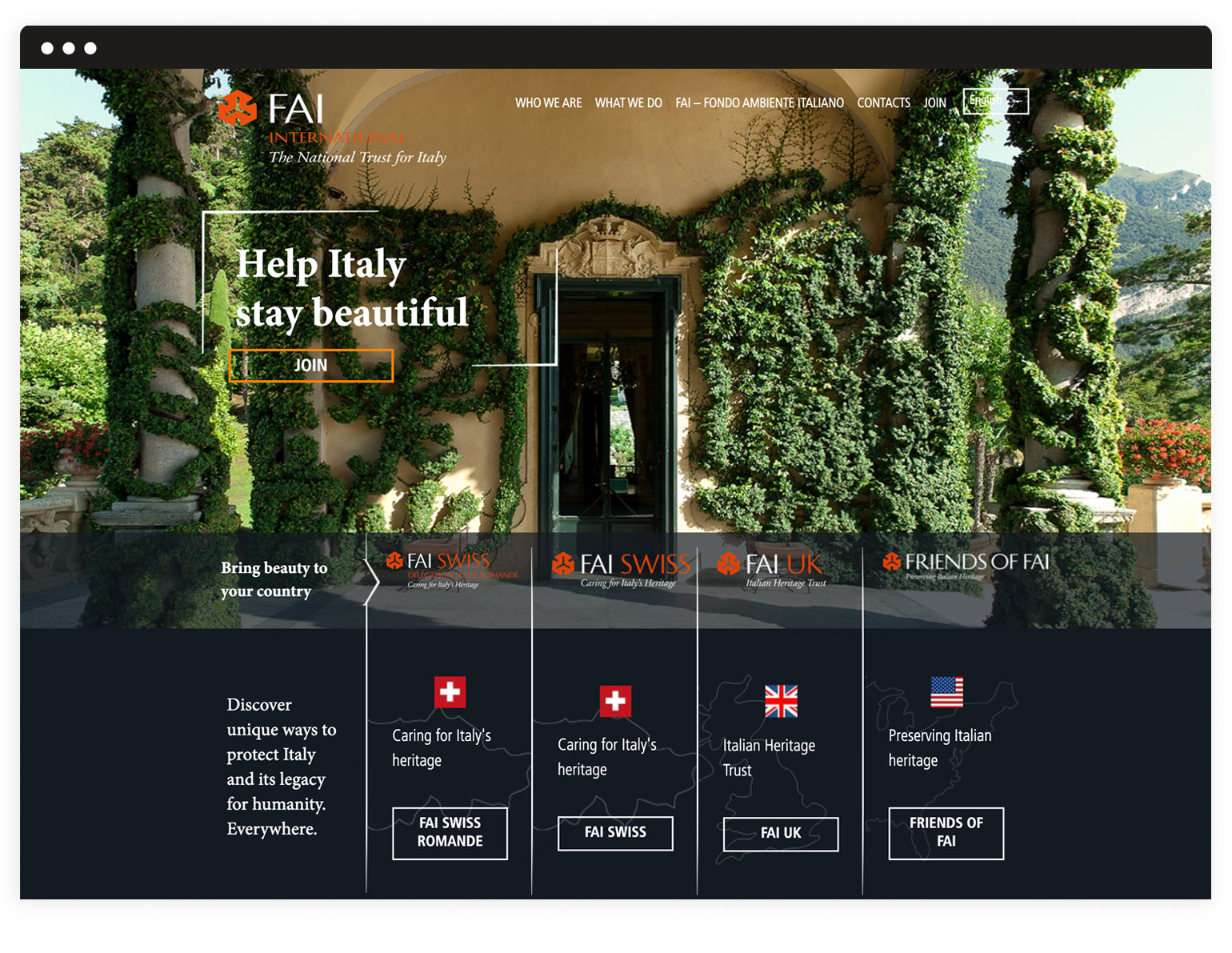
Multisites
In order to facilitate the use of the websites by FAI volunteers worldwide, who do not have professional technical skills, we chose WordPress as CMS. Besides a common set of functions, we selected a range of sections that can be activated according to specific national group’s requests. A multisite network which ensures integrated and centralized management and maximum graphical coherence.
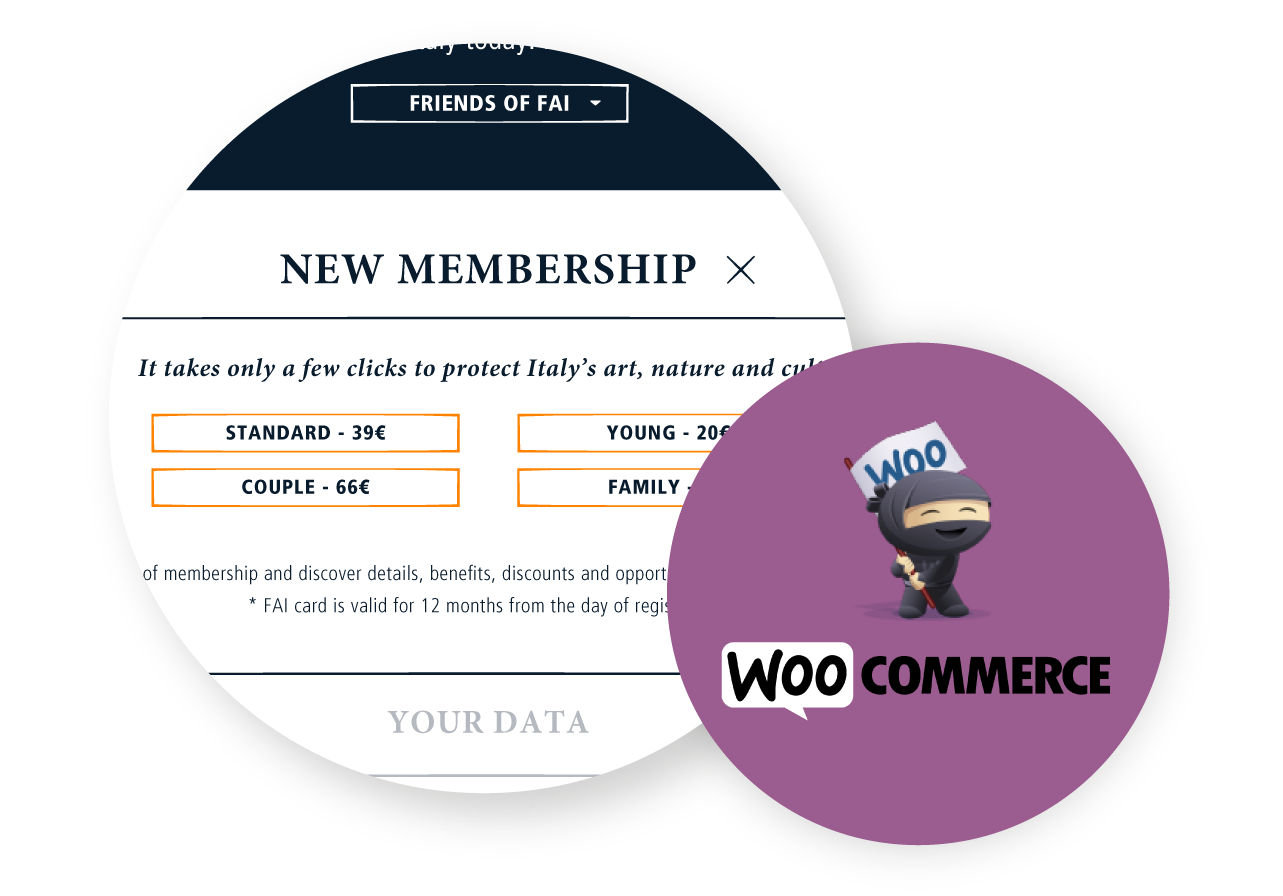
Woocommerce plugin
We implemented the subscription and the donation forms with customizable options available for each specific national site. We chose Woocommerce to manage and optimize the membership and donation process, so that every step is handled through the website: both the user and the admin do not have to involve other systems and all the processed data are already in one place.
Ministry of Cultural Heritage and Activities and Tourism –
Art Bonus
In 2014, the Italian Ministry of Cultural Heritage and Activities and Tourism promoted Art Bonus, a Decree Law to increase private investments in art and cultural projects.
In order to inform and organize different users involved in this complex project, we designed and realized a graphic proposal that combines elements of tradition and modernity.
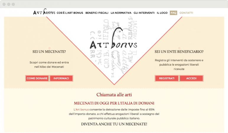
Logo and tagline
A link with tradition.
Illustrations, chromatic choices, graphic elements, front-end design are the visible parts of a complex project, with multiple levels of development and a layered structure.
The name of the project – Art Bonus – and the logo are both linked to tradition: the name is in Latin, the logo fonts are taken from manuscripts of past centuries. We proposed a tagline that would add a hint of modernity, a brief sentence to complete and freshen up the logo: “Chiamata alle arti” [Call for Arts] is a way to link the traditional elements of the logo and of the Italian cultural heritage to all the aspiring patrons who want to be involved in the future of this heritage.
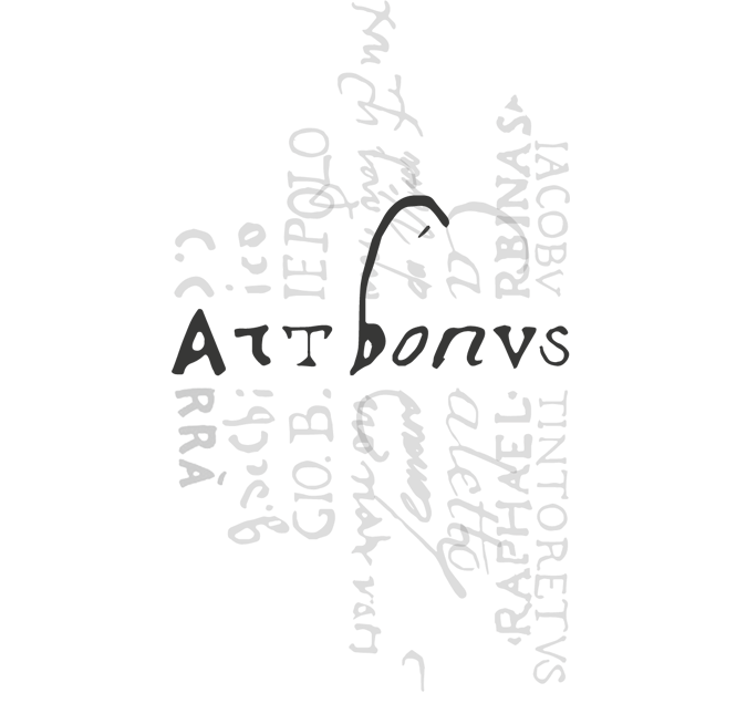
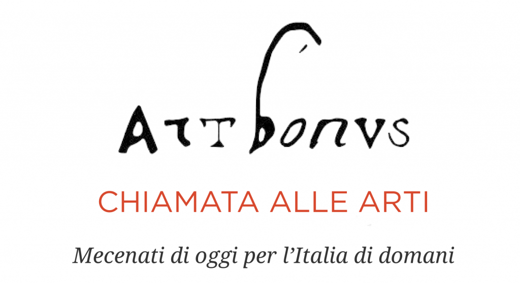
Brand Identity
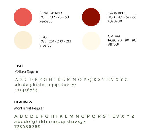
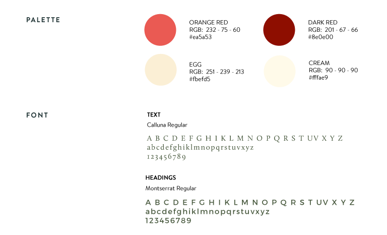
Colours and fonts were chosen to give the website a feeling of order and stability.
The main colours are neutral except for the two shades of red, the real “fil rouge“, a sort of path highlighting the important contents and guiding the users through the pages. Red is also an emotional colour, appropriate for the purpose of the campaign: to involve private individuals into art patronage.
The chosen font for headings is an elegant and contemporary sans serif, while the font for texts is a modern serif: we created a contrast between modern and traditional, the same contrast recurring throughout the website.
Graphic elements
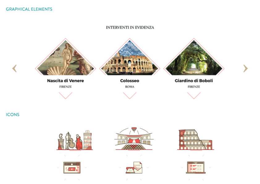
The diamond.
To give the website a modern twist we chose a shape not commonly used in web design to stand out as the most prominent graphic element: the diamond.
This kind of element provides a formal exactness but at the same time, it feels innovative and original.