Topic: Enviroment
Greenpeace –
Make smthng week
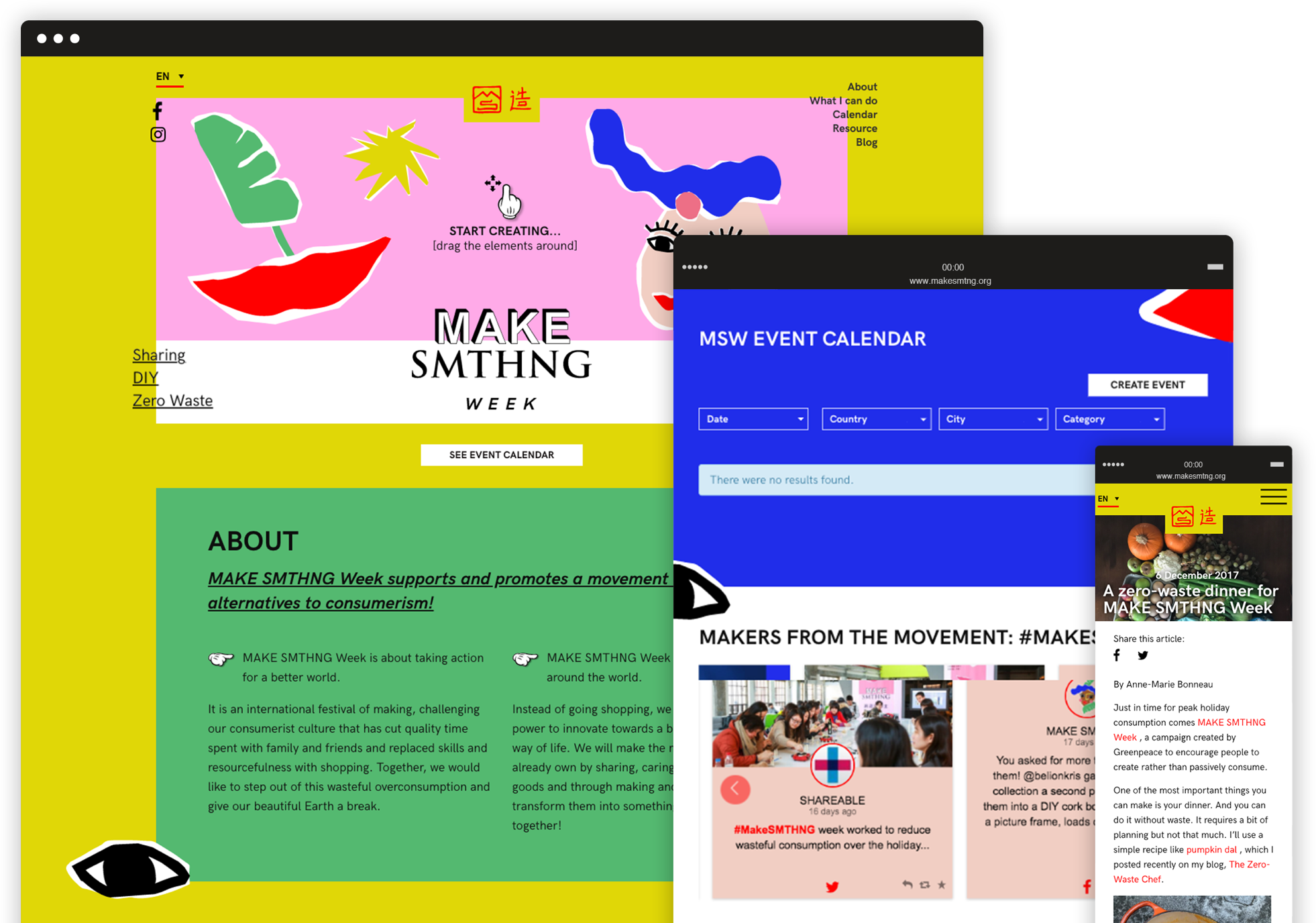
We designed a light, fresh brand identity and an highly engaging website to promote a global movement of makers and a week of fun events all around the world.
Inclusive design
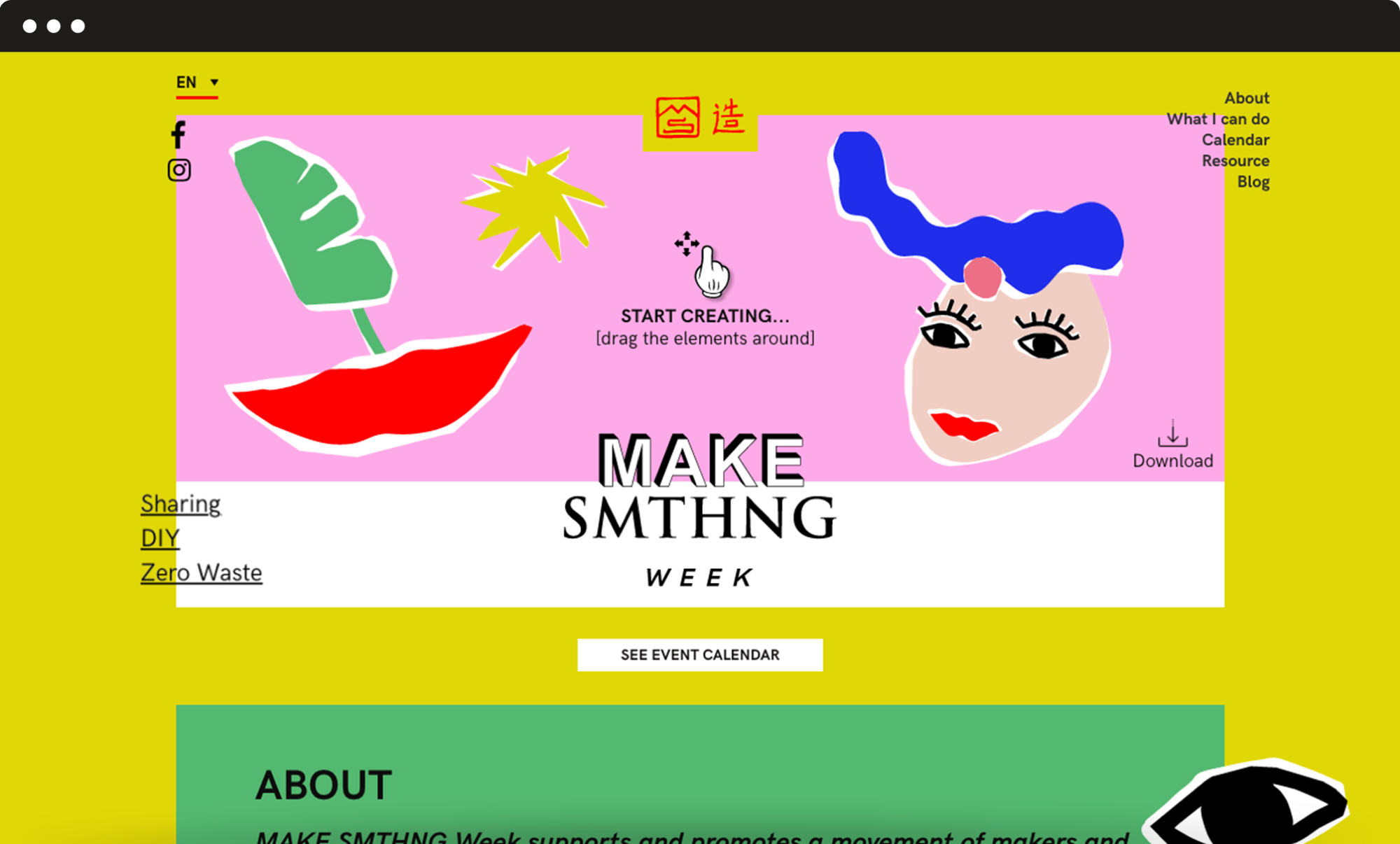
Give shape to your very own cover picture.
We decided to build a simple and engaging top section where users can drag and drop graphic elements, giving shape to their very own “cover picture”. This tool is very much consistent with the principles of creativity, upcycling and DIY that are at the campaign’s core. It also helped to grab the users’ attention so that they would stay on the website and get interested in offline events.
Information architecture
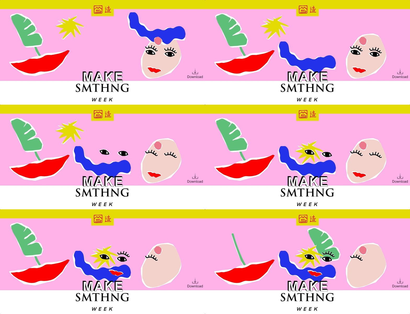
A series of flexible but consistent modules.
The page had to feature a great variety of contents. We played with the colour palette and graphic elements and designed a series of flexible but consistent modules to make the page navigation smooth and give each piece of content the right importance. We also added a fixed menu with anchor links to the different sections, so that users can easily reach any module with just a click.
Elephant Protection Initiative –
A meaningful future for elephants
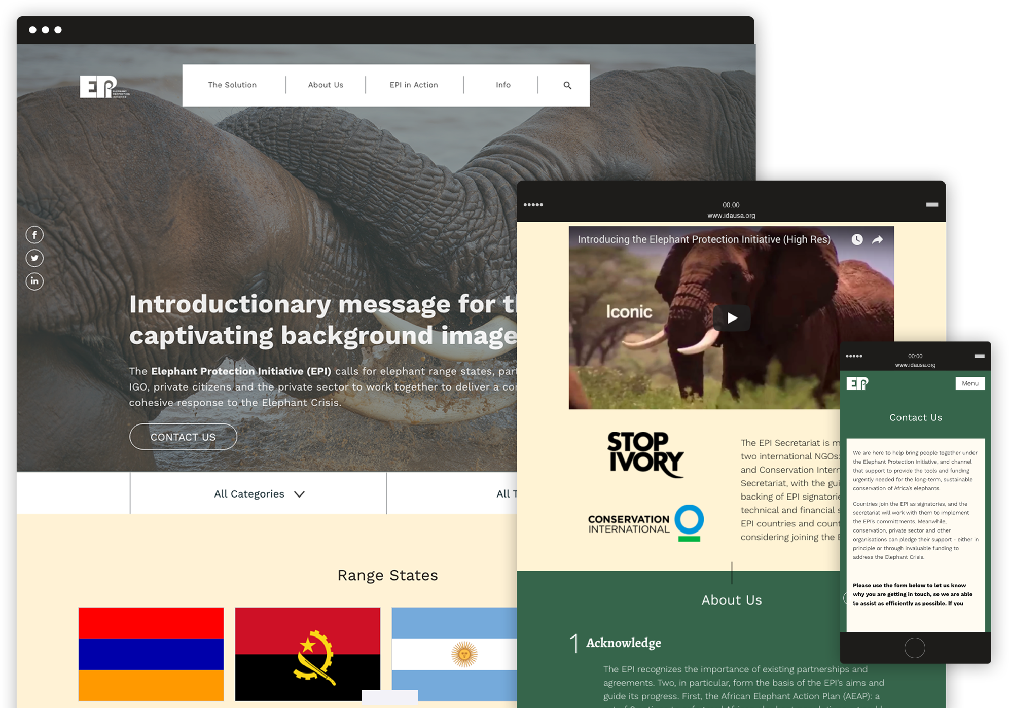
We redesigned the EPI website with a fully refreshed visual identity and a new organization of contents, to facilitate the navigation and drive more users to engage with the campaign.
Visual identity
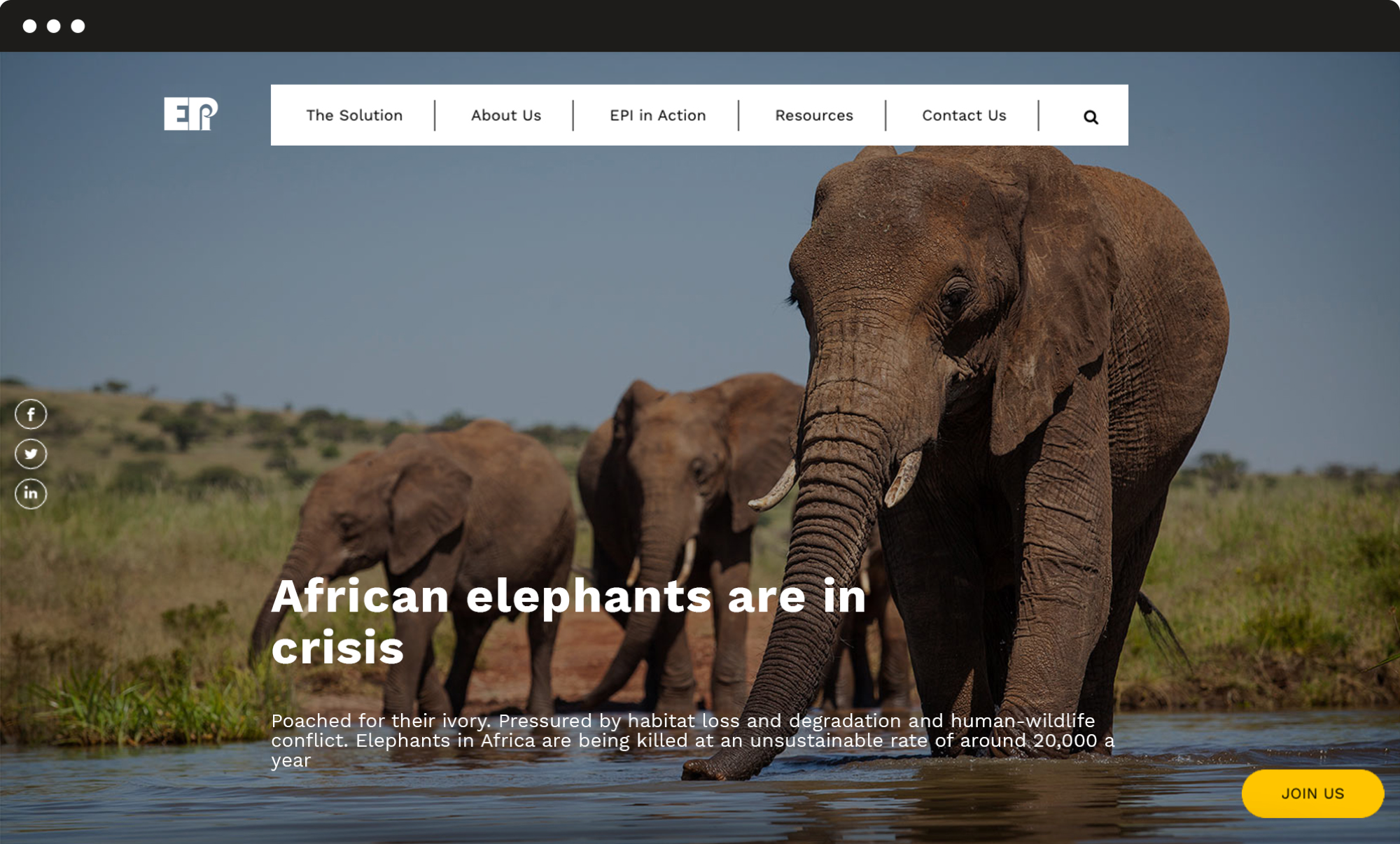
A stronger and modern identity.
We completely restyled the website’s visual design, choosing a new colour palette and different layouts for the pages in order to provide the organization with a stronger, more modern identity, and support the users’ experience by highlighting the most important contents and calls to action.
User experience
A new flowchart and implemented solutions.
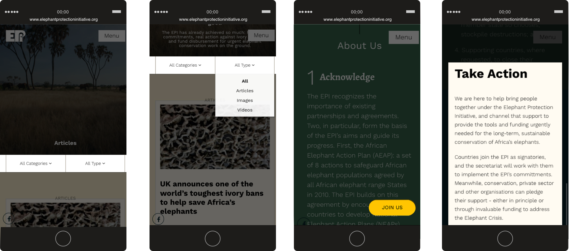
We designed a new flowchart and implemented specific solutions for the main interactive actions that users can take on the website: a fixed Join us button that opens a pop-up form, and a filter system to navigate through many articles and easily find relevant pieces of content.
Greenpeace –
Rethink our tech, end planned obsolescence.
IT companies design their products to make repairs tricky and expensive, while frequently advertising shiny, new devices. Greenpeace is leading a campaign asking these companies to change the system and make products easily fixable, to save the planet’s limited resources.
Landing page
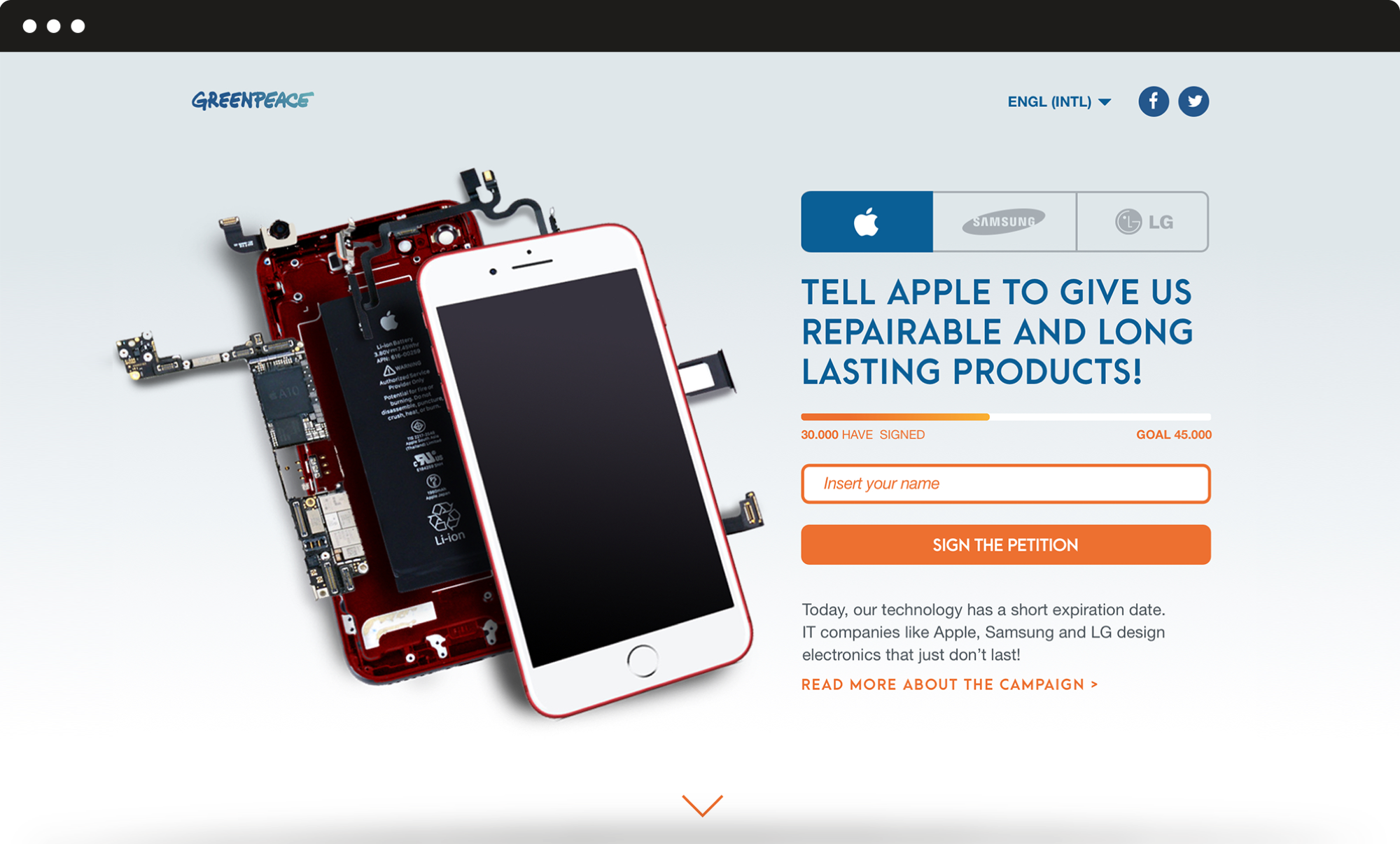
Inform and ask for a commitment.
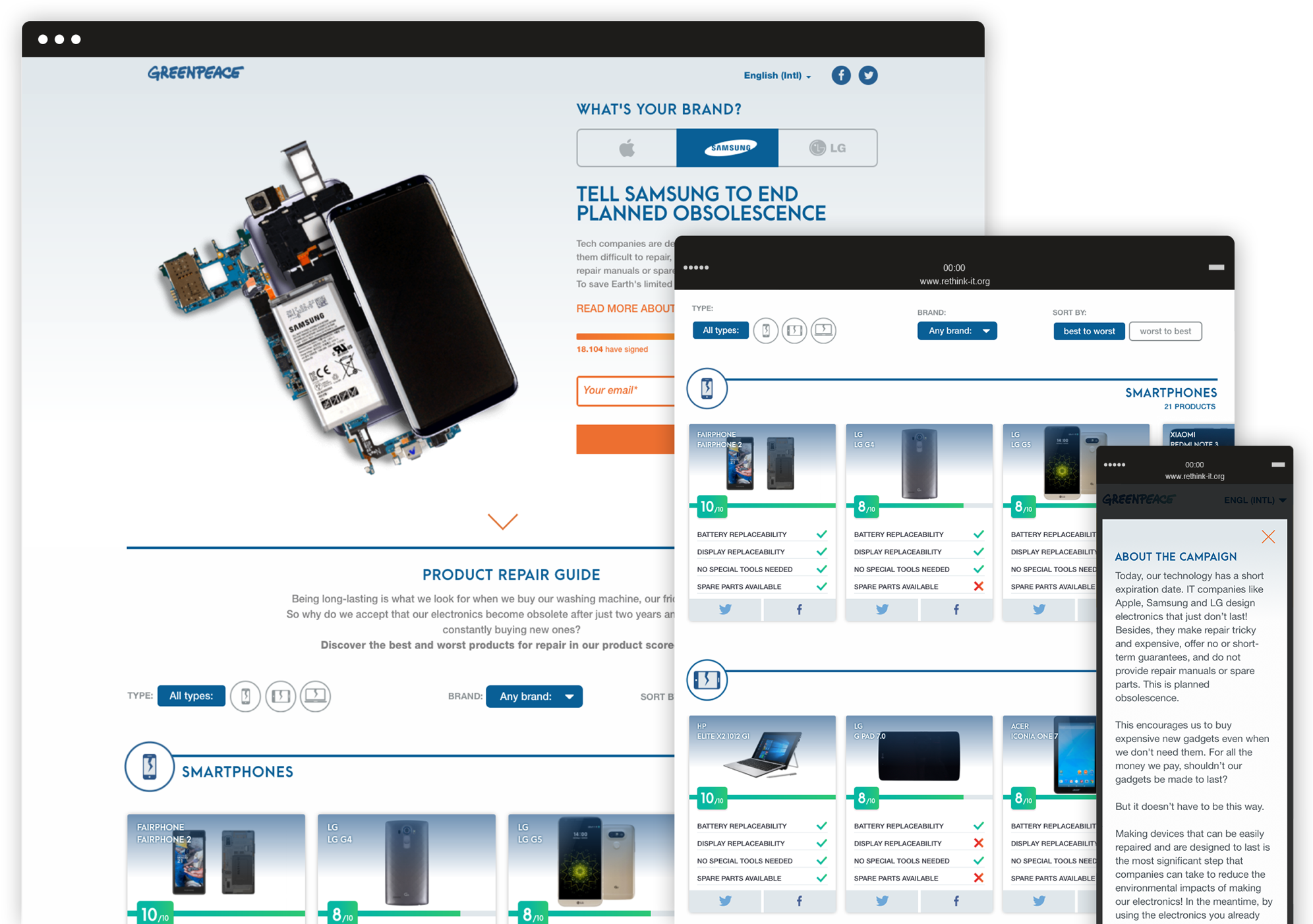
The user can navigate through the Product Repair Guide, a scorecard system that displays data about more than 45 devices: in this way the user is able to identify the best and worst in terms of battery and display replaceability, spare parts available and special tools needed for repair.
Through a dynamic petition form, it is also possible to directly ask the major IT companies to rethink our tech, and design products that are longer-lasting, and that don’t cost the earth.
Booklet
An offline version of the landing page.
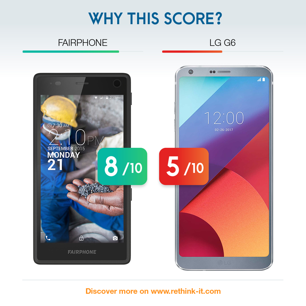
Adjusting the contents of the landing page we created a booklet to inform even offline users about tech obsolescence. The brochure shows all devices (smartphones, tablets and laptops), and each of them has four scoring parameters to understand if and how they can be repaired.

Social media campaign
Three types of cards were studied for the campaign.
The first one recalls the ADV of some famous IT companies while modifying the claim and its meaning. The second type shows a broken glass device and alludes to a “broken” environment, dirty and polluted. The connection between repairability and the environment is the key message. The latest typology, more institutional, short, and impactful, presents a challenge between devices, with a score referring to the level of obsolescence.



Greenpeace –
Save the Arctic 2.0
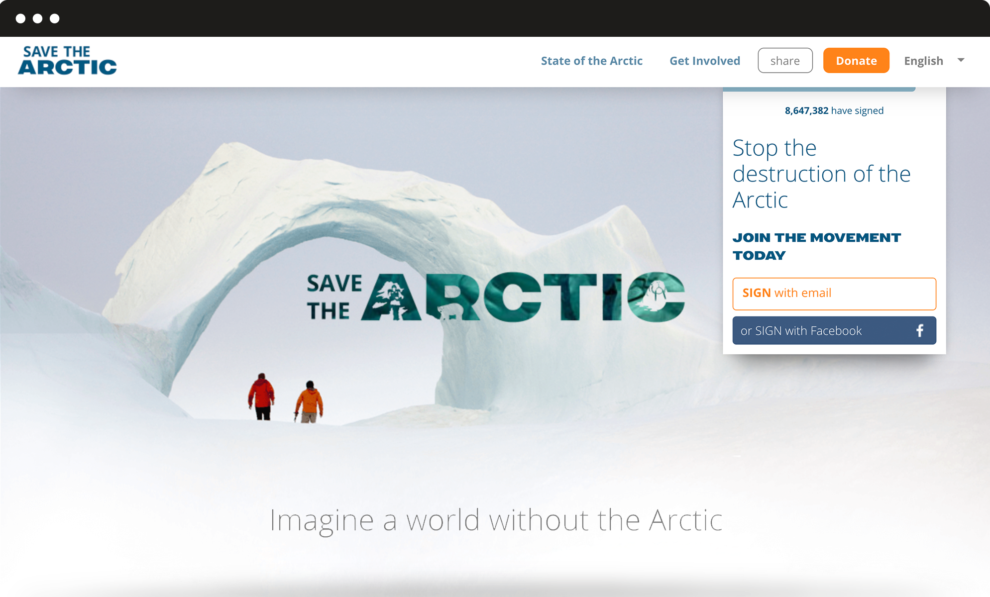
Greenpeace International asked us to redesign the main site of the Arctic campaign. After our successful redesign of the platform, it was time to move from an overarching single homepage to a richer and more complex website.
Information architecture
A first-level menu for the important sections and a second-level menu for other pages.
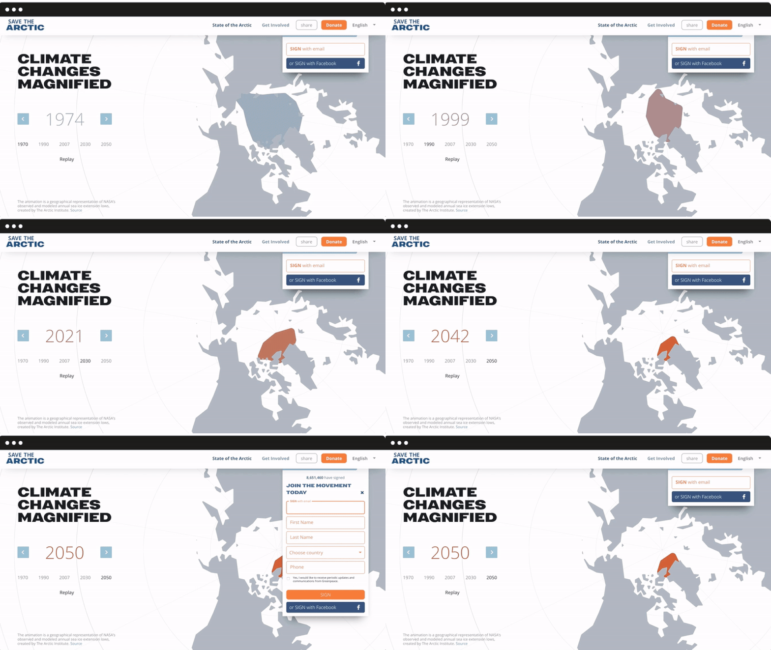
We ran a survey to identify existing strong features as well as expectations, which allowed us to design the site’s structure and new internal pages. We added a first-level menu for the most important sections: State of the Arctic (with interactive charts to display more scientific information) and Get Involved, but also a second-level menu for pages dedicated to the campaign’s history and main petitions. The form behaviour was also revisited, in order to be always visible and fully integrated into the navigation flow.
Mobile responsive
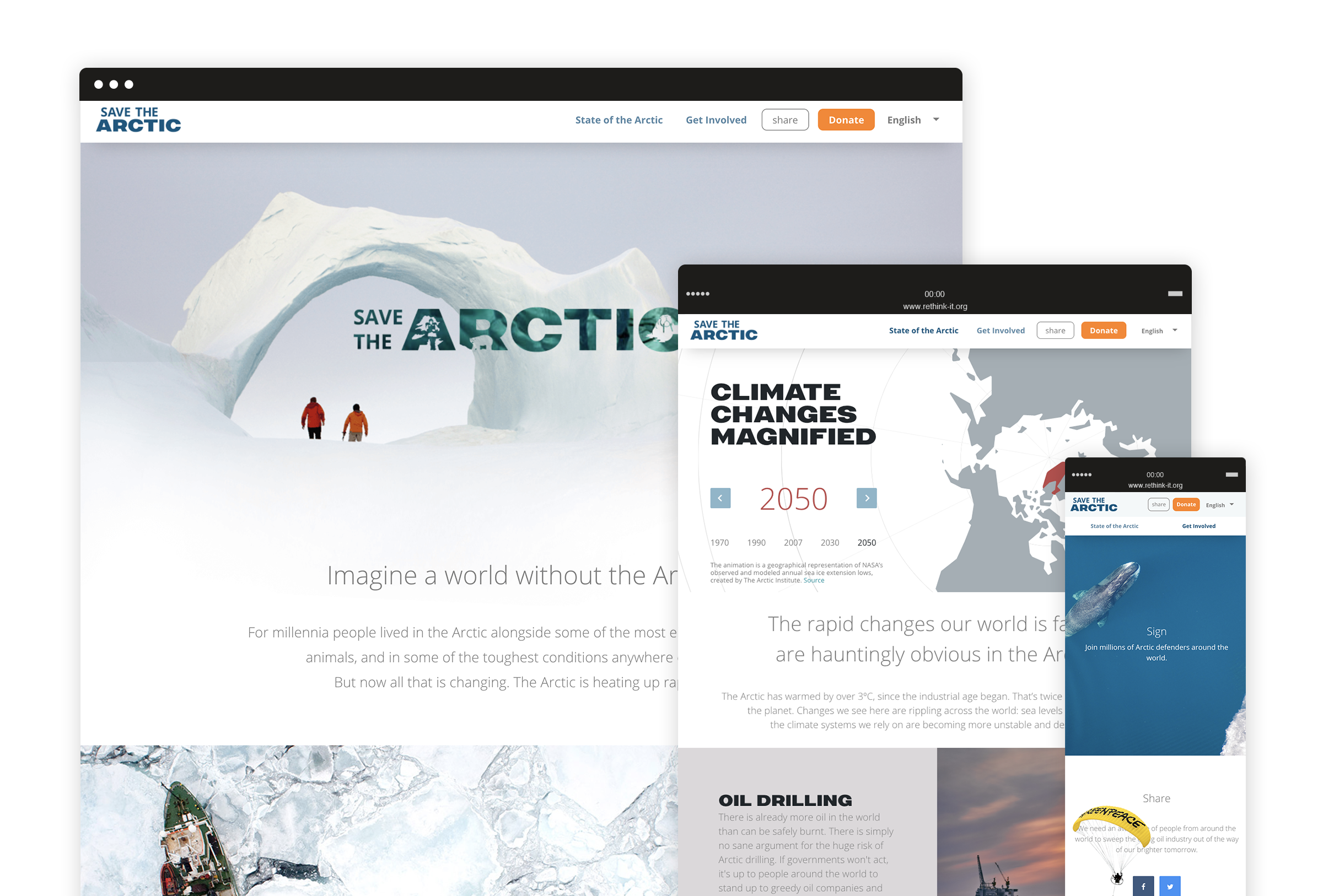
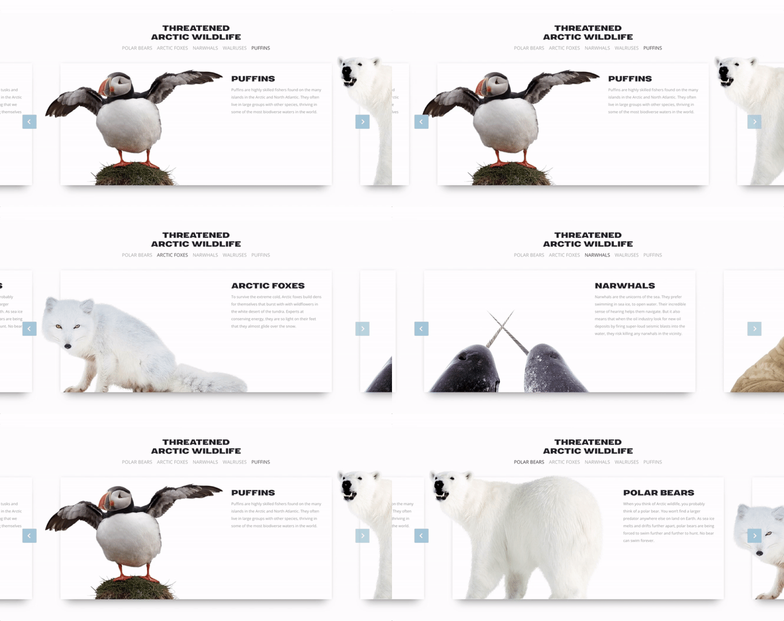
An internal narrative based on sliders and cards to display the most iconic protagonists of the campaign.
Throughout the website are highlight achievements and list the actions people can make every day to support the Arctic. Such horizontal structure is highly usable on mobile devices and it allows users to smoothly discover different contents with the top of a finger. We also designed a super lightweight petition template optimized for slower connections and mobile use, focusing on key contents and, of course, the signup form.
A new visual language
A new way to talk about the Arctic and communicate key concepts through visual design.
We got inspired by how Greenpeace describes the Arctic today: a fragile sanctuary, a gorgeous, almost sacred place that belongs to everyone and needs to be protected. We used airy spaces, top view photography, light typography and white shades to convey the concepts of untouchable beauty and fragility, whereas urgency and calls to action stand out thanks to brighter colours and bold fonts. All over the website, we used carefully selected images to visually guide the user through the campaign and reinforce the storytelling.
Greenpeace –
Save the Arctic: choose people over oil.
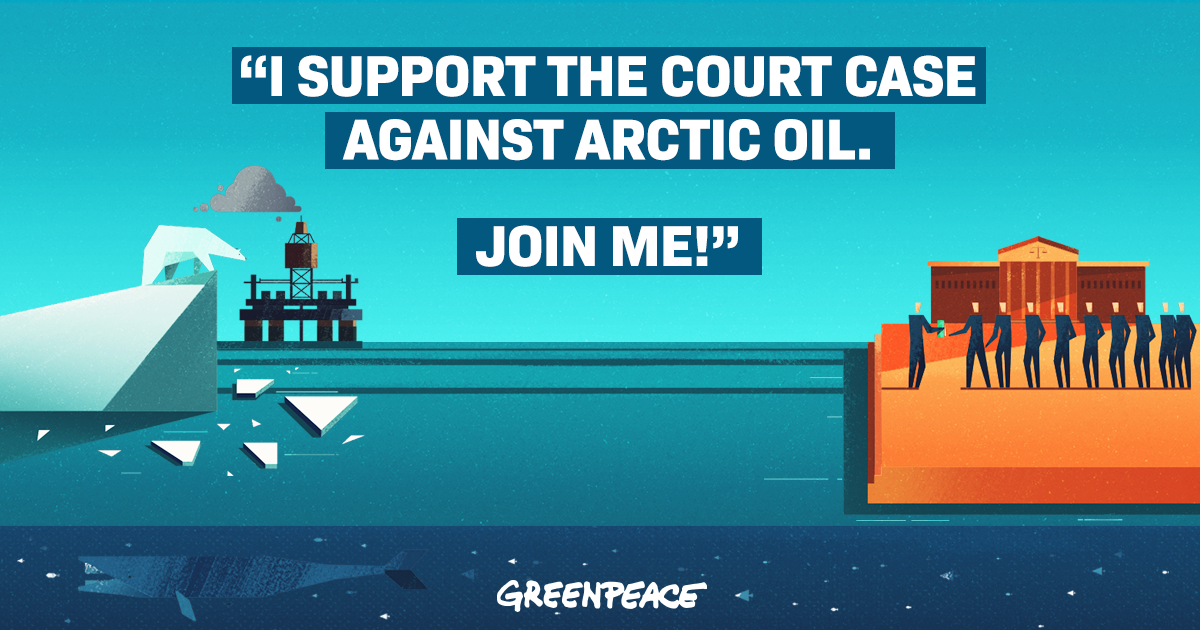
Greenpeace asked us to build a website where people can join the movement against Arctic oil by adding their names, pictures and statements to be submitted as evidence during the trial against the drilling.
Online engagement
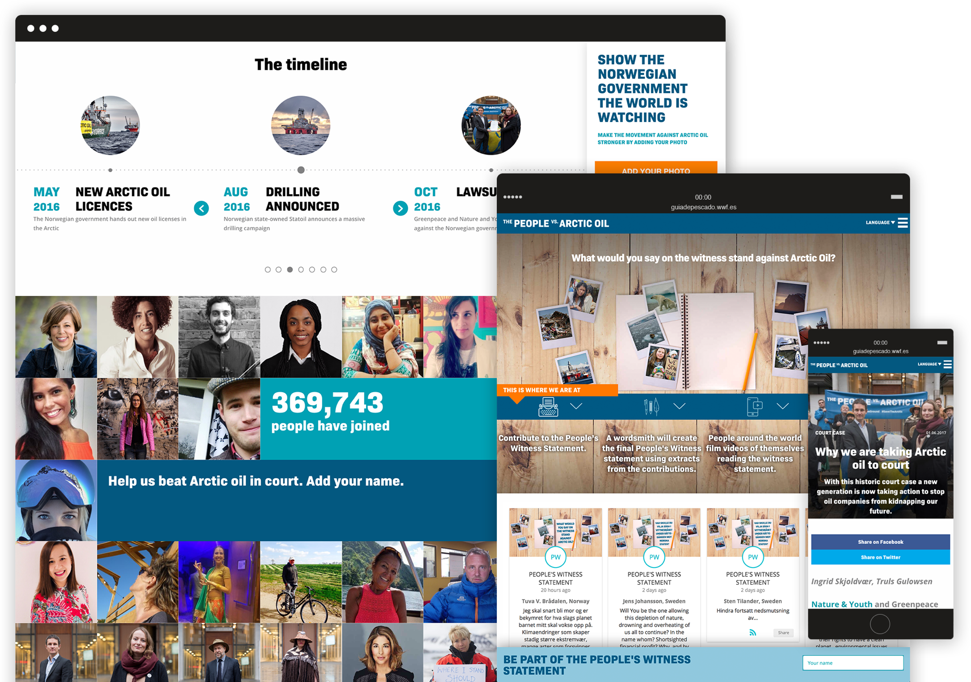
The Norwegian government has to know that thousands of people are getting involved in this battle.
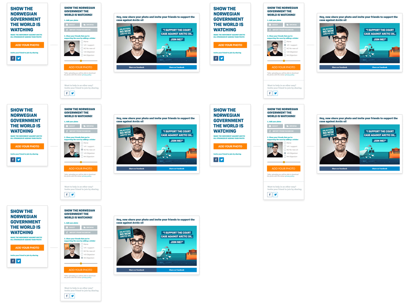
Such huge engagement is enhanced thanks to a step-by-step process that allows every user to: sign the petition, add their picture to an online photo wall, customize it with stickers and share it on social media, and finally publish their own witness statement on the cause. These many possibilities for a direct engagement establish a strong bond with the audience.
Online petition
The user is always reminded of the importance of their contribution and can take action at any time.
The petition about the court case is central in this campaign, but it was also important to show the case timeline, as well as articles, storytelling content and key information on the initiative. That’s why we designed several modules and pages to fit all this different content but kept the petition form fixed in the site sidebar.
Greenpeace –
A 3D giant bear to save the Arctic
We’ve been asked to find a creative way to catch people’s attention in crowded outdoor locations, in order to propose them a VR activity related to the fundraising campaign to save the Arctic.
We wanted people to get closer to the volunteer desk but at the same time to have fun and get involved.
Guerrilla
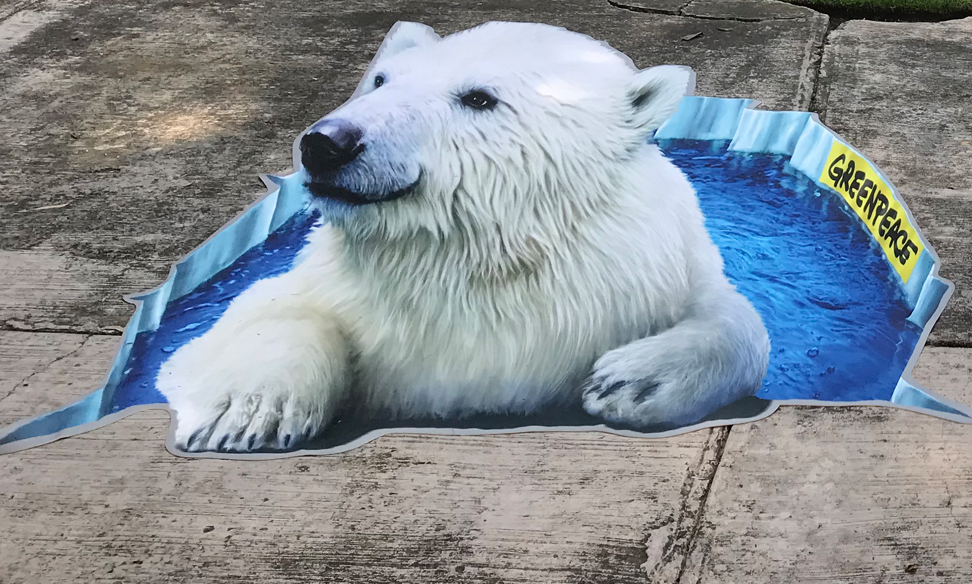
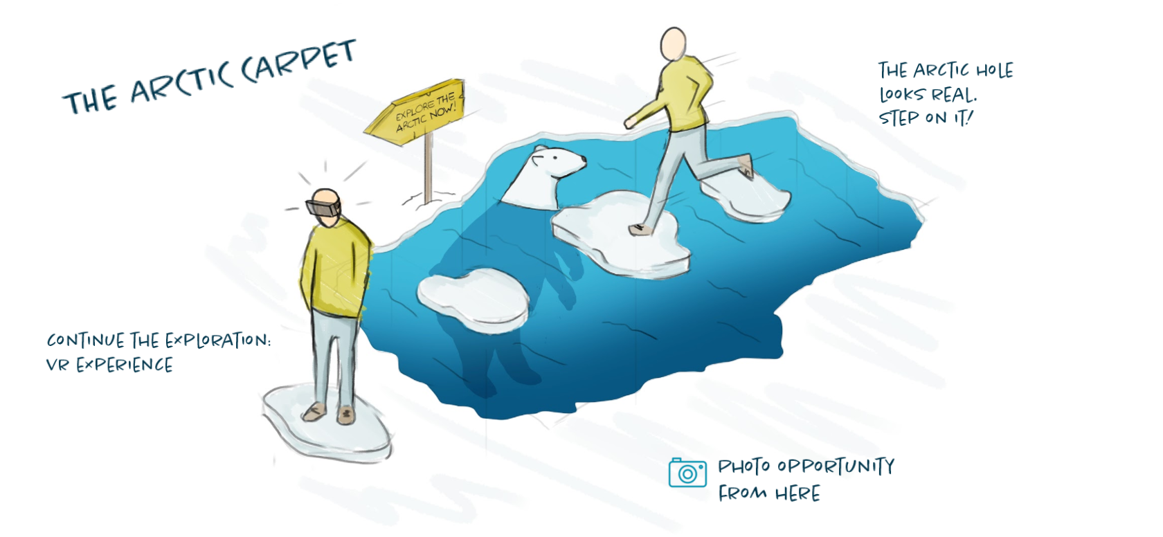
A 3D carpet picturing a realistic polar bear coming out from the ice.
We realized the perspective carpet by using the anamorphic painting technique that creates an optical effect: it looks like the polar bear is coming out from the ice that became an amusing photo opportunity for people passing by.
The carpet was just the main element of a complex outdoor “village”.
Event giveaways
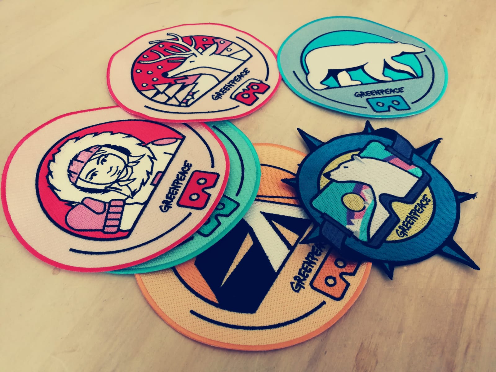
A series of colourful and catchy badges that picture several symbols of the Arctic world.
We designed six “Explorer Patches”. We addressed the users as if they were real explorer involved in a mission to save the Arctic.
The patches have been printed as stickers and they have been given to visitors as an official giveaway during the offline experience.
Greenpeace –
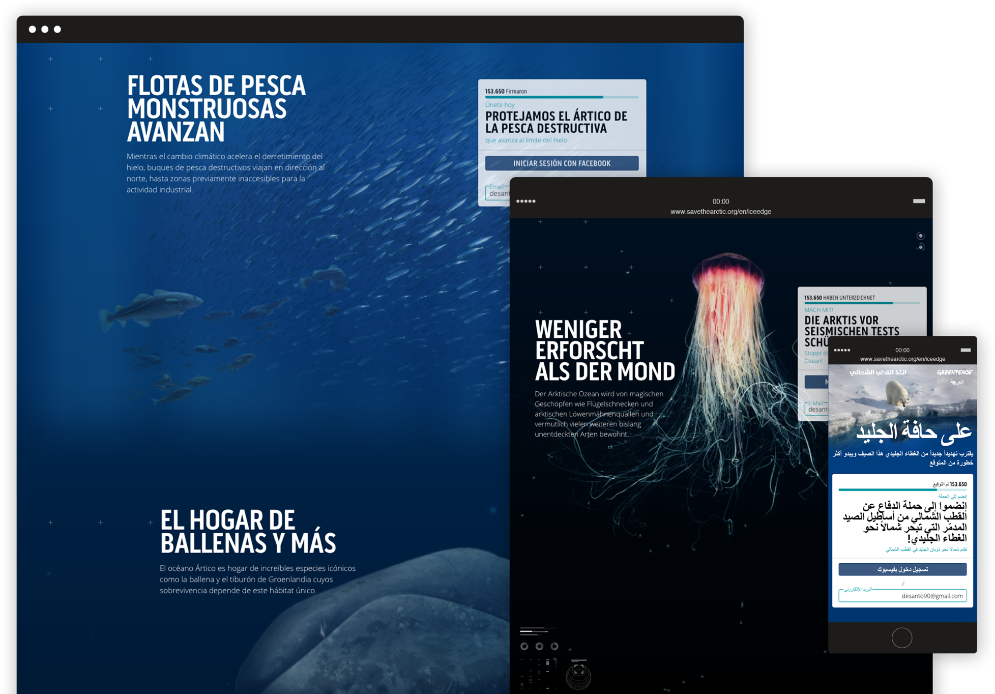
At the ice edge
An engaging website that spreads awareness of destructive fishing in the Arctic and invites people to support Greenpeace in their fight for protecting our planet.
Investigations by Greenpeace have shown industrial fishing fleets are invading the Barents Sea. These vessels are putting this previously inaccessible ecosystem at risk.
Website
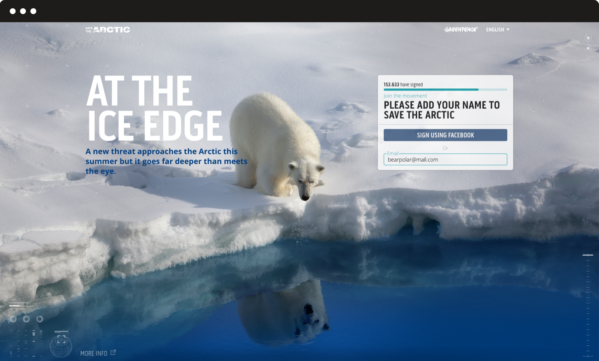
To raise awareness, we built a website where users are driven deep down into the abyss, to discover magic creatures and fascinating ecosystems that need our help to survive. A layered and graphically impactful interface to provide a strong sense of urgency.
The use of the parallax effect ensures an immersive experience, leading the user from the surface to the deep abyss through scrolling movements that reflect and enhance the visual storytelling.
To bring attention to the expandable petition form, we combined a sonar sound with an animated circular graphic behind the form which starts shaking in conjunction with the sound.
Multilanguage
The world environmental issues are closely related. Everyone has to contribute because everyone is involved. It was necessary to spread the site globally by providing the platform for exploration in twenty different languages, and this was possible thanks to our CSS management capability that has enabled all content to fit into the landing page in the various languages without overturning the structure.
Water Integrity Network –
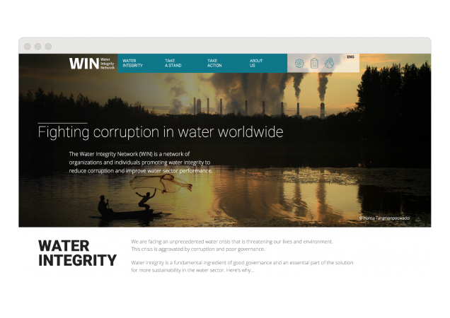
Fighting corruption in water worldwide
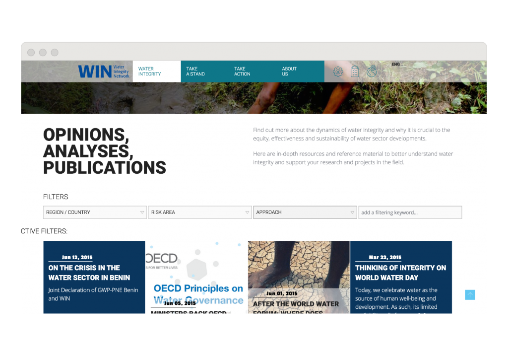
We had a very precise task: reflect clearly the organization’s values and overcome the barriers of communicating a delicate and challenging subject. We realized the Water Integrity Network website to let the user understand the huge amount of data about water integrity.
Brand identity
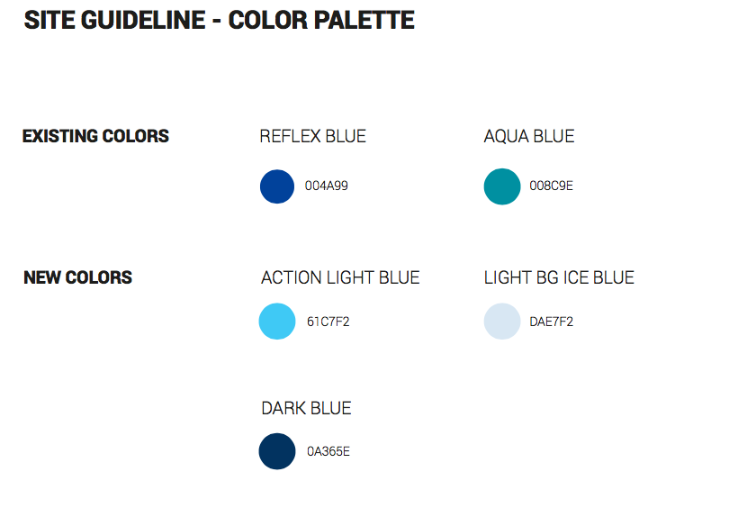
The site design keeps alignment with Water Integrity Network brand identities guidelines, such as colours and font, that has provided its institutional appearance but introducing new shades and elements to give more dynamicity and a modern look.
Information architecture and web design
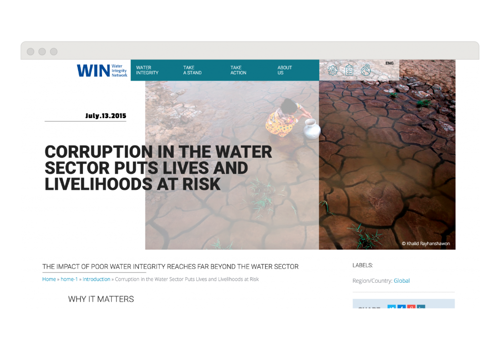
We have chosen architecture of fonts to better express the complexity of content and information distributed on the website. The result is that the editor has a multi-level to organize and express content in posts, and users will be facilitated during their web experience.
A photography slideshow dominates the homepage, emotional pictures are in various areas of the website. Reading posts is comfortable and pleasant thanks to the editorial template design that gives rhythm to the text and increases readability.

Greenpeace International
Save the Arctic
Time is running out for the North Pole. We worked with Greenpeace to restyle their high-priority “Save The Arctic” campaign website, one of the biggest campaigns the NGO has run against oil drilling and industrial fishing in the region since 2012. The campaign demands the area to be declared a natural sanctuary.
Greenpeace asked us to restyle their “Save the Arctic” website. Their aim was to increase conversion rates, build a responsive website optimized for different devices, make it as easy as possible to sign and create petitions, improve the interface with Facebook Connect, and respond to Greenpeace’s multilingual and multinational identity by ensuring easy modification and implementation of new plug-ins and features.
Website
In this project we did an overall restyling of the front end of the “Save The Arctic” website and refactored the back end by building a CMS. We started our work by researching and evaluating dozens of websites in order to gauge their effectiveness, call-to-actions, user engagement and usability.
Despite the fact that a single-page website was required, the design was complicated in and of itself. Greenpeace is an organization with independent offices in many countries. Each of these offices had different requests for the website as far as content, policy and data management went. To solve this conflict, we built a flexible CMS from scratch and endowed each individual national office with the faculty to change layouts and contents and manage the email addresses collected. We built the CMS using MODx, which offers simplicity while being flexible and efficient.
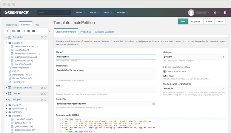
We also developed the possibility of inserting and changing images and videos on the default theme in the main area. The campaign’s goals may vary over time, so we wanted to create a flexible and reusable layout.
Responsivity
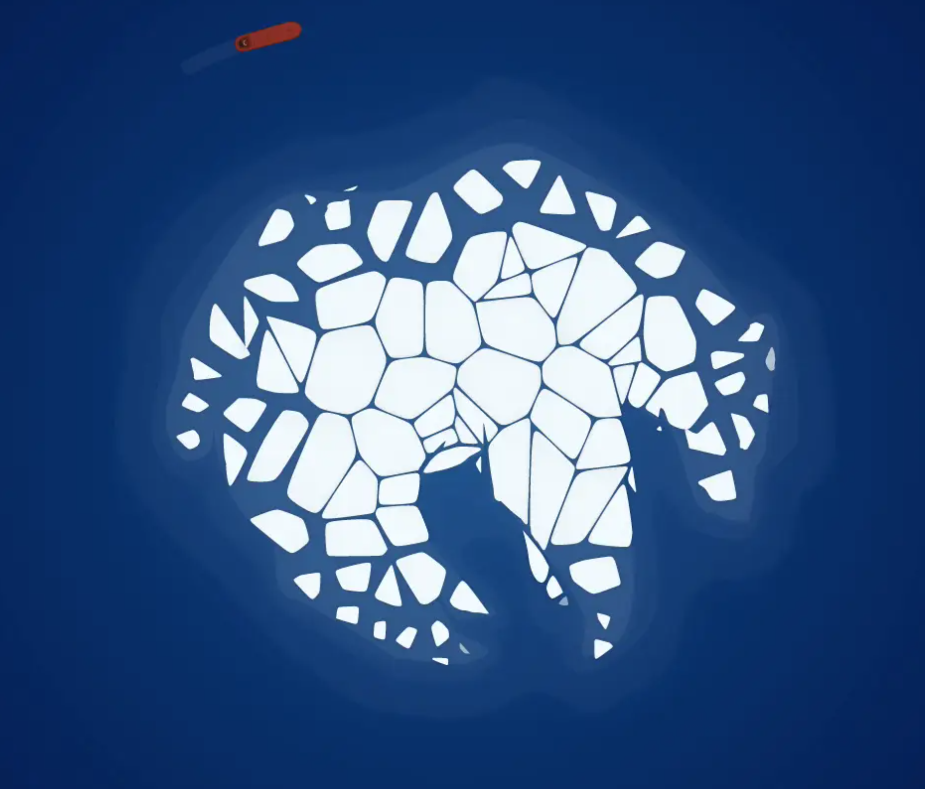
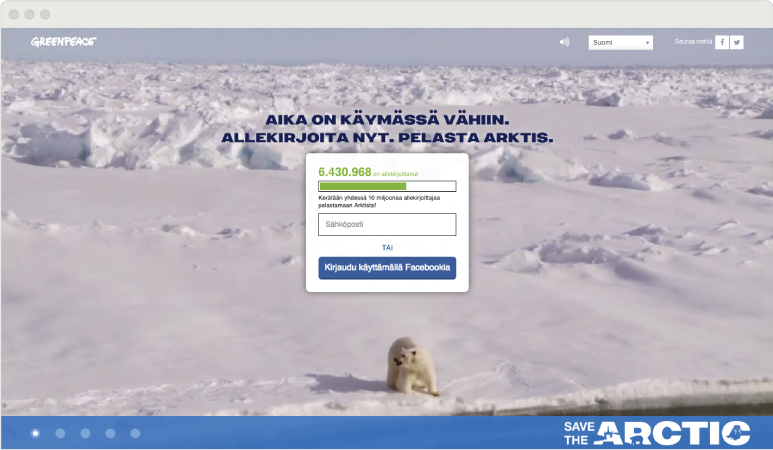
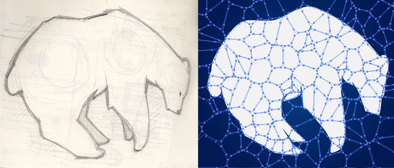
We designed the website along with the responsive approach, and we optimized the website for different devices as well as intended use. While designing the graphics and layout we were goal-oriented but at the same time attentive to the need to make it catchy, modern, fresh and urgent. We came up with the idea of a melting-polar-bear illustration composed of ice blocks; the illustration represents the Arctic environment and urges visitors to stop the melting by signing the petition.
Petition
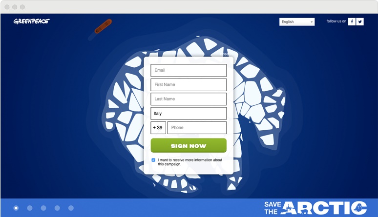
We improved the petition form by implementing a full-screen view and fewer form fields to catch the user’s attention and minimize the process friction. We also designed an effective user flow to lead users to share on their social accounts through a ‘thank you’ page and a ‘thank you’ email that invites friends and includes a donation option.
In this video you can see the animation of the polar bear melting that was on the homepage of Save the Arctic.
Hacking Save the Arctic
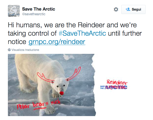
During Christmas 2014, we realized a “hacking Save the Arctic” campaign run by… reindeers.
In the fight against oil drilling, not only the polar bear – which is the iconic animal of the campaign – is in danger, but also reindeers and other species who are living in the same environment .
That’s why an “armed group” called Reindeer United take possession of the Save the arctic campaign, on social networks, during Christmas shouting “Polar bears suck!” and hacking all images of polar animals with reindeer’s antlers and nose.
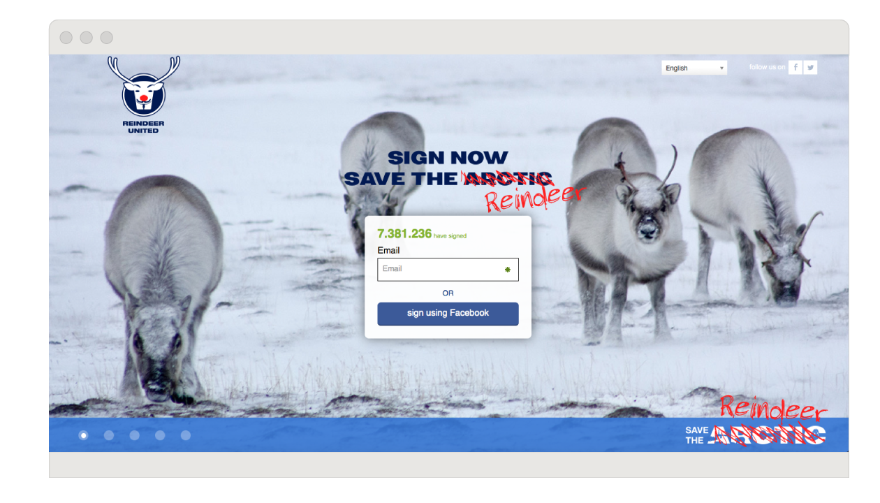
We also realized a replica landing page where reindeers could explain why they had taken possession of the campaign and why saving the arctic is so important, not only for the polar bears.
Results
Around 50 National Greenpeace offices are using the platform that we designed. In the first two weeks, Save The Arctic generated 80,300 total signups and 20,623 new leads.
We, both us and Greenpeace, achieved our goal of increasing the petition conversion rates. Save The Arctic conversion rate increased by 189% after the launch of the platform.
We will continue to work with Greenpeace to improve and develop the platform, along with addressing the campaign’s future needs.
European Green Party –
Green Party: Arctic campaign
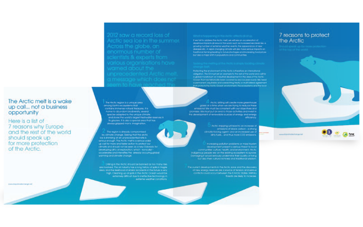
“The melting of arctic is a wake up call, not a profit opportunity”. We can count at least 7 reasons to save the arctic. The European Greens asked us to help them shout out loud the consequences of the arctic melting and the colossal importance of saving our white ocean, all in the framework of the upcoming European Elections.
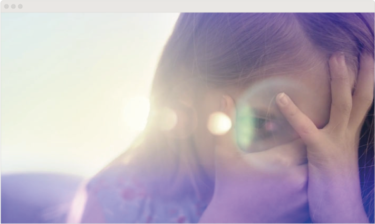
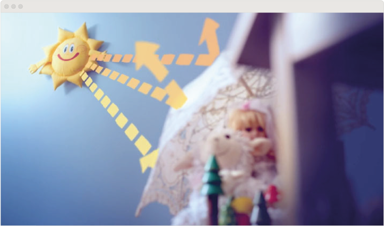
The aim was to highlight the clash between civil initiative, the relentless chase after political solutions for climate change and the all mighty oil industry, who is profiting from the lack of determination in the European governments and pushing shamelessly their destructive agenda.
Brochure
We designed a big format brochure for public distribution, stating clearly the 7 most relevant reasons for saving the arctic and details on taking action with the campaign.
Video
We also produced a video, a mix of live-action and traditional animation correlating this pressing real problem with a child’s wild imagination. The intention behind this concept is that in the end, all those who will really suffer because of climate changes are today’s young generations and we will forever remain responsible for this.