Fondazione per la Scuola –
Education for the future
The collaboration between Latte and Riconnessioni continues with the redesign of the website, aimed at transforming it into a new hub of teaching tools focused on the community of teachers, principals and students. The website is a library of knowledge, a living digital space where it is possible to explore teaching resources and tools organized in a clear and accessible way.
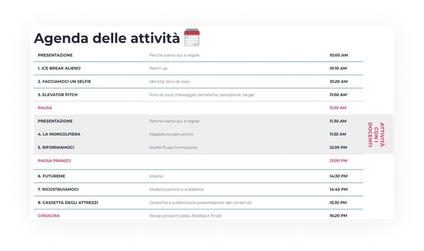
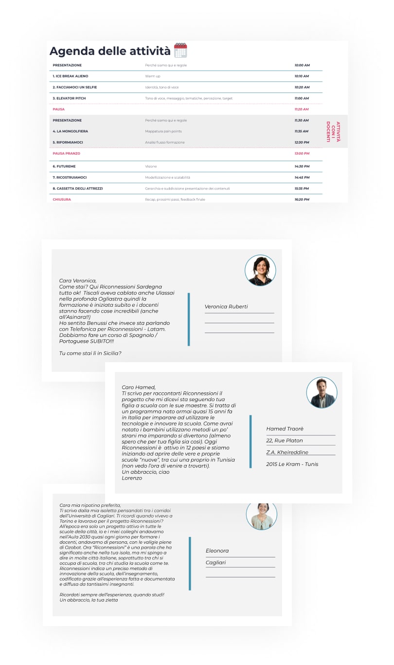
Workshop
Together with the members of the Reconnection team and some teachers, we created a workshop based on gamestorming techniques to co-design a new, shared idea of education for the second three-year period of the project.

Visual aspect
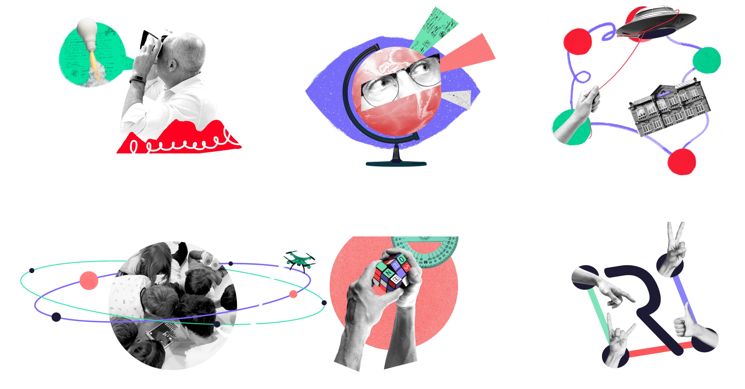
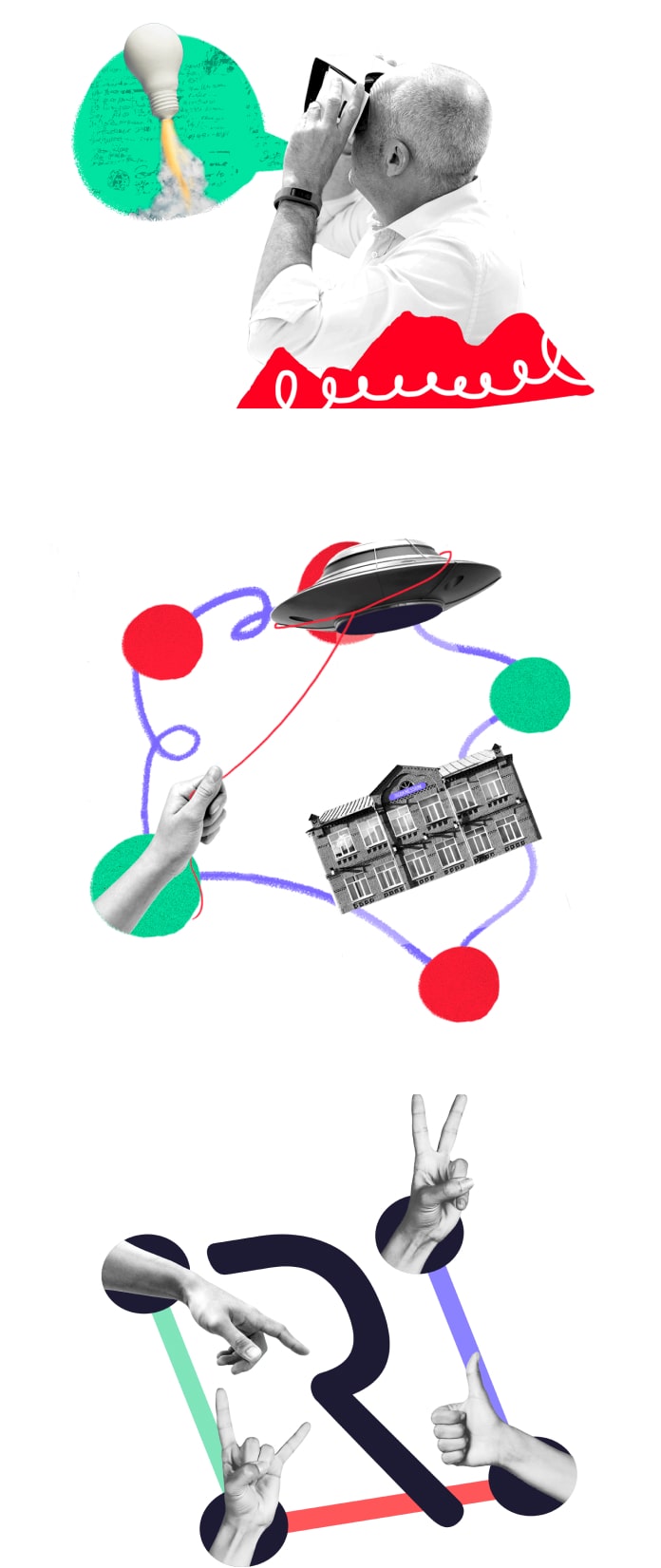
The identity of the project has changed and its tone of voice with it. We therefore decided to represent the world of Riconnessioni through collage technique that allows you to convey clear – but still open to interpretation – messages, and to create different images all the time. The “cut-and-paste” technique represents the idea of learning by doing, of manual skills and of creation in school laboratories.
Design System
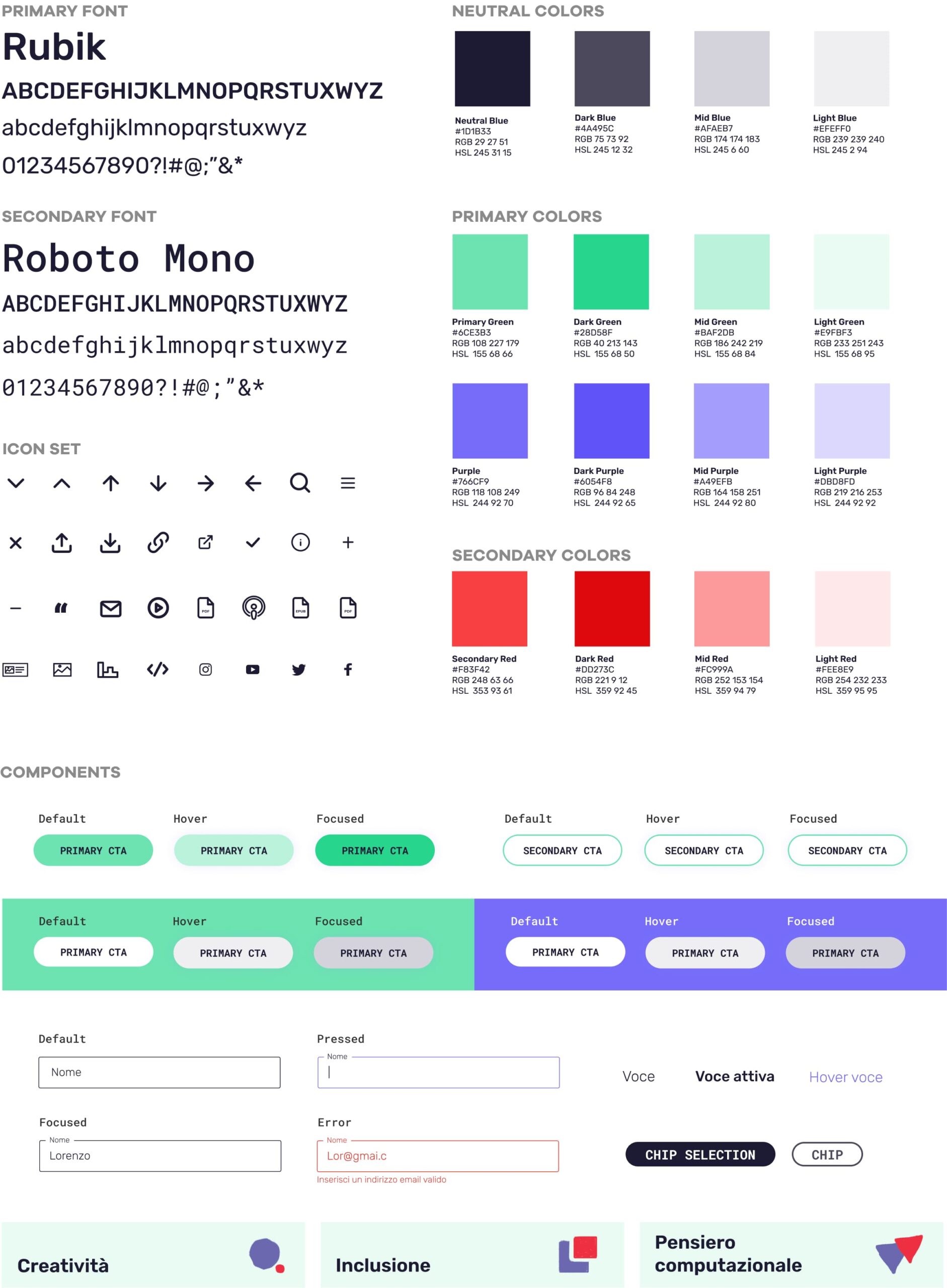
The typographic choice focuses on new typefaces: a primary one, Rubik, solid and modern, with soft details and finishes, to convey a friendly mood while maintaining institutionality; a secondary one, Roboto Mono, to express the tech component of the project. The color palette sees a hierarchical reorganization of the colors that are part of the identity of Riconnessioni, starting from the reduction in the number of primary colors, and are used to give rhythm and consistency to the entire site.

UX/UI Design
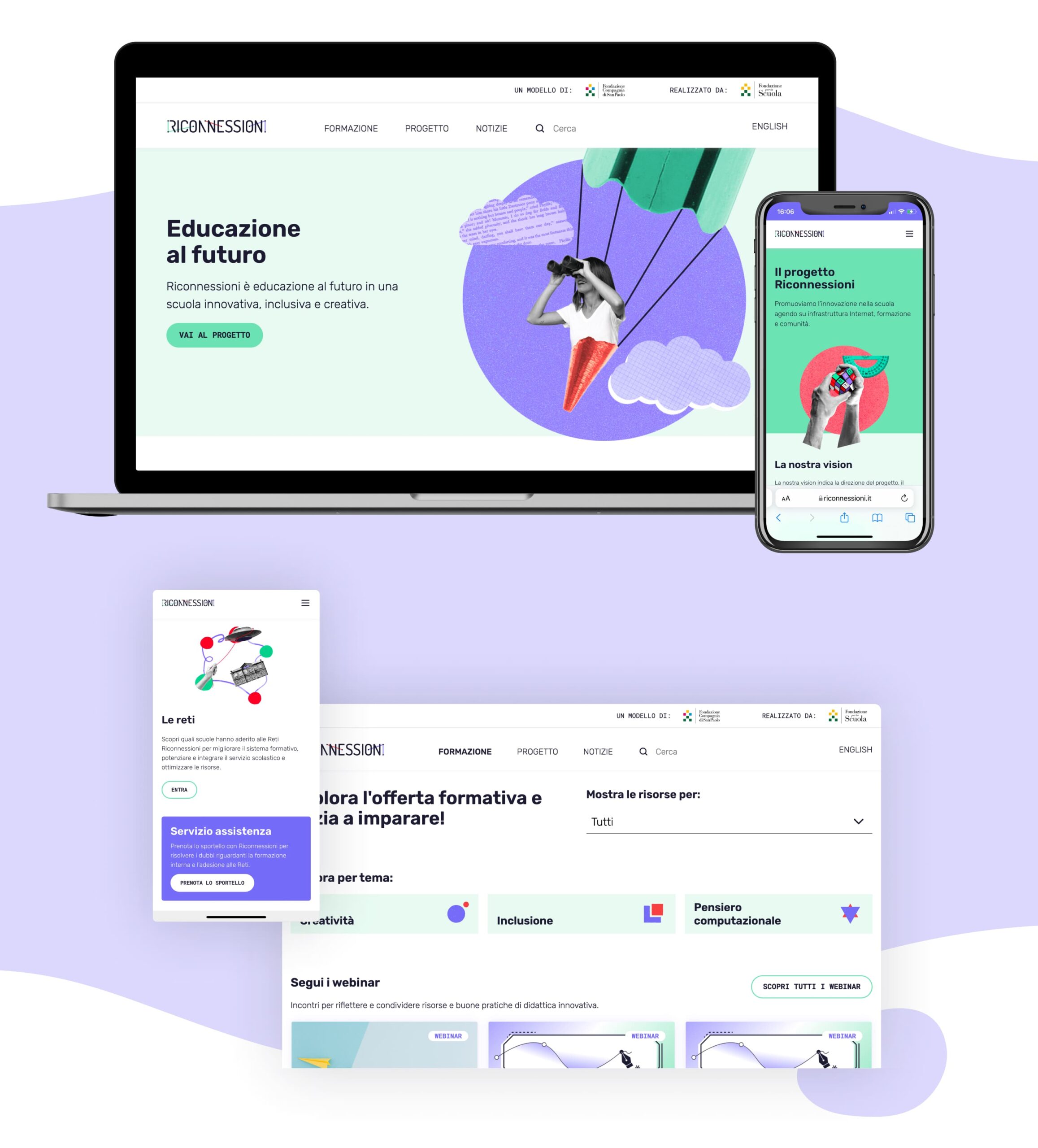
The menu channels the user’s attention to the main areas of the project: the training one, that reorganizes the resources in a clearer and more immediate way, the methodical one, that highlights the scalability of the Riconnessioni model, and the informative one that expresses the image of Riconnessioni as an active and connected reality.
This categorization favors a more immediate use of the contents.
The participation of the user who interacts with the platform is strengthened by adding several points where the community can upload their activities, participate in initiatives and be inspired by the successful case studies of colleagues.

An accessible website
Particular attention was given to studying the accessibility of the platform.
The color scale of the interface, as well as the typographic scale have been rethought in such a way that they meet the minimum accessibility criteria, respecting for example the minimum contrast values between texts and images, and making sure that the contents are understandable and usable by anyone.