Greenpeace –
Save the Arctic 2.0
Greenpeace International asked us to redesign the main site of the Arctic campaign. After our successful redesign of the platform, it was time to move from an overarching single homepage to a richer and more complex website.

Information architecture
A first-level menu for the important sections and a second-level menu for other pages.
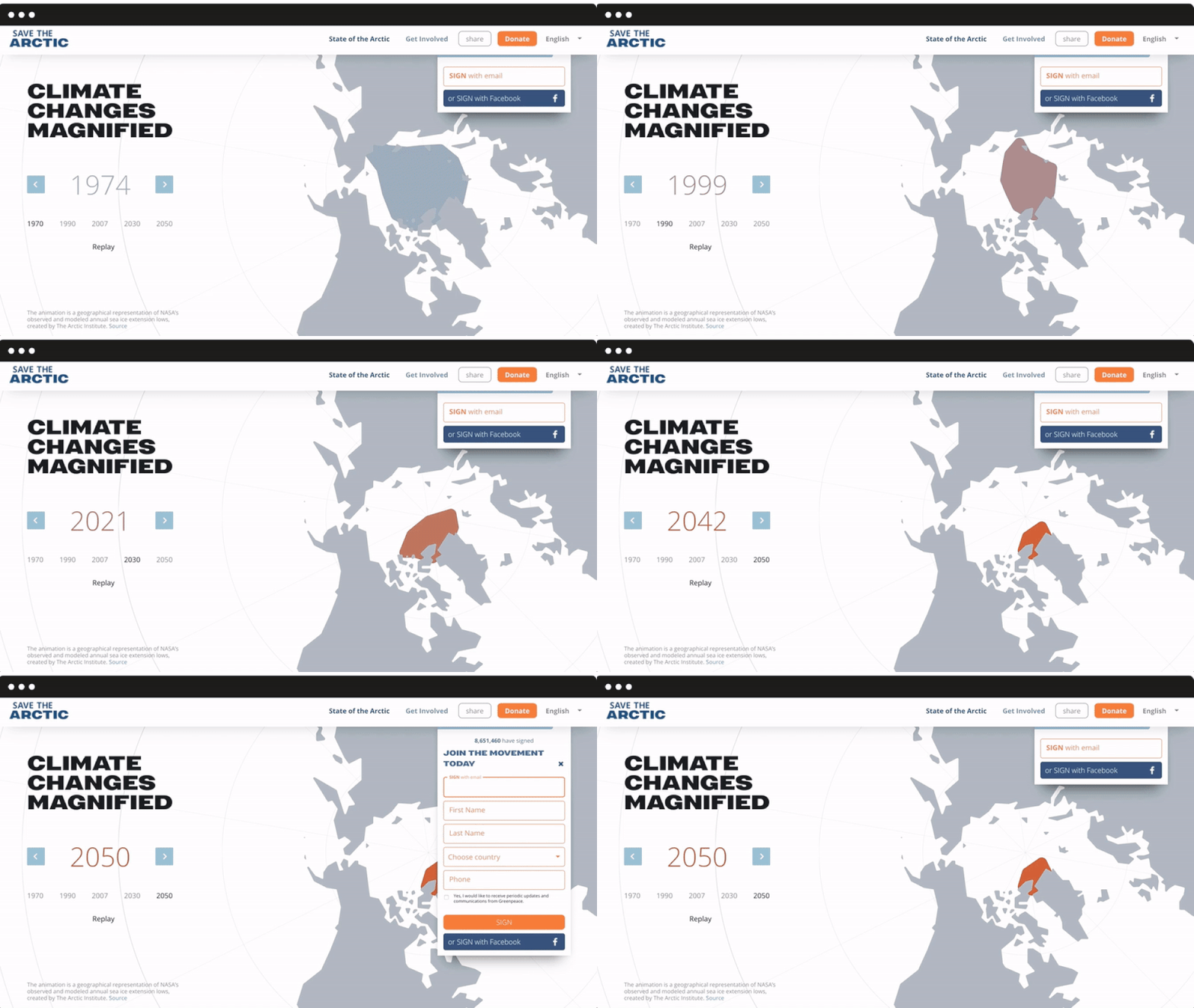
We ran a survey to identify existing strong features as well as expectations, which allowed us to design the site’s structure and new internal pages. We added a first-level menu for the most important sections: State of the Arctic (with interactive charts to display more scientific information) and Get Involved, but also a second-level menu for pages dedicated to the campaign’s history and main petitions. The form behaviour was also revisited, in order to be always visible and fully integrated into the navigation flow.

Mobile responsive
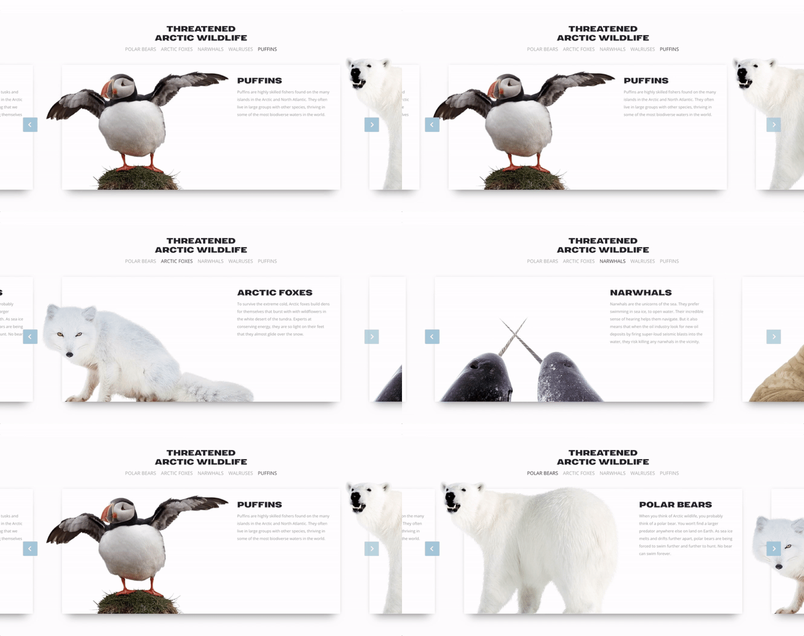
An internal narrative based on sliders and cards to display the most iconic protagonists of the campaign.
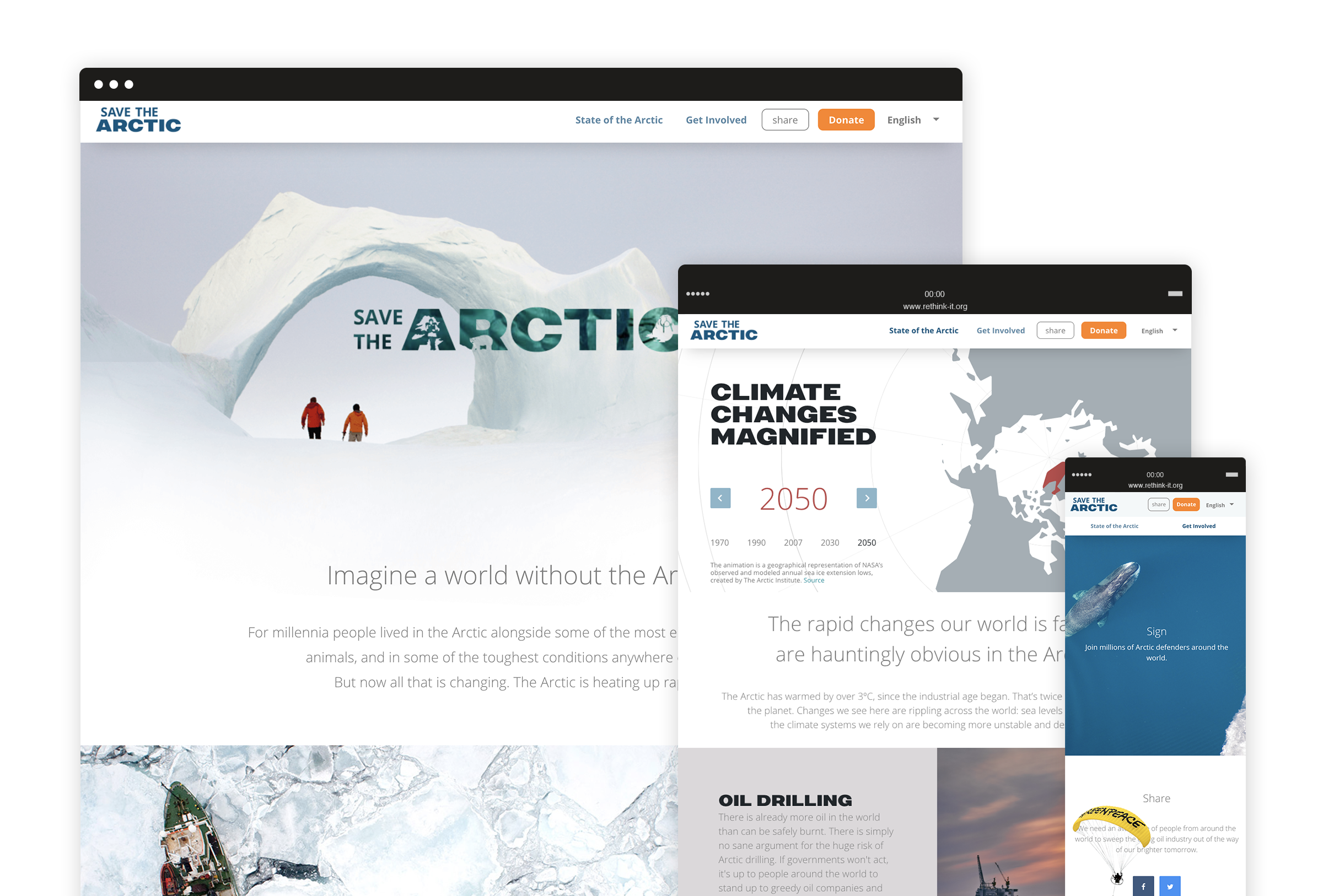
Throughout the website are highlight achievements and list the actions people can make every day to support the Arctic. Such horizontal structure is highly usable on mobile devices and it allows users to smoothly discover different contents with the top of a finger. We also designed a super lightweight petition template optimized for slower connections and mobile use, focusing on key contents and, of course, the signup form.

A new visual language
A new way to talk about the Arctic and communicate key concepts through visual design.
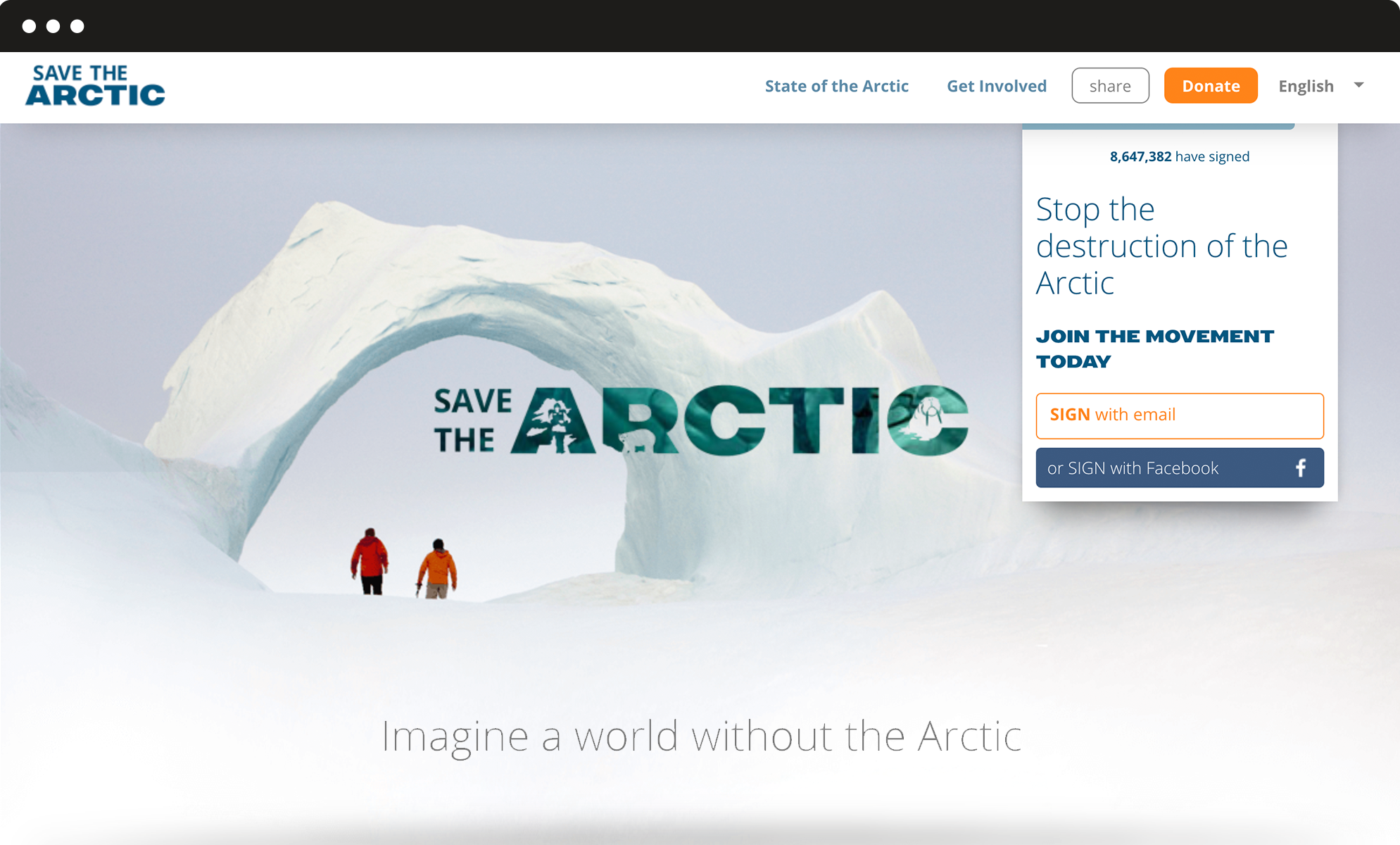
We got inspired by how Greenpeace describes the Arctic today: a fragile sanctuary, a gorgeous, almost sacred place that belongs to everyone and needs to be protected. We used airy spaces, top view photography, light typography and white shades to convey the concepts of untouchable beauty and fragility, whereas urgency and calls to action stand out thanks to brighter colours and bold fonts. All over the website, we used carefully selected images to visually guide the user through the campaign and reinforce the storytelling.
